
Recommended
More Related Content
What's hot
What's hot (17)
Viewers also liked
Viewers also liked (19)
Similar to Task 3c Double Page Spread Own Magazine Analysis
Similar to Task 3c Double Page Spread Own Magazine Analysis (20)
Recently uploaded
Recently uploaded (20)
Task 3c Double Page Spread Own Magazine Analysis
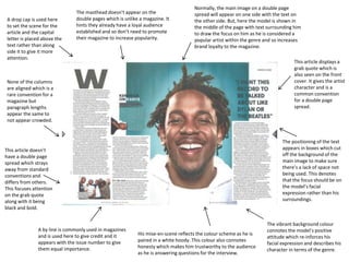
- 1. A drop cap is used here to set the scene for the article and the capital letter is placed above the text rather than along side it to give it more attention. This article displays a grab quote which is also seen on the front cover. It gives the artist character and is a common convention for a double page spread. Normally, the main image on a double page spread will appear on one side with the text on the other side. But, here the model is shown in the middle of the page with text surrounding him to draw the focus on him as he is considered a popular artist within the genre and so increases brand loyalty to the magazine. None of the columns are aligned which is a rare convention for a magazine but paragraph lengths appear the same to not appear crowded. The masthead doesn’t appear on the double pages which is unlike a magazine. It hints they already have a loyal audience established and so don’t need to promote their magazine to increase popularity. His mise-en-scene reflects the colour scheme as he is paired in a white hoody. This colour also connotes honesty which makes him trustworthy to the audience as he is answering questions for the interview. A by line is commonly used in magazines and is used here to give credit and it appears with the issue number to give them equal importance. The positioning of the text appears in boxes which cut off the background of the main image to make sure there’s a lack of space not being used. This denotes that the focus should be on the model’s facial expression rather than his surroundings. The vibrant background colour connotes the model’s positive attitude which re-inforces his facial expression and describes his character in terms of the genre. This article doesn’t have a double page spread which strays away from standard conventions and differs from others. This focuses attention on the grab quote along with it being black and bold.