Presentation by Andreas Schleicher Tackling the School Absenteeism Crisis 30 ...
Task 2c double page spread nme analysis
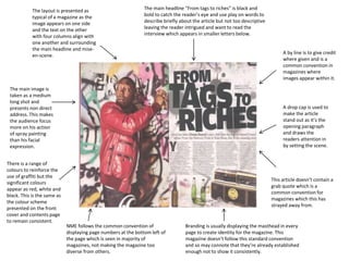
1. A drop cap is used to
make the article
stand out as it’s the
opening paragraph
and draws the
readers attention in
by setting the scene.
A by line is to give credit
where given and is a
common convention in
magazines where
images appear within it.
The layout is presented as
typical of a magazine as the
image appears on one side
and the text on the other
with four columns align with
one another and surrounding
the main headline and mise-
en-scene.
The main image is
taken as a medium
long shot and
presents non direct
address. This makes
the audience focus
more on his action
of spray painting
than his facial
expression.
There is a range of
colours to reinforce the
use of graffiti but the
significant colours
appear as red, white and
black. This is the same as
the colour scheme
presented on the front
cover and contents page
to remain consistent.
The main headline “From tags to riches” is black and
bold to catch the reader’s eye and use play on words to
describe briefly about the article but not too descriptive
leaving the reader intrigued and want to read the
interview which appears in smaller letters below.
This article doesn’t contain a
grab quote which is a
common convention for
magazines which this has
strayed away from.
Branding is usually displaying the masthead in every
page to create identity for the magazine. This
magazine doesn’t follow this standard convention
and so may connote that they’re already established
enough not to show it consistently.
NME follows the common convention of
displaying page numbers at the bottom left of
the page which is seen in majority of
magazines, not making the magazine too
diverse from others.