1. Inspirational Magazine Covers
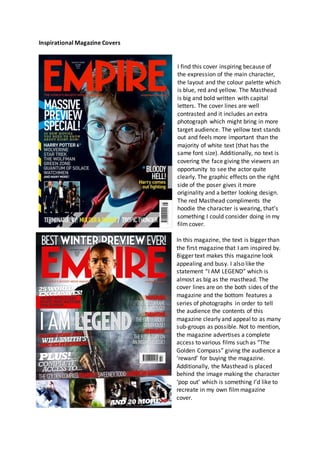
I find this cover inspiring because of
the expression of the main character,
the layout and the colour palette which
is blue, red and yellow. The Masthead
is big and bold written with capital
letters. The cover lines are well
contrasted and it includes an extra
photograph which might bring in more
target audience. The yellow text stands
out and feels more important than the
majority of white text (that has the
same font size). Additionally, no text is
covering the face giving the viewers an
opportunity to see the actor quite
clearly. The graphic effects on the right
side of the poser gives it more
originality and a better looking design.
The red Masthead compliments the
hoodie the character is wearing, that’s
something I could consider doing in my
film cover.
In this magazine, the text is bigger than
the first magazine that I am inspired by.
Bigger text makes this magazine look
appealing and busy. I also like the
statement “I AM LEGEND” which is
almost as big as the masthead. The
cover lines are on the both sides of the
magazine and the bottom features a
series of photographs in order to tell
the audience the contents of this
magazine clearly and appeal to as many
sub-groups as possible. Not to mention,
the magazine advertises a complete
access to various films such as “The
Golden Compass” giving the audience a
‘reward’ for buying the magazine.
Additionally, the Masthead is placed
behind the image making the character
‘pop out’ which is something I’d like to
recreate in my own filmmagazine
cover.