
Recommended
More Related Content
What's hot
What's hot (20)
Viewers also liked
Viewers also liked (15)
Similar to Codes and conventions
Similar to Codes and conventions (20)
More from katiehatton123
More from katiehatton123 (13)
Recently uploaded
Recently uploaded (20)
Codes and conventions
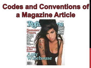
- 2. MAST HEAD The masthead is the title of the magazine and on this magazine its Rolling Stone and runs from the left of the magazine to the right of the magazine. The masthead is also usually placed on the top of the page and is often bright and colourful which is useful when connoting the magazine genre. The masthead is also very unique as it is was defines it as its own original magazine as there's nothing alike.
- 3. CENTRAL IMAGE The central image of the magazine is the main image used on the front cover and is used to attract the audience to the magazine. The central image is also the image of the person who is in the main interview for that issue. The central image also often fills the page and direct address is used to further grab audience attention.
- 4. MISE EN SCENE Mise en scene is the use of props and costumes. There isn't must used in this magazine article however the colours chosen work well with the black top that Amy is wearing. Mise en scene is used to signify the genre of the magazine article and is also useful in setting the tone of the article.
- 5. BUZZWORDS This edition of Rolling Stone doesn't actually contain any buzzwords, however they're usually used to entice the reader and make them want to buy the magazine as the words jump out at them when they look at the front cover. Examples of buzzwords are words such as Free, Plus and Win. They are also often bright and colourful to further grab the audience attention.
- 6. COVER LINES The cover line is the piece of text which is the second biggest text after the masthead. On this magazine the cover line is ‘Amy Winehouse’ because that is the main article in this edition. The cover line is usually short and catchy to bring the readers attention to the front cover and make them intrigued in finding out more about what the article will contain. The cover line is also useful in just bringing enough information about the magazine without having to write a huge boring paragraph. The cover line also frames the image of the person who the interview is about and is often very colourful and bold.
- 7. SUBHEADING The subheading usually appears above the main headline. The subheading grabs the readers attention and is bold and colourful. The subheading allows the reader to learn more about what will be in the article and makes their interest in the magazine grow. The subheading in this magazine is red and really stands out as a contrast of colours with the main headline.
- 8. BARCODE Although it is hard to see the barcode on this magazine, the barcode allows the audience to see the price of the magazine, the date it was put on shelves and also the issue number for the magazine.
- 9. TYPOGRAPHY Typography in a magazine is very important for a magazine front cover. The way the words are presented allows the reader to understand the genre of the magazine and they usually have around 4-6 different styles. The writing is also very colourful and bold to grab the audiences attention when they are walking past the shelf.
- 10. COLOUR SCHEME AND GRAPHIC FEATURES As previously mentioned the colour scheme is very important as humans are naturally attracted to colour over and object that is dull. If the whole front cover was in black and white then the viewer would not stop to take notice of the magazine. However like this magazine, it is very colourful and all the colours work well together. Graphic features also links in with attracting the audience as shapes used will help with this.