
Recommended
More Related Content
What's hot
What's hot (19)
Viewers also liked
Viewers also liked (15)
Similar to Contents page analysis
Similar to Contents page analysis (20)
More from Jamallywal1998
Recently uploaded
Recently uploaded (20)
Contents page analysis
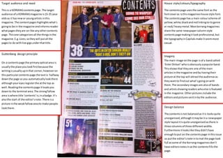
- 1. Guttenberg design principle On a contentspage the primaryoptical area is usuallythe place youlookfirstbecause the writingisusuallyupinthat corner,howeveron thisparticularcontentspage the textis halfway downthe page so you automaticallylookthere althoughyoureyes registerthe atthe top as well.Readingthe contentspage itleadsyou downto the terminal area.The strongfallow area iswhere title ‘contents’is;inabadge.It’s alsothe start of the editor’snote.There isa picture inthe weakfallowareato make people lookthere. House style/colours/typography The contentspage usesthe same font as the fontcoveras isthismagazineshouse style font. The contentspage has a main colourscheme of yellow;white;blackandredlinkingtoitsgenre or rock/ heavymetal.Mostkerrangmagazines share the same newspapercolumnstyle contentspage makingitlookprofessional,but the typographyinCapitalsmake itseemmore casual. Design balance The contentsisnot balancedas itis looksquite unorganised,althoughitmaybe ina newspaper style layoutitisquite unorganisedasthere is three columnsof three differentwidths. Furthermore itlookslike theydidn’thave enoughtoput on the contentspage inthisissue so putthe editor’snote intomat the page look full assome of the Kerrangmagazines don’t have editorsnotesinasthe contentsfillsthe page. Imagery The main image onthe page isof a bandcalled ‘EnterShikari’ whoisobviouslyapopularband. Thisshowsthat theyare one of the main articlesinthe magazine andby havingtheir picture at the top will attractthe audience as theywantto findout what’sgoingonwith them.The secondaryimagesare alsoof bands and artistsshowingreaderswhoelse isfeatured inthe magazine.Otherpicturesinclude the editorsandpicturessentinbythe audience. Target audience and need Thisis a KERRANGcontentspage.The target audience of a KERRANGmagazine is15-25 year oldsas it hasnewor youngartists inthis magazine. The contentpageshighlightswhat’s goingto be in the magazine andinformsreader whatpagestheyare on like anyothercontents page.Thisone categorizesall the thingsinthe magazine.E.g.Lives;sotheywill putall the pagesto do withlive gigsunderthattitle.
- 2. Guttenberg design principle The primaryoptical area isthe start of the mast head/title whichis‘contents’.Insteadof going to the terminal optical areayoureyesare draggeddownto the weakfallowareaas the page numbersare downthe lefthandside of the page makingreadersfollowthe information downit.The strongfallowareaisactuallythe weakfallowareaaskit has virtuallynothinginit but a page numberforthe photoof the artist. The rest of the page isfilledwiththe photo whichattracts people tothatarticle if they knowthe artist. Design balance This contents page has design Balance as most of the page is filled up with a photo of an artist and the other bit has the writing on it. The page looks very organised because of this. Target audience and need The Q magazine target audience are generally older audiences, due to the older bands they put in their magazines. Q’s contents page like any other contents page informs people of what’s in the magazine. Imagery The image is of an artist called Marc Bolan; he appears to be a famous rock artist and would most likely be the main article as he is the main image. The fact he is the only image on there could infer his importance in this issue making people want to find out what he’s doing. House style/colours/typography Q magazines use the same typography font on each of their magazines, as it brands their magazine. It has a main colour scheme of Black, white and red but has a bit of yellow because Black writing won’t show up on the photo show on the photo. The contents page is in a column like most content pages and has categorized the articles in the magazine. Comparing and contrasting. Both of these contentspageshave columnlikea newspaperandare bothin numerical order rather thanbeinginan unorganisedorder. Howeverkerrangseemsmore unorganizedfor the layoutof the page as it looksmore childish, makingitmore desirableforitstargetaudience and linkingtoitsgenre. WhereasQhas a more organisedpage asit’sall in one column.Qalso has one image makingthe audience focuson them,butkerranghas more than one as they showthe bandsmentionedinthe magazine.