SlideShare a Scribd company logo
1 of 3
Thiscontentspage has quite a
differentdesignfromthe othersIhave
lookedat.It presentsalotmore text
than the others.Howeveritisstill
effectiveasthe textiskeptseparated
by the use of boldtext,underlining,
differentfontsandcolours.Thiscover
page alsousessome imagesto
simplifythe page,byshowing
matchingimagesandpage numbers,
whichreducesthe amountof text.
The imagesusedinthispage are also
quite contrasting.Forexample the
central image withthe page number
50 is a natural photo, whichseemsto
be takenfrom an event,whereasthe
othersare all posedphotosfroma
professionalshoot.Thiscreatesaless
formal approachto the designof the
page,whichisalsoillustratedinthe
layoutof the textand the way itis
quite randomandclustered.
This contents page also uses a minimalistic design. The main
colour scheme uses red, black andwhite. This creates contrast
which allows us to tell differences between sections of the
page. The images compliment the colour scheme used, for
example Lana’s pale skinmatchesthe white used in the
background, and the blood matches the redusedonthe page.
The mainimage used onthis contents page is quite boldand
striking. It is an unusual image whichwouldcreate some
intrigue for those lookingat the page. For example, the blood
running downthe side ofher head, the waythat the
photograph is angledandthe waythe photo is cropped. The
waythat this is done shows a close up ofLana, which allows us
to see the quite sultryfacialexpression that she is using, such
as the waythat her lips are slightlypartedandalsothe blood
on her head. Thismaybe stereotypical ofthe male gaze, by
representingthe linkbetweena woman’s sexualityand
danger. This would attract the reader’s attentionanddraw
them to the image. It alsomatches the minimalistic design on
the page as she looks quite natural, she is not wearing lots of
makeupor boldcolours. This helps to drawthe attentionto
the bloodonthe side of her face also.
The cursor symbol usedon the left hand
side ofthe page createsa hotspot and
draws the reader’s attention to the image
displayedon the left. This image shows two
men in bear onesies, somethingwhich
creates humour. This contrasts quite
significantlyto the mainimage onthe right
hand side which is quite mysterious.
The waythat images are usedto show what will be
containedoneachpage as wellas writingmakes it
a lot easier for the reader to follow. It makes the
design more simple andeffective for the readers
use. It alsostops clusters of text to present the
relevant information, which helps to create the
minimalistic design.
The ‘contents’ title is displayedin the topcentre
of the page. It is bold, andin black withthe
magazine name displayednext to it withits usual
logo. Thisis effective as it is displayed clearlyand
also is kept separate from the rest ofthe text and
imageson the page whichmeans it is very
noticeable andeye catching. The most important
informationonthe page is displayedin bright red
boxes, this colour immediatelycatches the
reader’s attention. For example, page numbers
are displayedin these red boxes, alongside some
important text. The rest ofthe text is displayedin
black, however it is still veryeffective as eachbit
is sectioned off bya line sothat we canvery
clearlyunderstandthe different parts of the
magazine.
The ‘contents’title usedinthispage isquite
interesting.The lettersare spreadoutbelow
one another,whichtakesuproom onthe
page.Thismay be done to add to the
minimalisticdesign,byaddingsomethinga
bitdifferentwithoutbeingtooboldorbrash.
The font isinwhite whichstandsoutin front
of the dark redbackground. The lettersare
all incapital whichallowusto see that thisis
the title of the page.
The texton thispage is all displayedon
the lefthandside of the page.It usesa
small fontsize,sothat the image isstill
the dominatingfocusforthe reader.
Thisreinforcesthe ideathatthe man in
the image isshowingpower.Itdoesnot
take away the attentionfromthe image
but isstill presentedclearlyforthe
reader.The textissplitintoheadings,
by the titles‘features’and‘fashion’,
these botharrange the informationand
standout as a largerfontisused,
makingiteasierforthe readerto
follow.
The image on thispage shouldbe the main
focusfor the reader.Althoughitdoesnot
make up the backgroundof the page,itis a
verystrikingandboldimage.Forexample
the man has no topon, butinsteadis
sportinglotsof jewellery,suchasthe golden
chains,braceletsandringsthat he is
wearing.Itisalsoquite a brash and daring
pose,inwhichhe isgrittinghis goldteeth.
The way that he is doingthismaysuggest
that he is meantto dominate the page.The
page is relativelyminimalistic,forexample
there are no massivelyboldorcontrasting
colours,shapesortext.The page iskept
quite simple byusinganimage andonly
essential text.
A large ‘v’is showninthe redbackground,a
sectionisseenasmore of a burgundypurple
colourto do this.Thisstandsfor the title of
the magazine,‘vibe’.Thismakesthe design
more interestingwithouttakingawaythe
minimalisticfeatures.The title‘vibe’isalso
displayedinasmallerfontinthe topright
handside of the page.Thisusesblackand
white andmatchesboththe ‘contents’title
and the colourof the man’shat. Thisis shown
ina smallerfontonthe contentspage as itis
of lessimportance here thanonthe cover
page.

More Related Content

What's hot

Double page spread analysis
Double page spread analysisDouble page spread analysis
Double page spread analysishannahsilverr
 
Contents progress
Contents progressContents progress
Contents progressryanrococo
 
Final content page and double spread article designs
Final content page and double spread article designsFinal content page and double spread article designs
Final content page and double spread article designsIllyaBoyko1
 
Double page spread: Working Progress
Double page spread: Working ProgressDouble page spread: Working Progress
Double page spread: Working ProgressSatinaLOL
 
Becky double page spread magazine analysis
Becky double page spread  magazine analysisBecky double page spread  magazine analysis
Becky double page spread magazine analysisCharis Creber
 
5 magazine double page spreads
5 magazine double page spreads5 magazine double page spreads
5 magazine double page spreadsrobyngarcia
 
Drafts and analysis for magazine
Drafts and analysis for magazineDrafts and analysis for magazine
Drafts and analysis for magazineasmediae12
 
Music Magazine Double Page Progression
Music Magazine Double Page ProgressionMusic Magazine Double Page Progression
Music Magazine Double Page ProgressionBaneTMB
 
Contents Page and Double Page Spread
Contents Page and Double Page SpreadContents Page and Double Page Spread
Contents Page and Double Page SpreadMystifyingproductions
 
Task 8 tabloid
Task 8  tabloidTask 8  tabloid
Task 8 tabloidchamahan
 
Contents page analysis 3
Contents page analysis 3Contents page analysis 3
Contents page analysis 3adamkelly1234
 
Photoshop process
Photoshop processPhotoshop process
Photoshop processasmediae15
 

What's hot (18)

Double page spread analysis
Double page spread analysisDouble page spread analysis
Double page spread analysis
 
Contents progress
Contents progressContents progress
Contents progress
 
Contents Page
Contents PageContents Page
Contents Page
 
Final content page and double spread article designs
Final content page and double spread article designsFinal content page and double spread article designs
Final content page and double spread article designs
 
Evaluation
EvaluationEvaluation
Evaluation
 
Double page spread: Working Progress
Double page spread: Working ProgressDouble page spread: Working Progress
Double page spread: Working Progress
 
Becky double page spread magazine analysis
Becky double page spread  magazine analysisBecky double page spread  magazine analysis
Becky double page spread magazine analysis
 
Cover page analysis
Cover page analysis Cover page analysis
Cover page analysis
 
5 magazine double page spreads
5 magazine double page spreads5 magazine double page spreads
5 magazine double page spreads
 
Drafts and analysis for magazine
Drafts and analysis for magazineDrafts and analysis for magazine
Drafts and analysis for magazine
 
Page layout
Page layoutPage layout
Page layout
 
Magazine 1
Magazine 1Magazine 1
Magazine 1
 
Music Magazine Double Page Progression
Music Magazine Double Page ProgressionMusic Magazine Double Page Progression
Music Magazine Double Page Progression
 
Contents Page and Double Page Spread
Contents Page and Double Page SpreadContents Page and Double Page Spread
Contents Page and Double Page Spread
 
Task 8 tabloid
Task 8  tabloidTask 8  tabloid
Task 8 tabloid
 
Contents page analysis 3
Contents page analysis 3Contents page analysis 3
Contents page analysis 3
 
Contents page ideas & development
Contents page ideas & developmentContents page ideas & development
Contents page ideas & development
 
Photoshop process
Photoshop processPhotoshop process
Photoshop process
 

Viewers also liked

Progression of double page spread
Progression of double page spreadProgression of double page spread
Progression of double page spreadlaurenamyharriman
 
2.1 konsep pendekatan scientific
2.1 konsep pendekatan scientific2.1 konsep pendekatan scientific
2.1 konsep pendekatan scientific16051983
 
Progression of contents page
Progression of contents pageProgression of contents page
Progression of contents pagelaurenamyharriman
 
Double page spread_analysis (1)
Double page spread_analysis (1)Double page spread_analysis (1)
Double page spread_analysis (1)laurenamyharriman
 
Microsoftpowerpoint 100525101900-phpapp01 2
Microsoftpowerpoint 100525101900-phpapp01 2Microsoftpowerpoint 100525101900-phpapp01 2
Microsoftpowerpoint 100525101900-phpapp01 2JinJin Tangpo
 
Hakan hilmi serdaroğlu namaz konulu sunum-bdö - kopya
Hakan hilmi serdaroğlu namaz konulu sunum-bdö - kopyaHakan hilmi serdaroğlu namaz konulu sunum-bdö - kopya
Hakan hilmi serdaroğlu namaz konulu sunum-bdö - kopyaMustafa Arslan
 
RAMAZAN AYI VE ORUÇ İBADETİ KÖPRÜ KURMA
RAMAZAN AYI VE ORUÇ İBADETİ KÖPRÜ KURMARAMAZAN AYI VE ORUÇ İBADETİ KÖPRÜ KURMA
RAMAZAN AYI VE ORUÇ İBADETİ KÖPRÜ KURMAMustafa Arslan
 
Why +grouping is designed just for #teachers, #parents #education
Why +grouping is designed just for #teachers, #parents #educationWhy +grouping is designed just for #teachers, #parents #education
Why +grouping is designed just for #teachers, #parents #educationGrouping
 

Viewers also liked (15)

Progression of double page spread
Progression of double page spreadProgression of double page spread
Progression of double page spread
 
2.1 konsep pendekatan scientific
2.1 konsep pendekatan scientific2.1 konsep pendekatan scientific
2.1 konsep pendekatan scientific
 
Mustafa arslan
Mustafa arslanMustafa arslan
Mustafa arslan
 
Bdö özeti̇
Bdö özeti̇Bdö özeti̇
Bdö özeti̇
 
Progression of contents page
Progression of contents pageProgression of contents page
Progression of contents page
 
Double page spread_analysis (1)
Double page spread_analysis (1)Double page spread_analysis (1)
Double page spread_analysis (1)
 
Microsoftpowerpoint 100525101900-phpapp01 2
Microsoftpowerpoint 100525101900-phpapp01 2Microsoftpowerpoint 100525101900-phpapp01 2
Microsoftpowerpoint 100525101900-phpapp01 2
 
Representation in glue
Representation in glueRepresentation in glue
Representation in glue
 
Questions 1 a & 1b
Questions 1 a & 1bQuestions 1 a & 1b
Questions 1 a & 1b
 
Hakan hilmi serdaroğlu namaz konulu sunum-bdö - kopya
Hakan hilmi serdaroğlu namaz konulu sunum-bdö - kopyaHakan hilmi serdaroğlu namaz konulu sunum-bdö - kopya
Hakan hilmi serdaroğlu namaz konulu sunum-bdö - kopya
 
Cover page progression
Cover page progressionCover page progression
Cover page progression
 
Köprü ödevi
Köprü ödeviKöprü ödevi
Köprü ödevi
 
Kadi̇r aydin
Kadi̇r aydinKadi̇r aydin
Kadi̇r aydin
 
RAMAZAN AYI VE ORUÇ İBADETİ KÖPRÜ KURMA
RAMAZAN AYI VE ORUÇ İBADETİ KÖPRÜ KURMARAMAZAN AYI VE ORUÇ İBADETİ KÖPRÜ KURMA
RAMAZAN AYI VE ORUÇ İBADETİ KÖPRÜ KURMA
 
Why +grouping is designed just for #teachers, #parents #education
Why +grouping is designed just for #teachers, #parents #educationWhy +grouping is designed just for #teachers, #parents #education
Why +grouping is designed just for #teachers, #parents #education
 

Similar to Contents page analysis

Contents Page Research
Contents Page ResearchContents Page Research
Contents Page Researchbeckyjay26
 
Review Of A Kerrang Cover
Review Of A Kerrang Cover Review Of A Kerrang Cover
Review Of A Kerrang Cover CharlotteW123
 
Magazine Textual Analysis
Magazine Textual AnalysisMagazine Textual Analysis
Magazine Textual AnalysisJwbread
 
Textual analysis
Textual analysisTextual analysis
Textual analysisJwbread
 
Contents page analysis
Contents page analysisContents page analysis
Contents page analysisasmediae15
 
Codes and conventions of contents page
Codes and conventions of contents pageCodes and conventions of contents page
Codes and conventions of contents pagenathan gkikas
 
Contents page analysis
Contents page analysisContents page analysis
Contents page analysisMaxSunnar
 
Analysis of professional dps
Analysis of professional dpsAnalysis of professional dps
Analysis of professional dpsclaudiaohara
 
Analysis of professional dps
Analysis of professional dpsAnalysis of professional dps
Analysis of professional dpsclaudiaohara
 
Contents Page Analysis
Contents Page AnalysisContents Page Analysis
Contents Page Analysisbanesybaby
 
Magazine analysis
Magazine analysisMagazine analysis
Magazine analysisAlice Bates
 
Magazine analysis
Magazine analysisMagazine analysis
Magazine analysisAlice Bates
 

Similar to Contents page analysis (20)

Contents Page Research
Contents Page ResearchContents Page Research
Contents Page Research
 
Review Of A Kerrang Cover
Review Of A Kerrang Cover Review Of A Kerrang Cover
Review Of A Kerrang Cover
 
Task3
Task3Task3
Task3
 
Contetns research 2
Contetns research 2Contetns research 2
Contetns research 2
 
Magazine Textual Analysis
Magazine Textual AnalysisMagazine Textual Analysis
Magazine Textual Analysis
 
Textual analysis
Textual analysisTextual analysis
Textual analysis
 
Contents page analysis
Contents page analysisContents page analysis
Contents page analysis
 
G321 Magazine Flat Plan
G321 Magazine Flat PlanG321 Magazine Flat Plan
G321 Magazine Flat Plan
 
Deconstructions
Deconstructions Deconstructions
Deconstructions
 
Magazine analysis
Magazine analysisMagazine analysis
Magazine analysis
 
Codes and conventions of contents page
Codes and conventions of contents pageCodes and conventions of contents page
Codes and conventions of contents page
 
Task 3
Task 3Task 3
Task 3
 
Contents page analysis
Contents page analysisContents page analysis
Contents page analysis
 
Magazine analysis
Magazine analysisMagazine analysis
Magazine analysis
 
Conents
ConentsConents
Conents
 
Analysis of professional dps
Analysis of professional dpsAnalysis of professional dps
Analysis of professional dps
 
Analysis of professional dps
Analysis of professional dpsAnalysis of professional dps
Analysis of professional dps
 
Contents Page Analysis
Contents Page AnalysisContents Page Analysis
Contents Page Analysis
 
Magazine analysis
Magazine analysisMagazine analysis
Magazine analysis
 
Magazine analysis
Magazine analysisMagazine analysis
Magazine analysis
 

More from laurenamyharriman (12)

Stages in digipak
Stages in digipakStages in digipak
Stages in digipak
 
Analysis of posters.
Analysis of posters.Analysis of posters.
Analysis of posters.
 
Analysis further
Analysis furtherAnalysis further
Analysis further
 
Analysis furthrr
Analysis furthrrAnalysis furthrr
Analysis furthrr
 
Progression 4 digipak
Progression 4 digipakProgression 4 digipak
Progression 4 digipak
 
Lana del ray
Lana del rayLana del ray
Lana del ray
 
Lana del ray
Lana del rayLana del ray
Lana del ray
 
Digipack and advert research
Digipack and advert researchDigipack and advert research
Digipack and advert research
 
Mood board media coursework
Mood board media courseworkMood board media coursework
Mood board media coursework
 
Colour palettes
Colour palettesColour palettes
Colour palettes
 
Colour palettes (1)
Colour palettes (1)Colour palettes (1)
Colour palettes (1)
 
Fonts for media coursework
Fonts for media courseworkFonts for media coursework
Fonts for media coursework
 

Contents page analysis

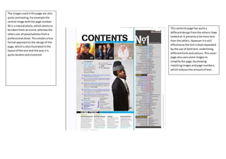
  • 1. Thiscontentspage has quite a differentdesignfromthe othersIhave lookedat.It presentsalotmore text than the others.Howeveritisstill effectiveasthe textiskeptseparated by the use of boldtext,underlining, differentfontsandcolours.Thiscover page alsousessome imagesto simplifythe page,byshowing matchingimagesandpage numbers, whichreducesthe amountof text. The imagesusedinthispage are also quite contrasting.Forexample the central image withthe page number 50 is a natural photo, whichseemsto be takenfrom an event,whereasthe othersare all posedphotosfroma professionalshoot.Thiscreatesaless formal approachto the designof the page,whichisalsoillustratedinthe layoutof the textand the way itis quite randomandclustered.
  • 2. This contents page also uses a minimalistic design. The main colour scheme uses red, black andwhite. This creates contrast which allows us to tell differences between sections of the page. The images compliment the colour scheme used, for example Lana’s pale skinmatchesthe white used in the background, and the blood matches the redusedonthe page. The mainimage used onthis contents page is quite boldand striking. It is an unusual image whichwouldcreate some intrigue for those lookingat the page. For example, the blood running downthe side ofher head, the waythat the photograph is angledandthe waythe photo is cropped. The waythat this is done shows a close up ofLana, which allows us to see the quite sultryfacialexpression that she is using, such as the waythat her lips are slightlypartedandalsothe blood on her head. Thismaybe stereotypical ofthe male gaze, by representingthe linkbetweena woman’s sexualityand danger. This would attract the reader’s attentionanddraw them to the image. It alsomatches the minimalistic design on the page as she looks quite natural, she is not wearing lots of makeupor boldcolours. This helps to drawthe attentionto the bloodonthe side of her face also. The cursor symbol usedon the left hand side ofthe page createsa hotspot and draws the reader’s attention to the image displayedon the left. This image shows two men in bear onesies, somethingwhich creates humour. This contrasts quite significantlyto the mainimage onthe right hand side which is quite mysterious. The waythat images are usedto show what will be containedoneachpage as wellas writingmakes it a lot easier for the reader to follow. It makes the design more simple andeffective for the readers use. It alsostops clusters of text to present the relevant information, which helps to create the minimalistic design. The ‘contents’ title is displayedin the topcentre of the page. It is bold, andin black withthe magazine name displayednext to it withits usual logo. Thisis effective as it is displayed clearlyand also is kept separate from the rest ofthe text and imageson the page whichmeans it is very noticeable andeye catching. The most important informationonthe page is displayedin bright red boxes, this colour immediatelycatches the reader’s attention. For example, page numbers are displayedin these red boxes, alongside some important text. The rest ofthe text is displayedin black, however it is still veryeffective as eachbit is sectioned off bya line sothat we canvery clearlyunderstandthe different parts of the magazine.
  • 3. The ‘contents’title usedinthispage isquite interesting.The lettersare spreadoutbelow one another,whichtakesuproom onthe page.Thismay be done to add to the minimalisticdesign,byaddingsomethinga bitdifferentwithoutbeingtooboldorbrash. The font isinwhite whichstandsoutin front of the dark redbackground. The lettersare all incapital whichallowusto see that thisis the title of the page. The texton thispage is all displayedon the lefthandside of the page.It usesa small fontsize,sothat the image isstill the dominatingfocusforthe reader. Thisreinforcesthe ideathatthe man in the image isshowingpower.Itdoesnot take away the attentionfromthe image but isstill presentedclearlyforthe reader.The textissplitintoheadings, by the titles‘features’and‘fashion’, these botharrange the informationand standout as a largerfontisused, makingiteasierforthe readerto follow. The image on thispage shouldbe the main focusfor the reader.Althoughitdoesnot make up the backgroundof the page,itis a verystrikingandboldimage.Forexample the man has no topon, butinsteadis sportinglotsof jewellery,suchasthe golden chains,braceletsandringsthat he is wearing.Itisalsoquite a brash and daring pose,inwhichhe isgrittinghis goldteeth. The way that he is doingthismaysuggest that he is meantto dominate the page.The page is relativelyminimalistic,forexample there are no massivelyboldorcontrasting colours,shapesortext.The page iskept quite simple byusinganimage andonly essential text. A large ‘v’is showninthe redbackground,a sectionisseenasmore of a burgundypurple colourto do this.Thisstandsfor the title of the magazine,‘vibe’.Thismakesthe design more interestingwithouttakingawaythe minimalisticfeatures.The title‘vibe’isalso displayedinasmallerfontinthe topright handside of the page.Thisusesblackand white andmatchesboththe ‘contents’title and the colourof the man’shat. Thisis shown ina smallerfontonthe contentspage as itis of lessimportance here thanonthe cover page.