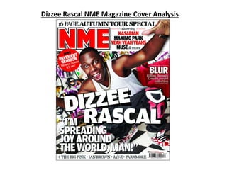
2. Masthead is in capitals to
allow it to stand out. Also its
in very big block letters which
are red to differ it from the
text around it for the same
effect. It’s also positioned in
a primary optical area for it
to be one of the first things
to be seen. The thin black
outline prevents it blending
into the background. The
simple denotation of the
colour red is to stand out.
The genre of this
magazine is quite
obviously music. The
cover lines are names of
artists/groups. The main
image and main cover
line is ‘Dizzee Rascal’, who
is a rap artist.
The model of the main image is
rap artist ‘Dizzee Rascal’. He is
crouching and the picture is
taken using a medium shot. He
fills up a good proportion of the
page and is quite centralised. He
uses direct address to engage
the reader. The graffiti wall
behind him and the chain he is
wearing connotes rap music, so
it’s easy to tell he comes from
this genre of music. It mainly
focuses on his face due to text
covering his body.
The main cover line stands out due to its
extremely large and white text. It’s in bold block
font similarly to the masthead to create the same
effect.
The strip doesn’t stand out as some of the
other parts but it does let the reader know
who to expect to see in the magazine. It’s
another part of the layout.
What’s different about this
magazine is that there’s
only one cover line other
than the main one. This
means that it doesn’t follow
codes and conventions. The
other text is just names of
artists/groups which can be
as effective.
The barcode is placed in
the bottom right. It’s not
very big as it has no
intent of being noticed.
The mise-en-scene is very hip hop.
The background is a wall of graffiti
which is common to see in hip hop
videos or in pictures with hip hop
artists. The gold chain with white
vest and jeans is also very typical of
a hip hop artist. He wants to
“remain street” but has the gold
chain to show off a bit of his
wealth. His funky trainers with the
big tongue sticking out is a typical
style choice of a hip hop artists
also.
The colour scheme excluding
the text is a combination of
simple red and white. This is
NME’s house style. But to keep
it from being boring the graffiti
wall is very outrageous and in
your face which is what make
this magazine stand out.
3. The genre of this magazine is music,
obviously, with the sub-genre covering two
genres of music: hip hop and rock. I say
this due to Dizzee Rascal (main image) and
Jay-Z (strip) being rappers. The magazine
also features big rock groups such as
Kasabian (cover line) and Paramore (strip).
This means that it is aimed at a larger
audience than magazines who solely focus
on one sub-genre (pop, rock, dance etc.)
The magazine is most likely aimed at
people of around the ages of 15-30 as they
are predominantly the main listeners of
these genres. It’s target audience, other
than age, is wide. Due to the hip hop side,
which would most likely be aimed at black
males and from the rock side, a unisexually
white group of people. I believe that the
audiences social-economic class would be
in between average and high. The layout of
the magazine tells me this and also due to
it being a well branded magazine, it maybe
be slightly expensive. This particular issue
is probably more for the hip hop fans of
their target audience.