Presiding Officer Training module 2024 lok sabha elections
Evaluation Q1
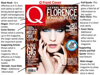
1. Mast Head - Q is
effective as it is short
and catchy as well as
being placed against a
bright red background,
which make the colour,
white stand out.
Cover Stories-
Shows what is coming
up in the magazine,
the larger words show
the important words
Supporting Article-
Shows what is
inside the
magazine, this is
effective as it helps
to engage the
reader.
Barcode, Issue Date,
Price – Additional
information
Pull Quote- This
effective as it
gives a little bit of
information to
the reader
Supporting
Article and Pull
Quote- Show a
new feature
Main Image-
Covers the full
magazine to show
who the main
story is about
Main Story -This
is effective
because it is short
and catchy
Cover Story-
Additional
information on
other stories
featured in the
magazine
Slogan- Short and
simple.
Q Front Cover
2. MOJO Contents Page MOJO
-Same recognisable logo that
matches front cover
-Situated in the middle of the
page
-Names situated underneath
popular music destinations
Page Numbers
-Clearly labelled
-Colour is the same as the
headings
- Colour is different from
the text
Headings
-Very few text
-Follow a colour scheme
-Smaller headings
-Categorised into two
sections
-Simple format to read
Pull Quote
-Engaging to the readers
-Direct to a page number
-Links to artist on contents
page
Date
-Shows the publication month
of the magazine
Cover story
-More in dept from the
front cover and the
features stories
-Same format as the
feature stories
- Clear to find from other
text
Page Number
-Connotation of a magazine
-Creates verisimilitude
Main image
-Pull quote link to the right
-Photography shoot image
-Effective 3D imagery used
-Domineering character
-Colour of the character
stands out
Background
-Relevant to target audience
-Neutral
-Appears classy
-Little text
Issue Number
-Inline with the date
-Small text(due to the little
importance)
-Clearly separated from other
features
3. Q DPSMain Image- The colour of the image is
separate to the rest of the article. The
grayscale effect also creates a vintage feel
to the image. The image is also provocative
which suggests she is trying to creating a
message to her fans. The eyes of Lady Gaga
are also looking straight towards the
audience which is effective as it implies
they are looking at them.
Drop Caps- This is a
typical convention of a
DPS. Here they have
been used to start a
new article/section.
The use of the first
drop is extremely effect
because it covers the
full article and is the
only colour present.
Also the letter L is
relevant to the artist.
Masthead- In a way this DPS
doesn’t have large masthead with
the artists name on it but they do
have a smaller version of a
masthead to the top right of the
page. I think this has been done
because the artist is already well
know so they can involve more
text for people to her about her .
Page Numbers- As
well as including a
page numbers, the
date and logo have
also been added.
These only appear
small because these
are the least
important feature of a
DPS. However page
numbers are an
essential convention.
Main Text- The text follows on
after the drop caps. The text
only appears in small font and in
this case is in the style of article
e.g. an interview which isn’t a
Question and Answer format.
This is because this type of text
is suitable to the genre of the
magazine.
4. There are many types of magazines which either
cover one genre or many genres of music. These
are a few images from music magazines, front
covers. The reason I have chosen these magazines
to take inspiration from is because each magazine
portrays a different meaning. For example the
Classical magazine shows a woman dressed
smartly and the background appears to look like a
concert hall. This fits the genre of Classical as it
shows a classy lady who looks very happy with her
carer. This is effective as it helps to show the genre
of the magazine just by looking at the Front cover.
Conventions of a front cover are important as it
helps to understand each magazine.
5. Contents pages usually appear on the first pages of the
magazine. Most contents pages follow a structural theory : main
feature, feature stories and regular articles however each
magazine shows this information in a different format. Classical
Pop use a large amount of images and use a small font size.
Although this contents pages goes across two pages , I like the
large use of images which show what is on the main pages on the
magazine. On the other hand the MOJO magazine is my favourite
layout. This is because it has a combination of images and text
which follows a simple structure.
6. Every music magazine has a `Double Page Spread `. The
DPS usually covers the main image which appears on the
front cover of the magazine. Every DPS is different, some
have very little text, others have the main article on one
page and the image on another. I like a DBS which has the
image as the main feature. Most commonly the image
spreads across both pages- like the DPS of The Beatles,
however the NME has spilt the image so it doesn't go over
the fold in the magazine.