SlideShare a Scribd company logo
1 of 10
A clear message and a simple but structured layout make this spread work. The band name and overall image running across the spread is neat and running the main text on the left hand page is either very clever or something the designer had to do to make that particular shot work. The font used for the concert dates is quite large and reflects the style of the band’s name.
From a far more recent issue the dps is laid out in a straightforward but striking way with a great posed shot used across the two pages. The typography is simple but classy, not detracting from the excellent shot. A nice big by-line for the author and good size credit for the photographer should have kept them happy too. The only folio on the right hand page completes the subtle tone of the layout.
Black white and red, the basic use of these colours is what pulls the pages together. It is a ‘busy’ layout with one overall background image and other shots dropped on top at the base of the pages. The title is a quote from the band that looks as though it is carelessly plonked onto the pages but is carefully positioned to run across the central gutter.  I think the ‘World Exclusive” box does do what its supposed to and highlight the uniqueness of the article but it looks a bit tacky and doesn’t seem to sit well with the rest of the type. The white panel on the right hand page is a good way of highlighting main elements of content not easily incorporated into the main article.
Great posed studio shot of Madonna reflecting her iconic status – the huge type used for her name seems unnecessary – every reader would know it already. The large dropped capital letter at the start of the text also seems a bit over the top  and I am unsure what exactly the hash signs  are supposed to represent, they look clumsy. I do like the balance of the red title text at the top of the left hand page and the vertical rule highlighting text at the base of the right hand page.
A cleverly composed posed shot makes the spread stunning to look at and the type sits well in the centre of the right hand page as an introduction to the main article on the following pages. The title is two weights of the same font the word ‘Pretty’ is picked out in bold and run in grey to emphasize it.  All in neat justified capitals the opposite of the scruffy graffiti in the background.
Striking  photography blending pictures of Kurt Cobain and Courtenay Love it looks like something from a horror movie because of the font used for the title – especially in red. I don’t think the type running across the two pages really because  it bends into the central gutter of the magazine and distorts the words. The alignment of the intro text is intentionally wonky to reflect the content of the story. The first impression is visually good but when you look at the spread as a whole in depth it does not gel together well.
The images take up most of the spread but are quite boringly presented in neat boxes onto the plain white pages beneath, aside from the use of white type on the left hand page for the heading and to highlight an element of the text on the photo the overall effect is dull. The two thin columns of type on the right with sub headings in red look neat but again quite boring and the inverted commas running behind the text on the pull quote look clumsy and out of place.
Using a double page spread like this with an incredible strong image and type just as an introduction to the main article is unusual, most magazines could not afford to dedicate that kind of space to what is essentially a heading. The only type is the author and photographers’ by-lines and the folio on the left hand page. The type used for ‘Katy” and the photograph complement each other well – both are fun and funky looking. Using only a black and white scheme with just a slice of red under the names adds to the graphic effect of this spread.
Very visual the photography is the most important element of this spread with the type and content taking second place. The picture really does say it all. The white out heading is quite small and subtle and the text panel white type out of a grey background sits neatly on the photo if the designer had just run that text as white on top of the photo it would have been hard to read whereas this way it is easy and visually clear. The folio at the bottom of the page only appears on the left so it does not detract or distract from the overall image.
A very striking attention catching and brave layout with a great photo taking up 2/3 of the page running and the picture and head line running across the gutter. The type for the headline has to be perfectly positioned to allow the word to be read correctly and reversing out just the last letter of ‘Transformed’ in the red intro panel completes the overall effect. The main text is made more interesting by running one central column above two justified columns so the overall symmetry of the spread works.

More Related Content

What's hot

Magazine analysis
Magazine analysisMagazine analysis
Magazine analysisAlice Bates
 
Magazine analysis
Magazine analysisMagazine analysis
Magazine analysisAlice Bates
 
Codes and conventions of a music magazine
Codes and conventions of a music magazineCodes and conventions of a music magazine
Codes and conventions of a music magazineedwardncfc1
 
Drafts and analysis for magazine
Drafts and analysis for magazineDrafts and analysis for magazine
Drafts and analysis for magazineasmediae12
 
Magazine analysis
Magazine analysisMagazine analysis
Magazine analysisCordiee
 
A2 MediaTextual analysis of an existing magazine
A2 MediaTextual analysis of an existing magazineA2 MediaTextual analysis of an existing magazine
A2 MediaTextual analysis of an existing magazineFran Orton
 
Contents page analysis
Contents page analysisContents page analysis
Contents page analysisDavid Stout
 
Making Front Cover
Making Front CoverMaking Front Cover
Making Front Coverct04929306
 
Making- Front Cover
Making- Front CoverMaking- Front Cover
Making- Front Coverct04929306
 
Double Page Spread Plan
Double Page Spread PlanDouble Page Spread Plan
Double Page Spread Planguest00b3d08
 
Music Magazine Research
Music Magazine ResearchMusic Magazine Research
Music Magazine ResearchOccy Occomore
 
Double page spread_analysis (1)
Double page spread_analysis (1)Double page spread_analysis (1)
Double page spread_analysis (1)laurenamyharriman
 
Analysis of 2 magazine articles media hw
Analysis of 2 magazine articles  media hwAnalysis of 2 magazine articles  media hw
Analysis of 2 magazine articles media hwamiemedia
 

What's hot (17)

Magazine analysis
Magazine analysisMagazine analysis
Magazine analysis
 
Magazine annotations
Magazine annotationsMagazine annotations
Magazine annotations
 
Magazine analysis
Magazine analysisMagazine analysis
Magazine analysis
 
Nme contents
Nme contentsNme contents
Nme contents
 
Codes and conventions of a music magazine
Codes and conventions of a music magazineCodes and conventions of a music magazine
Codes and conventions of a music magazine
 
Drafts and analysis for magazine
Drafts and analysis for magazineDrafts and analysis for magazine
Drafts and analysis for magazine
 
Magazine analysis
Magazine analysisMagazine analysis
Magazine analysis
 
A2 MediaTextual analysis of an existing magazine
A2 MediaTextual analysis of an existing magazineA2 MediaTextual analysis of an existing magazine
A2 MediaTextual analysis of an existing magazine
 
Contents page analysis
Contents page analysisContents page analysis
Contents page analysis
 
Contents analysis 1 & 2
Contents analysis 1 & 2Contents analysis 1 & 2
Contents analysis 1 & 2
 
Three artists
Three artistsThree artists
Three artists
 
Making Front Cover
Making Front CoverMaking Front Cover
Making Front Cover
 
Making- Front Cover
Making- Front CoverMaking- Front Cover
Making- Front Cover
 
Double Page Spread Plan
Double Page Spread PlanDouble Page Spread Plan
Double Page Spread Plan
 
Music Magazine Research
Music Magazine ResearchMusic Magazine Research
Music Magazine Research
 
Double page spread_analysis (1)
Double page spread_analysis (1)Double page spread_analysis (1)
Double page spread_analysis (1)
 
Analysis of 2 magazine articles media hw
Analysis of 2 magazine articles  media hwAnalysis of 2 magazine articles  media hw
Analysis of 2 magazine articles media hw
 

Viewers also liked

Viewers also liked (20)

Conference Call: Strong Start for Mothers and Newborns
Conference Call: Strong Start for Mothers and NewbornsConference Call: Strong Start for Mothers and Newborns
Conference Call: Strong Start for Mothers and Newborns
 
Webinar: State Innovation Models Initiative Round Two - Model Testing Applica...
Webinar: State Innovation Models Initiative Round Two - Model Testing Applica...Webinar: State Innovation Models Initiative Round Two - Model Testing Applica...
Webinar: State Innovation Models Initiative Round Two - Model Testing Applica...
 
Webinar: Initiative to Reduce Avoidable Hospitalizations - Overview and How t...
Webinar: Initiative to Reduce Avoidable Hospitalizations - Overview and How t...Webinar: Initiative to Reduce Avoidable Hospitalizations - Overview and How t...
Webinar: Initiative to Reduce Avoidable Hospitalizations - Overview and How t...
 
Webinar: State Innovation Models Initiative - Application Process for State O...
Webinar: State Innovation Models Initiative - Application Process for State O...Webinar: State Innovation Models Initiative - Application Process for State O...
Webinar: State Innovation Models Initiative - Application Process for State O...
 
Webinar: Comprehensive End-Stage Renal Disease Care (CEC) Model – The ESCO Ex...
Webinar: Comprehensive End-Stage Renal Disease Care (CEC) Model – The ESCO Ex...Webinar: Comprehensive End-Stage Renal Disease Care (CEC) Model – The ESCO Ex...
Webinar: Comprehensive End-Stage Renal Disease Care (CEC) Model – The ESCO Ex...
 
State Innovation Models Initiative for State Officials - Model Testing
State Innovation Models Initiative for State Officials - Model TestingState Innovation Models Initiative for State Officials - Model Testing
State Innovation Models Initiative for State Officials - Model Testing
 
Open Door Forum: Medicare Intravenous Immune Globulin (IVIG) Demonstration - ...
Open Door Forum: Medicare Intravenous Immune Globulin (IVIG) Demonstration - ...Open Door Forum: Medicare Intravenous Immune Globulin (IVIG) Demonstration - ...
Open Door Forum: Medicare Intravenous Immune Globulin (IVIG) Demonstration - ...
 
Media
MediaMedia
Media
 
Webinar: Health Care Innovation Awards Round Two - Overview of Categories Thr...
Webinar: Health Care Innovation Awards Round Two - Overview of Categories Thr...Webinar: Health Care Innovation Awards Round Two - Overview of Categories Thr...
Webinar: Health Care Innovation Awards Round Two - Overview of Categories Thr...
 
State Innovation Models Initiative for State Officials - Application Process
State Innovation Models Initiative for State Officials - Application ProcessState Innovation Models Initiative for State Officials - Application Process
State Innovation Models Initiative for State Officials - Application Process
 
Webinar: Health Care Innovation Awards Round Two - Overview of Categories One...
Webinar: Health Care Innovation Awards Round Two - Overview of Categories One...Webinar: Health Care Innovation Awards Round Two - Overview of Categories One...
Webinar: Health Care Innovation Awards Round Two - Overview of Categories One...
 
Webinar: State Innovation Models Initiative - Overview for State Officials
Webinar: State Innovation Models Initiative - Overview for State OfficialsWebinar: State Innovation Models Initiative - Overview for State Officials
Webinar: State Innovation Models Initiative - Overview for State Officials
 
Webinar: Strong Start for Mothers and Newborns - Amended Funding Opportunity ...
Webinar: Strong Start for Mothers and Newborns - Amended Funding Opportunity ...Webinar: Strong Start for Mothers and Newborns - Amended Funding Opportunity ...
Webinar: Strong Start for Mothers and Newborns - Amended Funding Opportunity ...
 
Evolution of Accountable Care Organization (ACO) Initiatives at CMS - Public ...
Evolution of Accountable Care Organization (ACO) Initiatives at CMS - Public ...Evolution of Accountable Care Organization (ACO) Initiatives at CMS - Public ...
Evolution of Accountable Care Organization (ACO) Initiatives at CMS - Public ...
 
Webinar: Strong Start - Medicaid Funding Opportunity
Webinar: Strong Start - Medicaid Funding OpportunityWebinar: Strong Start - Medicaid Funding Opportunity
Webinar: Strong Start - Medicaid Funding Opportunity
 
Webinar: Health Care Innovation Awards Round Two - Overview
Webinar: Health Care Innovation Awards Round Two - OverviewWebinar: Health Care Innovation Awards Round Two - Overview
Webinar: Health Care Innovation Awards Round Two - Overview
 
Webinar: Health Care Innovation Awards Round Two - Submitting An Application ...
Webinar: Health Care Innovation Awards Round Two - Submitting An Application ...Webinar: Health Care Innovation Awards Round Two - Submitting An Application ...
Webinar: Health Care Innovation Awards Round Two - Submitting An Application ...
 
Webinar: Health Care Innovation Awards Round Two - Application Road Map
 Webinar: Health Care Innovation Awards Round Two - Application Road Map Webinar: Health Care Innovation Awards Round Two - Application Road Map
Webinar: Health Care Innovation Awards Round Two - Application Road Map
 
Webinar: Graduate Nurse Education Demonstration - Overview and How To Apply
Webinar: Graduate Nurse Education Demonstration - Overview and How To ApplyWebinar: Graduate Nurse Education Demonstration - Overview and How To Apply
Webinar: Graduate Nurse Education Demonstration - Overview and How To Apply
 
Webinar: Health Care Innovation Awards Round Two - Achieving Lower Costs Thr...
 Webinar: Health Care Innovation Awards Round Two - Achieving Lower Costs Thr... Webinar: Health Care Innovation Awards Round Two - Achieving Lower Costs Thr...
Webinar: Health Care Innovation Awards Round Two - Achieving Lower Costs Thr...
 

Similar to Striking magazine layout designs analyzed

Similar to Striking magazine layout designs analyzed (20)

Contents pages
Contents pagesContents pages
Contents pages
 
Contents pages
Contents pagesContents pages
Contents pages
 
Contents pages
Contents pagesContents pages
Contents pages
 
Double page rolling stones
Double page rolling stonesDouble page rolling stones
Double page rolling stones
 
Magazine analysis
Magazine analysisMagazine analysis
Magazine analysis
 
As media 2u
As media 2uAs media 2u
As media 2u
 
Analysing music magazines
Analysing music magazinesAnalysing music magazines
Analysing music magazines
 
Double page analysis q
Double page analysis qDouble page analysis q
Double page analysis q
 
Contents page music magazine deconstruction
Contents page music magazine deconstructionContents page music magazine deconstruction
Contents page music magazine deconstruction
 
Nme double page spread
Nme double page spread Nme double page spread
Nme double page spread
 
Analysis of Music Magazines
Analysis of Music MagazinesAnalysis of Music Magazines
Analysis of Music Magazines
 
Contents page analysis
Contents page analysisContents page analysis
Contents page analysis
 
Contents page analysis
Contents page analysisContents page analysis
Contents page analysis
 
Production Research
Production ResearchProduction Research
Production Research
 
As 21
As 21As 21
As 21
 
Dps
DpsDps
Dps
 
Dps
DpsDps
Dps
 
Deconstructions
DeconstructionsDeconstructions
Deconstructions
 
Existing products
Existing productsExisting products
Existing products
 
Double Page Spread
Double Page SpreadDouble Page Spread
Double Page Spread
 

More from ellieyoungman

Uses and Gratifications Theory
Uses and Gratifications TheoryUses and Gratifications Theory
Uses and Gratifications Theoryellieyoungman
 
Uses and gratifications Theory
Uses and gratifications TheoryUses and gratifications Theory
Uses and gratifications Theoryellieyoungman
 
Prelim audience research feedback
Prelim audience research feedbackPrelim audience research feedback
Prelim audience research feedbackellieyoungman
 
Prelim audience research feedback
Prelim audience research feedbackPrelim audience research feedback
Prelim audience research feedbackellieyoungman
 
MMade Audience Feedback
MMade Audience FeedbackMMade Audience Feedback
MMade Audience Feedbackellieyoungman
 
MMade audience feedback
MMade  audience feedbackMMade  audience feedback
MMade audience feedbackellieyoungman
 
Prelim front cover+contents
Prelim front cover+contents Prelim front cover+contents
Prelim front cover+contents ellieyoungman
 
Prelim front cover+contents
Prelim front cover+contentsPrelim front cover+contents
Prelim front cover+contentsellieyoungman
 
Photos planning production
 Photos planning production Photos planning production
Photos planning productionellieyoungman
 
Preliminary evaluation
Preliminary evaluationPreliminary evaluation
Preliminary evaluationellieyoungman
 
College magazine cover/contents analysis
College magazine cover/contents analysisCollege magazine cover/contents analysis
College magazine cover/contents analysisellieyoungman
 
Rolling stone Flatplan
Rolling stone FlatplanRolling stone Flatplan
Rolling stone Flatplanellieyoungman
 

More from ellieyoungman (20)

Uses and Gratifications Theory
Uses and Gratifications TheoryUses and Gratifications Theory
Uses and Gratifications Theory
 
Uses and gratifications Theory
Uses and gratifications TheoryUses and gratifications Theory
Uses and gratifications Theory
 
Prelim audience research feedback
Prelim audience research feedbackPrelim audience research feedback
Prelim audience research feedback
 
Prelim audience research feedback
Prelim audience research feedbackPrelim audience research feedback
Prelim audience research feedback
 
MMade Audience Feedback
MMade Audience FeedbackMMade Audience Feedback
MMade Audience Feedback
 
MMade audience feedback
MMade  audience feedbackMMade  audience feedback
MMade audience feedback
 
Final Evaluation
Final Evaluation Final Evaluation
Final Evaluation
 
Prelim front cover+contents
Prelim front cover+contents Prelim front cover+contents
Prelim front cover+contents
 
Prelim front cover+contents
Prelim front cover+contentsPrelim front cover+contents
Prelim front cover+contents
 
Final DPS
Final DPSFinal DPS
Final DPS
 
Draft Layout Ideas
Draft Layout IdeasDraft Layout Ideas
Draft Layout Ideas
 
MMade Flatplan
MMade FlatplanMMade Flatplan
MMade Flatplan
 
Photos planning production
 Photos planning production Photos planning production
Photos planning production
 
Final contents page
Final contents pageFinal contents page
Final contents page
 
Final front cover
Final front coverFinal front cover
Final front cover
 
Preliminary evaluation
Preliminary evaluationPreliminary evaluation
Preliminary evaluation
 
College magazine cover/contents analysis
College magazine cover/contents analysisCollege magazine cover/contents analysis
College magazine cover/contents analysis
 
Personal Learning
Personal Learning Personal Learning
Personal Learning
 
MMade timeline
MMade timelineMMade timeline
MMade timeline
 
Rolling stone Flatplan
Rolling stone FlatplanRolling stone Flatplan
Rolling stone Flatplan
 

Striking magazine layout designs analyzed

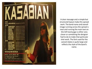
  • 1. A clear message and a simple but structured layout make this spread work. The band name and overall image running across the spread is neat and running the main text on the left hand page is either very clever or something the designer had to do to make that particular shot work. The font used for the concert dates is quite large and reflects the style of the band’s name.
  • 2. From a far more recent issue the dps is laid out in a straightforward but striking way with a great posed shot used across the two pages. The typography is simple but classy, not detracting from the excellent shot. A nice big by-line for the author and good size credit for the photographer should have kept them happy too. The only folio on the right hand page completes the subtle tone of the layout.
  • 3. Black white and red, the basic use of these colours is what pulls the pages together. It is a ‘busy’ layout with one overall background image and other shots dropped on top at the base of the pages. The title is a quote from the band that looks as though it is carelessly plonked onto the pages but is carefully positioned to run across the central gutter. I think the ‘World Exclusive” box does do what its supposed to and highlight the uniqueness of the article but it looks a bit tacky and doesn’t seem to sit well with the rest of the type. The white panel on the right hand page is a good way of highlighting main elements of content not easily incorporated into the main article.
  • 4. Great posed studio shot of Madonna reflecting her iconic status – the huge type used for her name seems unnecessary – every reader would know it already. The large dropped capital letter at the start of the text also seems a bit over the top and I am unsure what exactly the hash signs are supposed to represent, they look clumsy. I do like the balance of the red title text at the top of the left hand page and the vertical rule highlighting text at the base of the right hand page.
  • 5. A cleverly composed posed shot makes the spread stunning to look at and the type sits well in the centre of the right hand page as an introduction to the main article on the following pages. The title is two weights of the same font the word ‘Pretty’ is picked out in bold and run in grey to emphasize it. All in neat justified capitals the opposite of the scruffy graffiti in the background.
  • 6. Striking photography blending pictures of Kurt Cobain and Courtenay Love it looks like something from a horror movie because of the font used for the title – especially in red. I don’t think the type running across the two pages really because it bends into the central gutter of the magazine and distorts the words. The alignment of the intro text is intentionally wonky to reflect the content of the story. The first impression is visually good but when you look at the spread as a whole in depth it does not gel together well.
  • 7. The images take up most of the spread but are quite boringly presented in neat boxes onto the plain white pages beneath, aside from the use of white type on the left hand page for the heading and to highlight an element of the text on the photo the overall effect is dull. The two thin columns of type on the right with sub headings in red look neat but again quite boring and the inverted commas running behind the text on the pull quote look clumsy and out of place.
  • 8. Using a double page spread like this with an incredible strong image and type just as an introduction to the main article is unusual, most magazines could not afford to dedicate that kind of space to what is essentially a heading. The only type is the author and photographers’ by-lines and the folio on the left hand page. The type used for ‘Katy” and the photograph complement each other well – both are fun and funky looking. Using only a black and white scheme with just a slice of red under the names adds to the graphic effect of this spread.
  • 9. Very visual the photography is the most important element of this spread with the type and content taking second place. The picture really does say it all. The white out heading is quite small and subtle and the text panel white type out of a grey background sits neatly on the photo if the designer had just run that text as white on top of the photo it would have been hard to read whereas this way it is easy and visually clear. The folio at the bottom of the page only appears on the left so it does not detract or distract from the overall image.
  • 10. A very striking attention catching and brave layout with a great photo taking up 2/3 of the page running and the picture and head line running across the gutter. The type for the headline has to be perfectly positioned to allow the word to be read correctly and reversing out just the last letter of ‘Transformed’ in the red intro panel completes the overall effect. The main text is made more interesting by running one central column above two justified columns so the overall symmetry of the spread works.