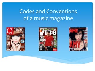
SlideShare a Scribd company logo
1 of 10
Codes and Conventions 
of a music magazine
Codes and conventions of 
a front cover
Codes and conventions of 
a contents page
Bold clear title 
making the reader 
know what page 
they're looking at. 
Outline of a ‘V’ in 
the background to 
keep the look of 
vibe throughout the 
magazine. But is 
subtle so it doesn’t 
draw the readers 
attention away 
from the main part 
of the page – the 
contents list. 
Lots of different cover 
lines are used to show 
that there are many 
stories inside. Also, the 
text is varied slightly in 
colour and boldness 
occasionally to made the 
most important 
information stand out – 
e.g. the name ‘Ciara’ is in 
bold, showing she is the 
main subject of the 
article and draws 
attention to it. 
Main cover lines to separate 
different articles into 
categories. 
Central image directly 
addresses the reader – 
making them feel involved 
in the page and they 
wonder why she is the 
main image and focus. So 
therefore they want to 
read the article on her.
The close up on Lana Del Rays eye draws 
the readers attention to it. The look in her 
eye is a look of pain which then draws the 
attention to the ‘blood’ dripping down her 
face. This pain could connote the message 
of her album at the time as heart break is a 
The digitalized mouse arrow links to common theme in her music. 
the word ‘download’ in the text. 
Shows that this magazine has an 
online platform, probably to appeal to 
a wider audience as most people go 
online rather than read magazines 
now. 
The pictures dominate the page and only 
a small amount of text guides the readers 
to the pages they want according to 
which artist they want to read about. The 
colour scheme is white and red and it 
keeps it simple and the red links to the 
title of ‘Q’ magazine. The page isn’t 
overloaded with too many pictures or 
information.
Codes and conventions of 
a double page spread
The image has been cut out and has been set in front of the rest of the double 
page spread. Everything in the article has been set in monochrome or blue. 
Whereas the artist is wearing a bright orange dress which breaks up the 
colourless article and gives a bold statement when comparing it with the rest of 
the double page spread. I believe the editor has chosen to use this image as it 
breaks up the texts and when you first glance at the double page spread the 
image is the first thing I look at. 
The same artist has had a variety of images taken and the 
editor has decided to place them images along the top half of 
the double page spread. The images of the artist have been set 
in black and white, the artist has posed in different positions in 
order to create the timeline of images that border the top half 
of the article. 
There isn’t an obvious title for this 
double page spread, however, I believe 
this text that has been written and 
highlighted in light grey and blue may 
be the title of the article. All of the text 
has been set below the monochrome 
images and a broken line. The text 
used in the article is simple yet easy to 
read land looks easy on the eye when 
looking at the rest of the double page 
spread. 
The text in this article has been written between both pages of the double page 
spread and has been broken up with images and bolder text in between. The 
text has been written in a small sized font and has been written in a simple text 
and colour. The colour of the text is almost a light black or very dark grey. 
The article has been written has been written in four separate columns. At the 
very start of the article there is a few sentences that have been written in a 
larger text and a different colour to the text in the article in order to create a 
summary for the article. 
The editor has decided to add a 
thick broken line between the 
images and the text. The lines look 
simple but effective and I like the 
way the editor has made it look 
like the artist is standing on the 
line. The lines also separates the 
images from the text which create 
less of a distraction when reading 
the article. 
Along side the article is this paragraph of bold 
black text. This is a piece of text has been written 
along side the article as the content relates to the 
artist. It has been written in black and bold font 
style so it breaks up the rest of the article.
The title of the double page spread has been written in a small but simple 
font. The font size however, is larger than the text size used for the 
magazine article. The title of the article has been outlined with a thin 
black border keeping the title separate from the text within the magazine 
article. There are also two lines/dashes that have been placed alongside 
the title of the magazine article in order to frame it. 
The article is only set on the left hand 
side o the page with the photograph on 
the right hand side of the page. This 
makes the image a lot more bold and 
the text stand out from the rest of the 
stuff on the double page spread. The 
text has been written in a very small 
font with large capital letters at the 
start of every other paragraph. The 
paragraphs have been written to the 
right hand side of the page as it lines 
with the rest of the page. The size of 
the columns have been kept the same 
width to create an even effect 
throughout the double page spread. 
The text has been written in a simple 
font and has been set in black as it is 
easy to read when set against the red 
‘J’ and the white background. 
The ‘J’ that is set beneath the text is simple but affective as it creates a 
contrast with the image that is set on the right hand side of the page. 
The ‘J’ is a slime simple ‘J’ which tells me that they have used a 
simple text throughout the double page spread. I like the way the ‘J’ 
has lined the top and the bottom of text within the columns. The colour 
of the red is a very bold and bright red creating a clear statement when 
set behind the text. The editor of the magazine may have adjusted the 
opacity of the ‘J’ in order to make the text easier to read. The ‘J’ is 
centred within the left hand side of the page with the middle of the ‘J’ 
running down the centre of the columns. 
The photograph used or this 
article creates a very bold 
statement yet the simplicity of the 
photograph gives a greater effect 
when placed next to the article. 
The background of the image is 
red fading into blue. The red 
background has been reflected 
onto the left side of his face with 
the blue being reflected on the 
other side. The artist is wearing 
sunglasses whist staring straight 
at the camera. The facial 
expression of the artist looks very 
stern and almost intimidating to 
give the idea that the artist is 
from a rap culture. The chain 
round his neck also suggests this 
which has been used as a 
statement when worn against the 
black top. 
Bright red text has been layered over the top of the image. I believe the 
red text has been used as it makes a bold contrast when layered over 
the top of the black from the photograph. The red also links in with the 
red background behind the image and the red ‘J’ that is placed on the 
left hand side of the article. There is a red line placed above the red text 
which may have been used to separate the text from the image. The has 
also been placed in the left hand corner of the page at it is keeping the 
artists face clear.

More Related Content

What's hot (17)

Detailed analysis of music magazine
Detailed analysis of music magazineDetailed analysis of music magazine
Detailed analysis of music magazine
 
Front cover, contents page & double page spread
Front cover, contents page & double page spreadFront cover, contents page & double page spread
Front cover, contents page & double page spread
 
Screenshots cover, contents and dps
Screenshots cover, contents and dpsScreenshots cover, contents and dps
Screenshots cover, contents and dps
 
Double page analysis q
Double page analysis qDouble page analysis q
Double page analysis q
 
Contents page analysis
Contents page analysisContents page analysis
Contents page analysis
 
Analysis of Contents Pages
Analysis of Contents PagesAnalysis of Contents Pages
Analysis of Contents Pages
 
Task 4- Magazine Analysis
Task 4- Magazine AnalysisTask 4- Magazine Analysis
Task 4- Magazine Analysis
 
Contents page analysis
Contents page analysisContents page analysis
Contents page analysis
 
Doublepage 110303030414-phpapp02
Doublepage 110303030414-phpapp02Doublepage 110303030414-phpapp02
Doublepage 110303030414-phpapp02
 
Music magazine article analysis
Music magazine article analysisMusic magazine article analysis
Music magazine article analysis
 
Question 1 media evaluation
Question 1 media evaluation Question 1 media evaluation
Question 1 media evaluation
 
Front cover analysis
Front cover  analysisFront cover  analysis
Front cover analysis
 
As 21
As 21As 21
As 21
 
As media-evaluation1 (1)
As media-evaluation1 (1)As media-evaluation1 (1)
As media-evaluation1 (1)
 
Existing products
Existing productsExisting products
Existing products
 
Research into codes and conventions
Research into codes and conventionsResearch into codes and conventions
Research into codes and conventions
 
Table of contents Analyze
Table of contents AnalyzeTable of contents Analyze
Table of contents Analyze
 

Similar to Codes and conventions of a music magazine (20)

Double Page Spread
Double Page SpreadDouble Page Spread
Double Page Spread
 
Contents
ContentsContents
Contents
 
As media 2u
As media 2uAs media 2u
As media 2u
 
Analysing music magazines
Analysing music magazinesAnalysing music magazines
Analysing music magazines
 
Magazine annotations
Magazine annotationsMagazine annotations
Magazine annotations
 
Analysis of double page spreads
Analysis of double page spreadsAnalysis of double page spreads
Analysis of double page spreads
 
Contents Page Research
Contents Page ResearchContents Page Research
Contents Page Research
 
DPS 1
DPS 1DPS 1
DPS 1
 
Analysis of double page spreads
Analysis of double page spreadsAnalysis of double page spreads
Analysis of double page spreads
 
Analysis of double page spreads
Analysis of double page spreadsAnalysis of double page spreads
Analysis of double page spreads
 
Analysis of double page spreads
Analysis of double page spreadsAnalysis of double page spreads
Analysis of double page spreads
 
Dps
DpsDps
Dps
 
Dps
DpsDps
Dps
 
Analysis of student magazines
Analysis of student magazinesAnalysis of student magazines
Analysis of student magazines
 
Magazine analysis
Magazine analysisMagazine analysis
Magazine analysis
 
Magazine analysis
Magazine analysisMagazine analysis
Magazine analysis
 
Magazine Analysis
Magazine AnalysisMagazine Analysis
Magazine Analysis
 
Double page spreads
Double page spreadsDouble page spreads
Double page spreads
 
Analysis of other double page spreads
Analysis of other double page spreadsAnalysis of other double page spreads
Analysis of other double page spreads
 
DPS
DPSDPS
DPS
 

More from edwardncfc1 (6)

Evaluation question 4&5
Evaluation question 4&5Evaluation question 4&5
Evaluation question 4&5
 
Evaluation Question 7
Evaluation Question 7Evaluation Question 7
Evaluation Question 7
 
Evaluation question 6
Evaluation question 6Evaluation question 6
Evaluation question 6
 
Evaluation question 2
Evaluation question 2Evaluation question 2
Evaluation question 2
 
Evaluation question 1
Evaluation question 1Evaluation question 1
Evaluation question 1
 
Codes and conventions of a typical music magazine
Codes and conventions of a typical music magazineCodes and conventions of a typical music magazine
Codes and conventions of a typical music magazine
 

Recently uploaded

QUATER-1-PE-HEALTH-LC2- this is just a sample of unpacked lesson
QUATER-1-PE-HEALTH-LC2- this is just a sample of unpacked lessonQUATER-1-PE-HEALTH-LC2- this is just a sample of unpacked lesson
QUATER-1-PE-HEALTH-LC2- this is just a sample of unpacked lesson
httgc7rh9c
 

Recently uploaded (20)

Graduate Outcomes Presentation Slides - English
Graduate Outcomes Presentation Slides - EnglishGraduate Outcomes Presentation Slides - English
Graduate Outcomes Presentation Slides - English
 
OSCM Unit 2_Operations Processes & Systems
OSCM Unit 2_Operations Processes & SystemsOSCM Unit 2_Operations Processes & Systems
OSCM Unit 2_Operations Processes & Systems
 
Understanding Accommodations and Modifications
Understanding  Accommodations and ModificationsUnderstanding  Accommodations and Modifications
Understanding Accommodations and Modifications
 
Introduction to TechSoup’s Digital Marketing Services and Use Cases
Introduction to TechSoup’s Digital Marketing  Services and Use CasesIntroduction to TechSoup’s Digital Marketing  Services and Use Cases
Introduction to TechSoup’s Digital Marketing Services and Use Cases
 
Jamworks pilot and AI at Jisc (20/03/2024)
Jamworks pilot and AI at Jisc (20/03/2024)Jamworks pilot and AI at Jisc (20/03/2024)
Jamworks pilot and AI at Jisc (20/03/2024)
 
Simple, Complex, and Compound Sentences Exercises.pdf
Simple, Complex, and Compound Sentences Exercises.pdfSimple, Complex, and Compound Sentences Exercises.pdf
Simple, Complex, and Compound Sentences Exercises.pdf
 
Accessible Digital Futures project (20/03/2024)
Accessible Digital Futures project (20/03/2024)Accessible Digital Futures project (20/03/2024)
Accessible Digital Futures project (20/03/2024)
 
80 ĐỀ THI THỬ TUYỂN SINH TIẾNG ANH VÀO 10 SỞ GD – ĐT THÀNH PHỐ HỒ CHÍ MINH NĂ...
80 ĐỀ THI THỬ TUYỂN SINH TIẾNG ANH VÀO 10 SỞ GD – ĐT THÀNH PHỐ HỒ CHÍ MINH NĂ...80 ĐỀ THI THỬ TUYỂN SINH TIẾNG ANH VÀO 10 SỞ GD – ĐT THÀNH PHỐ HỒ CHÍ MINH NĂ...
80 ĐỀ THI THỬ TUYỂN SINH TIẾNG ANH VÀO 10 SỞ GD – ĐT THÀNH PHỐ HỒ CHÍ MINH NĂ...
 
QUATER-1-PE-HEALTH-LC2- this is just a sample of unpacked lesson
QUATER-1-PE-HEALTH-LC2- this is just a sample of unpacked lessonQUATER-1-PE-HEALTH-LC2- this is just a sample of unpacked lesson
QUATER-1-PE-HEALTH-LC2- this is just a sample of unpacked lesson
 
FSB Advising Checklist - Orientation 2024
FSB Advising Checklist - Orientation 2024FSB Advising Checklist - Orientation 2024
FSB Advising Checklist - Orientation 2024
 
PANDITA RAMABAI- Indian political thought GENDER.pptx
PANDITA RAMABAI- Indian political thought GENDER.pptxPANDITA RAMABAI- Indian political thought GENDER.pptx
PANDITA RAMABAI- Indian political thought GENDER.pptx
 
COMMUNICATING NEGATIVE NEWS - APPROACHES .pptx
COMMUNICATING NEGATIVE NEWS - APPROACHES .pptxCOMMUNICATING NEGATIVE NEWS - APPROACHES .pptx
COMMUNICATING NEGATIVE NEWS - APPROACHES .pptx
 
21st_Century_Skills_Framework_Final_Presentation_2.pptx
21st_Century_Skills_Framework_Final_Presentation_2.pptx21st_Century_Skills_Framework_Final_Presentation_2.pptx
21st_Century_Skills_Framework_Final_Presentation_2.pptx
 
HMCS Max Bernays Pre-Deployment Brief (May 2024).pptx
HMCS Max Bernays Pre-Deployment Brief (May 2024).pptxHMCS Max Bernays Pre-Deployment Brief (May 2024).pptx
HMCS Max Bernays Pre-Deployment Brief (May 2024).pptx
 
Python Notes for mca i year students osmania university.docx
Python Notes for mca i year students osmania university.docxPython Notes for mca i year students osmania university.docx
Python Notes for mca i year students osmania university.docx
 
REMIFENTANIL: An Ultra short acting opioid.pptx
REMIFENTANIL: An Ultra short acting opioid.pptxREMIFENTANIL: An Ultra short acting opioid.pptx
REMIFENTANIL: An Ultra short acting opioid.pptx
 
Model Attribute _rec_name in the Odoo 17
Model Attribute _rec_name in the Odoo 17Model Attribute _rec_name in the Odoo 17
Model Attribute _rec_name in the Odoo 17
 
How to setup Pycharm environment for Odoo 17.pptx
How to setup Pycharm environment for Odoo 17.pptxHow to setup Pycharm environment for Odoo 17.pptx
How to setup Pycharm environment for Odoo 17.pptx
 
NO1 Top Black Magic Specialist In Lahore Black magic In Pakistan Kala Ilam Ex...
NO1 Top Black Magic Specialist In Lahore Black magic In Pakistan Kala Ilam Ex...NO1 Top Black Magic Specialist In Lahore Black magic In Pakistan Kala Ilam Ex...
NO1 Top Black Magic Specialist In Lahore Black magic In Pakistan Kala Ilam Ex...
 
Unit 3 Emotional Intelligence and Spiritual Intelligence.pdf
Unit 3 Emotional Intelligence and Spiritual Intelligence.pdfUnit 3 Emotional Intelligence and Spiritual Intelligence.pdf
Unit 3 Emotional Intelligence and Spiritual Intelligence.pdf
 

Codes and conventions of a music magazine

  • 1. Codes and Conventions of a music magazine
  • 2. Codes and conventions of a front cover
  • 3.
  • 4.
  • 5. Codes and conventions of a contents page
  • 6. Bold clear title making the reader know what page they're looking at. Outline of a ‘V’ in the background to keep the look of vibe throughout the magazine. But is subtle so it doesn’t draw the readers attention away from the main part of the page – the contents list. Lots of different cover lines are used to show that there are many stories inside. Also, the text is varied slightly in colour and boldness occasionally to made the most important information stand out – e.g. the name ‘Ciara’ is in bold, showing she is the main subject of the article and draws attention to it. Main cover lines to separate different articles into categories. Central image directly addresses the reader – making them feel involved in the page and they wonder why she is the main image and focus. So therefore they want to read the article on her.
  • 7. The close up on Lana Del Rays eye draws the readers attention to it. The look in her eye is a look of pain which then draws the attention to the ‘blood’ dripping down her face. This pain could connote the message of her album at the time as heart break is a The digitalized mouse arrow links to common theme in her music. the word ‘download’ in the text. Shows that this magazine has an online platform, probably to appeal to a wider audience as most people go online rather than read magazines now. The pictures dominate the page and only a small amount of text guides the readers to the pages they want according to which artist they want to read about. The colour scheme is white and red and it keeps it simple and the red links to the title of ‘Q’ magazine. The page isn’t overloaded with too many pictures or information.
  • 8. Codes and conventions of a double page spread
  • 9. The image has been cut out and has been set in front of the rest of the double page spread. Everything in the article has been set in monochrome or blue. Whereas the artist is wearing a bright orange dress which breaks up the colourless article and gives a bold statement when comparing it with the rest of the double page spread. I believe the editor has chosen to use this image as it breaks up the texts and when you first glance at the double page spread the image is the first thing I look at. The same artist has had a variety of images taken and the editor has decided to place them images along the top half of the double page spread. The images of the artist have been set in black and white, the artist has posed in different positions in order to create the timeline of images that border the top half of the article. There isn’t an obvious title for this double page spread, however, I believe this text that has been written and highlighted in light grey and blue may be the title of the article. All of the text has been set below the monochrome images and a broken line. The text used in the article is simple yet easy to read land looks easy on the eye when looking at the rest of the double page spread. The text in this article has been written between both pages of the double page spread and has been broken up with images and bolder text in between. The text has been written in a small sized font and has been written in a simple text and colour. The colour of the text is almost a light black or very dark grey. The article has been written has been written in four separate columns. At the very start of the article there is a few sentences that have been written in a larger text and a different colour to the text in the article in order to create a summary for the article. The editor has decided to add a thick broken line between the images and the text. The lines look simple but effective and I like the way the editor has made it look like the artist is standing on the line. The lines also separates the images from the text which create less of a distraction when reading the article. Along side the article is this paragraph of bold black text. This is a piece of text has been written along side the article as the content relates to the artist. It has been written in black and bold font style so it breaks up the rest of the article.
  • 10. The title of the double page spread has been written in a small but simple font. The font size however, is larger than the text size used for the magazine article. The title of the article has been outlined with a thin black border keeping the title separate from the text within the magazine article. There are also two lines/dashes that have been placed alongside the title of the magazine article in order to frame it. The article is only set on the left hand side o the page with the photograph on the right hand side of the page. This makes the image a lot more bold and the text stand out from the rest of the stuff on the double page spread. The text has been written in a very small font with large capital letters at the start of every other paragraph. The paragraphs have been written to the right hand side of the page as it lines with the rest of the page. The size of the columns have been kept the same width to create an even effect throughout the double page spread. The text has been written in a simple font and has been set in black as it is easy to read when set against the red ‘J’ and the white background. The ‘J’ that is set beneath the text is simple but affective as it creates a contrast with the image that is set on the right hand side of the page. The ‘J’ is a slime simple ‘J’ which tells me that they have used a simple text throughout the double page spread. I like the way the ‘J’ has lined the top and the bottom of text within the columns. The colour of the red is a very bold and bright red creating a clear statement when set behind the text. The editor of the magazine may have adjusted the opacity of the ‘J’ in order to make the text easier to read. The ‘J’ is centred within the left hand side of the page with the middle of the ‘J’ running down the centre of the columns. The photograph used or this article creates a very bold statement yet the simplicity of the photograph gives a greater effect when placed next to the article. The background of the image is red fading into blue. The red background has been reflected onto the left side of his face with the blue being reflected on the other side. The artist is wearing sunglasses whist staring straight at the camera. The facial expression of the artist looks very stern and almost intimidating to give the idea that the artist is from a rap culture. The chain round his neck also suggests this which has been used as a statement when worn against the black top. Bright red text has been layered over the top of the image. I believe the red text has been used as it makes a bold contrast when layered over the top of the black from the photograph. The red also links in with the red background behind the image and the red ‘J’ that is placed on the left hand side of the article. There is a red line placed above the red text which may have been used to separate the text from the image. The has also been placed in the left hand corner of the page at it is keeping the artists face clear.