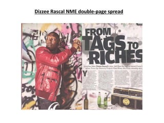
2. Layout
The basic layout is very traditional of a
double-page spread and it follows the
typical codes and conventions. It has
solely the picture covering one page
(usually the left) and the text and
headline filling/filling most of the
opposing page. The urban patterns
included behind the picture is included
on the page with the text, just not as
clear. This is to prevent it from looking
dull. The headline takes up almost half of
a page, which shows they want this
headline to be noticed. The text is set out
in columns which resembles a similar
look of a newspaper. This could suggest
that their purpose is to explain and be
serious about the topic. The rule of thirds
is particularly clear on the right side. The
top third is the headline, the middle third
is the article’s content (text) and the
bottom third is some images.
Columns (width and positioning)
The columns themselves aren’t too wide or too
narrow, they probably fit between five to eight
words on a line (depending on length of words).
The text is aligned to the left which is common.
The gap between each columns is definitely
noticeable but I wouldn’t say they are too far
apart either. It’s divided into 4 columns of similar
length which is fit around the images below them
(e.g. third column is shorter due to image of
stereo being there). Also this prevents the text
from looking repetitive and boring.
Font and type size
The font of the headline is bold, very wide and
block capitals. The type size differs, key words
such as ‘tags’ and ‘riches’ are bigger as they want
to be noticed whereas words like ‘from’ and ‘to’
and smaller because they aren’t as key to be
noticed. The sub-headline’s type size is bigger that
the content but smaller than the headline, it has
the same font as the article’s text (it appears). The
article text is probably about a type size 11 or 12
which is pretty standard, it’s following codes and
conventions.
Use of space
The double-page spread has used it’s
space very well. It doesn’t appear that
there is any blank or ‘dead’ space. On the
left side, other than the model (Dizzee
Rascal) there is just the wall behind him.
The wall is filled with creative urban
patterns , this isn’t dead space. On the
right hand side there is images at the
bottom third which prevents any blank
space. Usually there is dead space around
the text, here however, not so. There is
still that same urban pattern as the
opposing side but it’s just slightly faded
so the text is clear. It’s still noticeable
though.
3. Use of images
I feel like NME have provided a good use of images.
They are sticking to traditional codes and
conventions of devoting a whole page solely to an
image of the model. They have added the images of
the bottles, plastic cups and the stereo underneath
the text to add a bit of colour and something to look
at on that page. Instead of an entire page filled with
loads of text. Similarly to the image of the graffiti
wall behind the text, to avoid dullness and dead
space.
Main Image
The main image is Dizzee is the process of spray-
painting the very creative and urban pattern on the
wall. It’s a mid long shot. He is looking over his
shoulder, this is significant. Black, ghetto, inner city,
young males, like Dizzee, are often in trouble with
the police. ‘They have to watch their backs’. This is
what Dizzee is doing here to represent a common
theme of what he and others like him went through.
The colours of the pattern are in your face, it really
stands out and gets analysed. Both due to the
brightness and urban-ness of the pattern.
Colours
The double-page spread has a quite good
use of colour. Particularly the page on the
left. The model (Dizzee) is wearing a bright
red jacket and jeans with a huge white
pattern on it. Behind him the graffiti on the
wall is very colourful and in your face. This
is so it really gets noticed and stands out.
It’s also to avoid dullness. The right side is
quite black and white where the text is. This
is so it doesn’t draw the reader away from
the text. In the bottom third the colour is a
bit more clear. The images at the bottom
provide some colour to that page such as
the green bottles and the yellow on the
stereo, so it doesn’t seem too boring.
By line & Drop Cap
The by line is summing up what the story is
about without giving too much away. It’s
use to engage the reader to continue
reading on. They have ‘Dizzee Rascal’ in
bold to stand out, as he is the person the
articles about. The drop cap is very
common in stories and sometimes seen in
newspaper articles. It is used in this article.
This suggests that not only is this article
telling a story about Dizzee but is also very
serious and informative.
Headline
The headline is in very big block font to
clearly be seen. It heavily attracts readers
to the article. It is a play on words. The
original quote is ‘rags to riches’. The ‘rag’
has been changed to ‘tags’. The tags are
meant to refer to the graffiti. It is still
meant to have the same meaning, he came
from nothing and tagging walls in his youth
to gaining riches.
4. Overall impression
I feel it is a very good double page spread. The headline is catchy and noticeable, the by line is enticing
and due to the faded background the text isn’t too dull. I feel like the play on words, mise-en-scene
and the main image is very well done as it clearly connects Dizzee to his youth and is very relateable to
kids of inner city areas like Dizzee used to be. It follows the urban grimey theme which is given with
Dizzee on the front cover.