
Recommended
More Related Content
What's hot
What's hot (19)
Viewers also liked
Similar to Deconstructions
Similar to Deconstructions (20)
Recently uploaded
Recently uploaded (20)
Deconstructions
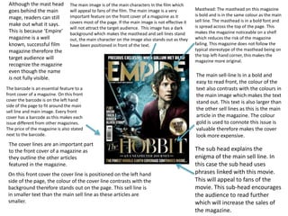
- 1. Masthead: The masthead on this magazine is bold and is in the same colour as the main sell line. The masthead is in a bold font and is spread across the top of the page. This makes the magazine noticeable on a shelf which reduces the risk of the magazine failing. This magazine does not follow the typical stereotype of the masthead being on the top left-hand corner, this makes the magazine more original. The barcode is an essential feature to a front cover of a magazine. On this front cover the barcode is on the left hand side of the page to fit around the main sell line and main image. Every front cover has a barcode as this makes each issue different from other magazines. The price of the magazine is also stated next to the barcode. The main sell-line Is in a bold and easy to read front, the colour of the text also contrasts with the colours in the main image which makes the text stand out. This text is also larger than the other sell lines as this is the main article in the magazine. The colour gold is used to connote this issue is valuable therefore makes the cover look more expensive. The sub head explains the enigma of the main sell line. In this case the sub head uses phrases linked with this movie. This will appeal to fans of the movie. This sub-head encourages the audience to read further which will increase the sales of the magazine. The main image is of the main characters In the film which will appeal to fans of the film. The main image is a very important feature on the front cover of a magazine as it covers most of the page. If the main image is not effective it will not attract the target audience. This image has a dark background which makes the masthead and sell lines stand out, the main character on the image also stands out as they have been positioned in front of the text. Although the mast head goes behind the main mage, readers can still make out what it says. This is because ‘Empire’ magazine is a well known, successful film magazine therefore the target audience will recognize the magazine even though the name is not fully visible. The cover lines are an important part to the front cover of a magazine as they outline the other articles featured in the magazine. On this front cover the cover line is positioned on the left hand side of the page, the colour of the cover line contrasts with the background therefore stands out on the page. This sell line is in smaller text than the main sell line as these articles are smaller.
- 2. The name of the magazine is positioned at the top of the contents page to connect the contents page with the front cover. This Is the masthead form the front cover. It is in bold front and in black so it contrasts the white background. The masthead of this page is also in a contrasting colour to the background of the main image which makes it stand out. The masthead goes behind the main image which is like the mast head on the front cover. This shows the contents page has synergy with the front cover in this magazine. Although the masthead goes behind the model in the image, the audience can still read the word. On this contents page there is only one image. The image is of a famous actress which links in with the genre of the magazine. The actress is dressed in the same clothes as a character she plays which links the image a certain film. As the actress is the main image, it connotes the main article is based upon a recent film she is in or the actress herself. The colours in the main image are dark and plain which contrasts with the red of the masthead and titles of the features. The colours are also natural and minimal colours have been used. Three main colours have been used on this page, this connotes the colour scheme for the rest of the magazine. The features have been positioned so they go under each other down the left side of the page, although the features are briefly described there is not a large amount of text on the page. This make it easy to the eye for readers. This contents page differs from others as this on only has a small amount of features described and does not have any other sections on the page. This makes this style of contents page unique to this magazine.
- 3. The main feature on the double page spread of this magazine is the main image. The main image is based upon the film the article is about. The colours in the main image are mostly greys and browns. Two images have been used on this page, the main image is larger and covers one half of the double page spread where as the other image is smaller and slightly overlaps the larger image. The smaller image is of a scene in the film which connotes the genre of the article. The props used in the images connote the genre of film the article is about, in this case is action and is also historic. The use of image in this article makes it easy to the eye for readers and also will appeal to fans of this film. The title of the article is spread over the two pages. The title ‘Gods and Monsters’ is related with the film the article is about therefore fans of this film will be attracted to the article. The text is in a larger font than the rest and is coloured in a gold/light brown colour which contrasts with the colours in the main image and also the background of the body of the text. An introduction to the article has been included in this double page spread which will briefly tell readers what the article is about before they read on. This is in a slightly larger text than the rest of the article to make it stand out so the audience reads this first. The font of the text is plain and simple so the audience can easily read the article, this will appeal to the target audience. The layout of this double page spread is similar to the layout of other double page spreads from magazines of different genres as similar features have been used. Capital letters have been used in the title of the article to make it bolder and stand out even more. Drop caps have been used in the main body of the text to make it look more authentic and formal.