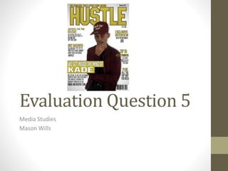
2. How did you address/attract your
audience?
I attracted my audience with the use of gold which was
the secondary colour of my magazines colour scheme.
The gold connotes jewellery and riches which hip-hop
artists often brag about in their lyrics. The gold is easily
noticed and stands out against the white background.
My masthead also filled a good majority of the top
third, meaning it was easily recognized. The name of
my magazine was ‘Hustle’, this in itself links to the hip-
hop genre and consumers are aware of this. Hip-hop
fans will be likely to want to buy this. My target
audience is black males and a lot of them experience
some form of ‘Hustling’ in their lifetime so they can
relate.
3. How did you address/attract your
audience?
I attracted the audience by placing a picture of my
main image in the centre of the page and having him
wear red. There is no other red on my cover so this
instantly made him stand out.
I addressed the audience by trying to use a
conversational tone and using ‘we’ and ‘you’ a lot to
make the reader feel comfortable and a part of the
magazine.
4. How did you address/attract your
audience?
The main headline is a gold box partly going over my
image which is clear in its self due to the contrast of
white behind it and the artist’s red coat. The white
block capitals which was the text further made this
stand out.
‘KADE’ (the artist’s name) is bigger than the rest so
fans would recognize it is him and be more drawn to
the magazine and reading the other cover lines.