The document analyzes the codes and conventions used in the front covers of several magazines, including VIBE, Q, and Billboard. Some key techniques identified include:
- Using recognizable celebrities and artists on the covers to attract wider audiences.
- Employing bold mastheads and logos to create brand recognition.
- Separating cover lines in bold, larger font to distinguish important information.
- Implementing consistent house styles and color schemes throughout the designs.
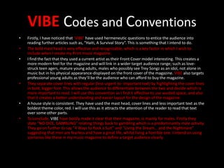
- Including hermeneutic questions and elements to intrigue readers and encourage purchasing the issue.
The analysis observes these techniques to understand how to effectively design the front cover of a music magazine to clearly define the target