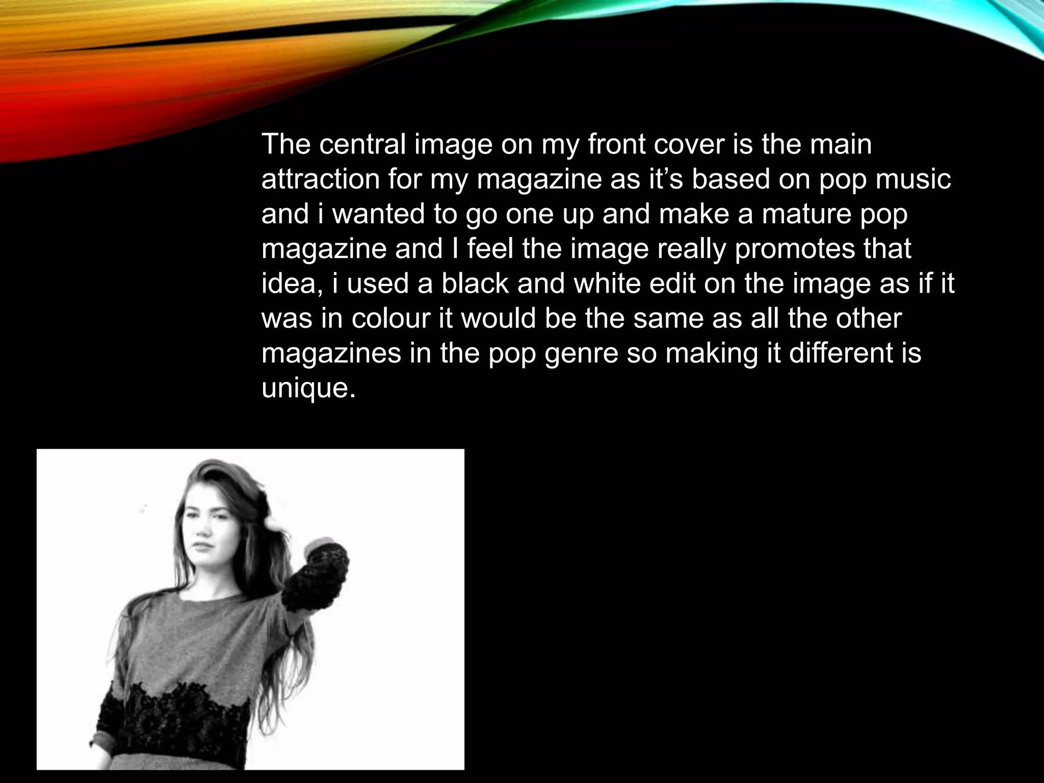
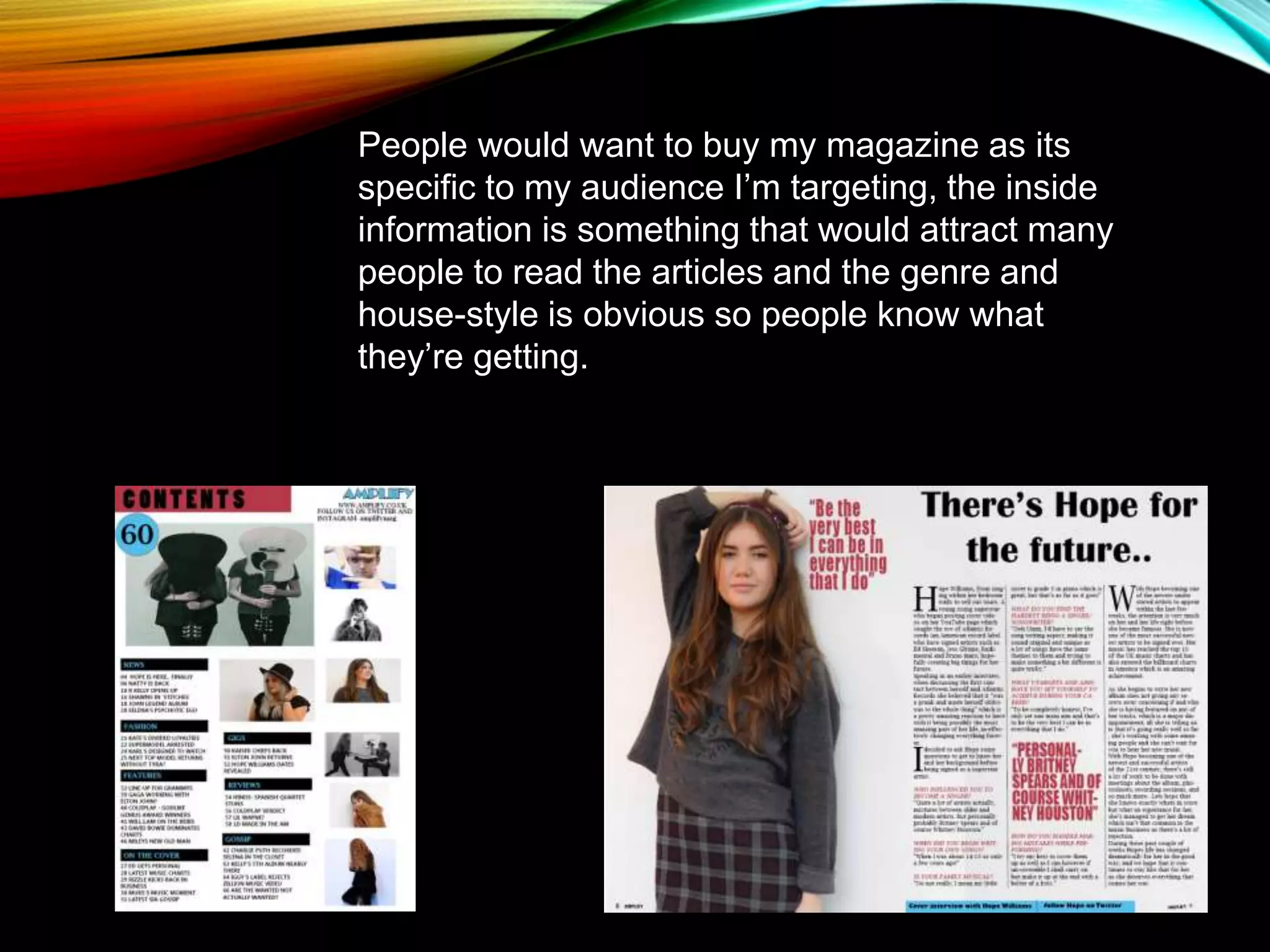
Abby attracted her target audience through the magazine's front cover design. She used bold colors like blue and pink/purple that would appeal to both males and females. The fonts were also bold and appropriate for her target age range. The central black and white image on the cover promoted the magazine's focus on mature pop music. The language and tone addressed the intended audience age range. The consistent genre and house style would be obvious to readers and attract them to buy the magazine for articles on topics relevant to that audience.