MARGINALIZATION (Different learners in Marginalized Group
Evaluation question 1
1. In what ways does your media product use, develop or challenge
forms and conventions of real media products?
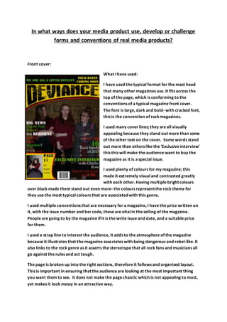
Front cover:
What I have used:
I have used the typical format for the mast head
that many other magazines use. It fits across the
top of the page, which is conforming to the
conventions of a typical magazine front cover.
The font is large, dark and bold- with cracked font,
this is the convention of rockmagazines.
I used many cover lines; they are all visually
appealing because they stand out more than some
of the other text on the cover. Some words stand
out more than others like the ‘Exclusive interview’
this this will make the audience want to buy the
magazine as it is a special issue.
I used plenty of colours for my magazine; this
made it extremely visual and contrasted greatly
with each other. Having multiple bright colours
over black made them stand out even more- the colours represent the rock theme for
they use the most typical colours that are associated with this genre.
I used multiple conventions that are necessary for a magazine, I have the price written on
it, with the issue number and bar code, these are vital in the selling of the magazine.
People are going to by the magazine if it is the write issue and date, and a suitable price
for them.
I used a strap line to interest the audience, it adds to the atmosphere of the magazine
because it illustrates that the magazine associates with being dangerous and rebel-like. It
also links to the rock genre as it asserts the stereotype that all rock fans and musicians all
go against the rules and act tough.
The page is broken up into the right sections, therefore it follows and organised layout.
This is important in ensuring that the audience are looking at the most important thing
you want them to see. It does not make the page chaotic which is not appealing to most,
yet makes it look messy in an attractive way.
2. What I have not used:
Most of the traditional magazines have the main image overlapping the title, this shows
that they are recognisable as a house brand because people do not need tosee the whole
title to know what magazine they are looking at.
I did not write who the people are on the front cover, this is important toacknowledge
because it may result in a decline in sales for people do not know who the people on the
front cover are, they may recognise their names as opposed to an image of them.
Contents page:
What I have used:
I have continued the theme of the mast head,
ensuring that the magazine is familiar all the
way through.
The house branding is also the same; because I
have used the same colours as I did on the
front cover- this influences the popularity of
the magazine because the audience are going
to enjoy the magazine in a better way.
I have added a editors letter to the magazine,
this is because it is used in magazines such as
Kerrang. Therefore it is a convention that is
used most magazines, this means there is a
sense of organisation and planning.
I have listed multiple page numbers that are
most important to the issue, this means that
our best pages are more likely to be seen
because we have directed them to the specific page. We are also ensuring the audience is
interested because we have added a caption next to the page number; this makes the
audience more curious because we have not given them all the details- they will have to
find those on the actual page.
I have added an image in the centre of the page, this draws attention to the centre which
in return will make them see whats around the image. This is significant because it
3. ensures that everything is read on the page as opposed to the audience only reading the
right side or left.
I have added information on searching specific things in the magazine by suggesting the
audience look at the index, this is a faster way to get the audience to read the specific
article they want- most importantly this results in the audience not losing interest in the
magazine.
What I haven’t used:
The page set out is not like the conventional grid many editors use, this therefore creates
uniqueness to the magazine. This can be both good and bad as it may cause the audience
to lose interest as they do not like the set out of the contents page, because it is
unfamiliar to them; however this may be good because it shows that the editor is risky,
which ultimately shows the attitude of the magazine which is to be deviant and go against
normality.
Double page:
What I have used:
I have used a main image
on the left side of the
page which creates visual
effect for the audience,
this means they are
going to be more focused
on the page because you
can see what is going on.
I have added the
interview to the page
and have set it out like
the conventionalformat-
the columns makes it appear like there is not as much writing to read, yet still ensures
that it is worth reading.
I have pull quotes on the page, they show quotes that are possibly going tograb the
attention of the audience – this will then encourage them to read the article to find out
the context of this quote.
4. I have used the same colour that is used on the front cover and contents page, this again
continues the housing brand, and makes the magazine more consistent; yet to make it
more interesting I have only used red and yellow. Missing the green makes the page look
different because the audience will know something is missing; this sense of missing
something may persuade to read the article for a sense of closure.
What I haven’t used:
I have not used the same mast head as I have on the other pages, this can be good
because it means that there is not too much repetition in the magazine so the audience
will not get bored of the same set out. However having it different like this may not be as
interesting because It Is not as bold as the original title, this therefore means that the
audience is not as interested in the magazine because it is boring.
I have not used as many pull quotes as I could have; having them creates more interest
with in the reader. Therefore if have more pull quotes the audience is going to get more
sneak peaks of the article- their curiosity is going to increase.