Call Girls In Sikandarpur Gurgaon ❤️8860477959_Russian 100% Genuine Escorts I...
Learning Layout and Design Principles from a Preliminary Magazine Task
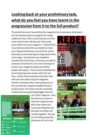
1. Looking back at your preliminary task,
what do you feel you have learnt in the
progressionfrom it to the full product?
The preliminary task I learned that the magazine has to look busy; otherwiseit
will not look persuasiveenough for the target
audience to buy. This is shown by how my front
cover only has two sell lines yet I haveused
seven within my music magazine. I realised from
my preliminary task that you needed to make
your magazinelook busy, yet not to the extent
whereby you are covering over large parts of the
main image. I learned that you needed to
include looks of sell lines, so that you are able to
promote and sell to the consumer whattype of
content your magazine holds and whether
people will enjoy it. I havemainly combated this
by including big name artists within the sell
lines, so that if they enjoy the artistthen they
will more than likely enjoy the magazine.
Another convention that I learned becauseof
this was that the magazineneeded to have a
proper layout. This meant that the masthead
needed to be proportionately bigger than the
rest of the magazine. I also
learned that in order to
make the magazine look
tidy to the viewer you
must keep things like the
barcode, issuedate and
number together. This led
to me thinking aboutthe
placement of such small
2. details, and how it mustbe put in the proper place
in order for the magazine to look professional. I
also learned that the colour scheme is to be used
successfully so thatit will catch the reader’s eye. I
liked the colour scheme shown on my preliminary
as by using the samecolours it made the magazine
look like it was trying to create its own induvial
look. I therefore used the same principle of
keeping the colour scheme running throughoutthe
magazine, as I thoughtthat it was one of the better
aspects of my preliminary, and made me learn that
the colour scheme should be used to engage the
target audience by using vibrant colours. This also allowed to gain some
knowledgeon how to usePhotoshop. Itallowed to understand why fontis
important as it needs to be suitable for the magazineyou are trying to create.
Itallowed be to learn how to usethe text on Photoshop, and how you should
arrangethe text around the image in order for the text to stand out justas
much as the colour scheme and the main image. The preliminary task also
allowed me to understand how much time I should be spending on each piece
of the magazine on Photoshop, and how I should manage my time in order to
complete other tasks that werenot using Photoshop. I had also planned my
work for my front cover. This allowed to understand how I would like the
magazine to look like and what I aspireit to be. By planning out the front
cover, it allows me to understand in whatorder to do each piece of work on
Photoshop, and allows me to have time to think as to how I would do it rather
than worrying whatI need to do next and wasting time making surethat I have
done everything properly. This is also included for my contents page, as by
planning whatI would like to do with my contents page it allows me to
understand beforehand how I would like to keep each section looking tidy and
how I would like to label each section of the contents page, as well as how I
would like to include the page numbers on the page and the name of the
articles. This followed through onto my as project, as I designed my contents
page so that I was able to haveanother spacefor each section of my magazine,
whilst also keeping each piece of magazineconventions like the subscription
offer, the masthead and the editorial looking spread out on the page. I have
3. also learned how to space out my contents page properly, by using the rule of
thirds. By using the rule of thirds I was able to spread the content of my
contents page properly, whilstgiving each induvial section room on the page. I
used the rule of thirds so that the left column of the page was mainly used for
the editorial, whilst all the top three thirds wereused for the masthead, with
the top right third being used for the subscription offer, with the remaining
two thirds used for the masthead. Look at this now and see how I have learned
to spread the conventions and aspects of media proportionally across the
page, meaning that no space is wasted, meaning that the contents page is
being used correctly so that it is able to offer information.