NO1 Top Black Magic Specialist In Lahore Black magic In Pakistan Kala Ilam Ex...
Evaluation magazine q1
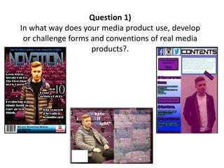
1. Question 1)
In what way does your media product use, develop
or challenge forms and conventions of real media
products?.
2. • Scanning over my media product, there is a variety of different ways that it conforms to the conventions of
a Music Magazine. My house music magazine was produced using Photoshop, allowing me to construct
my product professionally using tools to create a typical but unique product. The first major outstanding
convention clear in my work on the front cover is the main title/headline. I used a font called ‘Even
Stevens’ from Da Font to create a futuristic, outstanding and vigorous headline which as you would expect
in magazines- stands out and portrays the tone of the magazine and the genre of music on a whole. House
music is a club based music genre, and has a huge futuristic twist. The bold almost sci-fi like font along
with the gradient effected ‘blue with a hint of white’ colour similar to the lights in a night club scene
introduces the magazines links with the soul of House music and speaks to the audience saying ‘this is a
professional and understanding house magazine’. Whilst we are on the subject of the headline, I also
decided using the tools on Photoshop to lay my main image (House artist) over the A and a very small
section of the T in ‘Novation’. A convention of music magazines or even any general mainstream magazine
is to place the main image in some form over the Headline no matter what the name of the magazine. A
prime example is ‘Vibe’ who in one of their editions Eminem was the main image, his head and shoulders
covered the letters I and B. The reason behind this is the aspect of ‘brand identity’ which means how
popular and famous is that brand of magazine not just specific to that particular genre, but on a world-
wide magazine scale. Vibe is a huge music magazine so despite Eminem covering the headline, fans will
recognise the name. As we know my magazine is not mainstream, therefore it would be irrelevant to cover
the majority of my headline, due the to the fact Novation is a new invention, yet I have conformed to that
convention a little to add effect and make the image more subtle. Breaking everything up would look to
unprofessional.
A cropped image of my Headline ‘Novation’
The Headline
3. • One aspect of the Front Cover which is conventional is the Straplines. I have included 4 fairly detailed straplines. In
music magazines they will stand out, be bold and closely related to the genre of magazine and content inside. In
mine I have included aspects such as ‘Top 10 House artists’, suiting the genre and overall this is a fun fact page
that fans will enjoy. Of course my main story is presented large, placed on the left and that advertises what my
Double Page Spread is all about. In terms of the font, I have chosen quite a bubbly text style with an outer glow
around the letters to allow them to stand out. I understand that the colour choice is different, the themes for my
magazine are Blue and Purple, however I have chosen my text to be white. The reason for that is its different, it
changes the style up a little and works better with the darker background allowing them to stand out physically.
Also this links to the double page spread which included white text over a purples background.
• Another convention of the front cover is including a baseline, which sometimes includes the small but important
aspects such as the date, issues and sometimes sponsoring links. On my front cover page I have included a
barcode to scan the mag, the Issue number and the price. Along with an image of Pacha, a nightclub which has
huge links with House music artists adding to the aspect of brand identity.
Front Cover
4. • In terms of Mise-en-scene, costume and setting is significant regarding to conforming to conventions. Firstly the
Setting, the picture is not edited, therefore my model was standing in the exact location he was not photo-
shopped in. The photo is set on a stage where as you can see my model has his back to the seats behind him. This
introduces the themes of ‘fame’ and ‘domination’, which for any mainstream music magazine is vital to attract a
wider audience and in a way impress and sustain the current fans, it would be rare to see a huge music magazine
produce an issue with an unknown artists or in a location irrelevant to the music scene of the specific genre, if so
then they are breaking convention rules. For me House music in the modern world is about drawing fans in, more
and more people are becoming House fans because of the wide range of sub-genres branching of House. The
seats are there to signify the fact that there is room for more fans and the more the merrier as far as the artists
are concerned.
• Moving on, the costume was also important for me to stick to conventions. Music magazines will choose costumes
for artists which represent the artist themselves or that specific style of music. A far as House if concerned, the
‘futuristic’ aspect which we discussed in the previous slide, the puffer jacket my model is wearing supports this
fantastically, also the colour of grey signifies the standing out in a dim lit night club, as if the artists is glowing on
the stage. When considering this you can clearly see how my magazine conforms to the convention of making your
content suit the genre. House fans will see the artists on the front cover and get the House music vibe and simply
as other magazines do, attract my own fans to buy this issue.
The Mise-en-scene
Silver Puffer Jacket
Seating area behind Artist
5. • We continue with Mise-en-scene as we look at the Contents page and the Double Page Spread. Again in the double page
spread the Costume and Setting does not alter to the Front Cover. The same jacket is worn and we are again in the same
location, however now we are amongst the seating. This is to repentant how the artist had joined the audience as you have
indulged into the magazine, it speaks that you are now in the world of House music. Again I strongly feel that the theme of
drawing in a wider audience is presented here. It’s a very welcoming effect for the audience and in a positive way draws
away the attention of the futuristic, hard style Headline and strapline, offering a new style of House music.
• A magazine convention vital for a content page is the Headlines with descriptions and a teaser/ small message. On my
contents page these conventions have been conformed perfectly. I have 4 solid Headlines introducing different aspects of
the magazines, laid out in a the same colour as the theme on the front page, another convention for magazines, the
continuity between the colours on each page. Each feature headline includes a small description below, the heading to catch
our eye and the description to confirm what you will be reading, this is conventional and important for magazines so that
the audience does not end up reading something they are not necessarily interested in. Another feature of my Contents
page is the small box of writing in the right/top third with a message from the magazines producer. In music magazine
contents pages you see these little features which add that little extra and allow the audience to feel they are being more
directly targeted, even the audience can have a relationship with the producer which I think is a House music convention, it’s
a genre of unique talent where everybody is in a community, that was the vibe I wanted to create. Also on the contents page
apart from the direct links with colour, in the top/left third we see three logos of social media websites. Conventionally
these are included with small details e.eg Twitter account name for the magazine. I do break the rules here a little and that
will be spoken about later in this PowerPoint, however the fact that they are included is conventional, it allows the audience
to connect with there favourite or new genre of music via social media, which is a dominating and mainstream source of
medium. We also have a further link in terms of the Headline on the contents page. Conventionally it is small on the page
which is important as the details below is more significant to instruct the audience around the magazine, however I have
again used a similar, modern style font for the headline. It conveniently matches with the main headline on the front cover,
creating subtle links between each page on the magazine.
The Contents Page
Left third presenting the
Social media logos and
text
Contents Headline
6. • My Double Page Spread was deigned and created on InDesign. The main convention on a Double Page
Spread is the text and the style in which it is written. Formality will vary depending on genre, for example
a House or RnB magazine is bound to be informal as the genre is aimed at younger people, who are more
familiar with slang and informal language and as a result can adapt and understand the text more, also the
artists that are interviewed to create the text will be of a young age. In my case I have focused on dialect in
terms of geographical location. My artist is a Scottish Artist meaning he speaks English but has many
Scottish slang terms included. For House I decided to be conventional and allow swear words, slang words
etc. to be included, of course it is not at the point where you cannot understand the content, however the
spelling and choice of words are different. Personally I don’t think this effects an English audience or
another nationality as we are able to adapt to different styles of language. The layout of the actual text is
conventional, the text sits alone on the right page of the spread in a white gradient effected box with Bold
captions for the questions. It allows the text to look neat and formal despite the actual content, clearly I
do not want to go of the rails to much. In terms of the layout I have conventionally allowed the image to
dominate the left hand side of the page, so that we can clearly see who the artist is being interviewed and
the atmosphere being created for example my artist sits on the chairs welcoming the audience to his
interview to find out more. Regarding colour again conventionally I have kept the colour scheme thanks to
the setting with the purples seats and blue text on the headline. The text I decided to keep white as it is
more formal than splashing blue all over it. Plus that is the interview which I want the audience to focus
on rather than being attracted to advanced colours as on the front cover.
Double Page Spread
7. • There are many ways in my magazine in which I successfully conform to the
conventions for a music magazine and my specific genre. However there are some
areas in which I break those conventions and go against the typical style of a House
music magazine.
• Firstly we see the first example with Mise-en-scene on the contents page in terms of
Costume. On the front cover and double page spread my model wears the silver
buffer jacket, the meaning behind that is explained earlier in the question answer.
However on the contents page, I chose to have my artists wearing a Harrington Navy
Blue jacket, In what is a large picture adorning the right third of the contents page.
Earlier in this answer and in previous research tasks I have explained the costume for
House music and how it relates to garage, despite me not being conventional in this
form, I have broke the rule on a general scale as in most music magazines, artists will
wear stereotypical clothing. For example in Vibe Eminem wears a gold chain, rings
and a vest, clothing suiting the RnB music stereotype. The reason I have chosen to do
this is to present the different side of the artists. I wanted my magazine to be focused
on modern House music however House has a history and in some form I wanted to
represent the retro side of the genre, and with a Harrington being a suitable jacket it
was a appropriate choice. All in all it is possible the costume goes unnoticed and the
actual recognition of the artist is more significant, however it is there for a reason and
despite it breaking Mise-en-scene conventions or stereotypes, it still subtly represents
my genre of music.
Mise-en-scene
Harrington Jacket
8. • One form of challenging conventions on my contents page is the use of icons advertising social media.
There are two reasons for this. Many music magazines include icons such as a Facebook logo or twitter,
but they will be significantly small and mostly away from the pages where there is loads of other
information.
• Firstly in my magazine I have included 3 large icons for Facebook, Twitter and Instagram at the top left,
covering almost 2 thirds of the page. The reason for this is the connection between the music and social
media. House is not as dominating as say Pop or RnB and many artists rely on social media to present their
song and tracks, so by including the icons large it advertises and helps promote new coming artists. In
other genres they would be used to get people mainly as part of the magazine group for information and
updates however I want to present the fact that new artists need the social support.
• Also the magazines that like me do include these icons and advertisements will always include detail of
the actual names for the social media accounts, However I have not included this. This again links to the
idea with the headline of brand identity and recognition, I would expect my target audience to be heavily
linked with social media and either already follow the account or will know how to find it in seconds so
you could day my icons are there for an reminder of the social media sites rather than an invitation to
casually join/follow.
• Again I don’t see a huge issue with this aspect as they will not always directly effect the audience, if you
don’t want to use social media you don’t, if you do you do, its that simple aspect and the audience will still
concentrate on the magazines content rather than worrying about the size of the icons. Me myself would
notice it and be reminded to check out the page I already follow.
Contents Page
Social Media icons