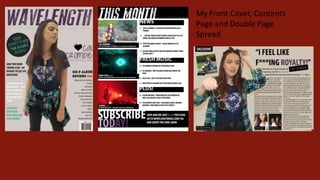
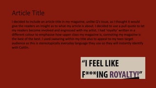
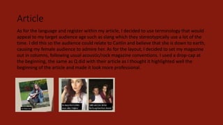
Question 1
In what ways does your media product use, develop or challenge forms
and conventions of real media products?
My Front Cover, Contents
Page and Double Page
Spread
Front Cover
This is my magazine compared to my main inspiration for my front cover, NME’s issue
featuring ‘Mia’. I have took certain conventions and aspects of this magazine and used them
when creating Wavelength, however I have also changed many and adapted them based on
my target audiences interests and the mise-en-scene I want to be portrayed. When creating
my flat plan, I used this NME example mainly, however I had a look at many other front
covers to give myself more ideas.
Masthead
I chose the word ‘Wavelength’ for my magazine as it had connotations of music so when my audience see the
magazine at first glance, they will immediately know what it’s genre is. I chose a one-word title so my masthead
would be snappy and memorable for any readers. I chose the font for my masthead to be as it is because it is eroded
and grunge, linking in with the stereotypes of what my chosen target audience think is cool. Moreover, I chose the
deep purple so it would appeal to my mainly female target audience which, working together with the font, help
produce a cool, edgy masthead instead of creating something that seems too girly and childish (which would not
appeal to my 16+ target audience).
The main inspiration for my masthead came from ‘Mojo’, specifically in the issue featuring The Smiths. I liked that
the celebrities were partially covering the masthead as it connotes the Mojo institution is confident that their
magazine will still be known to readers and they will still sell despite the audience not being able to see the
masthead fully. It also suggests that the band are the most important thing on the cover and they are what people
are going to be buying the magazine for, which is the attitude I wanted my readers to have towards Caitlin.
Dominant Image
For my dominant image, I decided to use a female model because if I were wanting to attract mainly females, a
female model would mean my audience would look up to her, see her as a role model and want to pick up my
magazine to read about her, (relating to the Uses and Gratifications Theory). I chose to use a slightly younger
model to appeal more to my chosen target audience, which is younger than NME’s. Unlike Mia in NME’s
magazine, I had my model look to the bottom right of the frame instead of breaking the fourth wall and making
eye contact with the audience. This symbolises she is looking down on people, suggesting she is of high class
(linking in with my main article title on my double page spread, ‘I feel like f***ing royalty!’). The use of indirect
mode of address also means my audience will be left on edge when looking at my cover, compelling them to pick
it up and read on. As well as this, both Mia and Caitlin are not smiling,
connoting they are both serious and intense, giving them the cool and
fashionable-look. Lastly, the body language of both of the models are very
casual yet stylish, connoting to my audience that they are down-to-earth
but still celebrities. Mia had quite a messy vibe with her hair and baggy
denim jacket which I used with my own model by the use of the shirt tied
around her waist.
Main Sell Line
For my main sell line, I decided to use my models name, using her own specific font, and below it a
sub sell line of ‘launches her world tour’. I did this so my audience would know she is famous and
talented enough to tour the world performing. I used a specific, girly font for my artists name (which I
have also used on the double page spread) so it will stand out to my readers and they can
immediately associate this font with Caitlin. In NME’s main sell line, the artists name was enlarged
and in a different colour so I took this into consideration and did the same with mine, meaning her
name will stand out the most and readers will know who they’re going to be reading about. I used a
small black heart before my artists name which I thought gave the mise-en-scene of my magazine a
slightly more girly look, appealing to my female target audience more. Finally, in NME’s cover, the text
was only slightly overlapping the dominant image, which I chose to do within my own magazine as
well to imply they are the most significant.
Essential Information
I copied NME’s convention of having the bar code, price and issue number in the bottom left hand
corner of the magazine. This follows reading eye conventions and is the last place the audience looks
so they will already have been sold by all the information they’ve read on the front cover. As well as
this, the price is extremely small, suggesting that it is insignificant and doesn’t matter ow much is
spent. I have added the website to the essential information in red as it will stand out when readers
come across it and if they go onto the website they will be more likely to read my magazine and
spend money on it, creating more of a profit for my institution.
Plug/Button
The plug or button I used was not included in the main front cover inspiration I was using, however
because of looking at other examples, I decided putting one in would be a good idea, and follows the
conventions of typical magazines. In my plug, I had ‘Your Chance To Win ‘The Kooks’ Tickets!’. I had
the words ‘your’ and ‘win’ underlined as I thought these were the most important. ‘Your’ is the use
of written direct mode of address so it means the audience would feel as though the magazine is
talking directly to them, encouraging them to buy it. I thought ‘Win’ was important as it is giving the
readers a chance to get something for free and usually inside plugs are some form of competition so
I thought I’d follow this typical convention. Lastly, I had ‘The Kooks’ in their own band font so it
would stand out to readers and any existing fans would cause an inherited audience from this.
Contents Page
This is my magazine compared to my main inspiration for my contents page, NME’s issue, mainly
featuring Arctic Monkeys. I tried to mainly follow this and took certain conventions and aspects of
this magazine and used them when creating Wavelength, however I have also changed many and
adapted them. For example, I used the subscribe box in my own magazine also, however I decided to
use more sub images because some other of my inspirations used this such as contents pages in
Mojo and Q’s magazines.
Features
Similar to NME’s contents page, I have included a list of the
features with subheadings of a similar style to NME’s, making
them stand out more and easier for my readers to find what
they are looking for. I also gave the page numbers a different
colour so these would also stand out more so they were easily
readable. I ensured the descriptions on the contents page
were the same, (or extremely similar), to the features I
mentioned on the front cover to avoid any continuity issues. I
used the same colours and fonts as on my front cover and
double page spread to follow the style and mise-en-scene of
Wavelength, making it appear as more professional.
Essential Information
I have challenged the typical conventions on the contents page as I did not include an
editors note or any social media links (other than my magazines website). I did this because
I wanted my readers to feel like the only information they were getting is content from the
magazine so they feel as though they are getting their moneys worth. I did, however, use a
subscription box as it didn’t take up very much room and I thought this would be a good
way to encourage my target audience to keep buying my magazine issues which would
increase the profits for my institution.
Double Page Spread
This is my magazine compared to my main inspiration for my double page spread, Q’s article,
featuring Lady Gaga. I didn’t necessarily follow this precisely, but I took certain conventions and
aspects of this magazine and used them when creating my double page spread. For example, I had
the model mainly taking up the left hand side of the page to show that she is most important. I also
used a drop-cap at the beginning of the article. However, I decided to include sub images to make
my page look a little busier and more appealing, especially since my target audience is younger.
Article Title
I decided to include an article title in my magazine, unlike Q’s issue, as I thought it would
give the readers an insight as to what my article is about. I decided to use a pull quote to let
my readers become involved and engrossed with my artist. I had ‘royalty’ written in a
different colour to emphasise how upper class my magazine is, connoting my magazine is
the best of the best. I used swearing within my title also to appeal to my teen target
audience as this is stereotypically everyday language they use so they will instantly identify
with Caitlin.
Dominant Image
For my dominant image, I had my model use different props as if she was shooting a fashion
video, (hence why she is changing sunglasses), connoting that she is cool, fashionable and
trendy, appealing to my young female readers as they will aspire to be like this. Similar to
Lady Gaga, I had my model slightly sexualised to appeal to my male audience by having her
hair partially down. However, I challenged this slightly by having some of it tied up to show
that she is slightly business like and still thinks about the music-side of fame. I had my
model wearing clothing that my audience said they liked (based on my mood-board and
audience profiles).
Sub Images
Regarding my sub images, I decided to use box-out black captions to add more of a quirky,
cool effect to my page, and making the sub images more noticeable to readers. I challenged
the idea of just having one (or no) sub image(s) as I thought my article would look busier
and therefore show the audience that my magazine contains a lot of content. I also
included a sub image of my artists album cover which I thought would give the audience a
better idea about my artists genre of music and her typical representation, allowing them
to feel more involved with her and the magazine.
Article
As for the language and register within my article, I decided to use terminology that would
appeal to my target audience age such as slang which they stereotypically use a lot of the
time. I did this so the audience could relate to Caitlin and believe that she is down to earth,
causing my female audience to admire her. As for the layout, I decided to set my magazine
out in columns, following usual acoustic/rock magazine conventions. I used a drop-cap at
the beginning, the same as Q did with their article as I thought it highlighted well the
beginning of the article and made it look more professional.

Question 1

  • 1.
    Question 1 In whatways does your media product use, develop or challenge forms and conventions of real media products?
  • 2.
    My Front Cover,Contents Page and Double Page Spread
  • 3.
    Front Cover This ismy magazine compared to my main inspiration for my front cover, NME’s issue featuring ‘Mia’. I have took certain conventions and aspects of this magazine and used them when creating Wavelength, however I have also changed many and adapted them based on my target audiences interests and the mise-en-scene I want to be portrayed. When creating my flat plan, I used this NME example mainly, however I had a look at many other front covers to give myself more ideas.
  • 4.
    Masthead I chose theword ‘Wavelength’ for my magazine as it had connotations of music so when my audience see the magazine at first glance, they will immediately know what it’s genre is. I chose a one-word title so my masthead would be snappy and memorable for any readers. I chose the font for my masthead to be as it is because it is eroded and grunge, linking in with the stereotypes of what my chosen target audience think is cool. Moreover, I chose the deep purple so it would appeal to my mainly female target audience which, working together with the font, help produce a cool, edgy masthead instead of creating something that seems too girly and childish (which would not appeal to my 16+ target audience). The main inspiration for my masthead came from ‘Mojo’, specifically in the issue featuring The Smiths. I liked that the celebrities were partially covering the masthead as it connotes the Mojo institution is confident that their magazine will still be known to readers and they will still sell despite the audience not being able to see the masthead fully. It also suggests that the band are the most important thing on the cover and they are what people are going to be buying the magazine for, which is the attitude I wanted my readers to have towards Caitlin.
  • 5.
    Dominant Image For mydominant image, I decided to use a female model because if I were wanting to attract mainly females, a female model would mean my audience would look up to her, see her as a role model and want to pick up my magazine to read about her, (relating to the Uses and Gratifications Theory). I chose to use a slightly younger model to appeal more to my chosen target audience, which is younger than NME’s. Unlike Mia in NME’s magazine, I had my model look to the bottom right of the frame instead of breaking the fourth wall and making eye contact with the audience. This symbolises she is looking down on people, suggesting she is of high class (linking in with my main article title on my double page spread, ‘I feel like f***ing royalty!’). The use of indirect mode of address also means my audience will be left on edge when looking at my cover, compelling them to pick it up and read on. As well as this, both Mia and Caitlin are not smiling, connoting they are both serious and intense, giving them the cool and fashionable-look. Lastly, the body language of both of the models are very casual yet stylish, connoting to my audience that they are down-to-earth but still celebrities. Mia had quite a messy vibe with her hair and baggy denim jacket which I used with my own model by the use of the shirt tied around her waist.
  • 6.
    Main Sell Line Formy main sell line, I decided to use my models name, using her own specific font, and below it a sub sell line of ‘launches her world tour’. I did this so my audience would know she is famous and talented enough to tour the world performing. I used a specific, girly font for my artists name (which I have also used on the double page spread) so it will stand out to my readers and they can immediately associate this font with Caitlin. In NME’s main sell line, the artists name was enlarged and in a different colour so I took this into consideration and did the same with mine, meaning her name will stand out the most and readers will know who they’re going to be reading about. I used a small black heart before my artists name which I thought gave the mise-en-scene of my magazine a slightly more girly look, appealing to my female target audience more. Finally, in NME’s cover, the text was only slightly overlapping the dominant image, which I chose to do within my own magazine as well to imply they are the most significant.
  • 7.
    Essential Information I copiedNME’s convention of having the bar code, price and issue number in the bottom left hand corner of the magazine. This follows reading eye conventions and is the last place the audience looks so they will already have been sold by all the information they’ve read on the front cover. As well as this, the price is extremely small, suggesting that it is insignificant and doesn’t matter ow much is spent. I have added the website to the essential information in red as it will stand out when readers come across it and if they go onto the website they will be more likely to read my magazine and spend money on it, creating more of a profit for my institution.
  • 8.
    Plug/Button The plug orbutton I used was not included in the main front cover inspiration I was using, however because of looking at other examples, I decided putting one in would be a good idea, and follows the conventions of typical magazines. In my plug, I had ‘Your Chance To Win ‘The Kooks’ Tickets!’. I had the words ‘your’ and ‘win’ underlined as I thought these were the most important. ‘Your’ is the use of written direct mode of address so it means the audience would feel as though the magazine is talking directly to them, encouraging them to buy it. I thought ‘Win’ was important as it is giving the readers a chance to get something for free and usually inside plugs are some form of competition so I thought I’d follow this typical convention. Lastly, I had ‘The Kooks’ in their own band font so it would stand out to readers and any existing fans would cause an inherited audience from this.
  • 9.
    Contents Page This ismy magazine compared to my main inspiration for my contents page, NME’s issue, mainly featuring Arctic Monkeys. I tried to mainly follow this and took certain conventions and aspects of this magazine and used them when creating Wavelength, however I have also changed many and adapted them. For example, I used the subscribe box in my own magazine also, however I decided to use more sub images because some other of my inspirations used this such as contents pages in Mojo and Q’s magazines.
  • 10.
    Features Similar to NME’scontents page, I have included a list of the features with subheadings of a similar style to NME’s, making them stand out more and easier for my readers to find what they are looking for. I also gave the page numbers a different colour so these would also stand out more so they were easily readable. I ensured the descriptions on the contents page were the same, (or extremely similar), to the features I mentioned on the front cover to avoid any continuity issues. I used the same colours and fonts as on my front cover and double page spread to follow the style and mise-en-scene of Wavelength, making it appear as more professional.
  • 11.
    Essential Information I havechallenged the typical conventions on the contents page as I did not include an editors note or any social media links (other than my magazines website). I did this because I wanted my readers to feel like the only information they were getting is content from the magazine so they feel as though they are getting their moneys worth. I did, however, use a subscription box as it didn’t take up very much room and I thought this would be a good way to encourage my target audience to keep buying my magazine issues which would increase the profits for my institution.
  • 12.
    Double Page Spread Thisis my magazine compared to my main inspiration for my double page spread, Q’s article, featuring Lady Gaga. I didn’t necessarily follow this precisely, but I took certain conventions and aspects of this magazine and used them when creating my double page spread. For example, I had the model mainly taking up the left hand side of the page to show that she is most important. I also used a drop-cap at the beginning of the article. However, I decided to include sub images to make my page look a little busier and more appealing, especially since my target audience is younger.
  • 13.
    Article Title I decidedto include an article title in my magazine, unlike Q’s issue, as I thought it would give the readers an insight as to what my article is about. I decided to use a pull quote to let my readers become involved and engrossed with my artist. I had ‘royalty’ written in a different colour to emphasise how upper class my magazine is, connoting my magazine is the best of the best. I used swearing within my title also to appeal to my teen target audience as this is stereotypically everyday language they use so they will instantly identify with Caitlin.
  • 14.
    Dominant Image For mydominant image, I had my model use different props as if she was shooting a fashion video, (hence why she is changing sunglasses), connoting that she is cool, fashionable and trendy, appealing to my young female readers as they will aspire to be like this. Similar to Lady Gaga, I had my model slightly sexualised to appeal to my male audience by having her hair partially down. However, I challenged this slightly by having some of it tied up to show that she is slightly business like and still thinks about the music-side of fame. I had my model wearing clothing that my audience said they liked (based on my mood-board and audience profiles).
  • 15.
    Sub Images Regarding mysub images, I decided to use box-out black captions to add more of a quirky, cool effect to my page, and making the sub images more noticeable to readers. I challenged the idea of just having one (or no) sub image(s) as I thought my article would look busier and therefore show the audience that my magazine contains a lot of content. I also included a sub image of my artists album cover which I thought would give the audience a better idea about my artists genre of music and her typical representation, allowing them to feel more involved with her and the magazine.
  • 16.
    Article As for thelanguage and register within my article, I decided to use terminology that would appeal to my target audience age such as slang which they stereotypically use a lot of the time. I did this so the audience could relate to Caitlin and believe that she is down to earth, causing my female audience to admire her. As for the layout, I decided to set my magazine out in columns, following usual acoustic/rock magazine conventions. I used a drop-cap at the beginning, the same as Q did with their article as I thought it highlighted well the beginning of the article and made it look more professional.