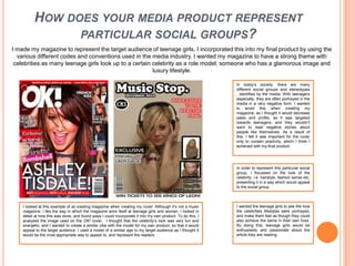
The document provides details about the design and content choices made for a music magazine project. Key points include:
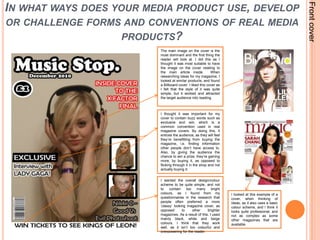
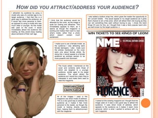
- The cover uses a single dominant image, simple color scheme, and includes promotional text and the price to attract readers.
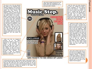
- The contents page lists only main article headlines in a simple, easy to read layout.
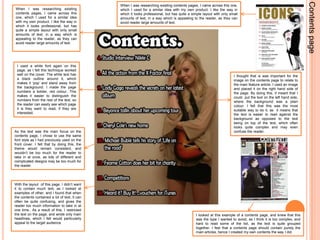
- A double-page article spread features a large single image, consistent font choices, and separates text from images for readability.
- Throughout the magazine, consistency of design is emphasized to create a clean, professional style that appeals to the target teenage female audience.