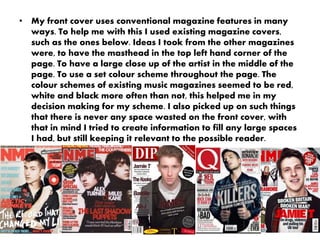
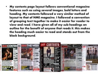
- The document discusses how the student's media product uses conventions of real magazines in its construction.
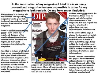
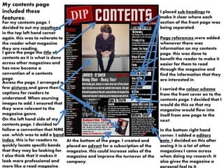
- For the front cover, conventions included masthead placement, tagline, artist image, and color scheme. The contents page followed conventions like masthead, images, headings, and ads.
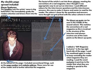
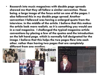
- The double-page article layout used conventions such as column structure for the interview, enlarged quote, and page numbers. However, it challenged conventions somewhat by placing some text on the image page.
- Overall, the student aimed to mimic real magazine styles and layouts to make the media product seem realistic while also experimenting with some unconventional placements.