

Recommended
More Related Content
What's hot
What's hot (18)
Viewers also liked
Similar to Media Evaluation
Similar to Media Evaluation (20)
Media Evaluation
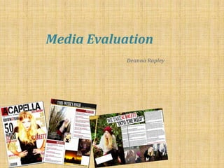
- 1. Media Evaluation Deanna Rapley
- 2. In what ways does your media product use, develop or challenge forms and conventions of real media products? I chose the masthead of 28 days letter from the website dafont.com. This choice of bold font, capital letters and slightly faded font conforms to the usual conventions of not only a magazine but specifically rock/indie music magazines. Many magazines such as Q and NME choose to use capital letters for their masthead to create a standout/loud effect to their cover instantly captivating an audience thus drawing them in. The faded effect on the text is used by Kerrang which is also a big Rock genre music magazine and inspired my choice of text as it gives the magazine an instant edge and sense of uniqueness and identification. The positioning of the masthead is at the top of the page and centred to draw instantly attention to the brand of the magazine giving the readership instant identification, this is a convention used by most magazines as it is known to work well. The word Acapella is a catchy word such as most magazine titles tend to be and there is meaning behind the word too. The word Acapella means acoustic music which relates to the genre I have chosen. The layout of my magazine conforms to the usual conventions of a magazine as the text surrounds the main image and also most of the information is positioned down the left hand side of the page. One reason for this is being that people read from left to write so will take in the information on the left hand side first. Another reason being that when magazines are placed on top of each other the left hand side is left exposed, so by having text on this side it allows the audience to still be drawn into my magazine and pick it up to read further . The main headline overlaps the image relating to the text to create a link. The colour scheme of my magazine revolves around specifically a 3 colour palette of scarlet red, golden yellow and black. These colours are ones which are often used by rock genre music magazines, which is a prime reason why I have chosen these colours; to conventionally conform. The added factor of gold is not used as often by rock magazines, but has been used occasionally by Q magazine. I felt that this added colour lifts the feel of the magazine and takes it away from the predominantly rock genre and into a more indie/pop lighter genre thus appealing to a more broad audience of mainstreamers rather than purely individualists. The gold also relates to the season that the magazine would be published, which is December/January time, where gold’s and reds are colours which are often seen around.
- 3. I have decided to include a issue number and date number in the top left corner of my front cover which conforms to the usual conventions of a magazine. This small bit of information is vital in allowing the reader some information as to how recent the magazine is thus allowing them to recognise if the magazine is still relevant to them. Some people don’t like to read magazines if the issue is outdated and a new one is about to be published. I chose my title ‘Acapella’ as it has musical connotations which hopefully an audience which appreciates music and has an interest in music would notice and become interested in. This is a convention often used by magazine producers, where they use names which have meanings attached to the genre of their magazine. This instantly targets specific audiences. Although the name is not necessarily short and snappy like many magazine titles tend to be, I feel that the name Acapella has a ring to it and flows well rather than sounding short and choppy like many do. This way it should stay in potential customers heads, and help them to remember the magazine. My feature article photo conforms to the usual conventions of a magazine as I have positioned the camera so that I took a mid shot photograph. This mid shot photo is vital for a front cover as it enables the audience to see a relatively close shot of the person enabling them to associate themselves with the person due to the close proximity. I also made sure that my front cover star was looking right down the lens of the camera to ensure direct eye contact. This eye contact hopefully will draw in an audience as her eye contact will hold their attention and cause them to want to read on. It also enables a relationship to be formed, based on being relatable and also forming a connection. My image is my unique selling point for my magazine due to it’s striking nature and the fact that when you look at the magazine it is the first thing that draws your attention in and incites the reader to not only carry on reading the magazine, but too also purchase it and buy further into the brand identity. I conformed to a conventionally typical technique in placing the barcode in the bottom left hand corner. This is so that it is out of the way and does not draw attention, yet is still visible for retailers to be able to scan it when buying.
- 4. Contents page Usually on a contents page the magazine includes their name at the top of their page. I decided to partially follow this convention whilst partially challenging it by only including the first letter of my magazine name with a small box of red as a background to allow it to stand out further against the black border, especially considering that writing is black so would clash against the border. The colour scheme of my contents page is a follow on from that of the front cover which is red, gold, black and white. This colour scheme follow on creates a sense of continuity in the magazine and links the pages in the magazine together, creating a flowing and cohesive effect to the magazine. I decided to include a long shot image of my feature lead story as the main image on the contents page. Conforming to this convention of including a large feature article photo on the contents page was important for me as it allows the reader to get a further in side look at what the feature article will contain. This way it is a further tease which will hopefully captivate an audience in too persuade them to further read the actual story. I have included a pull quote which is a convention which I thought was necessary to conform to, as not only do other leading magazines tend to include a pull quote on their feature article, but I have realised that it gives a better inside look into what the feature article will contain, which will hopefully tease the audience and entice them in to further read on into the details of this article. The layout of this contents page is very conventional and used by many other successful magazines including NME and Q magazine, who were my two main sources of inspiration. The way it is laid out is one of which is concise and practical allowing for an easy viewing for the customer, which is ultimately the main target to reach. Having it laid out in an easy manner allows the reader to find the content that they particularly want to read within the magazine rather than having to flick through a lot of pages not knowing where the page is that they are looking for. This easy and helpful layout would hopefully build on a relationship based on trust between the reader and the magazine. It also is set out in an interesting way, as there is not too much information left on any one side, which in a way challenges the usual conventions of a magazine, as many tend to lay out their content all on one side. I thought this would be interesting to challenge as it creates a unique look to the page creating a brand identification and uniqueness to the magazine. I chose to put an image of my front cover on the contents page to show the audience how the front cover links to the contents of the magazine and give further explanation to the cover. This is a conventional technique which is used by most leading magazines. At the bottom right hand corner of the page I have included a website address for the magazine which is a convention which most magazines tend to conform too. This website address creates brand identification and allows the reader to then become invested in this brand and immerse themselves in the other products that this particular brand produces, creating a bigger readership and audience.
- 5. Double page spread I decided for the heading of my double page spread to conform to the usual conventions of a double page spread and use a big bold font to draw in as much attention as possible. It is also placed on a slight angle to make it look more interesting rather than a standard boring title. The fact that I have changed the colour of the word ‘Scarlett’ to red is also conventionally widely used due to it’s stand out effect to draw attention to that specific word. The layout of my double page spread conforms a certain amount to the usual conventions of a magazine double page spread. The image is on the left hand side and is blown up to cover the whole page, which is a technique often used by other magazines. This is done to instantly attract attention and draw in an audience, as when you look at a page to take it in you start by looking towards the left hand side first. The heading is spread across the centre with the text body on the right hand side in conventional text boxes which are placed side by side. I have placed a small arrow style shape in the top hand corner with the writing exclusive across the middle to show the audience that the page that they are about to read is special and won’t be seen anywhere else. This sense of worth and importance will hopefully excite the audience and make them feel as if they are reading a truly special article. The structure of my text body on my double page spread is set out in a conventional interview format of a question and answer session. It is done to clearly indicate that it is an interview between two separate people. It is set out to be an easy read for the customer as the set out is spacious and clear. Having this easy read, clear content hopefully would please the audience and encourage them to carry on further buying different issues of my magazine. On my double page spread I have included multiple images of my artist in different locations in the woods, to keep a sense of freshness and avoid the audience getting bored. This technique doesn’t conform to usual conventions of a magazine as most tend to keep the number of images limited to avoid overcrowding, although I have seen some magazines with similar layouts to mine, with multiple images at the bottom of the text. I really like this layout of images next to each other as it takes up space in an interesting way, rather than just having more text which would probably bore a young audience who would rather look at images. I decided to pull out an interesting quote from the interview and place it across the picture, this technique is a convention often used by magazines when creating a double page spread. It’s often done as it draws attention instantly to the writing in a small and managable chunk. Once this information is taken in and in and digested the audience will then hopefully be wanting more and want to read more of the interview. I used the same font type as my masthead on the front cover and heading on this page to create a sense of cohesion and consistency across the various pages. This will hopefully allow the magazine to look that little bit more professional and well put together.
- 6. How does your media product represent particular social groups? I feel that my magazine represents all different social groups in positive and uplifting ways. One particular group in which I have chosen to represent is females in general. My cover star is female and rather than taking on the stereotypical pretty/seductive pose to attract males, she has taken on a strong and empowered pose connoting control and power. I felt that this was important to translate throughout my magazine, the ideology of strong and empowered women. This was particularly important to me to include a female cover star as rock/Indie music is made by predominantly males, so by including a female cover star it is challenging these usual conventions and representing females in a way that says, women can do anything men can do just as good and if not better. This ideology of strong up and coming women relates to the whole issue of female workers, and the issue in the past where women weren't allowed to do the same jobs as men. Because of this sexism it made it that bit more important to put across the message that women can also play good rock music and work just as well as men. The interview in the double page spread further delves into the idea of a strong independent woman, as in the interview she discusses her work ethic, and how she is working hard and producing her own music without the help of a stereotypically dominant man. In no point in the interview does she mention a man or the need for one in her life, rebelling against the stereotypical view that women need a man in their life to be happy and fulfilled. I feel that this makes for a good role model for the females in my audience as it shows a women who is working hard and being successful with decent values of working hard to succeed. This would hopefully motivate and inspire groups of Aspirers to be successful and successders who may enjoy witnessing others success. I wanted to represent people within the rock/Indie industry in a different light than is stereotypically used as usually there is a bias tendency to show rock music as aggressive and violent. The opposite of this would be to show a sensitive and more vulnerable side to my artists and the contents of my magazine, which would put the genre of my magazine into question. I decided to mediate between the two and show an aggressive side accompanied by a softer more sensitive side through the use of the outdoor environment and choice of language. This aggressive rebellious side is hopefully not too exposed as it could create the wrong impression of intimidating youth, when really the messages and value I am trying to translate is for people to stand up for what they believe in and to always pursue their dreams. In an attempt to create verisimilitude I decided to have the artist set in a natural environment, which would create an effect of being believable and realistic, meaning that the audience would be able to connect with the artist on a more personal level. Teenagers are often represented in the media in a negative way, so I attempted to show my thoughts on the reality of what a lot of teenagers are really like, which is hardworking and ambitous. I tried to do this by using sophisticated language, paired with colloquialism so that the language isn’t too alien.
- 7. What kind of media institution might distribute your media product and why? I think that a company such as IPC Media or Bauer Media group would be best suited to distribute my magazine. IPC media particularly are appropriate as not only do they have experience in mass marketing and publication as they are the publishing company behind NME magazine, but they are also renowned. The fact that they are not only a leading media institution but also already have a magazine under their name of similar genre to my magazine will entice in a similar target audience that I am attempting to captivate. As they are a big institution this would mean that my magazine would have many advertisement opportunities and at a cheaper rate. As they are a popular distributor this would allow my magazine to be distributed in mainstream retailers, such as Tesco, Wh Smith and newsagents creating easy access for my target audience. Bauer media group are a German distributor who similarly to IPC Media have rock genre magazines underneath their brand. Baeur distribute popular rock genre magazines such as Kerrang and Q magazine which also features much indie and pop orientated music within it. The fact that they distribute Q magazine really influenced my thinking behind choosing Bauer Media Group as a possible publisher as Q magazine was one of my big influences for the creation of my magazine from the layout, colour scheme, contents and even the market that they attempt to target. IPC is also a digital media publisher which would enable my product to gain an online readership due to a website that would be able to form. This will engage an ever increasing readership due to the vast amount of young people who have access to the internet on a regular basis, creating easier access than it would be to go out of your way to a supermarket to pick up an issue.
- 8. Who would be the audience for your media product? My media product will attempt to target and audience of males and females of an age of 16- 28 who enjoy not only rock music but Indie, alternative and some pop. I also think of my audience being strong music lovers who really appreciate not only their preferred genre of music but other music genres and are able to recognise that they are equally as good. I imagine a lot of my audience to also have a passion for playing music, creating music and writing lyrics, and would look at my magazine for further inspiration for their next piece of music. The diverse range of music would give them different sources of inspiration from genres of music they never would have thought of looking for inspiration. This makes the audience quite diverse and broad rather than try to appeal to a specific group of individualists. Although appealing to a niche audience of individualists may seem like an easier task as you know specifically who you are appealing to and what to include to appeal to this niche audience it would be hard to not only get my work published but to also gain a big readership which would bring in revenues and financial support. Without this financial backing it would be harder to include as many unique selling points such as a famous band on the cover, competitions and rewards and offers. The circulation numbers would slowly diminish and the price of the magazine would have to hiked up to attempt to make more profit, and this price inflation would most probably put remaining customers off purchasing more magazines. For this reason I think the choice of magazine genre to suit mainstreamers whilst not upsetting individualists who enjoy specific genres of music within my hybrid choice magazine is a smart idea financially and also for the benefit of my readership. By choosing this specific audience group I feel that I am able to associate with them due to my age and my interests, this way I am able to have an accurate account on what specifically appeals to the target audience and what doesn’t, rather than an older person thinking that they know what younger people want when they don’t have an as clear perspective. Although I feel that my audience would be predominantly for a young adult audience, I feel that my secondary audience would be adults who have an interest in the Rock/Indie music genre and like to involve themselves in that sort of scene. Another type of adult who could find themselves reading my magazine is parents who have children who are interested in Rock/ Indie music and purchase my magazine. Due to it being readily available to read they could find themselves temporarily immersing themselves into this particular music genre.
- 9. How did you attract/address your audience? Due to my audience being primarily young adults (16-25) I had to pay strong attention to the aesthetics of my product rather than the actual contents. I had to make sure that I created a layout that made it clear what the magazine was about and the ideologies attached to it. By doing this it instantly entices in the appropriate audience and persuade them to purchase the magazine. The aesthetics were one of the main components of the magazine that I looked at in attempting to attract in my target audience. Aesthetics such as layout, image and font were some of the other details that I paid specific attention to, as I realised that image over substance is usually key to attracting in a young audience. My layout meant that key selling points to the magazine were highlighted with the use of a bold, coloured or italic font, to draw as much attention as possible to the more important aspects of the magazine that I feel will represent my magazine in the best light and hopefully entice the audience in to either purchase my magazine or read further into it. My chosen layout also meant that my image was centred towards the right side of the page to not only draw attention to my unique selling point and inform the readership on what the contents of my magazine will include. For my chosen main image rather than use a stereotypical rock band for my cover artist I decided to rebel against usual conventions and chose a solo female artist. By challenging the usual conventions I am hopefully showing a strong female role model who is rebelling against usual customs in a powerful and empowering way. This factor will hopefully attract in a female audience who appreciate this role model and want to find out more about her personality, but whilst not excluding the male market who would be attracted to the cover image star and also want to find out more about her. The language of my text is one that is both intelligent without being threatening and overpowering and have colloquialism. I feel that this is appealing to my youthful target market who are currently expanding their vocabulary and language skills whilst still using colloquialisms and language almost exclusively used by young people. I feel that it is important to stick to this lexis as it would be attractive to the audience as the audience would be able to relate to the text on a friendly basis creating a better and stronger reader writer relationship. Aesthetically I was careful to make sure I stuck to a specific colour scheme that would appeal to my broad audience, I was also sure to make sure that these colours went together harmoniously rather than clashing, as clashing colours are not attractive to a youthful audience who would be interested in trends and music.
- 10. What have you learnt about technologies from the process of constructing this product? My last media task in GCSE was done of Microsoft word, so for this AS task I decided to attempt to upgrade my work by creating it on Microsoft publisher to create a more professional look to my magazine. Although it was a lot of hard and strenuous work at times it really paid off and creates a sleek and well put together effect to the magazine. On publisher I learnt how to erase plain white space from objects to allow for overlapping of other objects without having a unsightly white patch showing up. This really helped specifically around the masthead, as I originally got my masthead off of paint so it came with a white rectangular shape outlining the writing. To publish my research I chose to use a blog website called blogspot.comwhich enables you to publish your work using different medias onto a online public format. This way it enables easy access and viewing in a simple, presentable layout. I felt it would more interesting if I tried different angles and different shots for my images, so I learnt how to take long shot, wide shot, mid shot, close up shots and canted angle shots to create different effects and looks to photos. In one particular shot I took a wide shot and decided to manipulate it on a website called Picnik.com by cropping it to create a more intense effect as her facial features were more prominent in the closer shot than they were in the wide shot. I actually usedPicnik.comon all of my photographs to manipulate the lighting and brightness to create a more stand out and professional looking photos and also to flatter my model more. I think that looking at the before and after shots it is clear which image looks best and has the most striking effect. By manipulating the image it not only looks more flattering but it also looks striking which will hopefully captivate the readers attention instantly, thus persuading them to read on further into my magazine and it’s actual contents. Rather than use the normal typeface that you usually find on Word I decided to use the website dafont.com to find an interesting, fun and exciting typeface that would be bold, jump out of the page and attract attention as those are all the qualities that would usually be attached to a masthead. Luckily for me I found the right font for me and my magazine that instantly draws attention without detracting to much from the rest of the contents of my magazine. It was important for me to play around with the different mastheads to see which one would link in most with my magazine and the ideology and representations I want associated with my magazine. I feel that there is definitely a big difference between using just a plain bold text as the masthead compared to the font type I found off the website dafont.com. The dafont.com font stands out from the background and demands attention whereas the other text blends in with the background and is looked at after the other text due to it’s subdued nature. BEFORE AFTER ACAPELLA GEORGIA FONT DAFONT FONT
- 11. Looking back at your preliminary task, what do you feel you have learnt in the progression from it to the full product? Looking back at my preliminary task I feel that I have learnt a lot about not only the production of a magazine and how to make it look relatively professional and well made, but also how to gather information on specific target markets in order to make a product satisfactory to their needs and wants. I think I have learnt to plan my work out better by introducing more research and planning stages into my making process, rather than rushing into the creation of the magazine without much planning. I felt very much more prepared going into the final stages of my production of my magazine in the main task as apposed to that of my Preliminary task. I feel that this is all part of a progression process that naturally comes along with having a starter task to prepare you for the main task. I gained a better understand about magazine production and how to increase profit intake as much as possible. I learnt this through processes such as, increasing the magazine price to a price which is both acceptable to the target market and in this current economical climate, and also an amount which would guarantee a profit by pricing the magazine at more than it cost to make. This was different to my preliminary, as I decided to not put a price on my preliminary task. Cover Comparison Looking at my cover from the Preliminary task and cover from min music magazine task there is a clear sense of cohesion and personality to them both. I feel that I really learnt a lot from my Preliminary and although I was very proud of my work and pleased at the finished product I think that I continued to progress and improve on my work to enable me to create a more professional and mature looking cover. I was able to adjust minor things which I recognised maybe didn’t work as well as I thought it would. Small things such as the title being created using one word rather than lots of letters and joining them together. You can see that when I used this technique for the preliminary task that the letters don’t quite line up properly and look slightly out of place. I learnt from this and now my title for my music magazine looks well lined up and bold, creating a stand out bold effect to the masthead. The background of the preliminary, although relevant to the theme of the magazine and the contents makes the page look slightly cramped and means that the font doesn’t stand out quite so much as it should do, to grab maximum attention. I took it upon myself in my main task to make sure that I was able to cut my model out using Photoshop and put her against a white background to enable the text to stand out in her surroundings. I think I learnt how to use colours more appropriately rather than just chucking any random colour onto the page for the sake of it; I really thought about what parts of the text needed to stand out against the other words.
- 12. Contents Page Comparison My preliminary task actually bares a lot of similarity to my main task, most probably as I was relatively pleased with the outlook of the project. I did however have to make a few adjustments in order to improve upon small details to make it stand out, look more professional and ultimately appeal to my audience to the best of my abilities. I decided to limit the number of images I used to three rather than the 5 which I had on my preliminary task. When I used 5 images it ditracted attention away from the main feature article photo which is supposed to be the main selling point of the magazine. Whereas it was appropiate for the student magazine, it is not appropiate for a music magazine. I decided to make the feature article photo larger and thus more central than the main photo on the preliminary to draw attention to the fact that this is the subject of the leading feature article within the magazine. I decided that to make the layout slightly more interesting for the reader to set out the information across two sides of the page rather than just along one side of the page, like I did for the preliminary task. I feel this is effective as not only does it fill what would have been excess space in an interesting and different way, but it also makes for an easier read due to the writing being less cramped than it would be if it had to be consolidated. I have now realised looking at my preliminary contents page that I didn’t put page numbers against the contents. This is something which is importan for customers of the magazine to allow them for an easy read, allowing them to flick to their preferred page in the magazine with pre knowledge as to what it will contain, rather than having to search for the contents they want as they don’t know it’s whereabouts. After looking at my first attempt of a contents page, I decided against including any sort of message from an editor, like my preliminary contains. Although it seems like a good idea and in the context of a student magazine it suits it ‘s purpose for my particular music magazine I don’t feel that it is a necessary feature and could be left out without ditracting from the professionalism of the page on a whole. I feel that I have used colour better on my main task, by the use of red text for my headings it causes them to stand out more and draw attention to the headings of the contents whereas on the preliminary I just used a plain black text which slightly blends in with the explanation information.