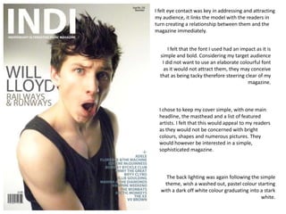
1. I felt eye contact was key in addressing and attracting my audience, it links the model with the readers in turn creating a relationship between them and the magazine immediately. I felt that the font I used had an impact as it is simple and bold. Considering my target audience I did not want to use an elaborate colourful font as it would not attract them, they may conceive that as being tacky therefore steering clear of my magazine. I chose to keep my cover simple, with one main headline, the masthead and a list of featured artists. I felt that this would appeal to my readers as they would not be concerned with bright colours, shapes and numerous pictures. They would however be interested in a simple, sophisticated magazine. The back lighting was again following the simple theme, wish a washed out, pastel colour starting with a dark off white colour graduating into a stark white.
2. I chose to follow generic conventions when it came to my double page spread, I felt this would appeal to my target audience as they would be able to relate the format of a large image on the left and text on the right as they are familiar with this. The pull out quotes help to break up the heavy text, this will appeal to my audience as they may not want to be over faced by a vast amount of text. I chose to include a list of stylistsand designers, this is due to the fact that my readers will have an interest in fashion as well as music and I have incorporated this throughout my magazine, so decided to carry this on into my double page spread. The model has a more relaxed facial expression in this image, I made this decision based on the fact that I wanted a contrast to the image on the cover, this allows the readers to relate to the artist and the different sides to his personality.
3. My contents incorporated varied styles, formal and informal. This was because I wanted to alternate the magazines theme. This will attract my target audience as they will have a mix of styles rather than the same reoccurring one throughout, some articles will be formal and others formal, this is displayed through the varied fonts The model in the image on the contents again has eye contact with the readers, I feel this is essential for the readers to connect with the artist. The images with Polaroid framing give a more informal twist to the magazine, this is to make the reader feel at ease, the scattered positioning of them does this also. And again links to the fashion element to the magazine as if they were test shots. The ‘Features’ and ‘Every Month’ sections give the readers a clear distinction between what they will find in every issue and artists and articles they will find in this issue, the decision to make the colour of the page numbers different to the subject was based upon the fact that the readers can easily distinguish one from the other and are able to quickly locate the page. I felt that including the web address in the contents was key, it means that the readers can find any further information they desire, this will appeal to my target audience as other magazines my not have this feature.