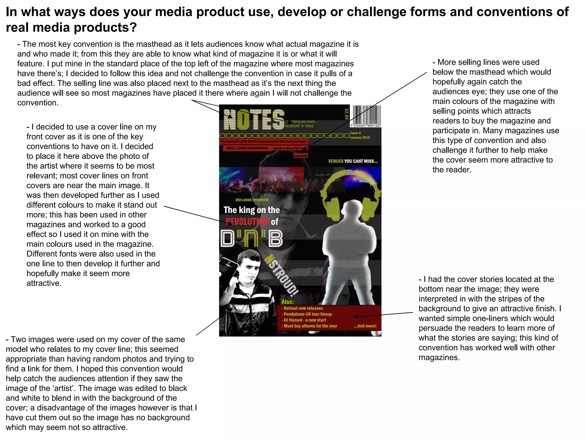
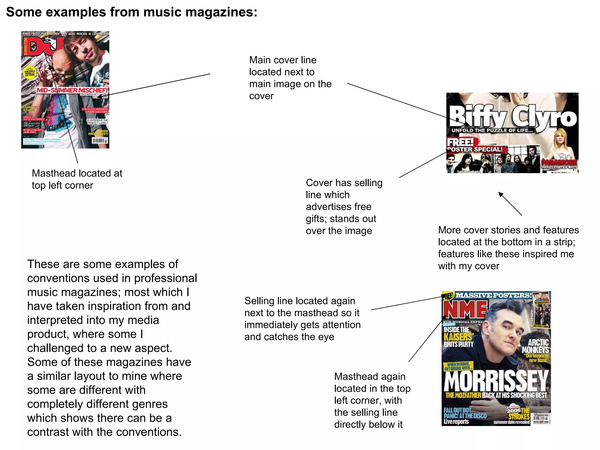
- The magazine follows conventions such as placing the masthead in the top left corner and cover lines near the main image to attract readers' attention.
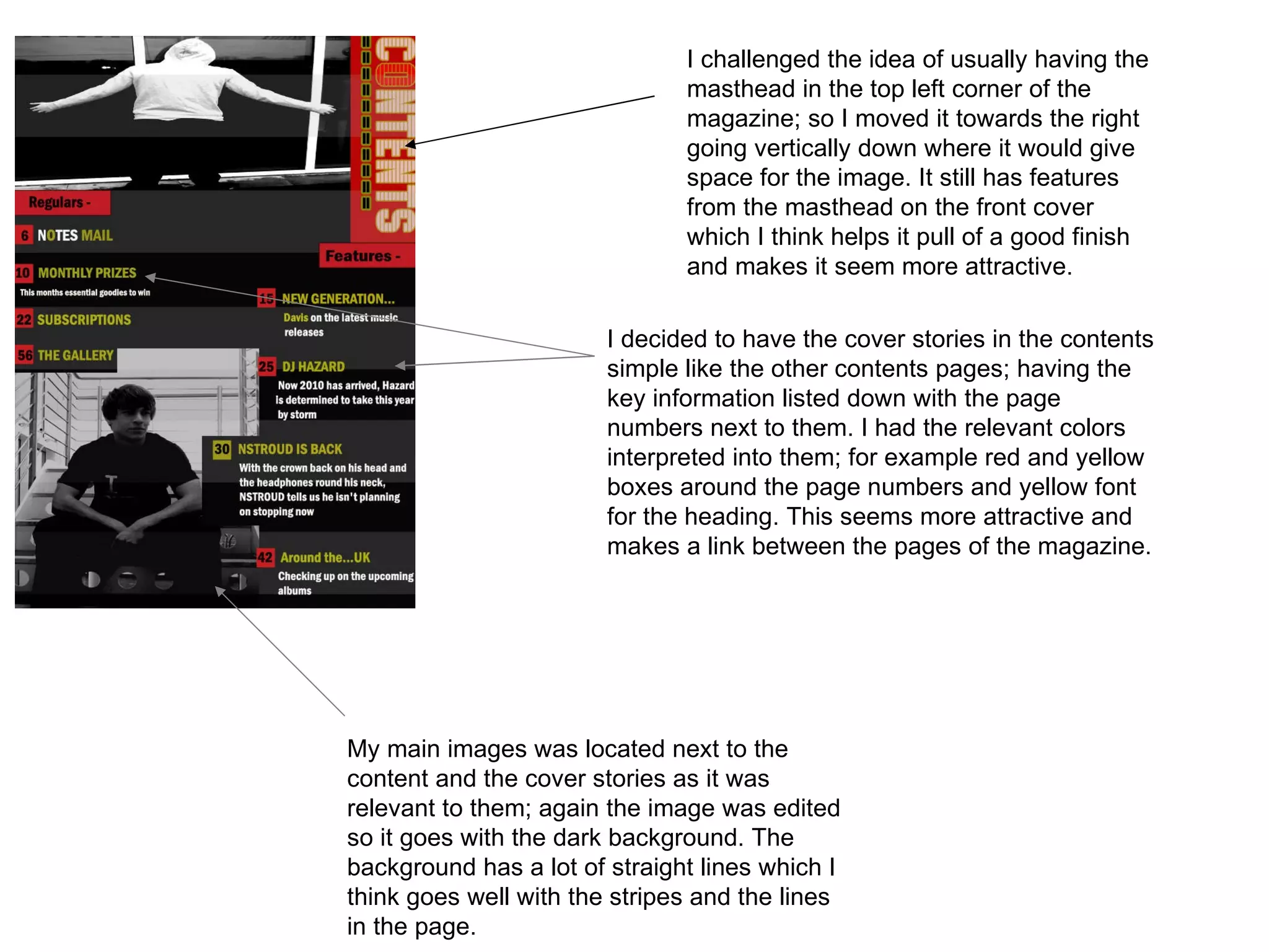
- It challenges some conventions by moving the masthead to the right and having simpler cover stories and contents pages with relevant colors.
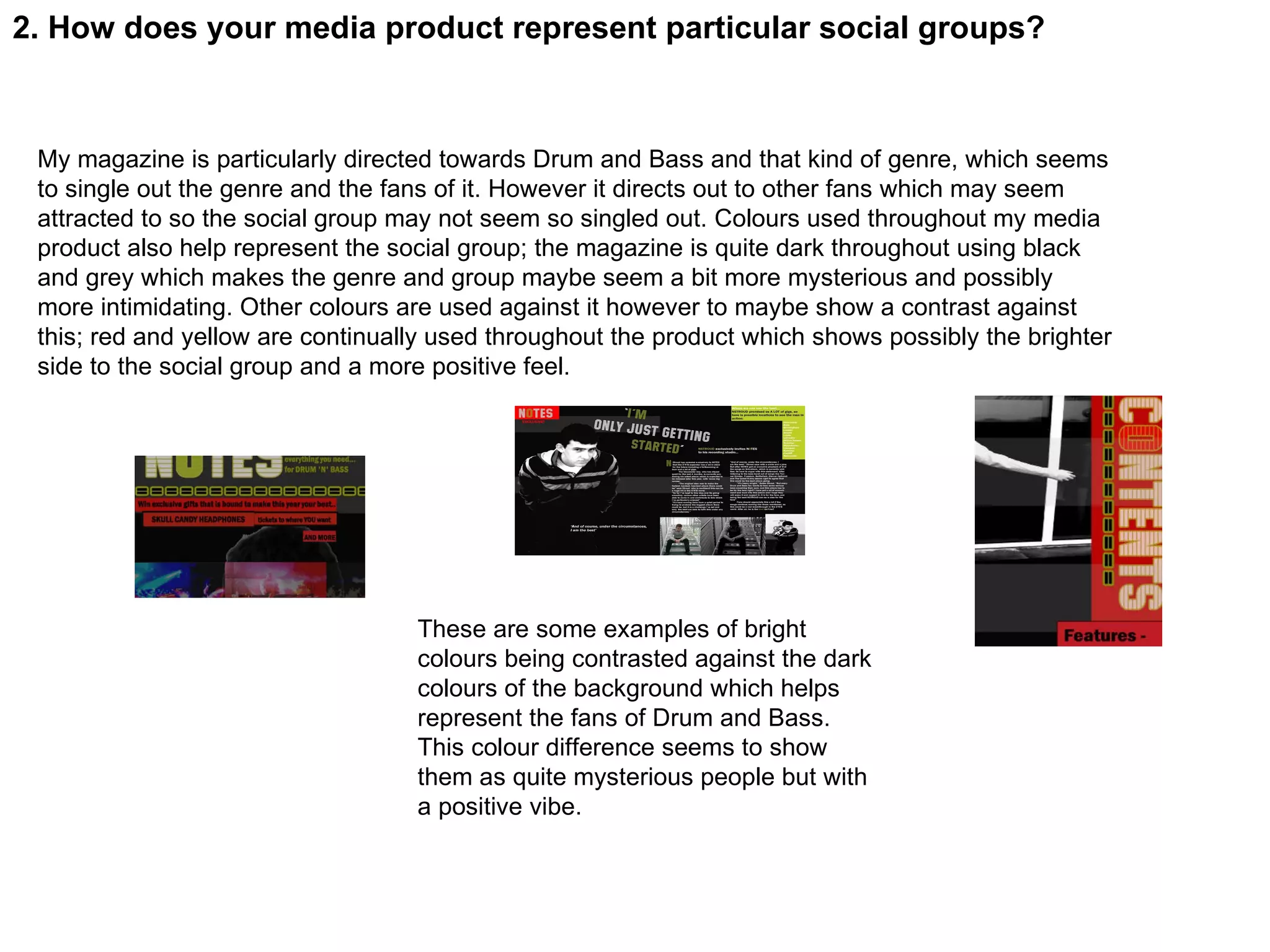
- While the magazine represents fans of drum and bass music, it also aims to attract other music fans through its use of dark colors contrasted with brighter tones.