
Recommended
More Related Content
What's hot
What's hot (20)
Similar to Purpose of a school magazine
Similar to Purpose of a school magazine (20)
More from sampsonrachael1190
More from sampsonrachael1190 (20)
Recently uploaded
Recently uploaded (20)
Purpose of a school magazine
- 1. Purpose of a school magazine By Rachael Sampson
- 2. Purpose of a school magazine • A school magazine is there to inform parents on the events of the school and what the students have been doing recently. It’s also a way to impress them and other parents to make the school look outstanding and a good place of learning for their children. It gives out messages to the parents about upcoming events and issues they want them to be aware of.
- 3. The issue number and term Key conventions and codes of school magazines Masthead Main events/headlines Free goodies (attract you to read it) Slogan/selling line - Front cover image – school related. No barcode – school magazine. (free)
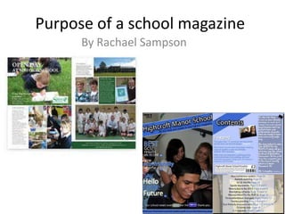
- 4. The colour scheme is fitting to the logo of the school, keeping the theme of blue and white throughout. Instantly the readers eyes are drawn to the ‘Aladdin’ text, to show that is the main story for the magazine, the image on the front also reflects this as the girls are by the curtain of the stage. The school’s slogan is along the bottom to keep the appearance professional and look official since it will be read by students and parents. The magazine is kept simple by not cluttering up the front page with headlines and stories. And selected stories along the side so that the image is the main focal point. The photo is very symmetrical which makes it look smart and simple. However the other storylines aren’t that noticeable, to improve this I would suggest an emboss around them to make them stand out a bit more but apart from that I would say it possesses the correct conventions of a school based magazine
- 5. The contents page for the school based magazine is very effective because it is clear what kind of magazine it is. The colour scheme matches the school’s logo and the schools quote is on the bottom showing it is purely about academics. The images next to the headings represent what the articles will be about, giving the readers more of an insight. The bold emboss around the text and images makes it stand out and show what is key to the page, since it is a contents page, its just to gather the information as to what is inside. The page is kept simple and easy to understand with the simplicity of the colours and layout. There isn’t any unnecessary information. It also includes an intro at the bottom about the school and what it is about, which is very helpful to the target audience which is parents as they get an insight as to what the school is like and their specialities. The bold yellow heading at the top is the main focus point due to the difference in colour, showing that is the key topic in this issue of the school magazine.
- 7. This double page spread of a school magazine is set out with different layers and angles of the text and images to make it look more interesting with having overlapping elements. A big part of this page and something which sticks out most within the double page spread is specific quotes, which have been enlarged. Therefore the people who are reading this kind of magazine are more likely to scan the text, so the key information is highlighted to draw in the reader. The colour scheme for this magazine is different shades of orange and red, which makes it look academic and professional. This magazine’s main aim is to inform the audience, so the article isn’t designed to persuade, but to just state the issues or things going on in the school. This specific article however is designed to inform students about use of mobiles and technology when learning and that it is restricting the ability to learn. The only slight persuasive technique here is the stating of statistics and showing the ‘most important cell phone feature’. The entire layout of this school magazine is extremely professional so I would say it is a really good example of a school based magazine.