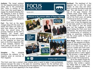
1. Audience: The target audience
for this magazine would be mainly
adults due to the professional
look. There is nothing on the
front cover that would appeal or
engage the students showing that
the magazine is more to inform
parents. Furthermore the front
cover isn’t as visually attractive
which again makes it not appeal to
students as much.
Font: The font on the pages
changes along with the sizes, this
means that some bits stand out
more than others, just like the
strap line, placed above the
pictures. However all the font is
simplistic but formal again
suggesting the magazine is aimed
at parents.
There isn't as much information
on this magazine as there has
been on the other magazines that
I have analysed, however the
front cover is full but not over
crowded, making it a success.
This front cover has a constant colour scheme which is good to make it look professional.
However because the colour is the same for everything, aspects like the masthead don’t
stand out like they should. Having said this the magazine cover has a unique approach, making
it stand out and be more appealing to the target audience.
Strapline: The strapline
introduces the audience to the
magazine gives an overview of
their magazine.
Main Image: There is a range of
images of the magazine all similar
sizes and shapes, this means that
there is no main focus, which is
good as it makes this front cover
stand out from other magazines.
In addition to this there is a
background which is other lapped
by the pictures, it adds depth to
the front cover, however I am
unsure of what the background is.
All of the images include the
students interacting in different
activities, they include a caption
too linking them to a page. This
makes the magazine informative,
interesting parents.
Masthead: The masthead of the
magazine ties in with the colour
scheme of navy blue and white,
which is writing vertically across the
page. This also blends in with the
logo of the page. However the
constant house colour means that
the masthead blends in with the
rest of the front cover, not making
it stand out as much as it could.
Another unusual aspect of the
front cover is how the magazine has
its own name, usually it is the initials
of the school or just the school
name, but this magazine is called
‘focus’ making the front cover more
professional. The word focus means
‘the concentration of attention or
energy on something’, highlighting
how the school wants to focus on
their students.