Download to read offline
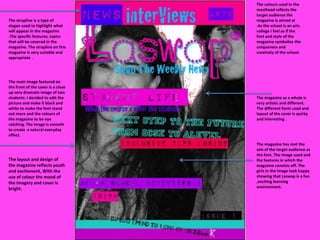

The magazine cover uses colors and fonts that reflect the target audience of an arts college. A close-up dramatic black and white image of two students is used to make the font and colors stand out. The overall design of the magazine, with its mix of fonts and layout, is artistic, quirky, and interesting, reflecting the youth and excitement of the target audience.


![Presentterin rooli breakout_sessiossa[1]](https://cdn.slidesharecdn.com/ss_thumbnails/presentterinroolibreakoutsessiossa1-111018003426-phpapp02-thumbnail.jpg?width=640&height=640&fit=bounds)


