SlideShare a Scribd company logo
1 of 4
Download to read offline
Layout – The layout is minimal which is aesthetically pleasing to someone who is potentially thinking of
becoming a teacher; this is because it can be very chaotic and therefore stressful. Although the layout is
minimal in a way it also looks quite bare this is because of the white background although, this does link
into the theme of becoming a nurse/doctor because white is a clinical and clean colour. Along the skyline of
the magazine it shows the reader of articles which are within the magazine although it goes not state which
pages these are on.
Target Audience – This is aimed at young adults both male and female who are potentially starting out
their career as a teacher.This is also show through the sub title ‘You’re hired!’ this could connote that
they’re getting their first job as a teacher. Although this could be argued because it comments on year 10’s
suggesting that it could be aimed at them but also could be aimed at the teachers because it could be an
article to decide what is best for the student e.g. further study or an apprenticeship - helps them advise
them better.
Image – The image of the girl is situated in the left hand thirds of the page. She is placed slightly over the
masthead to give it a more professional look but also suggest that she is ahead of everyone else – she stands
out from the rest of them (trainee teachers).The fact the model has her arms crossed connotes that she is
confident with herself but also laid back in her mannerism, so is not stressed out by her work. Furthermore,
she is wearing a half and half costume; on the left she is in a tie and blazer which is almost like a school
uniform and on the right she is in a nurses uniform suggesting that she has completed her training and is
now a qualified nurse. I feel the contrast in the two outfits could be denoting that if you work hard enough
you can reach your goals and get the career you want whatever it is. Also, the fact they’ve used a female
model suggests that they’re trying to say girls can also achieve high rated jobs and that it is no longer a
mans world but in contrast to this she is wearing a nurses uniform not a doctors which is a strong
stereotype so this could potentially be restraining the audience rather than showing the that they can break
the stereotype mould.This image is a mid-shot showing the girl from hip to head; this gives a clear view of
the girl and her outfit intention; furthermore, the fact she is looking directly at the camera suggests that she
is trying to connect with the reader and that the message she is trying to get across is direct to them.
Pugs – On this cover there is only one pug which is on the right hand side of the page.This states that you
can win an iPod but you have to look inside the magazine for more details on how; this is a way to draw
attention to the magazine and also persuade the audience to buy this magazine (although it has no price so
it may be free). I feel the reasons why there is limited pugs on this page is because they’re trying to continue
their mature look throughout the page and maintain its organised minimal overall appearance.
Masthead - The masthead is placed slightly behind the models head in the image. I feel this gives the
magazine a more established look but also it connotes that the female is ahead of everyone - had a head
start into the career she wants. Furthermore, the fact she is in front of the title also puts more emphasise
her. Also, the colour of the masthead is the starter of the house style which runs throughout the magazine
cover (turquoise/teal) and this is a strong element of the cover because it draws attention against the white
background which is ran throughout the cover.
Colour (House Style) - Throughout the magazine cover there is a colour theme of turquoise/teal.The fact
that this colour runs throughout gives it a more professional look because it isn't all over the show and too
bright and childish. Furthermore, it connotes that all these factors are linked to allow you to get to where
you want or get the job you want.Without teachers/education you cannot further your knowledge to allow
you to study at university for a job like a nurse/doctor. Although, along the skyline the colour scheme goes
red, pink, red these are in a bolder colour to the rest of the page to ensure they get noticed as there are
important things for both teachers and parents. In my personal opinion I feel that the ones relevant to the
teachers are written in read and the one for the parents/guardians are in pink; this clearly shows which
article are for who in a way which isn't obvious nor distracting from the rest of the page.
Style - The font used throughout this magazine cover is sans serif, I know this because it is quite boldly and there
is no flicks on the bases of any of the letters.The use of a sans serif font makes the overall look of the magazine
look more professional but also make further its appeal to its older target audience.There is a minimal amount of
text present on the page which creates an organised and clear look to the page.This is an appealing format/layout
for the target audience because it is easy to read and understand.
Text - There is a minimal amount of text on the cover; all of it is relevant to the magazines aim and allows the
reader to further their knowledge of children/teaching and what they can do in their future or career. It is all
written formally and its informative to the reader; it is all knowledge that will draw potential readers/buyers to the
magazine and they’ve carefully chosen the placement of the text to ensure each one is in the best and most
relevant positioning possible. For example, the pug is placed in the bottom left corner, although this is an eye
catching thing it is in a place where you will not look first because this doesn't provide information to the reader
but an advertisement instead even though it looks as if it is being used as a space filler it is actually placed in the
most appropriate place because it doesn't distract as much as it would do if it was situated in the top right hand
corner.
Layout - On the top right hand corner there is a list of things within the magazine (mini contents page).This is
discreet but also informative in a formal way.This allows the audience to have an insight to the magazines
contents and articles and decided whether or not it will interest them and help them to make the decision if
they'd like to purchase it. Banner states about Shakespeare and tutoring; things mostly associated with private
schools. Upper class audience to the magazine.The layout it quite basic in the fact it isn't cluttered but it could
be thought that the top is quite bare because it is mostly white so looks a little plain to the eye even though this
is used as a way to draw attention to the magazine and masthead.
Image - The image shows a young girl who it attending lower school, the outfit/costume she is wearing looks
very formal and denotes that she is privately educated.This further appeals to the upperclass audience because
it will be their children who are attending these private (paid for) schools.The main image/ focus is on the left
hand third of the page although the photograph cover the whole central third of the page.The reason why the
main focus is situated to the left third is because this is the part that is in focus and the girl who is facing
towards the camera.The image which is blurred out on the right hand side is of the back of the girls head, and it
is made to look like an over the shoulder shot, I feel this is a nice touch to the magazine because it simulates a
more natural image rather than a posed and forced photo; it shows the two young school girls naturally without
any interferences from the commercial world around them.
Buzz - Competition gives the magazine more of a attraction to the audience because they will want to win the
‘luxury family holiday’.This is well promoted because it is aimed at the parents for their children (very close
family) so they will want to go on family holidays; furthermore, the fact that it is luxury and aimed at the upper
class they will have the money to afford holidays but also want a luxury one so the would be appealing to them.
The buzz/competition advertised on the cover is not distracting from the main magazine itself this is because it is
located in the bottom left hand corner this is not a place you tend to look to first. Although,The text is written a
little bigger than the text on the right hand side which is education related this denotes that they're trying to
appeal to the audience through advertisement and competitions.
Masthead - The fact that the masthead was a white background behind it makes it more eye catching to the
audience because it make the masthead itself stand out more. Green Masthead links to the subtitles lower on the
page. Because the colours link together it gives it a more professional finish. ‘Parent’ is written bigger than the
main masthead ‘independent school’ I feel this is to denote to the audience that this magazine is specifically for
them and it is worth them getting because it will help them benefit their child/children’s future for the better as
they will receive the most informative and helpful information from this magazine because it is aimed wholly at
them - the parents.
Style - The font used throughout the magazine cover is sans serif this is because there is no flicks to the bases of
the letters.This gives it a more formal look and further targets the audience of around 25-35 (parents). Because
of its more formal look it clearly shows that this is not for the children to read it is for the adults.The font sticks
to the colours mint green, black and white because there is a continuous colour theme throughout the fonts it
links the whole page together and gives it a more professional look to the people reading it this is because its all
linked together in an easy to ready format. For example, mint green in titles and subtitles, black is for who the
magazine is aimed at and also further comments from reviewers and other readers and finally, white is captions
on photos and further information under the title and sub titles (mint green).
Colour (House Style) - The main colour and house style running through the cover page of this school magazine
is mint green, black and white.These colour all contrast well against one another without clashing so it makes it
aesthetically pleasing to the reader.This constant connection between article makes the layout more
understandable and easier to follow because it is laid out in such a way that it is easy to follow without looking
childish. on the page it is mostly laid out in blocks (squares and rectangles) this rigid format gives it symbolises a
structured upbringing for their child if they follow the steps to help them achieve the best education and future.
Text - On this magazine there is a varied amount of text, it is mostly focused on informing the reader of
ways to prepare their child for further education and give them the best opportunities they can.The main
image is not distracted from by the text because it is placed in the negative part of the image.The layout of
the text has been placed in appropriate places to not distract from the main focus of the magazine and this
careful layout has created an organised format to show the structure more clearly which gives it a more
formal effect to appeal to the adult audience.
Target Audience - Aimed at parents around 2535 years old— showing them how they can benefit their
child's/children's future and education. ‘Helping you make the right choices for your child’ is written
under the masthead as a cover line it is subtle yet informative to the parents. I can also tell its aimed at the
parents of the students because the image shows a lower school girl and the main image of the magazine
cover situated on the left hand third.
Target Audience - The target audience for this magazine is aimed mostly at teenagers (Secondary school
students).This is also shown through the style font used - sans serif which is less formal. I feel this magazine
clearly shows its target audience through the use of an image of a teen girl in her school uniform furthermore,
she is in an outdoor location smiling this could symbolise that she is either leaving or arriving at her school
and that she is happy to be there because of the smile.
Image - The school student is positioned in the right hand third of the page in her school uniform.The fact
that she has her top button undone and and tie quite loosely around her neck suggests that she is a typical
teenage girl at school who's rebellious acts involve wearing her uniform incorrectly.The lighting on the image
is quiet soft and natural; this stops her from looking commercial or the shot looking unrealistic.The natural
makeup worn by the school girl and her hair just down symbolises your typical young adult/teenager because
she has not become commercialised or materialistic. Furthermore, the camera angle is eye level and it it also a
close up; the girl is directly looking into the camera this could connote the she is determined to achieve the
goals she wants (grades/job) but it also gives it a more personal and friendly feel to the reader because its made
to look as if she is talking to them personally and sharing the things she has learnt through her experience of
school so far.This personal touch makes it more suitable for the reader (teenagers and young adults - in
secondary school) because it is less formal but it is still professional in its format.
Style - The font used is sans serif although the typography for the title is less formal as it almost looks hand
written (like a students writing).The use of a simple and easy to read font used throughout the cover gives the
magazine a formal yet easy approach which is best suited to its target audience.The majority of the writing is
situated on the left hand side of the magazine which shows some sort of organisation and structure without
being to formal; Also the use of colour behind the text gives it a more fun look suitable for the age range
because it makes the magazine less formal and therefore more easier to identify that its for the students
themselves rather than the parents.
Layout - The layout of the magazine is formal yet personal.This is suitable to the target audience because
although they’re maturing in life they still are young and fun so they still enjoy a bit of fluidity to their lives
rather than structure and this is reflected in the magazine covers layout. Many of the subtitles are places within
a transparent coloured box; this creates organisation in the page but also separation between the articles.
When displaying on a shelf the left hand side of the magazine is what is shown.This is why the title and main
information is presented on this side, in order to attract the audiences attention.The main image is located in
the right third of the front cover this is because it is less important to catch attention of the reader as its not
part of the main magazine.
Buzz - Although there is not really a buzz or pug present on the page there is a banner located in the top right
hand corner of the page highlighting an article within the magazine. Because it is in a mint green transparent
banner it doesn't distract the viewer from the image or the main articles listed on the left hand side.This
banner advertises a free ‘healthy cooking guide’ this draws attention to the magazine because it offers a extra
which is free this is appealing to a younger audience. I feel that there aren't many pugs, buzz’s or banners
because they do not want to distract from the main focuses which is the articles advertised on the cover.
Text - The text which is located within the coloured boxes are mostly aimed at the parents of the secondary
school student this is because the article are more relevant to them than the students themselves.The only
coloured text on the page is on the bottom third of the page written in yellow stating ‘our guide to coping with
teenage stress’ although only teenage stress is written in yellow and it is also large in size. I feel the reason that
teenage stress has been emphasise because this tends to be a main issue with teenagers. On the other hand, it
does not state which stress they're helping the teenagers cope with or which page this article is located on; I
feel that because the title is left quite open it leaves the reader with uncertainty as they're unsure if this article
(which is the main one shown through the text used) will benefit them personally.The fact that the font
throughout the page is the same gives the magazine stability and a house style gives it a more professional look
without overwhelming the young reader.
Masthead - The placing of which issue this magazine is, the schools website and the price of the magazine is
located just under the masthead, this is a prime location to place these details as the are clear for the viewer to
see and locate but the size of the font does not distract from the masthead or the rest of banners.The mast
head on this magazine is written in sans serif. Also, it does not have a capital letter therefore making the
magazine impersonal and more suitable to the teenage/student audience they are trying to reach.
Color (House Style) - Although it looks as if there is no real house style throughout the magazine cover there
is a common theme of white text.This colour could be thought as a symbol of purity and clarity because white
is a neutral colour. Other than that there is no house style throughout the cover but I think this subtle link
between the texts symbolises how all these school orientated things are linked.
Target Audience - The target audience for this magazine is aimed at upper school students (Sixth Formers/College
Students) aged around 16-18 years. I personally would say this is aimed slightly more at males than females because it
states about an article to do with the nominations for head boy whereas it could have been for both head boy and girl
to show equality between genders in a competitive environment e.g. University and jobs.
Image - The image is positioned in the central third of the page but also towards the left a little, so it doesn't take away
the attention from the writing and the photograph stands out. It is a mid shot of the boy showing him from hip to head.
This long show of the boy gives a clear view of the boy and his uniform. He is wearing it in a casual way - top button
undone and tie loosely around his neck.This symbolises that he is a typical male student of his age who likes to rebel
against the rules set by those above him. He model is making direct eye contact with the camera at eye level so it is
made to look like he is talking directly to the reader and sharing his school experience and tips with the reader.
Furthermore, the fact that the model is only slightly smiling symbolises that it is friendly yet formal.
Style - The font is written in a block Sans Serif font; this gives the magazine more of an appeal to a male audience as it
is more masculine in style whereas Serif fonts with flicks etc are more girly therefore more appealing to the female
audience.The font used on the masthead is easy to read to the audience which is good as it clearly states what brand/
title the magazine is.; along with the majority of the typography on the page it is in white which stands out well against
the background. Although some of the sub titles are written in blue which doesn't stand out against the negative space
of the image on the page this is a bad design fault because it is immediately clear to the reader what the article is about
without them looking closely and careful against the background. Furthermore, there seems to be little house style
throughout the magazine which does not create a consistent and professional look to this school magazine.
Layout - The layout of this magazine is quite spacious (minimal) I feel this works well with the magazine because
otherwise it may look too busy to the eye and then rather unappealing to its audience.The main focus on the image in
positioned centrally on the page although the model is turned with his back towards the left hand third of the page; the
fact that he is twisted slightly gives his stance a more casual look this makes the magazine less formal and more
personal which is appealing for the young audience (teenagers/school students). Furthermore, the fact that he looks
casual in his position may connote that he is relaxed in his school environment and not stressed out by work load/
exams this may also be appealing to the audience as they may be interested to learn what he does to keep so calm and
relaxed throughout his school experience,
Pug/Banner - There is a pug/banner located on the top left hand side on the magazine.This states ‘Free Handout
Insert’ although part of the text is cut off making the word ‘insert’ almost unreadable. I personally feel the banner is on
poor quality because the positioning on the typography does not allow the reader to easily read the message they're
trying to get across but instead have to guess/interpret the information given. Also, I feel that the use of the green text
against the blue banner also contributes to the difficulty of reading so a different colour font would benefit the
appearance here. On the other hand this banner is eye catching to the audience offering the opportunity to get a free
magazine which is appealing as it is something extra for them to gain from.
Text - The text which is located on the right hand third of the magazine lists a few of the articles which will be within
the magazine. I would say the most eye catching thing would be ‘HeadBoy’ as it is in the biggest font and therefore the
most drawing to the eye.The majority of the writing is in blue or white but the information under ‘HeadBoy’ is in green
I feel this has been done to state the importance of this to the magazine and maybe connote that this is the main article
within the magazine; but, I feel that the green is hard to read against the background of the image. If the designer had
chosen to include the text in boxes it would make it easier for the reader to reader but overall it would give it a more
professional and organised look through the front cover.
Masthead - The masthead on the magazine cover is unusual in the fact that the inside of the ‘o’ and
the dot on the ‘i’ has been coloured a different colour.The dot on the ‘i’ links in with the green on
the writing underneath ‘HeadBoy’ so this is a link between the title and that article but the red in the
‘o’ doesn't link to the page anywhere. I feel this is a bad design fault as if makes the page look less
professional and more like amateur production.
Colour (House Style) - Throughout this magazine there is little house style making it look
unprofessional and inconsistent. Although, there is a lot of white text throughout which is a house
style through the typography I feel there are no clear links between any of the elements of the
magazine. I feel a more organised approach would be more suitable to the target audience they're try
the reach as students like to be organised and able to get information easily.

More Related Content

What's hot

School magazine annalasyse
School magazine annalasyseSchool magazine annalasyse
School magazine annalasyselwica1999
 
Textual Analysis
Textual Analysis Textual Analysis
Textual Analysis 048600
 
Pop magazine anaysis
Pop magazine anaysisPop magazine anaysis
Pop magazine anaysishamidahr
 
School Magazine - Research
School Magazine - ResearchSchool Magazine - Research
School Magazine - ResearchSundasBostan
 
School magazine annalasyse
School magazine annalasyseSchool magazine annalasyse
School magazine annalasyselwica1999
 
Preliminary Task - Media Studies
Preliminary Task - Media Studies Preliminary Task - Media Studies
Preliminary Task - Media Studies emily_hop
 
Magazine examples
Magazine examplesMagazine examples
Magazine exampleschlozfox
 
Front Cover Analysis - 'We Love Pop'
Front Cover Analysis - 'We Love Pop'Front Cover Analysis - 'We Love Pop'
Front Cover Analysis - 'We Love Pop'Antonia-Montefusco
 
Preliminary Task Jamie Dear
Preliminary Task Jamie DearPreliminary Task Jamie Dear
Preliminary Task Jamie Dearjamiedear
 
Magazine deconstruction
Magazine deconstructionMagazine deconstruction
Magazine deconstructionLauraJaneLee
 
Unit 14 digital magazine production.
Unit 14 digital magazine production.Unit 14 digital magazine production.
Unit 14 digital magazine production.holliejoice
 
Four mixed genre contents pages
Four mixed genre contents pagesFour mixed genre contents pages
Four mixed genre contents pageslibchapman
 
Preliminary task
Preliminary taskPreliminary task
Preliminary taskaarons0902
 
School magazines
School magazinesSchool magazines
School magazinesA99elpula
 
Elle contents page deconstruction
Elle contents page deconstructionElle contents page deconstruction
Elle contents page deconstructionabbyrevell
 
Middle page spreads
Middle page spreadsMiddle page spreads
Middle page spreadssophiehudson
 

What's hot (19)

School magazine annalasyse
School magazine annalasyseSchool magazine annalasyse
School magazine annalasyse
 
Textual Analysis
Textual Analysis Textual Analysis
Textual Analysis
 
Pop magazine anaysis
Pop magazine anaysisPop magazine anaysis
Pop magazine anaysis
 
School Magazine - Research
School Magazine - ResearchSchool Magazine - Research
School Magazine - Research
 
School magazine annalasyse
School magazine annalasyseSchool magazine annalasyse
School magazine annalasyse
 
Preliminary Task - Media Studies
Preliminary Task - Media Studies Preliminary Task - Media Studies
Preliminary Task - Media Studies
 
Magazine examples
Magazine examplesMagazine examples
Magazine examples
 
Front Cover Analysis - 'We Love Pop'
Front Cover Analysis - 'We Love Pop'Front Cover Analysis - 'We Love Pop'
Front Cover Analysis - 'We Love Pop'
 
Preliminary Task Jamie Dear
Preliminary Task Jamie DearPreliminary Task Jamie Dear
Preliminary Task Jamie Dear
 
Magazine deconstruction
Magazine deconstructionMagazine deconstruction
Magazine deconstruction
 
Unit 14 digital magazine production.
Unit 14 digital magazine production.Unit 14 digital magazine production.
Unit 14 digital magazine production.
 
Four mixed genre contents pages
Four mixed genre contents pagesFour mixed genre contents pages
Four mixed genre contents pages
 
Target audience anaylsis
Target audience anaylsisTarget audience anaylsis
Target audience anaylsis
 
Preliminary task
Preliminary taskPreliminary task
Preliminary task
 
School magazines
School magazinesSchool magazines
School magazines
 
Elle contents page deconstruction
Elle contents page deconstructionElle contents page deconstruction
Elle contents page deconstruction
 
Preliminary Task
Preliminary TaskPreliminary Task
Preliminary Task
 
Preliminary task
Preliminary taskPreliminary task
Preliminary task
 
Middle page spreads
Middle page spreadsMiddle page spreads
Middle page spreads
 

Viewers also liked

Denise M Dusseau Resume 2015
Denise M Dusseau Resume 2015Denise M Dusseau Resume 2015
Denise M Dusseau Resume 2015Denise Dusseau
 
Leçon 112 - Énoncé et pratique
Leçon 112 - Énoncé et pratiqueLeçon 112 - Énoncé et pratique
Leçon 112 - Énoncé et pratiquePierrot Caron
 
VIII. L'incroyable croyance
VIII. L'incroyable croyanceVIII. L'incroyable croyance
VIII. L'incroyable croyancePierrot Caron
 
Curriculum vitae michaelvisschers-november2015v3_eng
Curriculum vitae michaelvisschers-november2015v3_engCurriculum vitae michaelvisschers-november2015v3_eng
Curriculum vitae michaelvisschers-november2015v3_engmhavisschers
 
Is APEC working for working women? (2004) Veronica Oxman
Is APEC working for working women? (2004) Veronica OxmanIs APEC working for working women? (2004) Veronica Oxman
Is APEC working for working women? (2004) Veronica OxmanVerónica Oxman
 
Trust and NIVEL Primary care database
Trust and NIVEL Primary care databaseTrust and NIVEL Primary care database
Trust and NIVEL Primary care databaseRobert Verheij
 
Images for Magazine
Images for MagazineImages for Magazine
Images for MagazineMissyClarkey
 
151114 nn leveraging character strengths and digital gaming
151114 nn leveraging character strengths and digital gaming151114 nn leveraging character strengths and digital gaming
151114 nn leveraging character strengths and digital gamingMayerson Academy
 
LEÇON 121 – Le pardon est la clef du bonheur.
LEÇON 121 – Le pardon est la clef du bonheur.LEÇON 121 – Le pardon est la clef du bonheur.
LEÇON 121 – Le pardon est la clef du bonheur.Pierrot Caron
 
Policies towards gender based violence: Australia, Argentina and Chile
Policies towards gender based violence: Australia, Argentina and ChilePolicies towards gender based violence: Australia, Argentina and Chile
Policies towards gender based violence: Australia, Argentina and ChileVerónica Oxman
 
VI. De la vigilance à la paix
VI. De la vigilance à la paixVI. De la vigilance à la paix
VI. De la vigilance à la paixPierrot Caron
 
«НАУКА В СОВРЕМЕННОМ ОБЩЕСТВЕ»
«НАУКА  В СОВРЕМЕННОМ ОБЩЕСТВЕ»«НАУКА  В СОВРЕМЕННОМ ОБЩЕСТВЕ»
«НАУКА В СОВРЕМЕННОМ ОБЩЕСТВЕ»Anyta
 
LEÇON 75 – La lumière est venue.
LEÇON 75 – La lumière est venue.LEÇON 75 – La lumière est venue.
LEÇON 75 – La lumière est venue.Pierrot Caron
 
المواد العازلة -انشاء مباني
المواد العازلة -انشاء مبانيالمواد العازلة -انشاء مباني
المواد العازلة -انشاء مبانيMohsna Alahwal
 

Viewers also liked (19)

Denise M Dusseau Resume 2015
Denise M Dusseau Resume 2015Denise M Dusseau Resume 2015
Denise M Dusseau Resume 2015
 
Leçon 112 - Énoncé et pratique
Leçon 112 - Énoncé et pratiqueLeçon 112 - Énoncé et pratique
Leçon 112 - Énoncé et pratique
 
Presentation zen
Presentation zenPresentation zen
Presentation zen
 
VIII. L'incroyable croyance
VIII. L'incroyable croyanceVIII. L'incroyable croyance
VIII. L'incroyable croyance
 
Perfume Feromonas
Perfume FeromonasPerfume Feromonas
Perfume Feromonas
 
Block18
Block18Block18
Block18
 
Marcus_Resume2015
Marcus_Resume2015Marcus_Resume2015
Marcus_Resume2015
 
Curriculum vitae michaelvisschers-november2015v3_eng
Curriculum vitae michaelvisschers-november2015v3_engCurriculum vitae michaelvisschers-november2015v3_eng
Curriculum vitae michaelvisschers-november2015v3_eng
 
Is APEC working for working women? (2004) Veronica Oxman
Is APEC working for working women? (2004) Veronica OxmanIs APEC working for working women? (2004) Veronica Oxman
Is APEC working for working women? (2004) Veronica Oxman
 
1. Le dernier pas
1. Le dernier pas1. Le dernier pas
1. Le dernier pas
 
Trust and NIVEL Primary care database
Trust and NIVEL Primary care databaseTrust and NIVEL Primary care database
Trust and NIVEL Primary care database
 
Images for Magazine
Images for MagazineImages for Magazine
Images for Magazine
 
151114 nn leveraging character strengths and digital gaming
151114 nn leveraging character strengths and digital gaming151114 nn leveraging character strengths and digital gaming
151114 nn leveraging character strengths and digital gaming
 
LEÇON 121 – Le pardon est la clef du bonheur.
LEÇON 121 – Le pardon est la clef du bonheur.LEÇON 121 – Le pardon est la clef du bonheur.
LEÇON 121 – Le pardon est la clef du bonheur.
 
Policies towards gender based violence: Australia, Argentina and Chile
Policies towards gender based violence: Australia, Argentina and ChilePolicies towards gender based violence: Australia, Argentina and Chile
Policies towards gender based violence: Australia, Argentina and Chile
 
VI. De la vigilance à la paix
VI. De la vigilance à la paixVI. De la vigilance à la paix
VI. De la vigilance à la paix
 
«НАУКА В СОВРЕМЕННОМ ОБЩЕСТВЕ»
«НАУКА  В СОВРЕМЕННОМ ОБЩЕСТВЕ»«НАУКА  В СОВРЕМЕННОМ ОБЩЕСТВЕ»
«НАУКА В СОВРЕМЕННОМ ОБЩЕСТВЕ»
 
LEÇON 75 – La lumière est venue.
LEÇON 75 – La lumière est venue.LEÇON 75 – La lumière est venue.
LEÇON 75 – La lumière est venue.
 
المواد العازلة -انشاء مباني
المواد العازلة -انشاء مبانيالمواد العازلة -انشاء مباني
المواد العازلة -انشاء مباني
 

Similar to Magazine Cover Analysis

Double Page Spread Deconstruction
Double Page Spread DeconstructionDouble Page Spread Deconstruction
Double Page Spread Deconstructionabbyrevell
 
Magazine draft annotations
Magazine draft annotationsMagazine draft annotations
Magazine draft annotationselliefrancis
 
Media Magazine Front Page Three
Media Magazine Front Page ThreeMedia Magazine Front Page Three
Media Magazine Front Page Three_hayley_
 
School Annotations
School AnnotationsSchool Annotations
School Annotationslibbsyb
 
As media studies coursework preliminary task
As media studies coursework preliminary taskAs media studies coursework preliminary task
As media studies coursework preliminary taskFilipstojcic
 
Alessio petulla` preliminary task evaluation
Alessio petulla` preliminary task evaluationAlessio petulla` preliminary task evaluation
Alessio petulla` preliminary task evaluationApetulla5
 
Preliminary task
Preliminary taskPreliminary task
Preliminary taskA99elpula
 
Preliminary task
Preliminary taskPreliminary task
Preliminary taskA99elpula
 
School magazine-evaluation
School magazine-evaluationSchool magazine-evaluation
School magazine-evaluationdmckee711
 
School magazine analysis
School magazine analysisSchool magazine analysis
School magazine analysisKlarasa098
 
Magazine resarch powerp 2
Magazine resarch powerp 2Magazine resarch powerp 2
Magazine resarch powerp 2Jessica Smith
 
School magazine annotations powerpoint
School magazine annotations powerpointSchool magazine annotations powerpoint
School magazine annotations powerpointMsiscar76
 
Magazine analysis new
Magazine analysis newMagazine analysis new
Magazine analysis newcuzzybrokhan
 
School magazine analysis 3
School magazine analysis 3School magazine analysis 3
School magazine analysis 3Sashawallen
 
School magazine research!
School magazine research!School magazine research!
School magazine research!Green1406
 
Evaluation
EvaluationEvaluation
Evaluationayreslou
 
Magazine resarch powerp 2 final
Magazine resarch powerp 2 finalMagazine resarch powerp 2 final
Magazine resarch powerp 2 finalJessica Smith
 

Similar to Magazine Cover Analysis (20)

Magazines
MagazinesMagazines
Magazines
 
Double Page Spread Deconstruction
Double Page Spread DeconstructionDouble Page Spread Deconstruction
Double Page Spread Deconstruction
 
Magazine draft annotations
Magazine draft annotationsMagazine draft annotations
Magazine draft annotations
 
Media Magazine Front Page Three
Media Magazine Front Page ThreeMedia Magazine Front Page Three
Media Magazine Front Page Three
 
Magazine cover 1
Magazine cover 1Magazine cover 1
Magazine cover 1
 
School Annotations
School AnnotationsSchool Annotations
School Annotations
 
As media studies coursework preliminary task
As media studies coursework preliminary taskAs media studies coursework preliminary task
As media studies coursework preliminary task
 
Alessio petulla` preliminary task evaluation
Alessio petulla` preliminary task evaluationAlessio petulla` preliminary task evaluation
Alessio petulla` preliminary task evaluation
 
Preliminary task
Preliminary taskPreliminary task
Preliminary task
 
Preliminary task
Preliminary taskPreliminary task
Preliminary task
 
School magazine-evaluation
School magazine-evaluationSchool magazine-evaluation
School magazine-evaluation
 
School magazine analysis
School magazine analysisSchool magazine analysis
School magazine analysis
 
Magazine resarch powerp 2
Magazine resarch powerp 2Magazine resarch powerp 2
Magazine resarch powerp 2
 
School magazine annotations powerpoint
School magazine annotations powerpointSchool magazine annotations powerpoint
School magazine annotations powerpoint
 
Magazine analysis new
Magazine analysis newMagazine analysis new
Magazine analysis new
 
School magazine analysis 3
School magazine analysis 3School magazine analysis 3
School magazine analysis 3
 
School magazine research!
School magazine research!School magazine research!
School magazine research!
 
Magazine 3
Magazine 3Magazine 3
Magazine 3
 
Evaluation
EvaluationEvaluation
Evaluation
 
Magazine resarch powerp 2 final
Magazine resarch powerp 2 finalMagazine resarch powerp 2 final
Magazine resarch powerp 2 final
 

Recently uploaded

Unlock the power of Instagram with SocioCosmos. Start your journey towards so...
Unlock the power of Instagram with SocioCosmos. Start your journey towards so...Unlock the power of Instagram with SocioCosmos. Start your journey towards so...
Unlock the power of Instagram with SocioCosmos. Start your journey towards so...SocioCosmos
 
Craft Your Legacy: Invest in YouTube Presence from Sociocosmos"
Craft Your Legacy: Invest in YouTube Presence from Sociocosmos"Craft Your Legacy: Invest in YouTube Presence from Sociocosmos"
Craft Your Legacy: Invest in YouTube Presence from Sociocosmos"SocioCosmos
 
Film show production powerpoint for site
Film show production powerpoint for siteFilm show production powerpoint for site
Film show production powerpoint for siteAshtonCains
 
Call Girls In South Ex. Delhi O9654467111 Women Seeking Men
Call Girls In South Ex. Delhi O9654467111 Women Seeking MenCall Girls In South Ex. Delhi O9654467111 Women Seeking Men
Call Girls In South Ex. Delhi O9654467111 Women Seeking MenSapana Sha
 
+971565801893>> ORIGINAL CYTOTEC ABORTION PILLS FOR SALE IN DUBAI AND ABUDHABI<<
+971565801893>> ORIGINAL CYTOTEC ABORTION PILLS FOR SALE IN DUBAI AND ABUDHABI<<+971565801893>> ORIGINAL CYTOTEC ABORTION PILLS FOR SALE IN DUBAI AND ABUDHABI<<
+971565801893>> ORIGINAL CYTOTEC ABORTION PILLS FOR SALE IN DUBAI AND ABUDHABI<<Health
 
Finance-and-Operations-in-the-Azure-Cloud.pdf
Finance-and-Operations-in-the-Azure-Cloud.pdfFinance-and-Operations-in-the-Azure-Cloud.pdf
Finance-and-Operations-in-the-Azure-Cloud.pdfandersonwille2024
 
Interpreting the brief for the media IDY
Interpreting the brief for the media IDYInterpreting the brief for the media IDY
Interpreting the brief for the media IDYgalaxypingy
 
BDSM⚡Call Girls in Sector 76 Noida Escorts >༒8448380779 Escort Service
BDSM⚡Call Girls in Sector 76 Noida Escorts >༒8448380779 Escort ServiceBDSM⚡Call Girls in Sector 76 Noida Escorts >༒8448380779 Escort Service
BDSM⚡Call Girls in Sector 76 Noida Escorts >༒8448380779 Escort ServiceDelhi Call girls
 
BVG BEACH CLEANING PROJECTS- ORISSA , ANDAMAN, PORT BLAIR
BVG BEACH CLEANING PROJECTS- ORISSA , ANDAMAN, PORT BLAIRBVG BEACH CLEANING PROJECTS- ORISSA , ANDAMAN, PORT BLAIR
BVG BEACH CLEANING PROJECTS- ORISSA , ANDAMAN, PORT BLAIRNeha Kajulkar
 
Capstone slidedeck for my capstone project part 2.pdf
Capstone slidedeck for my capstone project part 2.pdfCapstone slidedeck for my capstone project part 2.pdf
Capstone slidedeck for my capstone project part 2.pdfeliklein8
 
Hire↠Young Call Girls in Hari Nagar (Delhi) ☎️ 9205541914 ☎️ Independent Esco...
Hire↠Young Call Girls in Hari Nagar (Delhi) ☎️ 9205541914 ☎️ Independent Esco...Hire↠Young Call Girls in Hari Nagar (Delhi) ☎️ 9205541914 ☎️ Independent Esco...
Hire↠Young Call Girls in Hari Nagar (Delhi) ☎️ 9205541914 ☎️ Independent Esco...Delhi Call girls
 
Generate easy money from tiktok using this simple steps on the book.
Generate easy money from tiktok using this simple steps on the book.Generate easy money from tiktok using this simple steps on the book.
Generate easy money from tiktok using this simple steps on the book.AFFFILIATE
 
Vellore Call Girls Service ☎ ️82500–77686 ☎️ Enjoy 24/7 Escort Service
Vellore Call Girls Service ☎ ️82500–77686 ☎️ Enjoy 24/7 Escort ServiceVellore Call Girls Service ☎ ️82500–77686 ☎️ Enjoy 24/7 Escort Service
Vellore Call Girls Service ☎ ️82500–77686 ☎️ Enjoy 24/7 Escort ServiceDamini Dixit
 
Film show pre-production powerpoint for site
Film show pre-production powerpoint for siteFilm show pre-production powerpoint for site
Film show pre-production powerpoint for siteAshtonCains
 
Film show post-production powerpoint for site
Film show post-production powerpoint for siteFilm show post-production powerpoint for site
Film show post-production powerpoint for siteAshtonCains
 
Production diary Film the city powerpoint
Production diary Film the city powerpointProduction diary Film the city powerpoint
Production diary Film the city powerpointAshtonCains
 
VIP Call Girls Morena 9332606886 Free Home Delivery 5500 Only
VIP Call Girls Morena 9332606886 Free Home Delivery 5500 OnlyVIP Call Girls Morena 9332606886 Free Home Delivery 5500 Only
VIP Call Girls Morena 9332606886 Free Home Delivery 5500 Onlykhanf3647647
 
CASH PAYMENT ON GIRL HAND TO HAND HOUSEWIFE
CASH PAYMENT ON GIRL HAND TO HAND HOUSEWIFECASH PAYMENT ON GIRL HAND TO HAND HOUSEWIFE
CASH PAYMENT ON GIRL HAND TO HAND HOUSEWIFECall girl Jaipur
 
Improve Your Brand in Waco with a Professional Social Media Marketing Company
Improve Your Brand in Waco with a Professional Social Media Marketing CompanyImprove Your Brand in Waco with a Professional Social Media Marketing Company
Improve Your Brand in Waco with a Professional Social Media Marketing CompanyWSI INTERNET PARTNER
 

Recently uploaded (20)

Unlock the power of Instagram with SocioCosmos. Start your journey towards so...
Unlock the power of Instagram with SocioCosmos. Start your journey towards so...Unlock the power of Instagram with SocioCosmos. Start your journey towards so...
Unlock the power of Instagram with SocioCosmos. Start your journey towards so...
 
Craft Your Legacy: Invest in YouTube Presence from Sociocosmos"
Craft Your Legacy: Invest in YouTube Presence from Sociocosmos"Craft Your Legacy: Invest in YouTube Presence from Sociocosmos"
Craft Your Legacy: Invest in YouTube Presence from Sociocosmos"
 
Film show production powerpoint for site
Film show production powerpoint for siteFilm show production powerpoint for site
Film show production powerpoint for site
 
Call Girls In South Ex. Delhi O9654467111 Women Seeking Men
Call Girls In South Ex. Delhi O9654467111 Women Seeking MenCall Girls In South Ex. Delhi O9654467111 Women Seeking Men
Call Girls In South Ex. Delhi O9654467111 Women Seeking Men
 
+971565801893>> ORIGINAL CYTOTEC ABORTION PILLS FOR SALE IN DUBAI AND ABUDHABI<<
+971565801893>> ORIGINAL CYTOTEC ABORTION PILLS FOR SALE IN DUBAI AND ABUDHABI<<+971565801893>> ORIGINAL CYTOTEC ABORTION PILLS FOR SALE IN DUBAI AND ABUDHABI<<
+971565801893>> ORIGINAL CYTOTEC ABORTION PILLS FOR SALE IN DUBAI AND ABUDHABI<<
 
Finance-and-Operations-in-the-Azure-Cloud.pdf
Finance-and-Operations-in-the-Azure-Cloud.pdfFinance-and-Operations-in-the-Azure-Cloud.pdf
Finance-and-Operations-in-the-Azure-Cloud.pdf
 
Interpreting the brief for the media IDY
Interpreting the brief for the media IDYInterpreting the brief for the media IDY
Interpreting the brief for the media IDY
 
BDSM⚡Call Girls in Sector 76 Noida Escorts >༒8448380779 Escort Service
BDSM⚡Call Girls in Sector 76 Noida Escorts >༒8448380779 Escort ServiceBDSM⚡Call Girls in Sector 76 Noida Escorts >༒8448380779 Escort Service
BDSM⚡Call Girls in Sector 76 Noida Escorts >༒8448380779 Escort Service
 
BVG BEACH CLEANING PROJECTS- ORISSA , ANDAMAN, PORT BLAIR
BVG BEACH CLEANING PROJECTS- ORISSA , ANDAMAN, PORT BLAIRBVG BEACH CLEANING PROJECTS- ORISSA , ANDAMAN, PORT BLAIR
BVG BEACH CLEANING PROJECTS- ORISSA , ANDAMAN, PORT BLAIR
 
Capstone slidedeck for my capstone project part 2.pdf
Capstone slidedeck for my capstone project part 2.pdfCapstone slidedeck for my capstone project part 2.pdf
Capstone slidedeck for my capstone project part 2.pdf
 
Hire↠Young Call Girls in Hari Nagar (Delhi) ☎️ 9205541914 ☎️ Independent Esco...
Hire↠Young Call Girls in Hari Nagar (Delhi) ☎️ 9205541914 ☎️ Independent Esco...Hire↠Young Call Girls in Hari Nagar (Delhi) ☎️ 9205541914 ☎️ Independent Esco...
Hire↠Young Call Girls in Hari Nagar (Delhi) ☎️ 9205541914 ☎️ Independent Esco...
 
Generate easy money from tiktok using this simple steps on the book.
Generate easy money from tiktok using this simple steps on the book.Generate easy money from tiktok using this simple steps on the book.
Generate easy money from tiktok using this simple steps on the book.
 
Call Girls in Chattarpur (delhi) call me [9953056974] escort service 24X7
Call Girls in Chattarpur (delhi) call me [9953056974] escort service 24X7Call Girls in Chattarpur (delhi) call me [9953056974] escort service 24X7
Call Girls in Chattarpur (delhi) call me [9953056974] escort service 24X7
 
Vellore Call Girls Service ☎ ️82500–77686 ☎️ Enjoy 24/7 Escort Service
Vellore Call Girls Service ☎ ️82500–77686 ☎️ Enjoy 24/7 Escort ServiceVellore Call Girls Service ☎ ️82500–77686 ☎️ Enjoy 24/7 Escort Service
Vellore Call Girls Service ☎ ️82500–77686 ☎️ Enjoy 24/7 Escort Service
 
Film show pre-production powerpoint for site
Film show pre-production powerpoint for siteFilm show pre-production powerpoint for site
Film show pre-production powerpoint for site
 
Film show post-production powerpoint for site
Film show post-production powerpoint for siteFilm show post-production powerpoint for site
Film show post-production powerpoint for site
 
Production diary Film the city powerpoint
Production diary Film the city powerpointProduction diary Film the city powerpoint
Production diary Film the city powerpoint
 
VIP Call Girls Morena 9332606886 Free Home Delivery 5500 Only
VIP Call Girls Morena 9332606886 Free Home Delivery 5500 OnlyVIP Call Girls Morena 9332606886 Free Home Delivery 5500 Only
VIP Call Girls Morena 9332606886 Free Home Delivery 5500 Only
 
CASH PAYMENT ON GIRL HAND TO HAND HOUSEWIFE
CASH PAYMENT ON GIRL HAND TO HAND HOUSEWIFECASH PAYMENT ON GIRL HAND TO HAND HOUSEWIFE
CASH PAYMENT ON GIRL HAND TO HAND HOUSEWIFE
 
Improve Your Brand in Waco with a Professional Social Media Marketing Company
Improve Your Brand in Waco with a Professional Social Media Marketing CompanyImprove Your Brand in Waco with a Professional Social Media Marketing Company
Improve Your Brand in Waco with a Professional Social Media Marketing Company
 

Magazine Cover Analysis

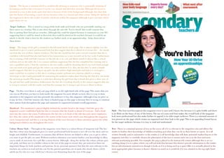
  • 1. Layout – The layout is minimal which is aesthetically pleasing to someone who is potentially thinking of becoming a teacher; this is because it can be very chaotic and therefore stressful. Although the layout is minimal in a way it also looks quite bare this is because of the white background although, this does link into the theme of becoming a nurse/doctor because white is a clinical and clean colour. Along the skyline of the magazine it shows the reader of articles which are within the magazine although it goes not state which pages these are on. Target Audience – This is aimed at young adults both male and female who are potentially starting out their career as a teacher.This is also show through the sub title ‘You’re hired!’ this could connote that they’re getting their first job as a teacher. Although this could be argued because it comments on year 10’s suggesting that it could be aimed at them but also could be aimed at the teachers because it could be an article to decide what is best for the student e.g. further study or an apprenticeship - helps them advise them better. Image – The image of the girl is situated in the left hand thirds of the page. She is placed slightly over the masthead to give it a more professional look but also suggest that she is ahead of everyone else – she stands out from the rest of them (trainee teachers).The fact the model has her arms crossed connotes that she is confident with herself but also laid back in her mannerism, so is not stressed out by her work. Furthermore, she is wearing a half and half costume; on the left she is in a tie and blazer which is almost like a school uniform and on the right she is in a nurses uniform suggesting that she has completed her training and is now a qualified nurse. I feel the contrast in the two outfits could be denoting that if you work hard enough you can reach your goals and get the career you want whatever it is. Also, the fact they’ve used a female model suggests that they’re trying to say girls can also achieve high rated jobs and that it is no longer a mans world but in contrast to this she is wearing a nurses uniform not a doctors which is a strong stereotype so this could potentially be restraining the audience rather than showing the that they can break the stereotype mould.This image is a mid-shot showing the girl from hip to head; this gives a clear view of the girl and her outfit intention; furthermore, the fact she is looking directly at the camera suggests that she is trying to connect with the reader and that the message she is trying to get across is direct to them. Pugs – On this cover there is only one pug which is on the right hand side of the page.This states that you can win an iPod but you have to look inside the magazine for more details on how; this is a way to draw attention to the magazine and also persuade the audience to buy this magazine (although it has no price so it may be free). I feel the reasons why there is limited pugs on this page is because they’re trying to continue their mature look throughout the page and maintain its organised minimal overall appearance. Masthead - The masthead is placed slightly behind the models head in the image. I feel this gives the magazine a more established look but also it connotes that the female is ahead of everyone - had a head start into the career she wants. Furthermore, the fact she is in front of the title also puts more emphasise her. Also, the colour of the masthead is the starter of the house style which runs throughout the magazine cover (turquoise/teal) and this is a strong element of the cover because it draws attention against the white background which is ran throughout the cover. Colour (House Style) - Throughout the magazine cover there is a colour theme of turquoise/teal.The fact that this colour runs throughout gives it a more professional look because it isn't all over the show and too bright and childish. Furthermore, it connotes that all these factors are linked to allow you to get to where you want or get the job you want.Without teachers/education you cannot further your knowledge to allow you to study at university for a job like a nurse/doctor. Although, along the skyline the colour scheme goes red, pink, red these are in a bolder colour to the rest of the page to ensure they get noticed as there are important things for both teachers and parents. In my personal opinion I feel that the ones relevant to the teachers are written in read and the one for the parents/guardians are in pink; this clearly shows which article are for who in a way which isn't obvious nor distracting from the rest of the page. Style - The font used throughout this magazine cover is sans serif, I know this because it is quite boldly and there is no flicks on the bases of any of the letters.The use of a sans serif font makes the overall look of the magazine look more professional but also make further its appeal to its older target audience.There is a minimal amount of text present on the page which creates an organised and clear look to the page.This is an appealing format/layout for the target audience because it is easy to read and understand. Text - There is a minimal amount of text on the cover; all of it is relevant to the magazines aim and allows the reader to further their knowledge of children/teaching and what they can do in their future or career. It is all written formally and its informative to the reader; it is all knowledge that will draw potential readers/buyers to the magazine and they’ve carefully chosen the placement of the text to ensure each one is in the best and most relevant positioning possible. For example, the pug is placed in the bottom left corner, although this is an eye catching thing it is in a place where you will not look first because this doesn't provide information to the reader but an advertisement instead even though it looks as if it is being used as a space filler it is actually placed in the most appropriate place because it doesn't distract as much as it would do if it was situated in the top right hand corner.
  • 2. Layout - On the top right hand corner there is a list of things within the magazine (mini contents page).This is discreet but also informative in a formal way.This allows the audience to have an insight to the magazines contents and articles and decided whether or not it will interest them and help them to make the decision if they'd like to purchase it. Banner states about Shakespeare and tutoring; things mostly associated with private schools. Upper class audience to the magazine.The layout it quite basic in the fact it isn't cluttered but it could be thought that the top is quite bare because it is mostly white so looks a little plain to the eye even though this is used as a way to draw attention to the magazine and masthead. Image - The image shows a young girl who it attending lower school, the outfit/costume she is wearing looks very formal and denotes that she is privately educated.This further appeals to the upperclass audience because it will be their children who are attending these private (paid for) schools.The main image/ focus is on the left hand third of the page although the photograph cover the whole central third of the page.The reason why the main focus is situated to the left third is because this is the part that is in focus and the girl who is facing towards the camera.The image which is blurred out on the right hand side is of the back of the girls head, and it is made to look like an over the shoulder shot, I feel this is a nice touch to the magazine because it simulates a more natural image rather than a posed and forced photo; it shows the two young school girls naturally without any interferences from the commercial world around them. Buzz - Competition gives the magazine more of a attraction to the audience because they will want to win the ‘luxury family holiday’.This is well promoted because it is aimed at the parents for their children (very close family) so they will want to go on family holidays; furthermore, the fact that it is luxury and aimed at the upper class they will have the money to afford holidays but also want a luxury one so the would be appealing to them. The buzz/competition advertised on the cover is not distracting from the main magazine itself this is because it is located in the bottom left hand corner this is not a place you tend to look to first. Although,The text is written a little bigger than the text on the right hand side which is education related this denotes that they're trying to appeal to the audience through advertisement and competitions. Masthead - The fact that the masthead was a white background behind it makes it more eye catching to the audience because it make the masthead itself stand out more. Green Masthead links to the subtitles lower on the page. Because the colours link together it gives it a more professional finish. ‘Parent’ is written bigger than the main masthead ‘independent school’ I feel this is to denote to the audience that this magazine is specifically for them and it is worth them getting because it will help them benefit their child/children’s future for the better as they will receive the most informative and helpful information from this magazine because it is aimed wholly at them - the parents. Style - The font used throughout the magazine cover is sans serif this is because there is no flicks to the bases of the letters.This gives it a more formal look and further targets the audience of around 25-35 (parents). Because of its more formal look it clearly shows that this is not for the children to read it is for the adults.The font sticks to the colours mint green, black and white because there is a continuous colour theme throughout the fonts it links the whole page together and gives it a more professional look to the people reading it this is because its all linked together in an easy to ready format. For example, mint green in titles and subtitles, black is for who the magazine is aimed at and also further comments from reviewers and other readers and finally, white is captions on photos and further information under the title and sub titles (mint green). Colour (House Style) - The main colour and house style running through the cover page of this school magazine is mint green, black and white.These colour all contrast well against one another without clashing so it makes it aesthetically pleasing to the reader.This constant connection between article makes the layout more understandable and easier to follow because it is laid out in such a way that it is easy to follow without looking childish. on the page it is mostly laid out in blocks (squares and rectangles) this rigid format gives it symbolises a structured upbringing for their child if they follow the steps to help them achieve the best education and future. Text - On this magazine there is a varied amount of text, it is mostly focused on informing the reader of ways to prepare their child for further education and give them the best opportunities they can.The main image is not distracted from by the text because it is placed in the negative part of the image.The layout of the text has been placed in appropriate places to not distract from the main focus of the magazine and this careful layout has created an organised format to show the structure more clearly which gives it a more formal effect to appeal to the adult audience. Target Audience - Aimed at parents around 2535 years old— showing them how they can benefit their child's/children's future and education. ‘Helping you make the right choices for your child’ is written under the masthead as a cover line it is subtle yet informative to the parents. I can also tell its aimed at the parents of the students because the image shows a lower school girl and the main image of the magazine cover situated on the left hand third.
  • 3. Target Audience - The target audience for this magazine is aimed mostly at teenagers (Secondary school students).This is also shown through the style font used - sans serif which is less formal. I feel this magazine clearly shows its target audience through the use of an image of a teen girl in her school uniform furthermore, she is in an outdoor location smiling this could symbolise that she is either leaving or arriving at her school and that she is happy to be there because of the smile. Image - The school student is positioned in the right hand third of the page in her school uniform.The fact that she has her top button undone and and tie quite loosely around her neck suggests that she is a typical teenage girl at school who's rebellious acts involve wearing her uniform incorrectly.The lighting on the image is quiet soft and natural; this stops her from looking commercial or the shot looking unrealistic.The natural makeup worn by the school girl and her hair just down symbolises your typical young adult/teenager because she has not become commercialised or materialistic. Furthermore, the camera angle is eye level and it it also a close up; the girl is directly looking into the camera this could connote the she is determined to achieve the goals she wants (grades/job) but it also gives it a more personal and friendly feel to the reader because its made to look as if she is talking to them personally and sharing the things she has learnt through her experience of school so far.This personal touch makes it more suitable for the reader (teenagers and young adults - in secondary school) because it is less formal but it is still professional in its format. Style - The font used is sans serif although the typography for the title is less formal as it almost looks hand written (like a students writing).The use of a simple and easy to read font used throughout the cover gives the magazine a formal yet easy approach which is best suited to its target audience.The majority of the writing is situated on the left hand side of the magazine which shows some sort of organisation and structure without being to formal; Also the use of colour behind the text gives it a more fun look suitable for the age range because it makes the magazine less formal and therefore more easier to identify that its for the students themselves rather than the parents. Layout - The layout of the magazine is formal yet personal.This is suitable to the target audience because although they’re maturing in life they still are young and fun so they still enjoy a bit of fluidity to their lives rather than structure and this is reflected in the magazine covers layout. Many of the subtitles are places within a transparent coloured box; this creates organisation in the page but also separation between the articles. When displaying on a shelf the left hand side of the magazine is what is shown.This is why the title and main information is presented on this side, in order to attract the audiences attention.The main image is located in the right third of the front cover this is because it is less important to catch attention of the reader as its not part of the main magazine. Buzz - Although there is not really a buzz or pug present on the page there is a banner located in the top right hand corner of the page highlighting an article within the magazine. Because it is in a mint green transparent banner it doesn't distract the viewer from the image or the main articles listed on the left hand side.This banner advertises a free ‘healthy cooking guide’ this draws attention to the magazine because it offers a extra which is free this is appealing to a younger audience. I feel that there aren't many pugs, buzz’s or banners because they do not want to distract from the main focuses which is the articles advertised on the cover. Text - The text which is located within the coloured boxes are mostly aimed at the parents of the secondary school student this is because the article are more relevant to them than the students themselves.The only coloured text on the page is on the bottom third of the page written in yellow stating ‘our guide to coping with teenage stress’ although only teenage stress is written in yellow and it is also large in size. I feel the reason that teenage stress has been emphasise because this tends to be a main issue with teenagers. On the other hand, it does not state which stress they're helping the teenagers cope with or which page this article is located on; I feel that because the title is left quite open it leaves the reader with uncertainty as they're unsure if this article (which is the main one shown through the text used) will benefit them personally.The fact that the font throughout the page is the same gives the magazine stability and a house style gives it a more professional look without overwhelming the young reader. Masthead - The placing of which issue this magazine is, the schools website and the price of the magazine is located just under the masthead, this is a prime location to place these details as the are clear for the viewer to see and locate but the size of the font does not distract from the masthead or the rest of banners.The mast head on this magazine is written in sans serif. Also, it does not have a capital letter therefore making the magazine impersonal and more suitable to the teenage/student audience they are trying to reach. Color (House Style) - Although it looks as if there is no real house style throughout the magazine cover there is a common theme of white text.This colour could be thought as a symbol of purity and clarity because white is a neutral colour. Other than that there is no house style throughout the cover but I think this subtle link between the texts symbolises how all these school orientated things are linked.
  • 4. Target Audience - The target audience for this magazine is aimed at upper school students (Sixth Formers/College Students) aged around 16-18 years. I personally would say this is aimed slightly more at males than females because it states about an article to do with the nominations for head boy whereas it could have been for both head boy and girl to show equality between genders in a competitive environment e.g. University and jobs. Image - The image is positioned in the central third of the page but also towards the left a little, so it doesn't take away the attention from the writing and the photograph stands out. It is a mid shot of the boy showing him from hip to head. This long show of the boy gives a clear view of the boy and his uniform. He is wearing it in a casual way - top button undone and tie loosely around his neck.This symbolises that he is a typical male student of his age who likes to rebel against the rules set by those above him. He model is making direct eye contact with the camera at eye level so it is made to look like he is talking directly to the reader and sharing his school experience and tips with the reader. Furthermore, the fact that the model is only slightly smiling symbolises that it is friendly yet formal. Style - The font is written in a block Sans Serif font; this gives the magazine more of an appeal to a male audience as it is more masculine in style whereas Serif fonts with flicks etc are more girly therefore more appealing to the female audience.The font used on the masthead is easy to read to the audience which is good as it clearly states what brand/ title the magazine is.; along with the majority of the typography on the page it is in white which stands out well against the background. Although some of the sub titles are written in blue which doesn't stand out against the negative space of the image on the page this is a bad design fault because it is immediately clear to the reader what the article is about without them looking closely and careful against the background. Furthermore, there seems to be little house style throughout the magazine which does not create a consistent and professional look to this school magazine. Layout - The layout of this magazine is quite spacious (minimal) I feel this works well with the magazine because otherwise it may look too busy to the eye and then rather unappealing to its audience.The main focus on the image in positioned centrally on the page although the model is turned with his back towards the left hand third of the page; the fact that he is twisted slightly gives his stance a more casual look this makes the magazine less formal and more personal which is appealing for the young audience (teenagers/school students). Furthermore, the fact that he looks casual in his position may connote that he is relaxed in his school environment and not stressed out by work load/ exams this may also be appealing to the audience as they may be interested to learn what he does to keep so calm and relaxed throughout his school experience, Pug/Banner - There is a pug/banner located on the top left hand side on the magazine.This states ‘Free Handout Insert’ although part of the text is cut off making the word ‘insert’ almost unreadable. I personally feel the banner is on poor quality because the positioning on the typography does not allow the reader to easily read the message they're trying to get across but instead have to guess/interpret the information given. Also, I feel that the use of the green text against the blue banner also contributes to the difficulty of reading so a different colour font would benefit the appearance here. On the other hand this banner is eye catching to the audience offering the opportunity to get a free magazine which is appealing as it is something extra for them to gain from. Text - The text which is located on the right hand third of the magazine lists a few of the articles which will be within the magazine. I would say the most eye catching thing would be ‘HeadBoy’ as it is in the biggest font and therefore the most drawing to the eye.The majority of the writing is in blue or white but the information under ‘HeadBoy’ is in green I feel this has been done to state the importance of this to the magazine and maybe connote that this is the main article within the magazine; but, I feel that the green is hard to read against the background of the image. If the designer had chosen to include the text in boxes it would make it easier for the reader to reader but overall it would give it a more professional and organised look through the front cover. Masthead - The masthead on the magazine cover is unusual in the fact that the inside of the ‘o’ and the dot on the ‘i’ has been coloured a different colour.The dot on the ‘i’ links in with the green on the writing underneath ‘HeadBoy’ so this is a link between the title and that article but the red in the ‘o’ doesn't link to the page anywhere. I feel this is a bad design fault as if makes the page look less professional and more like amateur production. Colour (House Style) - Throughout this magazine there is little house style making it look unprofessional and inconsistent. Although, there is a lot of white text throughout which is a house style through the typography I feel there are no clear links between any of the elements of the magazine. I feel a more organised approach would be more suitable to the target audience they're try the reach as students like to be organised and able to get information easily.