
Recommended
More Related Content
What's hot
What's hot (17)
Viewers also liked
Viewers also liked (20)
Similar to Powerpoint 1st skl mag
Similar to Powerpoint 1st skl mag (20)
More from 08BMolla
More from 08BMolla (20)
Recently uploaded
Recently uploaded (20)
Powerpoint 1st skl mag
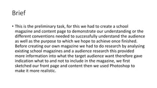
- 1. Brief • This is the preliminary task, for this we had to create a school magazine and content page to demonstrate our understanding or the different conventions needed to successfully understand the audience as well as the purpose to which we hope to achieve once finished. Before creating our own magazine we had to do research by analysing existing school magazines and a audience research this provided more information into what the target audience want therefore gave indication what to and not to include in the magazine, we first sketched our front page and content then we used Photoshop to make it more realistic.
- 2. Masthead is ‘break’ as it appeals to the target audience because most students seek and need this due to all the expectations and stress they encounter at school, as a consequence of this the masthead has to be short and simple so that its not to complicated for them. These are all secondary stories The issue number is needed so that it shows its current which this target audience like and tend to be This is the sell line, the word ‘new’ links in with being current which appeals to the target audience but also it gives this magazine exclusiveness therefore more copies will be taken These words are direct to the target audience as during high school these will be emotions felt through out either about exams or even problems such as friendships therefore getting problems answered is something they are likely to have great interest in Success is personified and exaggerated by roaring, this is trying to emphasis how well the students have done academically which they all will want to know . Its also uses the listening sense Puff/splash: ‘1st issue FREE!’ is incongruous wit the rest of the information on the school magazine, this is why it is in a bold colour such as yellow and in a shape of a circle so that it stands out as its giving information on purchasing it This is in bold and has a exclamation mark because its emphasizing the availability of this magazine therefore more people are more likely to have this The price is small so people are not put of by it straight away however those who liked the first free one may then want to actually purchase It. Also it makes people aware of the actual price therefore knowing its price ‘£1’ people may be more interested to pick up the free one The website is given so that the audience can find out main Stories before considering to buy its also useful because the target audience for this magazine will have an interest in the internet ‘ice factor’ is used instead of ‘x factor’, x factor is a show that shares a target audience with this magazine. A story included in the magazine is to do with auditions which is similar process that occurs in the x factor this is done so that the audience are interested in this as much as they are to the x factor so that they repurchase to find out what happens next. ‘scoop’ clearly suggest that the target audience is 11-16 year olds, students who go high school. Its informal therefore appealing to this target audience more This is a rhetorical question, its direct to the reader which may make them more curious to read on This uses rhyme ‘cool’ and ‘school’ which makes it unforgettable it is also a phrase that many students may think of themselves to be this is further suggested by the image of students wearing clothes that do not conform to uniform as well as behaving inappropriate for school. The key image is a medium close up shot is used so that the audience automatically are aware that this is a student that wants changes with the uniform ,the purple dot on the collar matches the colour scheme that is followed through out the text in the magazine The bar code is bottom right so that it does not ruin the coherent structure of colour and positioning of all the above and also it shows that it needs purchasing for those people who fail to see the small print of the cost
- 3. ‘CHS’ is an abbreviation for chosen this appeals to the target audience of 11-16 year olds as they tend to abbreviate their language also, however the typography is small and it fades into the background making it in contrast less appealing to this audience. Secondary stories Masthead is CHS magazine, more emphases is put into ‘magazine’ through the typography and the yellow colour the reason may be for it be more obvious as to what it is as well as its easier and memorable to refer to instead of CHS Issue number is necessary as it shows its new and current magazine which the audience will like to be aware of Turner can be a student that will explain her plans for future this appeals to this target audience as they are likely to be same age as her therefore they are all at the stage where they are deciding what they want to do in the future as well so will be interested to read about someone else's. its in speech marks which indicates its come straight out of the story the exclamation mark makes it more interesting and exciting to want to find out what it is This is the Sell line as it does not have a pink background which makes it different to the other but also the ones that are in pink ‘new to school?’ and ‘turners: ‘’my big plans!’’ both link to gcse’s for example pupils main aim when entering any school is to achieve high in end exams also turners big plans would not be possible if does not achieve the grades she needs. Puff/splash- its in a trapezium shape and shaded in a hot pink colour so that it stands out as its emphasizing the ‘FREE 10 PAGE” which is also in bold which signifies that its something new to this magazine The price is in small print so people are not automatically put of but instead first read the stories A website is important as it makes it possible to read upcoming stories but mainly it appeals to the target audience as they tend to use the internet more Key image is a _____ shows a student That is happy and on way home we can tell this by the background Being a street view Rhetorical question directly asking the audience specifically those who are new, this is more likely to appeal to them therefore making them want to read on Typography and colour is similar to the masthead which signifies its importance. The mayor of Cheltenham having a say on this school makes this magazine more exclusive and prestige this is also supported by the school being ‘different’ to others, this appeals to the targeted audience as 11-16 year olds don’t like being the same especially with others their own age group. However the mayor is not some one that is likely to appeal to the target audience.
- 4. AUDIENCE RESEARCH 1) How much would you pay for a school magazine? £_____ / _______p 2) How often would you like a school magazine published? _________ weeks / ________ days 3) What information would you like to find out about in a school magazine? _________________________________ 4) How often do you purchase a school magazine? (tick one option) Every week Every month Every year Never 5) Do you read the school magazine? (Tick one option) Yes No 6) Should the school magazine also be linked to social media/internet? Yes No 7) What would encourage you to buy the school magazine? _________________________________________
- 5. AS Media Studies Preliminary Task – School Magazine Front Page Proposal Form Target audience: (age range, interests) Although it is a school newsletter you still have to think about your audience and how to appeal to them. 11-16 year olds. as it’s a school magazine they will have interest what is going on with the school; any problems that they encounter magazine can offer solutions. They are likely to have interest in exams certain subject information on. Has to appeal to both genders- include male activities eg sports then female eg dance,music. Should include a gossip page applying a chapter for each year Incorporate the houses!! Colour code sections specific to them, where to go receive help Possible title ideas: (masthead / title block) What is your magazine going to be called? merit magazine dot on I to be blue I want colours on it to represent houses colours ( earth,(green), air(silver),water(blue),fire(red) Main image: What will be the focal point of your front page, remember, your work “must include a photograph of a student in a medium close-up” medium close up from bellow= connotations are important asset to school, looking up= no limits on what can achieve want sky in background = sky is limit not looking towards reader shows they rather look forward then back Main cover line: What will be the main story? alevel results slogan ‘’ how can YOU improve?’’ High school students houses Additional key images: What other images will be on your front cover? Remember, it is a school magazine. school logo Additional cover lines: Other features, stories or selling points which will be inside the magazine, these need to be audience appropriate. topic- science …… sports-football tournament drama- theatre – week sport results,. education drive Talk- highschool: gossip for each house, alevel: barnet NEW study room… chairty awerness – 10 tips to avoid stress. Tips to revise/how to achieve best results / most merits! New,. Merits achieved and Awards won this week message from lantos and barnet! Newa/events Typography: (style, size, colour of copy) Think about the writing and the style of the writing on your front page. Background colour/image: What will be in the background, remember you don’t want to take the focus away from the main image. Or medium close up from above looking up= having high aspirations only looking forward sky in background direct contact with audience shows confidence, fearless able to achieve what set mind to font to be sophisticated , uniform and school is presented this way to smart looking (courier Merit new) Merit (skia) Merit (papyrus) background may be blurry of a place with similar colours used in rest or sky above might need to put colour sugar papers in background to take pictures equip will need camera costume will ne normal clothing if Technical considerations: possible to get them to wear colour similar to one in background… (equipment, setting, props, costume, lighting) Be realistic and creative, think about what you have access to and how you could use it.
- 6. Front page Rough Drafts Content page
- 8. What did you do to the image? How did you change it? To this image I added a masthead I choose to call this magazine ‘merit’ reasons for this is that the school its targeting uses a system where the children are rewarded for any positives by a merit, this then gives the magazine associations with being positive and a reward for those who read it. The colours I used for the text on the magazine are the same as the house coulors the school also uses this represents the magazine to have a connections and information relating to all the different year groups. The different colours also make the text stand out and eye catching as well as it will appeal to the target audience being teenagers. The main cover lines appeal to both the high school and the 6 form, its stories that all in education will want to know more about making it more mainstream for all. The main image I used is a current student, the image is a medium close up shoot the focal point is his facial expressions for example the no eye contact represents the student only looking forward the background being a sky shining over him is as if there is no limits to what you can achieve. The offer is there to attract more students so they have an idea what it includes free of charge to then make them want to repurchase, furthermore the website was used to appeal to the target audience as they are more likely to have an interest with the internet as well as it gives them other options instead of waiting for next copy. The ‘new’ is used to make the readers feel they are up to date in comparison to those who do not purchase this is used to encourage more to ne interested in the magazine.
- 9. Why pick this font I picked this font as it is sophisticated which the target audience will appreciate however it also has rough edges this represents the target audience as some of them in different areas to do with education will also be rough in, furthermore it also shows that they can change personalities to being very formal and slick to informal and scruffy Magazine
- 10. What did you do to this image? How did you change it? To the content page I added the same masthead as the front page this makes them coherent as well as it putting emphasis on the magazines name, the colours used for the masthead is further used for the main headings this reinforces the different house importance throughout the magazine. The main cover stories will appeal to the different variety of students for example events more for boys where as talk more for girls. The image___ is of students similar age of those in the school hugging each other this has connotations of team work or even friendship.
- 11. What did you learn? • I learnt how to become familiar with Photoshop again and also recapped the conventions needed for a magazine and context page, as well as doing analyses made me more aware of the different conventions you can use to make the magazine more succesfull.