
Recommended
More Related Content
What's hot
What's hot (17)
Similar to Journey Photoshop Experiments
Similar to Journey Photoshop Experiments (20)
More from TillyBrown1
More from TillyBrown1 (20)
Recently uploaded
Recently uploaded (20)
Journey Photoshop Experiments
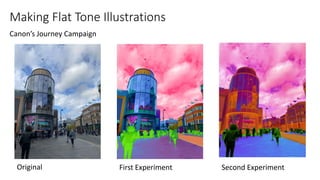
- 1. Making Flat Tone Illustrations Canon’s Journey Campaign Original First Experiment Second Experiment
- 2. Original First Experiment Second Experiment I took this first image in Newcastle as part of my journey after leaving the metro station. When editing these images I had only three different layers, one for the sky, one for the building in the background and one for the metro sign. I wanted the metro sign to stand out the most and since the sky was very clear that day, I could only really edit its colour as there was a lack of detail. Overall I like the colour contrasts of both edits however I think in the second edit the colours are slightly too similar. I would also edit more of the background and maybe change the colour of the windows of the building behind,
- 3. Original First Experiment Second Experiment
- 4. How to create a Flat Tone Illustration I first selected one of the three lasso tools available. I . use the magnetic lasso tool as I find it the quickest and easiest out of all of the options as it automatically detects the area that you’re selecting as you drag your mouse along the outline of the landscape/object that you are selecting. I also tend to use the polygonal lasso tool with the shift (+) or alt (-) key to add or subtract certain areas of the image, if the magnetic tool has not captured it correctly. Once I have selected the desired area of my image, a dotted line will surround it and I can see whether all of the area has been selected and if it needs adjusting. Next I selected the colour box on the bottom of the left hand side of the screen and chose a colour to fill my selected area (preferably a colour that contrasts the other parts of the image).
- 5. Next I selected the “Edit” button at the top of the page and scrolled down and pressed the “Fill” button, which made the selected area filled with the colour that I had chosen. Following the fill of my selected area, I used the blending tool to blend my selected area of the image with the colour in different ways and I selected the blending effect that I thought suited the rest of the image best and created the bend colourful contrast. Repeat these steps with other layers and parts of the image.
- 6. Final Photoshop Experiments For my final pieces of work, I edited the Canon logo and a small phrase (relating to the journey theme) onto my work. I picked a specific font for the phrase and edited the logo so that the logo could be readable however looked as if it was peaking out from behind the buildings.