
Recommended
More Related Content
What's hot
What's hot (18)
Similar to Canon Final Pieces and Evaluation
Similar to Canon Final Pieces and Evaluation (20)
More from TillyBrown1
More from TillyBrown1 (20)
Recently uploaded
Recently uploaded (20)
Canon Final Pieces and Evaluation
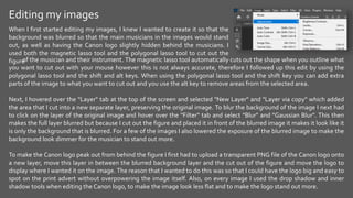
- 1. Editing my images of the musician and their instrument. The magnetic lasso tool automatically cuts out the shape when you outline what you want to cut out with your mouse however this is not always accurate, therefore I followed up this edit by using the polygonal lasso tool and the shift and alt keys. When using the polygonal lasso tool and the shift key you can add extra parts of the image to what you want to cut out and you use the alt key to remove areas from the selected area. Next, I hovered over the "Layer" tab at the top of the screen and selected "New Layer" and "Layer via copy" which added the area that I cut into a new separate layer, preserving the original image. To blur the background of the image I next had to click on the layer of the original image and hover over the "Filter" tab and select "Blur" and "Gaussian Blur". This then makes the full layer blurred but because I cut out the figure and placed it in front of the blurred image it makes it look like it is only the background that is blurred. For a few of the images I also lowered the exposure of the blurred image to make the background look dimmer for the musician to stand out more. To make the Canon logo peak out from behind the figure I first had to upload a transparent PNG file of the Canon logo onto a new layer, move this layer in between the blurred background layer and the cut out of the figure and move the logo to display where I wanted it on the image. The reason that I wanted to do this was so that I could have the logo big and easy to spot on the print advert without overpowering the image itself. Also, on every image I used the drop shadow and inner shadow tools when editing the Canon logo, to make the image look less flat and to make the logo stand out more. When I first started editing my images, I knew I wanted to create it so that the background was blurred so that the main musicians in the images would stand out, as well as having the Canon logo slightly hidden behind the musicians. I used both the magnetic lasso tool and the polygonal lasso tool to cut out the figure
- 2. A problem that I ran into when editing my images (specifically when making the Canon logo peak out from behind the figure) was editing their hair. I first edited the main figure in the images like I previously described by using the magnetic and polygonal lasso tools however because hair is so fine the lasso tools were not the best To fix this issue I used the colour range tool where I had to click on the hair, so the computer knew what colour was being detected and needed to be separated. This editing feature was still not exact and therefore I corrected it more, getting rid of the unwanted selected areas by using the alt key and the polygonal lasso tool. Once I was finished using the colour range selection tool, I copied the selected area added it onto a new layer, separating it from the original image before merging my newest layer down onto the main layer cut out of the figure. tools to use when editing the hair, I originally tried this method but found that it made the hair look chunky and unnatural and didn't blend in on top of the Canon logo.
- 3. For this image I found it difficult when editing the quote used on the image, this way due to the busy background of the image although I thought blurring the background would improve this it was still quite difficult to read the quote on the image. Because of this I tried experimenting with different effects on photoshop for example changing the fonts, changing the colour of the text from white to grey and adding shadows to the text. First, to try and make the text stand out more, I changed the colour of the text. The colour was originally white, next I changed it to a darker grey but overall decided that the light grey was the best option. I experimented with several different fonts and saved each of my favourites to choose from for my final piece, which is shown in the next slide. I next experimented with shadows on my text using the drop shadow and the inner shadow tool. After trying each and seeing what they looked at together I decided to just use the drop shadow effect on the text which did help make it easier to read and make it stand out more, without overpowering the image or the logo.
- 4. Experiments with fonts I experimented with several different fonts for my quotes to see which worked best with the image, making sure that the quote was visible and readable as well as making sure that the logo and the image itself still stood out. These are some of the fonts that I experimented with hut decided not to use for my main piece.
- 5. Like my other images I wanted the Canon logo to be peeking out from behind something yet still visible in my print adverts, however with this image it was slightly difficult because the figure was placed in the centre of the image, therefore for the Canon logo to be fully visible it would have to be placed of either side of the figure. As well as experimenting with the placement of the Canon logo, like my past slide I also experimented with different fonts for my slogan.
- 6. More examples of experimenting with different fonts and placements:
- 7. More examples of experimenting with different fonts and placements:
- 10. Final pieces:
- 11. Evaluation of final pieces: As I had limited experience with photoshop before using it for the Journey Campaign, I feel like I have gained quite a bit of knowledge into how photoshop works, however my skills could still improve, and I still have quite a lot to learn. I plan to learn more about photoshop to help me with my future projects however I am still pleased with how my final pieces turned out. What I would change about my work is that when taking my images, I would try to take photographs with a plainer background, this would make it easier to edit while also making the image look neater and have more focus about the print advertisement. Another aspect of my work that I would improve is the quotes as I would want to make them more visible, although I already tried to improve this, I feel like I could have been more successful when doing so, possibly by making the text bigger on certain print adverts or by changing the colour on others.