
Recommended
More Related Content
What's hot
What's hot (19)
Viewers also liked
Viewers also liked (20)
Similar to Preliminary task progression and planning & research
Similar to Preliminary task progression and planning & research (20)
More from AMV-Westbrook
More from AMV-Westbrook (19)
Recently uploaded
Recently uploaded (20)
Preliminary task progression and planning & research
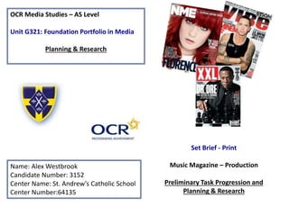
- 1. OCR Media Studies – AS Level Unit G321: Foundation Portfolio in Media Planning & Research Name: Alex Westbrook Candidate Number: 3152 Center Name: St. Andrew’s Catholic School Center Number:64135 Set Brief - Print Music Magazine – Production Preliminary Task Progression and Planning & Research
- 2. Section 1) – Preliminary Task
- 3. Preliminary Task Progression– Evidence Front Cover Step-by-step
- 4. For the background of the magazine I used the gradient tool and selected the radial gradient. I then set the primary and secondary colours in the colour pallet to a dark blue and yellow (the school colour scheme). Once I had done all of this I dragged across the middle of the screen over the area in wished I wished the gradient to take effect.
- 5. For the banner at the top I selected the yellow school colour and used the rectangle tool . I then took the St. Andrews logo and sized it down and added blending options to give it a better look. To add the text option I used the type tool and selected the area in which I wanted to add text. I then selected the font ‘’ and the St.Andrews blue colour and typed out the school slogan onto the banner.
- 6. I then made a start on the barcode. To begin with I used the rectangle tool, changed the colour to white and then selected the area in which I wanted the barcode to exist. For added effect I added a number of blending options to make it smoother and more appealing. I then took to google and searched for an appropriate barcode for the magazine. After finding this barcode I opened it in Photoshop and resized it before inserting it into my front cover and placing in the center of the shape. With the barcode in place I added social media icons such as Facebook and Instagram and placed them directly above the barcode. To complete my barcode I added the issue number, price and date using the type tool.
- 7. The next step towards completing my magazine cover was the main image. In order to complete this step I first needed and image and so used a classmate and had them pose so that I could take a picture. Now that I had an image I had to remove the background before it could be inserted into my front cover. To remove the background I used a number of techniques. The first technique that I used was the quick selection tool, which I used to remove the majority of the background by selecting the area that I wished to keep and then inversed the selection and used the backspace key to remove the background. Although this removed the majority of the background, there was still a remainder of the background which needed to be removed. To do this I used the background eraser tool (which can be found within the eraser tool) and then set the limits to discontiguous and the sampling to once and turned on the protect foreground colour option. Once I had all of the correct options selected I brushed over the areas which I wanted to remove. To better the image I then added blending options including a drop shadow and yellow outer glow.
- 8. Upon adding and finalizing the main image I decided that I needed to add a puff promotion and so I took to google in order to find an adequate image. Once I had found the image that I wished to use I saved it and opened it into a new canvas and removed the white background using the quick selection tool. After removing the background coloured the image with the St. Andrews school blue and yellow colours. I then opened blending options and added a drop shadow and blue outer glow. Before moving the puff promotion onto the front cover it needed text to be added, so I selected the type tool and dragged it over the image I then selected my font and typed out the text. I then coloured the text yellow and added a stroke option. I then did the exact same for the text below it yet coloured it blue.
- 9. In this step I added both the masthead and the main headline. For the masthead I went online to dafont.com and found a font that I wanted to use. Normally I would download the font but this time I had to screenshot it as I wished to apply multiple colours. Once I had taken a screenshot of the font, I opened it on a new canvas and removed the white background using the magic wand tool and then used the bucket tool to colour the text yellow and blue. After doing this I decided to add some blending options. The blending options I added where stroke, drop shadow and bevel and emboss. For the masthead I used a font which I had already downloaded from dafont.com and used for my puff promotion. First I selected the type tool and then dragged it out across the area in which I wanted the text to go over and then selected the font and colour that I would be using and typed in the text. I then added a white stroke in the blending options.
- 10. Here I began adding my cover lines. As the story for my first cover line I chose the sixth form café and so took to Google to find the logo of the school catering company. Once I had found the image that I would be using I opened it in a new canvas so that I could remove the background using the magic wand tool. Then in order for the image to be more visible and stand out more I applied the stroke option ( Blending options). I then dragged the image over onto my front cover and positioned it. For the text below I selected the type tool and then dragged it out across the area in which I wanted the text to go over and then selected the font and colour that I would be using and typed in the text. I then added a black stroke in the blending options.
- 11. I then decided to promote the school YouTube channel and so began by finding both a subscribe button and the YouTube logo on Google. After finding the images that I wanted to use and opened them in a new canvas. I then removed the background using the magic wand tool and added a drop shadow (blending options) then dragged them into the front cover. For the text below I selected the type tool and then dragged it out across the area in which I wanted the text to go over and then selected the font and colour that I would be using and typed in the text. I then added a black stroke in the blending options.
- 12. For my next colour I chose to go with the subject of the attendance raffle. As the article was speculating as to what the prize was, I chose the Xbox-One S as the speculated prize and so found an image on Google of the Xbox-One S and opened it on a new canvas to remove the background using the magic wand tool then dragged it into the front cover. . For the text I selected the type tool and then dragged it out across the area in which I wanted the text to go over and then selected the font and colour that I would be using and typed in the text. I then added a black stroke in the blending options.
- 13. To finalize the front cover for my preliminary task magazine I added the address of the magazines website. I selected the type tool and then dragged it out across the area in which I wanted the text to go over and then selected the font and colour that I would be using and typed in the text. I then added a drop shadow in the blending options.
- 14. Preliminary Task Progression– Evidence Contents Page Step-by-step
- 15. To begin my contents page I first opened a new document the size of an A4 page and then added the background. For the background I used the gradient tool and selected the St. Andrews blue colour and then selected another lighter blue and dragged across the screen to fill the background. I then added in a yellow line using the shape tool by selecting the yellow colour that I wanted to use and dragging the shape out over the page. After this I needed the St. Andrews logo , which I found on the website, and placed it into the document. Once I had resized the logo using command t I added a number of blending options including stroke to add an effect.
- 16. To create an outline for the contents I decided to use yellow lines which I created using the shape tool. For these shapes I decided to use a very slightly lighter shade than the top rectangle. After placing the larger vertical shape I created a smaller one and simply duplicated it a number of times and dragged the shapes into position.
- 17. I decided that for the next step I would add in the school motto , ‘to live, to love and to learn in the light of Christ’ , to the top of the page right below where the title will go. To make the motto subtle I chose the colour to be a slightly lighter shade of blue and lowered the opacity.
- 18. The next step was to add in the title. To begin with I placed the ‘St.’ masthead that I have already used for the front cover. I then took to dafont to find the same font that was used for my masthead and took the ‘specials’ part of the title into Photoshop to create the blue and white colours with the bucket tool and then added blending options. After completing the title I duplicated it and turned it 90 degrees using transform and lined it up correctly.
- 19. After adding in the title I began working on the actual contents. The first thing in which I did was take a photo to place into the page and cropped it before placing it in. For the title of this story I used the one from my front cover by dragging it over. I then used the same font to add in a page number in the corner with the type tool. Once I had duplicated the story title from the front cover I added in cover lines explaining what the story contained.
- 20. The features were then to be added in below the main story. For the features title I copied the previous title and changed the text using the type tool. After adding in the features title I added in the page numbers using the same font but in all white. I then copied over the images for the features from the front cover and resized them using transform and placed them. I then changed the font to add in the text for the features which I placed below the images.
- 21. For the ‘other stories’ section I continued to use the same ‘bebas nue’ font that I had used throughout the page. To begin with I added in the title using the type tool. Then using the same font but changing the colours to all white I typed in the stories and then aligned them correctly.
- 22. The next step that I took was to add in the social media logos, magazine website and page number. I already had social media logos saved and so just placed them in, resized and rotated them using transform and then moved them into position. I then used the type tool to add in the website and page number.
- 23. This step was to add in the editorial. The first thing that I did was went out and had my picture taken. After taking the picture I added a vignette and feathered the edge (refine edge) to get the effect. With the picture ready I copied the ‘Other Stories’ title and used the type tool to change the text to ‘editorial’. For the text in the actual editorial I first added in the first letter using the type tool and made it large. I then added in another text box and used the pen tool to outline the drop capital and then pasted in the text that I had already typed up into a word document. Finally I added in the picture and then included my name, email and scanned in my signature.
- 24. For the final section at the bottom of the page I first placed in a screenshot of the front cover. I then went to the school website to find a picture of the front of the school and then another image with words associated with the school. For the image of the school I opened it separately in photo shop and used transform to crop it and make it the correct size. Finally I added in the last image and placed it over the top of the previous image and then lowered its opacity (blending options).
- 25. Section 2) – Log Book
- 26. R E S E A R C H NME, the last of the old-school inkies, suffered another fall in sales, narrowly avoiding a drop below the 15,000 mark for the first time in its history. The Time Inc UK title, launched as New Musical Express, had an average weekly print circulation of just 13,995 in the second half of last year, down 23% on the same period in 2013, according to Audit Bureau of Circulations figures published on Thursday. - theguardian 2015 Bauer Media's purchase of Planet Rock gives it a digital leg-up in its battle with rival Global Radio but may cast doubt on the future of one of its other rock brands, Kerrang!. - theguardian 2013 Of those music titles that declare ABC figures today, NME had the smallest average circulation in print and overall. However, the NME's digital edition recorded a rise in circulation of 16.1 per cent period on period to an average of 1,518 in the first half of 2014. - campaignlive.co.uk 2014 This table highlights that within UK magazine sales, the Hip-Hop genre falls into the other category, which controls 5% of sales. My research has proved that the demand for printed magazines has fallen and therefore NME magazine has suffered large falls in sales which is down by 23% from 2013.
- 27. Established Magazine for my Research Masthead The masthead denotes a white font in a red background which connotes passion, happiness, enthusiasm, and energy as red is a warm colour. Main headline The main headline denotes the quote ‘how to rebuild your life’ which appeals to the reader as they will most likely regard advice from a band such as Coldplay to be particularly useful and thus are more likely to purchase the magazine Cover lines The cover lines feature renowned artists such as ‘U2’ and ‘David Bowie’ which exploits Richard Dyers ‘Star Appeal’ Barcode/pric e The barcode displays the date of issue and price. Main picture ‘Star Appeal’ (Richard Dyer) -The main picture features the entire Coldplay band. The image covers the page therefore highlighting the status and success of the band. Puff promotion - The puff promotion states that the article included is ‘World Exclusive’ suggesting that it can only be seen in this magazine which gives people an incentive to purchase the magazine Strapline Although there does not appear to be a strapline on this particular magazine cover, on other Q magazine front covers you can see the strapline ‘Discover great music’ which connotes that by reading the magazine the reader will ‘discover great music’
- 28. The USP of Q magazine seems to be that not only is the magazine globally available yet it also features a number of different artists from around the globe which not only shows ‘star appeal’ by featuring universally recognized artists which also creates a worldwide fan base for the magazine. The audience of Q tends to be an older age of at least 25 (Hartley). I discovered this from a survey that I found a ‘Q Media Pack’ on the website for ‘Q’ magazine. The fact that the main audience are older or at least working adults means that they are able to charge a high price of £3.90. Due to its high price it could perhaps appeal to a higher class of audience. Although it includes a range of genres it would more so attract rock and roll fans. In accordance to Katz Uses and Gratifications theory that users may want to be ‘informed or educated’. This is evident in this Q magazine within the title ‘Coldplay, how to rebuild your life’ which would entice the reader into reading the magazine as Coldplay are a well known and successful band and therefore many people may be interested in their success , especially if they feel that they need to ‘rebuild their life’ . In particular fans of Coldplay would be interested in Coldplay’s take on success. Also due to the fact that Coldplay are a famous band it corresponds with Richard Dyer’s ‘’star appeal” , which would apply to fans of Coldplay as they would want to hear all about Coldplay and everything that they have to say. According to Maslow’s hierarchy of needs ‘social climbers’ will be enticed by the artists within the magazine.
- 29. The slogan ‘We think popular’ of Bauer media connotes that they are attempting to find and publish a magazine which is popular with a wide range of people which is most likely why the magazine features a large amount of celebrities of a variety of music genres in order to attract all types of audiences and ultimately become the most popular magazine. With regards to the price and availability, the magazine is available to the public by subscription online costing £24 a year for seven issues of the magazine. Almost 85% of the readers are male which shows that the magazine is highly popular with male readers.
- 30. Cover Line Includes Obama in the strapline which almost suggests that Obama has an interest in the magazine and so if someone as big as the president is involved with the magazine then it must be worth reading Main picture covers part of the masthead to highlight Eminem Masthead uses aggressive color red In order to ensure that the color stands out and is immediately noticeable to the reader Ident includes a list of featured names which would entice the reader as there are many well known celebrities Main Headline Features a banner which says ‘exclusive’ which shows that you cannot get this story anywhere else
- 31. Target Audience – Katz, Maslow, Hartley and/or socio-economic needs The target audience of VIBE appears to be ‘social climbers’ considering that the magazine cover features a number of well known celebrities and so they would read it simply because of these featured celebrities. The featured celebrities would also attract an audience of ‘survivors’ seeing as they feel the need to constantly update themselves on the latest celebrity news. VIBE magazine appeals to primarily males seeing as it mainly features male celebrities. The usual age for a VIBE reader would be between the age of 18 and 30 as it would perhaps not appeal to a younger audience because of the explicit content of the featured celebrities. With socio- economic needs I would say that the main audience would be C2 African Americans seeing as most of the artists are African American yet it is not exclusive seeing as there are artists from this genre which are not African American. What is the USP of this magazine? Judging by the front covers of VIBE magazine I would say that the main USP would be Richard Dyers ‘star appeal’ considering that the magazine consistently includes household names such as Eminem and Kendrick Lamar which would attract a large number of people to purchase the magazine as they may be fans of the featured celebrities.
- 32. Publisher research As of 2014 VIBE magazine became available exclusively online Although VIBES publisher SpinMedia des not have a slogan you could argue that their slogan is ‘redefining Hip Hop’ as this is what is said on their website. The fact that are redefining a genre suggest that their content is in some way different to other Hip Hop magazines suggesting that they show a unique kind of innovation that makes VIBE appeal to readers as they are able to view Hip Hop from a different and interesting perspective.