Creating a Cracked Screen DPS Effect in Photoshop
•Download as PPTX, PDF•
0 likes•184 views

This is a short powerpoint presentation that i have created to tell you about how i achieved my DPS.

Recommended
More Related Content
What's hot
What's hot (20)
Viewers also liked
Viewers also liked (17)
Similar to Creating a Cracked Screen DPS Effect in Photoshop
Similar to Creating a Cracked Screen DPS Effect in Photoshop (20)
More from Sophie Mcgrath
More from Sophie Mcgrath (20)
Creating a Cracked Screen DPS Effect in Photoshop
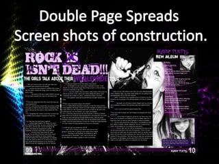
- 2. I started of my double page spread by using a cracked screen photo, and setting the effect to screen to make the cracked screen effect less vibrant. I made my DPS (Double page spread) effect on Photoshop. I made a cracked screen background to make the DPS look like it was cracking with the loudness of the music. You can achieve the cracked screen effect by placing an existing image of a cracked screen, placing it to your preferred size, and to the right of your screen you will see a drop down menu called layers, you then click screen and that will make your screen less vibrant. This will enable you to put textboxes, images mastheads ect over the top.
- 3. I then added my masthead. I created this masthead on Photoshop, I got the font of the internet and downloaded it to my Photoshop, I then added made a purple overlay and set the layer to overlay to give the text a two tone look. I used the star brush tool to create the purple cross over ‘is’. I then added textboxes , the textboxes all the same length to give the overall look a professional feel. I then started to add my interview text. I added the text by copy and pasting my interview from a word document. I made the first letter of the interview bigger and changed the colour to purple, as I have noticed in my background research that all the magazines have the beginning letter larger and usually in a different colour.
- 4. I have now added the rest of the interview as you can see here: At the bottom of the page I have added a skyline. To create my skyline I added a thick purple line, I then used the blur brush tool and blurred all around the edges to create a glowing effect. After I did that, I again went to the right hand side of the page and clicked the layers drop down menu and set that to overlay, I did this so the background cracked effect was visible over the skyline. The over all look so far in my opinion looks professional.
- 5. I have now added a headline, I again created this text on Photoshop. On the lower right hand side of the page I have added a purple textbox with a caption, the caption states what the upcoming image is. On the upper right hand side of the page I have added the bands logo (which I also created on photoshop), thee is a purple text box that I have made half transparent using the same effect as previously (using the layers dropdown menu and selecting the overlay effect), the text in the purple textbox and the fan’s thoughts on ‘MANIC PURPLE’s’ new album.
- 6. This is the finished DPS. I have now added the images, page numbers, the magazine title and the bands name next to the page number ’10’. To create the main image I edited the image on Photoshop using the pen tool, when using the pen tool you have to make a selection then delete what’s in the dotted line. I made the image black and white, by clicking the layers dropdown menu at the top of my screen this time and clicking on ‘convert to black and white, I then changed the contrast to make the black parts of the image a little darker. I did the same thing to my image in the lower right hand corner of my screen. As for the album cover in the upper right hand corner I used the same effect as the other two, but I used a few pictures and cut the eye out of one and the nose out of the other to make a album cover of two people’s features in one whole face, in this case it’s the two models pictures cut into one.