
Recommended
More Related Content
What's hot
What's hot (20)
Similar to Music Magazine Front Cover & Interview Layout
Similar to Music Magazine Front Cover & Interview Layout (20)
More from SLyne98
More from SLyne98 (20)
Recently uploaded
Recently uploaded (20)
Music Magazine Front Cover & Interview Layout
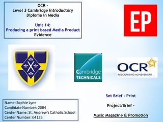
- 1. Set Brief - Print Project/Brief – Music Magazine & Promotion OCR – Level 3 Cambridge Introductory Diploma in Media Unit 14: Producing a print based Media Product Evidence
- 3. 1. Rough Sketches Slide 4 and 5 2. Final Sketches Slide 6 3. House Style Slide 7 4. Font Style Slide 8 5. Masthead ideas Slide 9 6. Images of Influence Slide 10 7. Mood Board Slide 11 8. Draft Articles Slide 12 and 13 9. Graphic Layout Slide 14 10. Photography Plan Slide 15 11. Test Photography Slide 16 12. Prop List Slide 17 13. Production Plan Slide 18 14. Resources Needed Slide 19 15. Conclusion Slide 20
- 4. Masthead As you can see the masthead will be in the top left of my magazine so it is clearly visible. Strapline The strapline is placed near the masthead so when you think of it, you’ll know which magazine is it from. Main Image The photo will be in the centre so that the front cover will look eye catching and not too text heavy. Cover Stories The cover stories will be down the side so that it doesn’t take the attention away from the image. Main Headline/ Anchorage Text These will be clear either at the top or in the middle so that you know straight away what/ who the main feature is about. Barcode The barcode will near the bottom so that it is visible to scan but it is as important for promoting the magazine.
- 5. Headline It will be at the top for the reader to know what the article is about. Stand First The stand first is near the headline so they can see the introductory about the story. Drop Capital Having a drop capital makes the page more appealing to see. At the bottom of every page, I would have the page number, the magazine logo and either the issue date or web address so it’s subconscious advertising and as for page number, it makes it easier for the reader to find a specific page. Photos I would have a variety of photos which may possibly link to what the article is about.
- 6. For my front cover, I would have the masthead at the top for clear visibility and my photo in the middle of the page so everyone knows who it being featured, the same reason for why my headline will be roughly in the middle. Also I’d have a quote so the customers can see a quote relevant to the article. Additionally, I’d use puff promotion and social media so that it could possibly lead to more consumers. For my cover stories they will be down the side of my page so people wouldn’t think it is part of the main article if it was near the middle for example. My double page spread will have the masthead so people will become more aware with the logo and that is why it's included at the bottom as well. Also I would have a stand verse and headline so people know which article they are about to read and an overview as well. I think having pictures on one side of the page would be appealing and make the pages more interesting rather than having a double page of text.
- 7. Masthead Anthem Demo Record Muse EP Music can be people’s inspirations or muse Extended Play- extending your knowledge about the music industry/ bands and artists Keeping up to date or a record of what’s happening in music As you can see, here are some ideas of what I was thinking about calling my magazine and that they are all music related and short so it wouldn’t be hard to remember. In the end I decided on EP.
- 8. Colour Scheme The colour scheme will be set with black, white and red. This is because black and white are standard in other magazines and then with the red, it’ll give that edge which a music magazine would need. Social Media EP would be in synergy with social media because then it will be able to become more well known and then it should lead to more readers and consumers, as well as publicity.
- 9. My magazine’s font will be in Myriad Pro because it is clear to read and that is what is important when having block texts of interviews/cover stories and reviews. For my masthead, I am using the font called Bebas Neue because it has that sort of style which would be on a magazine and because it is a straightforward design, it will be more recognisable and can be noticed quicker. Furthermore, the masthead will be at the top left on the front cover to be seen easier. Also the logo will be at the bottom of each page to make the masthead more notable.
- 10. When it came to thinking about my magazine, I looked at existing music magazines with the same/ similar genre so I could see how everything is presented. The magazines I looked at was Q and NME because they have that rock and alternative genre. Additionally, within these magazines as well as the genre it also has existing artists that I would include and the layout would be similar. For example having the masthead in the top left and having the cover stories to the side and also having a simple and not too complex look so that people will want to look at it and not find it too busy to look at.
- 11. For inspiration and ideas, I created a mood board which reflects the genre, mainly rock in this instance, and examples of artists who would be featured as well as any puff promotion ideas and colour schemes. Also it has the stereotypical type of people (white and an edgy look) and props are kind of included because in promotions, you can win an amp and guitar.
- 12. Hello Christina, How are you? Hello Sophie, I’m great. How are you? I’m good thanks. So, next month you’ll be starting your world tour, let’s talk about that. Yes! I’m very excited and cannot wait to get started. What are you looking forward to the most? Seeing my fans from across the world is always something to look forward to when I go on tour and it just makes the experience that more special because they are so supportive. Although, there are a lot of back stage antics as well so it’ll be fun. And what are you like on tour? Anything you need to have with you? I wouldn’t say I’m that bad…. As long as I get some sleep (Christina laughed). Erm… well it’s always nice to have something from home so like a blanket if I’m on the plane so there is some comfort when travelling. In your opinion what are the top 5 necessities when touring? Ooh I would definitely say a blanket, make-up, hairbrush, snacks and some really comfortable clothing. One thing that I love after finishing a show is to get into some comfy clothing and have a bit of time to relax. What do you miss the most when on tour? One of the hardest things to do is to not be around family and friends for so long, that’s what I miss the most. Also like many other singers, will you be bringing any other celebrities with you as guest appearances? I wouldn’t want to give any spoilers but there or may not be someone joining me.
- 13. When touring what is your favourite country where you like to visit? As much as I love my home country, I do love to visit places like New York. All my fans there are amazing; well all my fans are but there’s something about New Yorkers… I suppose it’s because they’re in the city that never sleeps. How hectic is it when touring? Do you have any spare time? It can be pretty hectic, especially when travelling from one country to the next so it can be hard to have some spare time and if I do it’s not always for long. If it’s been a while then I would try and find the chance to call home and my friends because when you’ve been touring for so long and get quite tired it helps when especially my friends motive me. I don’t think I’d be able to do it on my own! This will be your second tour, what will you change from your first? I definitely want to enjoy my time touring a lot more, simply because last year it was all work hard but every needs a break every now and then. We’re only human! Do you have any fears when going on tour? Last year I worried a lot more simply because it would be the first time I’d be away from home the longest but this year I’m not as worried. I guess the one thing I would hate doing is falling over on stage. Oh I’ve probably just jinxed myself now, I might as well say “Join me on tour to see me fall” (Christina laughed). Have you got any plans for when you finish? Go on holiday! (Christina jokes) Just to have some time to relax before I start working again. I think it would be a good time in my career to start making a new album so when touring finishes, make sure you start listening out for a new single! These questions and answers were used in my double page spread and it is all about my featured artist going on tour, who is the main focus on my front cover. Also I saw an interview in Q magazine which inspired me because the simple colours with a bit of red and then the photos match what the article is about.
- 14. On my front cover, certain conventions will stay where they are on every issue. For example, my masthead will always be in the top left corner so it is visible from a distance and my barcode, along with social media icons and additional information (price, issue date and website address) will generally stay at the bottom. As for my double page spread, the layout could be different every issue. Although my logo will usually stay at the top and at the bottom there will always be the issue date, page number, website and ‘EP’. After adapting my original layout designs, I recreated my graphic layouts. + Masthead Strapline Quote Headline Photo of Artist Cover Stories Barcode Masthead Headline Quote Photos Text Text Text Text Text Stand Verse Page Number/ Logo/ Issue Date Issue Date/ Logo/ Page Number
- 16. These images will be suitable for my front cover and double page spread for my magazine because they reflect the right look and have the right angle and shot. They can be taken in a room where there is enough space and this is fine because the background will be edited out. If any room, a bedroom is acceptable because then it will almost be like she is getting ready to go out, for example the top right image.
- 17. When taking photographs for my first issue, I didn’t really need any props. This is because I only needed a camera and for the model to have different outfits in able to have a variety of photos. The clothing used was the models own so the clothing wouldn’t have had an effect on cost. The camera used was expensive because it is a professional photography camera and you can buy it from Currys. To be able to use this camera, I was allowed to borrow it from the school so my photos will have a good quality to them. If I was to make more issues then I would possibly have props such as a guitar, an amp or microphone. http://www.currys.co.uk/gbuk/cameras/digital-cameras/dslr-cameras/nikon-d3200- dslr-camera-body-only-16617165-pdt.html#cat-0 Props Price Camera £229.00 Outfits £0
- 18. My magazine will be published at the beginning of May 2015 (May 4th) because that is when it is coming up to summer with a variety of festivals so other issues would have that content to cover. Regarding my magazine being printed, for the first year it will have 40 page magazines printed with a cost of £1.57 and then after that 72 page magazine at £1.35. Also to make sure they can be distributed, they need to be printed at around the 30th April to be able to get to stores on time. When it comes to distribution, I haven’t yet got a set fee.
- 19. As you can see in the tables, this is what I would need to set up my magazine. So as well as programmes such as Photoshop, I need an office, computers and staff. The salaries I have put is usually the starting salary so it would be more likely to change if they’ve been working there for a long period of time. Also it depends on what your job title is. For example if you're on the editorial team and you're a editor-in- chief, you’ll have a higher salary than £19,000.
- 20. To conclude, I have my final ideas on my magazine and some of the conventions which will be included and the layout of my first edition as well as my font and house style. In order to make my magazine I will need equipment such as Photoshop to make the pages and a camera in order to take the photos.
- 22. 1. Location Recce Slide 23 2. Hazards at the Work Place Slide 24 3. Ethical/ Legal Slide 25, 26 and 27 4. Conclusion Slide 28
- 24. The Health and Safety at Work Act (HSWA) has 13 different headings and 10 schedules. Some of these consist of general duties, commission, regulations and provisions. These general duties can be about a worker having to look after themselves and any one else who could be affected by their work. Also its law for workers to be working in a place where their health and safety surroundings are controlled regularly and if there is any queries or concerns that they talk to their manager or supervisor. http://www.hse.gov.uk/workers/responsibilities.htm http://www.legislation.gov.uk/ukpga/1974/37/contents
- 25. Ethical If there’s a problem or situation which requires a person or group to choose whether the alternatives are right (ethical) or wrong (unethical). When producing magazines, companies have to follow rules so once published and sold, it will not cause harm or offence to any consumers. One of them is that “Particular care must be taken to avoid causing offence on the grounds of race, religion, gender, sexual orientation, disability or age. Compliance will be judged on the context, medium, audience, product and prevailing standards.”. If there was any ethical issues, it could be that younger artists are featured more often compared to older artists. Royalties Magazine companies can have royalties also. The NLA are a newspaper licensing company which sell copying licenses to newspapers and now magazine contents. Also royalties is when a magazine has included content which is copyrighted and if someone else includes this information then they have to pay the original magazine. This would be important to have in my own magazine because it would include original content which needs to be protected. IP/ Watermark Content that usually has copyright can be referred to as Intellectual Property (IP) and this is protected by the law. IP can be divided into two categories; Industrial Property and Copyright. So with IP, any literary work and photographs will be protected. Additionally, IP allows owners and trademarks to be benefitted from their own work and investment. This is important to have for my magazine because all of the work that goes into my magazine will be original and needs to be protected. As well as IP on printed work, I would get a digital watermark which protects any copyrighted content from my magazine online and in any digital format. http://nlaroyalties.co.uk/faq/ http://www.nlamediaaccess.com/uploads/public/What%20we%20cover/NLA%20MA%20Magazine%20List.pdf http://www.webopedia.com/TERM/D/digital_watermark.html
- 26. Data Protection Act As well as protecting my companies content, the Data Protection Act protects any personal information and how personal information is used within business. A few examples of the ‘Data Protection Principles’ are that it is used accurately, fairly, kept safe, beliefs, opinions, health and any criminal records. This is important to keep safe because someone's personal life could affect the company and each worker should have privacy within the industry. For my magazine I need to make sure that those legal issues are carried out but also that health and safety is made aware to all staff. For example, in printing the employees will need to know on how to handle machinery, chemicals and how to prevent any health issues due to the noise. IPSO For my magazine, the regulation I need to keep in check is that the editors code is not breached, make sure everything is factual and if any material can be commercially sensitive then it needs to be brought to the regulator’s attention so the content can be handled with respectively. Additionally, my magazine will need to be able to deal with any possible complaints. Companies such as IPSO have a website in which you can see what complaints they deal with and how to go about the procedure. https://www.gov.uk/data-protection/the-data-protection-act http://www.hse.gov.uk/printing/index.htm https://www.ipso.co.uk/IPSO/ http://www.bauerlegal.co.uk/website-terms.html#intellectualProperty
- 27. When it comes to legal issues. There is a code of practise which editors have to follow. Additionally here are some examples and most of which my magazine would have to follow. Clause 1-Acuracy - The press are not allowed to publish any inaccurate or misleading pictures and information. - If it is then they must correct it as quickly as possible and also publish an apology. - Publishes must state the difference between comment, conjecture and fact. - The publication must have a fair and accurate report for the action of defamation unless an agree settlement is published or agreed otherwise. Clause 12- Discrimination - The press must not publish anything that is prejudicial to an individual’s race, colour, religion, gender, sexual orientation or any mental and/or physical ability. - It must always be avoided unless it is relevant to the story. Clause 14-Confidential sources - All journalists have a moral accountability to protect any confidential sources of information. https://www.ipso.co.uk/IPSO/cop.html
- 28. Overall, it’s important that any workers are not putting their health and safety at risk. Additionally, when I next do a photoshoot, I will need to make sure I am allowed to take photos and that I follow the regulations. As for legal and ethical, following the editors code is crucial and that I produce truthful work that would not cause any offence or discrimination. As well as that I need to make sure all my work is copyrighted so all original content is mine.
- 30. 1. Setting Up Equipment Slide 31 2. Pre- Production Material Slide 32 3. Production Process Slide 33 4. Operating Desktop Publishing Tools Slide 34-38 5. Conclusion Slide 39
- 31. When it came to doing the photoshoot, I used and Nikon D3200 DSLR camera (£229) and a VELBON DF-41 tripod (£16.97) so that the quality would be better than using an ordinary camera. As well as the quality, this camera has autofocus, flash and a LCD screen so you can look at the photos on a clear screen and won’t have to spend time trying to focus on the model and worry about lighting as much. http://www.currys.co.uk/gbuk/cameras/digital-cameras/dslr-cameras/nikon-d3200-dslr-camera-body-only- 16617165-pdt.html#cat-06g-zoom-lens-55-200-mm-f-4-5-5-6g-telephoto-zoom-lens-10029673-pdt.html http://www.currys.co.uk/gbuk/cameras/accessories/tripods/velbon-df-41-tripod-21019343-pdt.html Also here are some other pieces of equipment that I would need in my office to carry out the work.
- 32. When it comes to pre production materials, hand drawn drafts were changed so that it had more of a professional layout and not too complex. My photography plan changed a little bit because I didn’t really have a rock theme, the rock theme was shown in my cover stories and I didn’t use any props. The theme in the photo shoot was more alternative.
- 33. After looking at a production process on http://hosbeg.com/the-magazine-production-process/, I have made my own plan which would be used if I made my magazine. I have followed this plan because once I decided who I was going to have fore my article, I had written it and then decided to take the photos and finally make the pages.
- 34. For a front cover 1. Once you have your blank canvas set to the size that you need (A4), it is best to add ruler lines on your canvas so that everything will be in line with each other and this means it will look more professional. To add them click ‘Ctrl + R’ to add the ruler then press on the ruler and drag to wherever you want the ruler to be. If you want to hide the lines click ‘Ctrl + H’ and then do the same to make the lines appear again. 2. Before adding any conventions, it may be easier to add a background colour first. An effect way to have a background it to have a gradient. On the side bar, look for a box with the colour going from dark to light (12th one down). Then change the colour by the using the colour boxes at the bottom of the tool bar and then have the colour as you wish. 3. Then you are going to want to put the most important conventions in first. For example, masthead and barcode with the issue date, website address, small masthead logo and publisher’s logo. 4. When adding your barcode, you can insert an image of one by going to ‘File’ and then ‘Place’. If you then click ‘Ctrl + T’, you can change the shape and size of the image, then move it to the desirable position. 5. Above or to the side of the barcode you can insert text to add your additional information by clicking the ‘T’ on the side bar in Photoshop. 6. Now that you’ve done that, you are going to want to place your masthead and strapline. What you want to do is add the shapes of the masthead and strapline by clicking on the solid square on the tool bar (18th down) and draw to the size you want. Then you should add the magazine name over the text and strapline. 7. If you ever want to move this around all together and keep everything in the same place, highlight the layers on the far right, right click and click ‘Link Layers’. 8. Depending on your logo, you can add text effects by right clicking on the text layer and go to ‘Blending Options’.
- 35. 9. The next convention that I would add next is the photo you want for your front cover. If you go to ‘File’ and then ‘Place’ again you can add that image. To remove the background of that image, have it selected (‘Ctrl + T’) and find the quick selection tool on the tool bar (4th down), then select the background you want to get rid of and make sure you don’t delete parts of the picture you need. 10. To neaten the edges, click on the eraser (13th down) and select the airbrush tool and to do this look in the top left of the screen at the eraser and find it on the dropdown. Now you can soften the edges. 11. Move the image around on the page and change the shape and size to how you want it. If you want to add an effect you can either go on the layer and to ‘Blending Options’ again or at the top go to filters and edit to how you want the picture to look. 12. To make it look like a magazine, you need to add your headline, anchorage text, puff promotion, quote (optional) and cover stories. 13. Use the text icon in the tool bar to add your text and then you can change to colour of your text using the colour swatches at the bottom of the tool bar and if you want to change the width and height of the text, highlight over it and click ‘Windows’ at the top of the screen and go to ‘Character’. Adapt it to how you’d like it to look and then carry on adding your text. 14. For puff promotion, repeat the steps of adding a shape then text on top. For puff promotions, you do not want it to look too text heavy, so make sure you keep it concise.
- 36. For a double page 1. You will need to repeat the process like you would do for a front cover by creating the canvas to the size you would like and adding your ruler lines. You can move them if you do not like where they are placed. Also changed the background to how you’d like it. 2. Like you would have done for the front cover, you should add your masthead but not the strapline. On your front cover, you can copy your masthead layer (select the layer and click ‘Duplicate Layer’) and drag it to your double page. 3. If you want to add a border then use the shape tool and make the shape to the size you would like and place it. 4. At the bottom, you need to add your page number, date issue and preferably your logo. To do this, use the text tool and add in the necessary information. 5. On your double page, you need to add your headline and to make it stand out, it would be best to adapt the text. So going to windows and then character again is an example.
- 37. 6. Now that the basics are in place, the next thing to add would be your image(s). Repeat the same again like you would for your front cover by going to ‘File’ and then ‘Place’. You can edit your picture as you wish and move it to where you had planned it to go. 7. Once everything is in place, you can now add your text for your article. The first bit of the article that could be added is a quote. The reason is because if you need to have text going around it, you know where and when to use the pen tool. 8. By adding your quote, the stand verse is the next text to add. When adding your stand verse, you need to create a drop capital. So all you need to do is to create a text box and type the first letter of the first word you are going to use. Then you get the pen tool form the side bar (15th down) and click around some of the sides of your letter and then carry on making a text box where you want your stand verse to go. After that type all your text for that paragraph. 9. The rest of your article can be added and if you need to, use the pen tool in case you need to type around a quote or an image, or both. 10. Lastly, what you can do is add a caption to your photo(s) and then your double page is complete.
- 38. While producing my magazine pages I edited my photos. The example in my step by step below is for my for my front cover spread but you can apply these steps to any photo. 1. Firstly, once I had my images imported, I cropped out the background with the ‘quick selection tool’ and inversing the selection to remove unwanted areas. 2. Once you’ve done this, you need to convert the image into a smart object and make a copy of the layer. 3. Then you will need to change the effect from ‘Normal’ to ‘Overlay’. 4. Again, go to ‘Filter’ and then ‘Blur’ and then ‘Gaussian Blur’. With this you will need to make it so that you cannot really see the eyes nose and mouth. 5. Once you’ve clicked ok, you need to hide that layer and click on the original layer. 6. After that you need to go to ‘Select’ and ‘Colour Range’. You need to make sure that most of the skin is covered. 7. After clicking ok, you need to change it to ‘Quick mask’ and use the brush tool and cover everything which isn’t the skin so the eyes and eyebrows for example. 8. Once you’ve finished doing that, select the copy and click the ‘Layer Mask’ button. 9. You can always change other features to look different so possibly eye colours but it depends on what you want.
- 39. In conclusion, I have covered what equipment I would set up for the photoshoot, when all the key dates are for producing my magazine and the step by step process of how I produced all both my front cover and double page spread. Additionally, I’ve got a step by step in how I went about editing my photos so if I made them brighter, removing the background and softening the edges.
- 41. 1. Deadlines Slide 42 2. Post- Production Skills Slide 43 3. Safe Working Practises Slide 44 4. Proof Reading and Sub editing Slide 45 5. Colour Slide 46 6. Font Slide 47 7. Changes Slide 48 and 49 8. Conclusion Slide 50 9. Witness Statement Slide 51
- 42. To have my deadline as the beginning of May 2015 (4th for example), I would say that I have met this. Also I would say that the longest task would have to be making my actual pages because of the editing that is involved.
- 43. I used the software Photoshop CS5.1 to create my front cover and double page. This is because it has the necessary features to make it look professional. Examples of some of the features I used are the pen tool, quick selection tool, eraser, text, gradient tool and the airbrush tool. The pen tool was used to have my text going around any pictures or quotes and this is when I also used the text tool. Also the quick selection tool and eraser was used to get rid of the backgrounds to any images I added. Additionally, the gradient tool was used for the background on both of my pages and the airbrush tool was to make my photos more softer around the edges. By using these tools, the quality of my pages were better because it looks like other existing magazine pages and doesn’t look amateur.
- 44. Safe Working Practises It is always best to remove the back ground of any photos you have used because otherwise the image background will not match the page background and it’ll just look unprofessional and will look like you’ve just copied and pasted any image onto your page which fits the criteria. Also by using the pen tool it’s important because if you want your pages to look like existing magazines then you are going to want a similar look. Therefore by having text going around an image or quote, it could fill any dead space and makes the pages more appealing. As for the ruler tool, this is important because for magazine pages, you need everything in line otherwise it will not look aesthetically pleasing and not many people would want to read a magazine where it looks quite messy. Another example of an important tool is the eye dropper tool. This is because the shade of red could be different each time I add or change a convention which I wouldn’t have liked. Moreover, another useful tool which is important is the airbrush tool. Without it, the photos on the pages wouldn’t have smooth edges and so they would blend well within the magazine.
- 45. On my double page spread, I made sure I had proof read all my work in case anything was spelt wrong or didn’t make sense. At the bottom of the slide you can see that the sentence didn’t make sense so all I had to do was add one word. As well as proof reading, I sub-edited my text and removed hyphens from my text.
- 46. To be able to maintain my house style, I needed to make sure that all the colours I used were the same. For this to be possible every time I need to change the colour of a shape or text, I would use the eye dropper tool. The eye dropper tool enables me to select the same colour I’ve used previously and then I can save it to my swatches to prevent different shades being selected.
- 47. To pick a font for my magazine masthead, I went to www.dafont.com. This website has a variety of fonts and I selected the font called Bebas Neue. I chose this type of font because it has a professional look and that edge which would be on a music magazine. Also I looked at magazines like Q and NME and had noted what type of font they have. For my front cover, this font was used for my masthead, quote, puff promotion and a link to social media. As for my double page, it was used again for my masthead and headline. This website allows freeware, shareware, demo versions or a public domain for the use of the fonts. Also if they do not have information about an individual font, then you are not allowed to use the font and so it wouldn’t be free as well.
- 48. Front Cover As you can see, the changes I made from when I originally started creating my front cover is quite dramatic. To start off with, the first one is very basic and does not look professional at all. Whereas, I think that the second one looks a lot more like a magazine, especially because dead space has been filled and the text itself looks more appealing. Masthead: as you can see that masthead is in the top left for maximum visibility and the white text really stands out against the red background. Strapline: the strapline will be next to the masthead so that when people see it, they’ll know that it is from EP magazine. Puff Promotion: I would include puff promotion on my magazine because it could mean that more people may buy my magazine for q chance to win the competition. Main Image: the main image is in the centre so it is the main focus on the cover. Cover Stories: by having them at the side it means it wont take the attention away from the main image but they are still visible so they know what other content is in the magazine. Quote: having a quote means that people can see a little bit of what that artist has said which could lead them to reading the article. Headline/ Anchorage Text: having the headline and anchorage right by the image means that everyone knows that they are directly linked.Barcode
- 49. Double Page As you can see, the one on the left is more basic and doesn’t look that interesting. Although its only really the image and background that has changed, it looks a lot more effective and professional. Masthead: I will include it on the double page so that people will recognise the logo more. Caption: The reason why I have a caption is either to do with the photo so identifying who it is Main Image: I decided to have it on one page so the whole double page does not look too text heavy. Headline: it is best to have it at the top of the page so everyone knows what article they would be reading. Drop Capital: using a drop capital makes the page look more professional and adds colour to the text. Stand First: this will give an over view of the article. Text: I will have the question and answer clearly distinguished. Quote: it gives more of an idea of what the article is about and breaks the text up a bit.
- 50. In conclusion, by making my pages on Photoshop I was able to make them look professional due to the fact that they have tools such as quick selection to remove the original background and that I can use the airbrush tool to soften the edges. In addition, I have my set fonts and colour scheme and I wouldn’t change these so these conventions are recognisable and it will build the brand identity. Also the changes I have made to my front cover have more of a formal look and with the photos edited, it looks a lot more appealing.
- 51. Here is evidence of my witness statement.