SlideShare a Scribd company logo
1 of 81
OCR –
Level 3 Cambridge Introductory Diploma in
Media
Unit 13:
Planning and Pitching a Print based Media
Product
P1 Evidence
Name: Sophie Lyne
Candidate Number: 2084
Center Name: St. Andrew’s Catholic School
Center Number: 64135
Set Brief - Print
Project/Brief –
Music Magazine & Promotion
1. Publisher of Q Slide 4
2. Media Product and Sub-genre(Q) Slide 5
3. Content of the Magazine (Q) Slide 6 and 7
4. Front Page Annotations (Q) Slide 8
5. Double Page Annotations (Q) Slide 9
6. Website Annotations(Q) Slide 10
7. Form and Style (Q) Slide 11
8. Target Audience (Q) Slide 12
9. Production Process (Q) Slide 13 and 14
10.About NME Slide 15 and 16
11.Content of the magazine (NME) Slide 17
12.Front Cover Analysis (NME) Slide 18
13.Double Page Spread Analysis (NME) Slide 19
14.Website Analysis (NME) Slide 20 and 21
Bauer Media group are the publishers of Q magazine and they have more than
570 newspapers, over 300 digital products and 50 TV and radio stations. The
business was started by the Bauer family 138 years ago and Bauer Media
Group’s CEOs and its ‘sister’ company are David Goodchild and Paul Keenan.
They have offices located all across Europe and in Australia. Additionally,
they now have the slogan ‘We Think Popular’. The connotations of this is that
Bauer Media create magazines which everyone will be interested in and
therefore they will be ‘popular’. In 2011 business area such as sales
decreased but then by 2012 they increased again and sales were 2175 million
euros.
Furthermore, Bauer Media have owned Q magazine since January 2008 after
EMPA sold its consumer titles to Bauer Media Group.
Q magazine has a monthly circulation of 48,353 copies and the sub-genre is usually rock and roll. Also it is non-
fiction because it features interviews and can be factual with information on charts and tours. Additionally, Q
magazine use social media to help promote their magazine and the company. Also Bauer media use social media
as well which will mention Q magazine. More over, Q magazine is sold across the UK but you can access the
magazine on their webpage so it could also be seen as worldwide and so they will have a larger readership. As
well as that, Q magazine’s mission statement is all about giving their readers as much information about any
features and everything important that’s happening in rock and roll at the time and this is the purpose of Q
magazine. Also Q magazine’s strapline is ‘The UK’s biggest music magazine’ this detonates that there no other
music magazine which is bigger than theirs so it can connote to theirs being the best. Q’s ideology is that readers
are going to want to know what is happening now in the music industry, not about what happened in the past
and so this is an important view for them.
http://magazines.bauermediaadvertising.com/magazines/detail/Q
http://www.qthemusic.com/
The contents of the magazine include any stories or interviews that they’ve covered
and they have reviews on, for example, any new albums and concerts. In the magazine
they will talk about any other bands or artists as well as their main feature. At the
back of the magazine they do ‘Q Mail’ and several pages of advertisements. Some
advertisements include music lessons, anything you want to sell and they advertise
any upcoming concerts. Even though they are advertising other brands and artists, it is
important they give as much information to the reader as possible to keep them
interested and wanting to buy the magazine again next month. Even on the contents
page Q have the same style and layout as the front cover, for example the images in
front of the title which can connote to showing the importance of the artists. As well
as that, the layout is simple so it is easier for the customer to look at what is included
in the magazine and can find it straight away. On the page after there is a editor’s
letter and this is when the editor mentions a little about the issue and hopes that the
reader enjoys the magazine. Also it mentions who was involved and their contacts.
The colour scheme and layout is the same compared to the rest of magazine and this
will keep Q’s brand identity constant and recognisable. Moreover, they have the page
number, issue date and logo at the bottom of the page still and the connotations could
be that its to keep advertising Q while you’re reading the magazine itself.
Some reviews are about new albums such as Arctic Monkeys and The Manics and so this would
inform the reader on whether they should buy the album. Also the cover story is the biggest on
the contents page because it’s the main focus in the magazine and so they are going to want the
reader to be drawn there to then find out what page(s) it is on.
Main Image: as you can see, the band is actually positioned in front of the masthead. The denotations
of this is that they must be important and show authority. Also because the image takes up most of
the cover it means that consumers can see the band and know straight away who is the feature
instead of having to look at a smaller image and then recognising the band and there is ‘star appeal’
(Richard Dyer) because Green Day are well know in rock and roll so they would have a big fan base
who would be interested to know what the band is up to and so would buy this magazine.
Strapline: By the magazine being the
‘biggest’ it means that it could be the most
reliable and most interesting magazine
because that could mean it’ll have better
client than other magazines with the same
genre.
Cover Lines: The bands and
artists are bigger and
bolder than the quotes and
statements because the
consumer would rather
know who is in the
magazine and then what
they have said.
Main Headline: This follows convention because the headline is positioned at the bottom of the
page. By having a quote from the band saying they’re ‘chaos’ it then links to the short phrase
‘let’s rock’. This connotes that the band can get straight back to business by starting off with this
feature and so it should persuade the customer to purchase the magazine.
Convergence, Barcode, Price and Month of
Issue: The convergence is Q magazine’s web
address and they may add this so people will
go onto their website and become for
interested in Q as a company and not just a
magazine.
Masthead: Only has one letter
so that it stands out on
newsstands. Also it has a red
background. The denotation
could mean anger because
sometimes rock and roll can
have anger or aggressive
tones in that genre of music.
The capital letter may mean
that it has authority.
Anchorage text: To link to the main
headline, what the feature could be about.
Also ‘They’re back. Let’s rock.’ and the fact
that its white connotes that they are a
blank canvas and are ready to start touring
and making new music
The connotations of the background being
green could be because of the band being
Green Day so it’s building their identity. As
well as Green Day’s identity, red and green
are complimentary colours so the
masthead will be more noticeable so Q
will stand out more which means more
people will want to look at it and
remember it.
Issue month and
year/ Page
number/ logo: It
is consistent
throughout the
magazine and is
important so that
Q can become
even more
recognisable.
No distinctive separations of who is
speaking: a band member is usually
introduced at the beginning of a
sentence: Set out more like a story
rather than an interview.
Quote from one of the band members:
From this the reader can get an insight
about what is included in the interview
and what they will talk about. For
example, they could use this quote
because the cover story is about their
comeback and it explains part of their
story.
Drop Capital: They use the drop
capital to then go into a different
section of the interview, such as
talking about a different topic.
Also they may use the colour red
to keep it the same as the
masthead and to stand out against
the white background.
Caption to
support images:
They would have
captions to
support images
so the reader
has more of an
insight on why
the magazine
have included
them and what
relevance it may
have to the
cover story.
Main image and
smaller images: Q
magazine may have
chose images of the
band performing
and being together
because the story is
all about their
comeback and so
the images can
convey this story.
As well as in their
magazine, their
website keeps to
the same house
style and simple
layout. They may
have decided to do
this because then if
everything looks
the same it could
be more
recognisable
straight away.
By advertising that you can subscribe and read the magazine digitally means that more people can buy it and
so more consumers. Also it means that Q magazine are involved in technology as well as just a magazine.
In addition to this, they have opportunities on the website where you can enter competitions and you can
also contact the magazine if you wish to. For example, they have headings which take you to a competitions
page and at the bottom it has links for if you want to apply for any jobs or work experience.
Also, Q are in synergy
with social media pages
so the readers can get
more information, e.g.
possibly what will be in
the next issue or if
there are any
competitions. This is
important because
then the more they
advertise, the more
exposure so marketing
will increase and they
will get more readers/
consumers.
Throughout the magazine, Q magazine keep to a simple form and style. For example,
they will have white font on a black background or vice versa. Also they will use red
colour font for conventions such as drop capitals to keep with the theme so it
matches the masthead and stands out against the basic colours of black and white.
Furthermore, the front covers are usually set out in the same way and inside the
magazine they always have the page number and web address so they are advertising
more and keeps everything the same and this could be because it will be instantly
recognisable and distinctive so people may start to buy Q magazine more.
In every Q magazine, the font stays the same and its simple which is why it would
appeal to the reader because then its carrying on with its distinctive features and
also due to it being simple, the consumer will not find it difficult to read.
Hartley’s theory
Age: Stereotypically 15-30 would be the age range because this is more of a rebellious age and the music in the
magazine reflects this because you wouldn’t have the older generation listening to rock.
Gender: More males would read this than female because some men are more interested in rock than women.
Class: People in ABC1 in the socio-economic needs because it would be working class who buy the magazine. This
group of consumers is shown as 70%. The other 30% could be students because their target market age range
between 15-24 so not many students will be categories A and B.
Katz’ theory
Inform and educate: The reader can find out what Green Day will be doing next on the return and learn facts about
what is in the cover lines, for example unseen pictures of Nirvana.
Personal Identification: It is about what Green Day will be doing now that they will be coming back to rock.
Maslow’s Hierarchy of Needs
Explorers: Readers of Q would be explorers because the magazine includes upcoming bands and stories about
what is happening at one point in time to do with specific bands or artists and the reader would want to know this
because then they can become more interest in new bands and possibly enjoy rock more. Also then the consumer
can find out if there are tours happening, for example.
http://magazines.bauermediaadvertising.com/
magazines/detail/Q
The writers and editors of Q magazine are: Chris Catchpole, Matt Mason,
Niall Doherty, Paul Strokes, Phil Alexander, Simon McEwen and Ted Kessler.
The standard steps to producing a magazine are:
1.Set a date for publication.
2.Manage a schedule to prevent any mishaps: also it is to keep on track and can
publish the magazine on time.
3.Editorial and budgetary decisions: at this stage editors can decide on how the
money will be spent during the production and features in the magazine.
4.The content of the magazine to be planned: without any content there would be
no magazine so during this step the company decide what will be featured and then
journalists will start interviews and researching.
5.Sub- editing: is important because this is when the company need to make sure all
the facts are right and then needing to sort out house style and colours.
6.Page Layout: this is important because it needs to look interesting and make the
consumer want to buy it.
7.Proofreading: so there are no mistakes in the magazine.
8.Printing the magazine.
9.Distribution: When the magazine is sent out to stores and newsstands to be sold.
http://hosbeg.com/the-magazine-production-process/
I tried to contact Bauer Media so I could find out a bit more about their production
process but even after trying more than three times I wasn’t able to get a response.
However at http://www.bauermedia.co.uk/uploads/QMediaPack-Feb2013.pdf
their media pack informs us that their editorial team are editor: Andrew Harrison,
senior editor: Matt Mason, associate editor (digital): Paul Stokes and associate
editor (production): Simon McEwan.
The publisher of NME magazine is Time Inc (UK) and they have been
around for 150 years. However, its name Time Inc UK was made this in
2014. Other magazines that they publish under entertainment are
What’s on TV, InStyle and Uncut for example. The genre of NME is rock
and this is visible because of the artists featured. Additionally, the
purpose of the magazine is to ‘deliver the definitive verdict on
everything that matters in music’. As for production, when you want
to buy the magazine, you can either subscribe online or go to any
supermarkets (for example ASDA) or corner shops or shops such as
WHsmiths. With subscriptions, you can either have print or digital
copies and you can use the website
http://www.magazinesdirect.com/subscription/nme/33780876/nme.tht
.
http://www.timeincuk.com/brands/nme/
http://www.slideshare.net/hannahfox1/nme-11855499
As for the frequency, it’s a monthly magazine at a price of £2.20 and
they have a circulation at 56,284. The format of the magazine is a
standard size of A4 and the style is quite a informal language and
their main colour scheme is red and white with additional colours and
they use a variety of shot angles, deadening on how it will reflect the
artist and what the article is about. The readership is 411, 000 and as
this is a magazine only in the UK, the audience is in the UK, mainly
male, young adults and are within the ABC1 category because if they
are adults they will have a reasonable spending power. Also they are
more ‘explorers’ (Maslow) because they are quite trendy and want to
keep up to date. Furthermore, they are more likely to buy the
magazine for information and to educate (Katz) themselves because
its all about keeping their viewers up- to- date on what is happening.
The content that is included in NME
magazine is any interviews, album reviews
and information on live events. By doing
this, it allows them to keep up to date on
what has happened recently and they
interview artists which are very well
known. Anything that is more relevant, is
shown in a bigger font and each article is
put into sections. For example, reviews.
Additionally, there is a band index at the
side so that the reader can find possibly
their favourite artist very easily and so it is
helpful for them to get to the pages they
are most interested in. Moreover, at the
bottom of the contents page, they
advertise their magazine for subscription
and try and persuade them that they will
save money by doing this.
http://www.nme.com/magazine/issue/wolf-alice-in-wonderland
Masthead: With the plain
background, it allows the
masthead to stand out and
with the colour red, it
connotes to the genre
because red is associated
with anger which is how
some of the songs are
portrayed as. By having
Alex Turner in front of the
masthead, it denotes that
NME is already significant
even if you cannot see the
whole thing
Cover Stories: they have
them down either side of
the magazine which fills up
dead space and also doesn’t
take the effect away from
the picture and have similar
artists to the main one.
Headline/ Anchorage Text:
This has the biggest text so
you know that its about
Arctic Monkeys and their
story about a record.
Barcode: It tells you the price, the
issue date and website address.
Strapline: By using the verbal code ‘express’ this
connotes that they get all of the music news
quickly so that they can tell all their readers.
Main Image: this is very
important because the
readers are going to
want to know who is the
main feature. Also by
Alex Turner holding a
record, it relates to their
article.
Background: by having a
simple background, it
allows all the focus to be
on the main image and
also so that the colours
will stand out and
hopefully better than
any competing
magazines.
Puff Promotion: in this
magazine they are
promoting a guide and
many people may find
this useful because it’s
about upcoming
concerts.
Headline: Even the headline relates exactly to what the
article is and the colour font really stands out against
the dark background. Having the ‘bloody’ in white
connotes that because its plain, that making the album
could have been quite draining for all of the artists.
Drop Capital: By using
this, it’s a great way to
start off the article and
adds more effect to the
article.
Pull Quote: Having a quote can be a
small section so the readers can
have a indication of what it’s about.
Main Image: Keeping the image to
one side of the page can make the
pages more eye catching and
interesting. Also having the main
singer in front of the others denotes
how he has a lot of authority in the
group.
Page Number: This convention is very
useful and have the logo. Another logo
creates a subconscious advertising and so
the customers will remember the brand.
Stand First: This is used
so that that reader has a
quick over- view of what
the article is about and
so it can persuade them
to read the whole
interview.
As for their website, there's
advertisement on subscribing to
their magazine and this will save
the reader 34% of the original
price per year. Also they include
information on what is
potentially in their magazine as
well such as reviews. At the
bottom there is links so you can
contact them and another link so
you can buy their content,
presumably for their videos and
pictures. The navigation bar at
the top is useful because it
offers the reader to find concert
or festival tickets easily and
because it is split into, reviews,
photos and news, the reader
knows where to go straight away
for what they want to look at.
Additionally, NME are in
synergy with a variety of
social media. All of these will
be good to have as a
company because the
readers will be able to see
what might be going on
behind the scenes and have
that extra connection with
the artists being featured.
1. Summary of Ideas Slide 24 and 25
2. Initial Mind Map Slide 26
3. Font Styles Slide 27 and 28
4. Magazine Mind Map Slide 29
5. Mood Boards Slide 30 and 31
6. Mood Board Conclusion Slide 32
7. Hand Drawn Drafts Slide 33- 36
8. Hand Drawn Drafts Conclusion Slide 37
9. Graphic Layout Slide 38-41
10.Graphic Layout Conclusion Slide 42
11.Conclusion Slide 43
The genre of my magazine will be rock and roll, likewise to magazines such as
Q, Kerrang! and NME. Additionally, my magazine will have the standard
dimensions of 8”X11” with a simple house style. The colours would be mainly
monochrome with hints of other colours, for example red and the font style
would be simple and clear so the reader doesn’t have difficulty reading the
magazine. As for my target audience, there will be an age range of 15-30 as it
is predominantly young adults who are into rock and roll and for gender it
would be addressed to both male and female but stereotypically it would be
for men. My target audience will have psychographics of having a big interest
in music and could possibly have a big effect on your life and be quite up to
date in the modern world. Apart from students who could possibly be
unemployed, the socio-economic needs for my magazine would be A-C1
because other magazines such as Q have a 70% of ABC1 demographics. By
consuming the magazine, the reader will learn anything that is happening in
specific band/ artists lives and what they will be doing next on the
professional front so if they will be touring or releasing a new album (Katz’
theory). The readers of my magazine are more likely to be ‘explorers’
(Maslow’s theory) because they will be wanting to know what is happening in
rock and roll right now and what artists and bands are getting up to.
http://magazines.bauermediaadvertising.com/magazines/detail/Q
On my front cover, it will have some similarities as Q magazine’s (my magazine of inspiration)
front covers. For example, I will have my masthead in the top left because that’s where most
mastheads are and I think that it looks better in the top left where it’ll seen better/ clearer
compared to if it was at the bottom. Also I will have one main image and no secondary images
so the front cover stays simple and keep the attraction to my main feature in the magazine (e.g.
exclusive interview). At the bottom of my magazine I would have the barcode because you don’t
need to advertise the barcode so it doesn’t have to be as noticeable.
For my double page spread I would have a collage of images because many people prefer visual
aids and I would have a simple layout of text in columns and paragraphs so it doesn’t look too
complex and included quotes that will stand out on the page, which will interest the consumer
so they’ll read the interview.
Magazine Ideas
Masthead
Colour
Scheme
Brand
identity
Types of Images
Frequency
Target
Audience
Muse
Monochrome
Demo
EP
Hints
of Red
Record
Well Known
Bands/ Artists
Upcoming
Bands/ Artists
Mid Shots-
More Close
Up
Monthly
Circulation-
Artists do not
always albums
being released
More time to get
information/
reviews
Music can be
people’s
inspiration or
muse
Keeping up to date/ a
record of what’s
happening in music
15-30 Years of
Age-
Stereotypically,
young adults
prefer rocks
music
Dark colours can be connotations of rock
and roll because of anger that can be linked
to that genre of music
Masthead next to each page
number along side the web
address- Make the reader more
aware of the brand.
Use bold
colours to
make
conventions
stand out
Anthem
Extended play-
extending your
knowledge about the
music industry/ bands
and artists.
Then there will
be more interest
in buying the
magazine
ABC1-
socioeconomics
Bebas Neue Franchise Fight NightAcens
I like these fonts for my masthead because they are simple and clear to read so it
would be visible for the consumer to see and recognise which magazine it is straight
away. Also I prefer how most of them are bold so it makes it stand out even more and
I think it adds a little edge instead of the font being really thin.
Gobold Headline Prosciutto Sansish
Bebas Neue
I have chosen Bebas Neue for my masthead font style
because I think it is simple and the way it is shaped
connotes to being more on a magazine than the other
three because it isn’t stretched or a bit like bubble
writing. Additionally, EP would be a good name for a
magazine because it’s a shortened music related term
and two letters is better than a long winded word due
to the fact that not many people may remember it.
Masthead
Brand Identity
Colour
Scheme
Frequency
Types of Images
Target
Audience
EP Magazine
EP- Extended Play
Because it means extended
play, the reader can extend
their knowledge on rock and
roll and be up to date with
what’s happening.
Monochrome
It will keep it simple and so the
magazine will not look too
complex with lots of different
colours.
Hints of Red
With only certain
conventions of the
magazine re, it’ll be
bold and draw
attention.
Monthly Circulation
There would be more
information because albums/
singles aren’t released all the
time and bands/ artists are not
touring all the time either.
Mid shots- close up so artists/
bands are quicker to recognise.
Upcoming/ well known artists
and bands.
Mainly
ABC1
target
audience,
the rest
could be
C2 and E. It would appeal to these
demographics due to the
simplicity and maturity of
the magazine as well as the
interest in rock and roll.
Masthead next to the
page number- the reader
can become more aware
of the company.
Simple, bold
colours- it’s
simple but
effective.
These images have been an inspiration because they use black, white and red
colours and the genre of these magazines are rock and roll. Also the images of
bands/ artists have been featured in magazines such as Q and NME so they
could possibly be featured in my magazine. Moreover, if I wanted to include
free giveaways in my magazine, it would include prizes such as guitars because
it is music related and many people would be interested in having a chance in
winning one. In my magazine I would ‘repeat’ how most of the main images are
up close so the band/ artist are more recognisable.
EP
Front Cover
Out of my two designs, I like the layout
on the left with the headline and
anchorage text at the top. Although with
both I like how the cover lines are at
either side, the barcode at the bottom
and the masthead at the top left.
Double Page
I think that the design layout in the top
left would be better because the images
are more of a collage and in the middle
so it will attract attention as soon as the
reader turns the page. Furthermore, I
like the idea that at the bottom on the
left page will be the page number, logo
and issue date while on the right instead
of the issue date will be the web address
because then by repeating the logo and
having a web address it will become
more recognisable and the reader may
become more interested in the
magazine.
Record
Front Cover
As for these designs, I prefer the one on
the right because the layout looks more
like a magazine front cover.
Double Page
The one on the top looks better because
I like the layout more and I think with
having an image on one page with the
headline and stand verse will seem more
appealing.
Masthead
Strapline
Headline/
Anchorage Text
Cover
Stories
Cover
Stories
Barcode
Quote
Photo of
Artist
Photo of
Artists
Masthead
Strapline
Headline/
Anchorage Text
Barcode
Cover
Stories
Puff
Promotion
These are my graphic layouts of my front covers for EP which will be helpful when it comes to making
my pages on Photoshop. Also it is more of a representation as well as my hand drawn drafts.
Headline/
Stand Verse
Photos
CaptionQuote
Text
Text
Text
Drop
Capital
Page no/ logo/ Issue Date Page no/ logo/ Web Address
Drop
Capital
Headline/
Stand Verse
Quote
Caption
Text
Text
Text
Photos
Photos
This is what my double page
spreads look like in a graphic
layout.
I prefer the layout at the top
because it looks a lot more simple
and organised.
Masthead
Puff
Promotion
Headline/
Anchorage Text
Quote
Barcode
Cover
Stories
Photo
of Artist
Masthead
Photo
of Artist
Cover
Stories
PuffProm
otion
Barcode
Quote
Headline/
Anchorage Text
Here are my
graphic
layouts for
my second
magazine
(Record).
I prefer the
one on the
right
because it
looks more
professional
and
organised.
Headline/
Stand Verse
Quote
Photo Masthead
Text Text
Page Number/ Logo Web Address/ Page Number
Text Text Text
Headline/
Stand Verse
Masthead
Quote
Photo
Page Number/ Issue Date Logo Web Address/ Page Number
These are my double page spreads
for my second magazine ‘Record’. I
think that the top layout looks
better and not as cramped.
These are the graphic layouts that I preferred because they are organised and set out well.
Also these designs were better as my hand drawn drafts as well compared to the other
ones. These will be the layout guidance I will use when working on Photoshop. However, I
may change some conventions depending on the final outcome.
Overall, my magazine will have the name EP and the colour scheme within this masthead
will be red and white. Also the colour scheme in the magazine and on the front cover will
mainly be black and white with hints of red, for example a red drop capital.
On my front cover there will be just one main image and this will be of a band/ artist and
the image will be a mid shot so they would be more recognisable at a distance and it’ll be
close up. Additionally, I will have my cover lines on either side and my barcode at the
bottom with the issue date and convergence, e.g. web address so the readers can go onto
the website.
Moreover, on my double page spread I will have a collage of images with a caption so the
pages will be very visual and this means that the reader shouldn’t lose interest. Also there
will be a differentiation between the questions and the answers, for example the
questions will be in red while the rest of the text will be black. On one of the pages I will
use a quote from the band/ artist so it could give a simple insight to what the interview is
about. Lastly, at the bottom of the page I will have the page number, logo and web address
so the reader will become more aware of my magazine and visit the website.
1. Proposal Slide 46 and 47
2. My Magazine- Final Slide 48
3. House Style Slide 49
4. Test Photography Slide 50
5. Magazine Flat Plan Slide 51
6. Hand Drawn Drafts Slide 52
7. Draft Article Slide 53 and 54
8. Step-by-step Summary Slide 55 and 56
9. Second Magazine Cover Slide 57
10.Second Magazine Cover DPS Slide 58
11.Conclusion Slide 59
The magazine will be called EP because it is a musical terminology meaning extended play and therefore can
be compared to customers wanting to expand or extend their knowledge on the music industry. Therefore
this is why I chose EP and the fact that it is short and easy to remember.
The font style is Bebas Neue with the font colour being white along side a red background.
In the market place, it will be a new product launched and as time goes on it will works its way up to be one
of the best music magazines.
The competition will be of the likes such as Q, Kerrang! and NME because they are other rock sub-genre
magazines.
For my target audience there will be an age range of 15-30 years because younger people are more likely to
listen to rock and stereotypically, it would be more of a male majority.
As for socio-economic needs, like magazines such as Q, it will be ABC1 groups but it would also include C2
and E groups because of students buying the magazine. ABC1 groups will have a higher spending power
compared to C2 and E groups because stereotypically, they will have a higher income.
Colour Scheme
The colour scheme will be set with black, white and red. This is because
black and white are standard in other magazines and then with the red, it’ll
give that edge which a music magazine would need.
Font Style
My magazine’s font will be in Tahomabecause it is clear to read and that is
what is important when having block texts of interviews/cover stories and
reviews. For my masthead, I am using the font called Bebas Neue because it
has that sort of style which would be on a magazine and because it is a
straightforward design, it will be more recognisable and can be noticed
quicker. Furthermore, the masthead will be at the top left on the front
cover to be seen easier. Also the logo will be at the bottom of each page to
make the masthead more notable.
Social Media
EP would be in synergy with social media because then it will be able to
become more well known and then it should lead to more readers and
consumers, as well as publicity.
These images will be suitable for my front cover and double page spread for my magazine because they
reflect the right look and have the right angle and shot. They can be taken in a room where there is
enough space and this is fine because the background will be edited out. If any room, a bedroom is
acceptable because then it will almost be like she is getting ready to go out, for example the top right
image.
My magazine flat plan is useful because that way I can see how the magazine would look on a
layout basis. Also I can see whereabouts my double page spread will go and see if everything is
suitable for a rock and alternative music magazine.
These drafts are going to be helpful when constructing my pages because
then I have a rough idea of a layout for my front cover and double page
spread and to see how everything will go together.
My inspired interview is in Q magazine with the band U2 about releasing their new album. I would
replicate this interview in various ways, for example the differentiated question and answers because
then certain conventions will stand out and it will have more of an effect as soon as the reader sees
the page. Additionally, the layout is clear and simple which then helps the reader focus on some
conventions (images or text) and it doesn’t look complex and too over the top. I will be interviewing
Christina Lewis who is of the likes such as Nicole Scherzinger and this will be the main headline on my
front cover.
Hello Christina, How are you?
Hello Sophie, I’m great. How are you?
I’m good thanks. So, next month you’ll be starting your world tour, let’s talk about that.
Yes! I’m very excited and cannot wait to get started.
What are you looking forward to the most?
Seeing my fans from across the world is always something to look forward to when I go on tour and it
just makes the experience that more special because they are so supportive. Although, there are a lot
of back stage antics as well so it’ll be fun.
And what are you like on tour? Anything you need to have with you?
I wouldn’t say I’m that bad…. As long as I get some sleep (Christina laughed). Erm… well it’s always
nice to have something from home so like a blanket if I’m on the plane so there is some comfort
when travelling.
In your opinion what are the top 5 necessities when touring?
Ooh I would definitely say a blanket, make-up, hairbrush, snacks and some really comfortable
clothing. One thing that I love after finishing a show is to get into some comfy clothing and have a bit
of time to relax.
What do you miss the most when on tour?
One of the hardest things to do is to not be around family and friends for so long, that’s what I miss the
most.
Also like many other singers, will you be bringing any other celebrities with you as guest appearances?
I wouldn’t want to give any spoilers but there or may not be someone joining me.
When touring what is your favourite country where you like to visit?
As much as I love my home country, I do love to visit places like New York. All my fans there are amazing;
well all my fans are but there’s something about New Yorkers… I suppose it’s because they’re in the city that
never sleeps.
How hectic is it when touring? Do you have any spare time?
It can be pretty hectic, especially when travelling from one country to the next so it can be hard to have
some spare time and if I do it’s not always for long. If it’s been a while then I would try and find the chance
to call home and my friends because when you’ve been touring for so long and get quite tired it helps when
especially my friends motive me. I don’t think I’d be able to do it on my own!
This will be your second tour, what will you change from your first?
I definitely want to enjoy my time touring a lot more, simply because last year it was all work hard but every
needs a break every now and then. We’re only human!
Do you have any fears when going on tour?
Last year I worried a lot more simply because it would be the first time I’d be away from home the longest
but this year I’m not as worried. I guess the one thing I would hate doing is falling over on stage. Oh I’ve
probably just jinxed myself now, I might as well say “Join me on tour to see me fall” (Christina laughed).
Have you got any plans for when you finish?
Go on holiday! (Christina jokes) Just to have some time to relax before I start working again. I think it would
be a good time in my career to start making a new album so when touring finishes, make sure you start
listening out for a new single!
For a front cover
Once you have your blank canvas set to the size that you need (A4), it is best to add ruler lines on your canvas so that everything will be in line with each
other and this means it will look more professional. To add them click ‘Ctrl + R’ to add the ruler then press on the ruler and drag to wherever you want the
ruler to be. If you want to hide the lines click ‘Ctrl + H’ and then do the same to make the lines appear again.
Before adding any conventions, it may be easier to add a background colour first. An effect way to have a background it to have a gradient. On the side bar,
look for a box with the colour going from dark to light (12th one down). Then change the colour by the using the colour boxes at the bottom of the tool bar
and then have the colour as you wish.
Then you are going to want to put the most important conventions in first. For example, masthead and barcode with the issue date, website address, small
masthead logo and publisher’s logo.
When adding your barcode, you can insert an image of one by going to ‘File’ and then ‘Place’. If you then click ‘Ctrl + T’, you can change the shape and size of
the image, then move it to the desirable position.
Above or to the side of the barcode you can insert text to add your additional information by clicking the ‘T’ on the side bar in Photoshop.
Now that you’ve done that, you are going to want to place your masthead and strapline. What you want to do is add the shapes of the masthead and
strapline by clicking on the solid square on the tool bar (18th down) and draw to the size you want. Then you should add the magazine name over the text
and strapline.
If you ever want to move this around all together and keep everything in the same place, highlight the layers on the far right, right click and click ‘Link Layers’.
Depending on your logo, you can add text effects by right clicking on the text layer and go to ‘Blending Options’.
The next convention that I would add next is the photo you want for your front cover. If you go to ‘File’ and then ‘Place’ again you can add that image. To
remove the background of that image, have it selected (‘Ctrl + T’) and find the quick selection tool on the tool bar (4th down), then select the background you
want to get rid of and make sure you don’t delete parts of the picture you need.
To neaten the edges, click on the eraser (13th down) and select the airbrush tool and to do this look in the top left of the screen at the eraser and find it on
the dropdown. Now you can soften the edges.
Move the image around on the page and change the shape and size to how you want it.
If you want to add an effect you can either go on the layer and to ‘Blending Options’ again or at the top go to filters and edit to how you want the picture to
look.
To make it look like a magazine, you need to add your headline, anchorage text, puff promotion, quote (optional) and cover stories.
Use the text icon in the tool bar to add your text and then you can change to colour of your text using the colour swatches at the bottom of the tool bar and
if you want to change the width and height of the text, highlight over it and click ‘Windows’ at the top of the screen and go to ‘Character’. Adapt it to how
you’d like it to look and then carry on adding your text.
For puff promotion, repeat the steps of adding a shape then text on top. For puff promotions, you do not want it to look too text heavy, so make sure you
keep it concise.
For a double page
You will need to repeat the process like you would do for a front cover by creating the canvas to the size you would like and adding your ruler
lines. You can move them if you do not like where they are placed. Also changed the background to how you’d like it.
Like you would have done for the front cover, you should add your masthead but not the strapline. On your front cover, you can copy your
masthead layer (select the layer and click ‘Duplicate Layer’) and drag it to your double page.
If you want to add a border then use the shape tool and make the shape to the size you would like and place it.
At the bottom, you need to add your page number, date issue and preferably your logo. To do this, use the text tool and add in the necessary
information.
On your double page, you need to add your headline and to make it stand out, it would be best to adapt the text. So going to windows and then
character again is an example.
Now that the basics are in place, the next thing to add would be your image(s). Repeat the same again like you would for your front cover by
going to ‘File’ and then ‘Place’. You can edit your picture as you wish and move it to where you had planned it to go.
Once everything is in place, you can now add your text for your article. The first bit of the article that could be added is a quote. The reason is
because if you need to have text going around it, you know where and when to use the pen tool.
By adding your quote, the stand verse is the next text to add. When adding your stand verse, you need to create a drop capital. So all you need
to do is to create a text box and type the first letter of the first word you are going to use. Then you get the pen tool form the side bar (15th
down) and click around some of the sides of your letter and then carry on making a text box where you want your stand verse to go. After that
type all your text for that paragraph.
The rest of your article can be added and if you need to, use the pen tool in case you need to type around a quote or an image, or both.
Lastly, what you can do is add a caption to your photo(s) and then your double page is complete.
I made a second cover of my other magazine choice named
‘Record’, as you can see EP is more eye-catching due to the
more colours used and I think the masthead looks more
professional as EP. The reason I did this was that you could see
the difference between the two and it clearly shows what
magazine would do better.
Similarly to my front cover, you can see that the Record double page
spread doesn’t look as eye catching because the colour black has
been used so much. However, it does make the drop capital and
quote stand out more. Also the picture in EP looks a lot more
effective against the red header instead of the black.
To conclude, my magazine, EP will have Christina Lewis as the
main story and will be featured on the front cover and double
page spread. Furthermore, I have made changes compared to my
plans because it is now made to look more professional.
Now that I have finished, I will be creating a presentation and
pitching my ideas about EP magazine.
1. Environment of Presentation Slide 62
2. Sources of Presentation Slide 63
3. Material Used Slide 64
4. My Pitch Slide 65 and 66
I have got pictures of the computer I used, an interactive board where everyone will see my presentation, a slide
changer so I don’t have to stand by the compute and an apple mac where I set up my presentation for the class.
* http://www.findalondonoffice.co.uk/toolbox/office-space-calculator/
* http://www.google.co.uk/url?sa=t&rct=j&q=&esrc=s&source=web&cd=3&sqi=2&ved=0CCsQFjAC&url=http
%3A%2F%2Fwww.ppa.co.uk%2Fjobs-careers-and-training%2Fthe-periodicals-training-council-ptc%2F~
%2Fmedia%2FDocuments%2FTraining%2FMagscene
%2FMagScene.ashx&ei=6O20VNulJ8y9aaG2gdgD&usg=AFQjCNEKzQVKxmP_Qb41eMd5hKp7-
W3M6Q&bvm=bv.83339334,d.d2s
* http://www.currys.co.uk/gbuk/computing/laptops/apple-laptops/apple-macbook-pro-13-with-retina-display
* http://education.pugh.co.uk/index.php?nID=productDetail&manu=95&prodID=3891
* http://www.contentfac.com/how-much-does-social-media-marketing-cost/
* http://www.bauermedia.co.uk/uploads/Kerrang!-MediaPack-2011.pdf
* http://print24.com/uk/product/magazines/
* http://smallbusiness.chron.com/much-television-advertising-really-cost-58718.html
* http://www.stateofthemedia.org/2013/news-magazines-embracing-their-digital-future/news-magazines-by-t
Here is an example of the materials I used. So I used PowerPoint before
I had made my Prezi. As well as PowerPoint, I used the internet to get
my information on how much office rent would be for example.
Here are images of my witness statement which gave me feedback on my pitch and the
information about it.
Here are some screen shots that I have taken from the video of my pitch. So as you
can see, my Prezi was organised and simple, I had my script so I didn’t have to read off
the board and I did make eye contact.
1. Feedback Slide 69
2. Survey Monkey Slide 70- 72
3. Evidence of Feedback Slide 73
4. Feedback on my Magazine Slide 74
5. Production Plan Slide 75 and 76
6. Legal and Ethical Slide 77, 78 and 79
7. Calendar Events Slide 80
8. Conclusion Slide 81
As well as asking for feedback via survey monkey, I obtained more feedback from my
teacher. I had covered near enough everything on the checklist and then I had feedback
on what I did well and any corrections that I needed to make.
All the corrections have been made on my Prezi and if anything needed to be changed on
the front cover or double page spread, for example spelling, the date in my magazine
pages and moving headings around on my double page spread to make it look better.
https://www.surveymonkey.com/analyze/mKFrj0wUl12epq0PGVKPtCnSn82v_2FpOsSJCRSqo1VAU_3D
As you can see from the first question, I had good presentation skills and was very
persuasive which is needed when you are promoting a new music magazine.
Also for my second question, it is essential that you have given enough information so that
the publisher would have a clear idea on the magazine. From the responses I got, I covered
everything they needed to know.
When you have a pitch, it’s best to know what the positives and negatives are so that you can
improve and know what went well. A lot of positives were that I was understandable and that I
had the right information.
As for negatives, I did have one or two spelling mistakes and that I could look up more rather
than looking at my script.
To be able to have 75% to say yes
they would buy m magazine
means that most of them liked
my ideas. Having 25% as a
possibly is good because it may
not have been a magazine with
the genre of music that they like.
Here is the before and after of the corrections I
have made once I had my feedback.
So the spelling of intentions, the date on my
magazine and the word ‘exclusive’ has been moved
to make my double page look better.
The feedback I got on my magazine was very positive, many
people though it had that formal and professional layout that a
magazine should have. Also they like the images and the way
they look on the pages themselves and how I included a lot of
conventions for example, puff promotion and a drop capital.
The magazines should be in stores by the 4th
May.
Equipment Cost
Office Space £212,480
Apple MacBook
Pro (X25)
£29,975
Adobe CS6
Master
Collection
£9,179
Desks (X25) £937.25
Chairs (X25) £1249.75
Printer £79.99
Cameras (X3) £687
Pens £9.58
Paper £9.16
http
://www.staples.co.uk/stanford-desk-beech-effect/cbs/418927.html?promoCode=300300666&Effort_Code=WW&Find_Number=418927&cm_sp=W15_02_107_07UK-_-u_ad_01
http://www.staples.co.uk/street-fabric-operator-chair/cbs/385136.html?promoCode=300300666&Effort_Code=WW&Find_Number=385136
http://www.currys.co.uk/gbuk/cameras/digital-cameras/dslr-cameras/nikon-d3200-dslr-camera-body-only-16617165-pdt.html#cat-0
http://www.currys.co.uk/gbuk/computing-accessories/printers-ink/printers-scanners/all-in-one-printers/brother-dcpj4120dw-all-in-one-wireless-a3-inkjet-printer-10028091-pdt
http://www.staples.co.uk/cristal-medium-ballpoint-pens-black/cbs/105841.html?promoCode=300300666&Effort_Code=WW&Find_Number=105841
http://www.staples.co.uk/a4-copy-paper-75gsm-5-reams/cbs/403657.html?promoCode=300300666&Effort_Code=WW&Find_Number=403657
Here are some examples of what
equipment I would need and the
staff involved in producing my
magazine. Also because I did not
think of the costs for some of the
equipment , my budget may
change which could lead to a
change in the price for my
magazine to cover the costs and so
that we make a profit not a loss.
However, it is essential that the
price doesn’t become considerably
high other wise my competitors
could gain the customers that I
would have had. Overall, I still think
my financial aspects are still
realistic but they could still be
improved. Therefore, I could
possibly have less staff in the first
year while the brand is still building.
Staff Salary
Publisher £50, 000
Editors £19, 000
Journalists £22, 000
Writers £22, 000
Photographers £20, 000
Marketing £21, 000
Finance £18, 000
Design £21, 000
Human
Resources
£17, 000
Copyright
When you want to copyright work, you have to register and fill out forms, then pay a non-refundable
filing and deposit fee. The forms which you fill out are continuation and renewal as well as fees
varying ($100-130). With regards to the forms, you have to enter yours and the business’ detail and
also that you are claiming copyright. The way to go about it is to either apply online or on paper.
After this you would expected to be contacted to get more information or a certificate of registration
which will say your work has been registered. Sometimes you can be contacted to say it hasn’t be
registered. All of the work which is copyrighted needs to have the copyright logo clearly shown.
‘Copyright © 2015 [COPYRIGHT OWNER’S NAME]. All Rights Reserved.’
IPSO/ PPC
For my magazine, the regulation I need to keep in check is that the editors code is not breached,
make sure everything is factual and if any material can be commercially sensitive then it needs to be
brought to the regulator’s attention so the content can be handled with respectively. Also any
discrimination, harassment in researching and privacy of anyone’s personal life must be prohibited.
With regards to personal life, you must have his or hers consent. These rules are an example of
specific ones that need to be followed in producing my magazine. Lastly, the reason why everything
needs to be accurate is that EP is not allowed to false advertise or publish an article which could
create backlash because it will create the wrong opinion about that topic and the magazine itself.
http://copyright.gov/forms/
http://copyright.gov/circs/circ01.pdf
https://www.clickandcopyright.com/copyright-resources/copyright-symbol-usage.aspx https://www.ipso.co.uk/assets/1/REGULATIONS__PDF_.PDF
http://www.pcc.org.uk/cop/practice.html http://info.legalzoom.com/fill-out-copyright-forms-23660.html
Here is an example of some of the official guidelines in the Editors Code of Practise
which I would have to follow.
Clause 1-Acuracy
- The press are not allowed to publish any inaccurate or misleading pictures and
information.
- If it is then they must correct it as quickly as possible and also publish an apology.
- Publishes must state the difference between comment, conjecture and fact.
- The publication must have a fair and accurate report for the action of defamation
unless an agree settlement is published or agreed otherwise.
Clause 12- Discrimination
- The press must not publish anything that is prejudicial to an individual’s race,
colour, religion, gender, sexual orientation or any mental and/or physical ability.
- It must always be avoided unless it is relevant to the story.
Clause 14-Confidential sources
- All journalists have a moral accountability to protect any confidential sources of
information.
https://www.ipso.co.uk/IPSO/cop.html
IP
Content that usually has copyright can be referred to as Intellectual Property (IP) and this
is protected by the law. IP can be divided into two categories; Industrial Property and
Copyright. So with IP, any literary work and photographs will be protected. Additionally, IP
allows owners and trademarks to be benefitted from their own work and investment. This
is important to have for my magazine because all of the work that goes into my magazine
will be original and needs to be protected. As well as having IP on all printed work, I would
get a digital watermark which protects any copyrighted content from my magazine online
and in any digital format. If you would like to register online you have to upload your work
and files and make a payment along with entering your personal details. However, for
printed forms, this is for work which may be quite slow to upload and what you do is
complete a form online, print off this form, sign it and post it with your payment in the
envelope. The photo of the flower is an example of a watermark.
Data Protection Act
As well as protecting my companies content, the Data Protection Act protects any personal
information and how personal information is used within business. A few examples of the
‘Data Protection Principles’ are that it is used accurately, fairly, kept safe, beliefs,
opinions, health and any criminal records. This is important to keep safe because someone's
personal life could affect the company and each worker should have privacy within the
industry.
http://www.smashingmagazine.com/2011/06/14/understanding-copyright-and-licenses/ https://www.copyrightservice.co.uk/register/registration_centre
http://www.wipo.int/edocs/pubdocs/en/intproperty/450/wipo_pub_450.pdf http://www.webopedia.com/TERM/D/digital_watermark.html
https://www.gov.uk/data-protection/the-data-protection-act
There are no dates or events that could conflict with the release date
of my magazine because festivals usually take place in the summer, so
July and August, not May. However, any events that could possibly be
an issue such as festivals, then it can be used as content coverage for
my magazine so I will still have enough information to publish. So in
my cover stories I could say that there will be information about
reading festival for example, such as royal blood preforming, or I could
have an artist feature on the front cover to promote my magazine.
http://www.readingfestival.com/line-up
To conclude, I have evaluated my feedback and made any
corrections to improve on and now I can look over my production
plan to know when everything should be completed in order for
the magazines to reach stores in time. Also after looking at legal
and ethical issues for my magazine, I know that the ‘Editor's
Code of Practise’ is extremely important and that it shouldn’t be
breached as well as making sure all the content in my magazine
is copyrighted so that all the information and photographs are
protected. Additionally, the content that is to be featured on
future magazines would have information on festivals so any
upcoming events are not seen as conflicts.

More Related Content

What's hot

Preliminary task and planning research
Preliminary task and planning researchPreliminary task and planning research
Preliminary task and planning researchchhaynes16
 
LO1- Understand existing print-based media Products and how they are created
LO1- Understand existing print-based media Products and how they are created LO1- Understand existing print-based media Products and how they are created
LO1- Understand existing print-based media Products and how they are created Harrison Cole
 
Eleanor watson - log book
Eleanor watson - log book Eleanor watson - log book
Eleanor watson - log book ellie6278
 
LO3 Proposal
LO3 ProposalLO3 Proposal
LO3 Proposalsangus7
 
Preliminary Task and Planning Research
Preliminary Task and Planning ResearchPreliminary Task and Planning Research
Preliminary Task and Planning ResearchImani Ayimba-Golding
 
2nd magazine idea pitch
2nd magazine idea pitch 2nd magazine idea pitch
2nd magazine idea pitch Harrison Cole
 
Research summary
Research summaryResearch summary
Research summaryLandellr2
 
LO3 Proposal
LO3 Proposal LO3 Proposal
LO3 Proposal sangus7
 
Magazine analysis
Magazine analysisMagazine analysis
Magazine analysisLoftusg1
 
Sophie Angus Unit 13 LO3
Sophie Angus Unit 13 LO3Sophie Angus Unit 13 LO3
Sophie Angus Unit 13 LO3sangus7
 
Preliminary Task and Planning & Research
Preliminary Task and Planning & ResearchPreliminary Task and Planning & Research
Preliminary Task and Planning & Researchsewayne1254
 
Preliminary task and planning & research
Preliminary task and planning & research Preliminary task and planning & research
Preliminary task and planning & research MaximilianStainer3138
 
Codes and Conventions of Music Magazines
Codes and Conventions of Music MagazinesCodes and Conventions of Music Magazines
Codes and Conventions of Music MagazinesEvijaKapeljuha
 
Codes and Conventions of Front Covers
Codes and Conventions of Front CoversCodes and Conventions of Front Covers
Codes and Conventions of Front CoversEvijaKapeljuha
 
Magazine research
Magazine researchMagazine research
Magazine researchfaithsavory
 
Evaluation Of Final Products
Evaluation Of Final ProductsEvaluation Of Final Products
Evaluation Of Final ProductsLance Boden
 

What's hot (20)

Preliminary task and planning research
Preliminary task and planning researchPreliminary task and planning research
Preliminary task and planning research
 
LO1- Understand existing print-based media Products and how they are created
LO1- Understand existing print-based media Products and how they are created LO1- Understand existing print-based media Products and how they are created
LO1- Understand existing print-based media Products and how they are created
 
Question 1.
Question 1.Question 1.
Question 1.
 
Eleanor watson - log book
Eleanor watson - log book Eleanor watson - log book
Eleanor watson - log book
 
LO3 Proposal
LO3 ProposalLO3 Proposal
LO3 Proposal
 
Preliminary Task and Planning Research
Preliminary Task and Planning ResearchPreliminary Task and Planning Research
Preliminary Task and Planning Research
 
2nd magazine idea pitch
2nd magazine idea pitch 2nd magazine idea pitch
2nd magazine idea pitch
 
Unit 14: LO2
Unit 14: LO2Unit 14: LO2
Unit 14: LO2
 
Research summary
Research summaryResearch summary
Research summary
 
LO3 Proposal
LO3 Proposal LO3 Proposal
LO3 Proposal
 
Magazine analysis
Magazine analysisMagazine analysis
Magazine analysis
 
Sophie Angus Unit 13 LO3
Sophie Angus Unit 13 LO3Sophie Angus Unit 13 LO3
Sophie Angus Unit 13 LO3
 
Preliminary Task and Planning & Research
Preliminary Task and Planning & ResearchPreliminary Task and Planning & Research
Preliminary Task and Planning & Research
 
Preliminary task and planning & research
Preliminary task and planning & research Preliminary task and planning & research
Preliminary task and planning & research
 
Codes and Conventions of Music Magazines
Codes and Conventions of Music MagazinesCodes and Conventions of Music Magazines
Codes and Conventions of Music Magazines
 
Unit 14 LO4
Unit 14 LO4Unit 14 LO4
Unit 14 LO4
 
Unit 14 LO4
Unit 14 LO4Unit 14 LO4
Unit 14 LO4
 
Codes and Conventions of Front Covers
Codes and Conventions of Front CoversCodes and Conventions of Front Covers
Codes and Conventions of Front Covers
 
Magazine research
Magazine researchMagazine research
Magazine research
 
Evaluation Of Final Products
Evaluation Of Final ProductsEvaluation Of Final Products
Evaluation Of Final Products
 

Viewers also liked

Unit 13 planning and pitching a print based media product
Unit 13   planning and pitching a print based media productUnit 13   planning and pitching a print based media product
Unit 13 planning and pitching a print based media productNick Crafts
 
Mood board template
Mood board   templateMood board   template
Mood board templateNick Crafts
 
Unit 13 lo 5 production plan template
Unit 13   lo 5 production plan templateUnit 13   lo 5 production plan template
Unit 13 lo 5 production plan templateNick Crafts
 
Unit 13 p1 power point template
Unit 13   p1 power point templateUnit 13   p1 power point template
Unit 13 p1 power point templateNick Crafts
 
Lo 3 proposal template
Lo 3 proposal   templateLo 3 proposal   template
Lo 3 proposal templateNick Crafts
 
Unit 13 – planning and pitching a print based media product checklist
Unit 13 – planning and pitching a print based media product checklistUnit 13 – planning and pitching a print based media product checklist
Unit 13 – planning and pitching a print based media product checklistNick Crafts
 
Mind map p2 task - template
Mind map   p2 task - templateMind map   p2 task - template
Mind map p2 task - templateNick Crafts
 
Magazine flat plan
Magazine flat planMagazine flat plan
Magazine flat planSLyne98
 
Lo5 Production Plan
Lo5 Production PlanLo5 Production Plan
Lo5 Production PlanSLyne98
 
Demographics and psychographics
Demographics and psychographicsDemographics and psychographics
Demographics and psychographicsBigDproductions
 
Unit 13 - LO 4 - Be able to pitch ideas on proposed print-based products to a...
Unit 13 - LO 4 - Be able to pitch ideas on proposed print-based products to a...Unit 13 - LO 4 - Be able to pitch ideas on proposed print-based products to a...
Unit 13 - LO 4 - Be able to pitch ideas on proposed print-based products to a...andyp0810
 
Unit 13 – Planning and Pitching a Print based Media Product (LO2)
Unit 13 – Planning and Pitching a Print based Media Product (LO2)Unit 13 – Planning and Pitching a Print based Media Product (LO2)
Unit 13 – Planning and Pitching a Print based Media Product (LO2)mdelmar97
 

Viewers also liked (12)

Unit 13 planning and pitching a print based media product
Unit 13   planning and pitching a print based media productUnit 13   planning and pitching a print based media product
Unit 13 planning and pitching a print based media product
 
Mood board template
Mood board   templateMood board   template
Mood board template
 
Unit 13 lo 5 production plan template
Unit 13   lo 5 production plan templateUnit 13   lo 5 production plan template
Unit 13 lo 5 production plan template
 
Unit 13 p1 power point template
Unit 13   p1 power point templateUnit 13   p1 power point template
Unit 13 p1 power point template
 
Lo 3 proposal template
Lo 3 proposal   templateLo 3 proposal   template
Lo 3 proposal template
 
Unit 13 – planning and pitching a print based media product checklist
Unit 13 – planning and pitching a print based media product checklistUnit 13 – planning and pitching a print based media product checklist
Unit 13 – planning and pitching a print based media product checklist
 
Mind map p2 task - template
Mind map   p2 task - templateMind map   p2 task - template
Mind map p2 task - template
 
Magazine flat plan
Magazine flat planMagazine flat plan
Magazine flat plan
 
Lo5 Production Plan
Lo5 Production PlanLo5 Production Plan
Lo5 Production Plan
 
Demographics and psychographics
Demographics and psychographicsDemographics and psychographics
Demographics and psychographics
 
Unit 13 - LO 4 - Be able to pitch ideas on proposed print-based products to a...
Unit 13 - LO 4 - Be able to pitch ideas on proposed print-based products to a...Unit 13 - LO 4 - Be able to pitch ideas on proposed print-based products to a...
Unit 13 - LO 4 - Be able to pitch ideas on proposed print-based products to a...
 
Unit 13 – Planning and Pitching a Print based Media Product (LO2)
Unit 13 – Planning and Pitching a Print based Media Product (LO2)Unit 13 – Planning and Pitching a Print based Media Product (LO2)
Unit 13 – Planning and Pitching a Print based Media Product (LO2)
 

Similar to Unit 13

Similar to Unit 13 (20)

Unit 13 LO1
Unit 13 LO1Unit 13 LO1
Unit 13 LO1
 
Unit 13 LO1
Unit 13 LO1Unit 13 LO1
Unit 13 LO1
 
Unit 13 LO1
Unit 13 LO1Unit 13 LO1
Unit 13 LO1
 
Unit 13 LO1
Unit 13 LO1Unit 13 LO1
Unit 13 LO1
 
Unit 13 LO1
Unit 13 LO1Unit 13 LO1
Unit 13 LO1
 
UNIT 13 LO1 10TH JAN
UNIT 13 LO1 10TH JANUNIT 13 LO1 10TH JAN
UNIT 13 LO1 10TH JAN
 
Unit 13 lo1 corrected
Unit 13 lo1 correctedUnit 13 lo1 corrected
Unit 13 lo1 corrected
 
Final key concepts research
Final key concepts researchFinal key concepts research
Final key concepts research
 
Final key concepts research
Final key concepts researchFinal key concepts research
Final key concepts research
 
Unit 13 - LO1
Unit 13 - LO1Unit 13 - LO1
Unit 13 - LO1
 
Unit 13
Unit 13Unit 13
Unit 13
 
Unit 13- LO1
Unit 13- LO1Unit 13- LO1
Unit 13- LO1
 
Unit 13- LO1
Unit 13- LO1Unit 13- LO1
Unit 13- LO1
 
Research q magazines
Research q magazinesResearch q magazines
Research q magazines
 
Unit 13 LO1
Unit 13 LO1Unit 13 LO1
Unit 13 LO1
 
Unit 13 q magazine
Unit 13 q magazineUnit 13 q magazine
Unit 13 q magazine
 
Unit 13 LO1
Unit 13 LO1Unit 13 LO1
Unit 13 LO1
 
Unit 30 LO1 PowerPoint
Unit 30 LO1 PowerPointUnit 30 LO1 PowerPoint
Unit 30 LO1 PowerPoint
 
Unit 1- LO2
Unit 1- LO2Unit 1- LO2
Unit 1- LO2
 
Tommy Crossley Unit 30 - UK Media Publisher
Tommy Crossley Unit 30 - UK Media PublisherTommy Crossley Unit 30 - UK Media Publisher
Tommy Crossley Unit 30 - UK Media Publisher
 

More from SLyne98

Locations recce
Locations recceLocations recce
Locations recceSLyne98
 
Unit 35
Unit 35 Unit 35
Unit 35 SLyne98
 
Sophie lyne unit 15 - witness statement
Sophie lyne   unit 15 - witness statementSophie lyne   unit 15 - witness statement
Sophie lyne unit 15 - witness statementSLyne98
 
Ep fest pitch
Ep fest pitchEp fest pitch
Ep fest pitchSLyne98
 
Unit 15 production plan poster
Unit 15 production plan posterUnit 15 production plan poster
Unit 15 production plan posterSLyne98
 
Production plan
Production planProduction plan
Production planSLyne98
 
Ep fest pitch
Ep fest pitchEp fest pitch
Ep fest pitchSLyne98
 
Unit 15 lo2 production plan mag ad
Unit 15   lo2 production plan mag adUnit 15   lo2 production plan mag ad
Unit 15 lo2 production plan mag adSLyne98
 
Unit 15 lo2 production plan poster
Unit 15   lo2 production plan posterUnit 15   lo2 production plan poster
Unit 15 lo2 production plan posterSLyne98
 
Locations recce
Locations recceLocations recce
Locations recceSLyne98
 
Unit 15 proposal 2
Unit 15 proposal 2Unit 15 proposal 2
Unit 15 proposal 2SLyne98
 
Unit 15 proposal 1
Unit 15 proposal 1Unit 15 proposal 1
Unit 15 proposal 1SLyne98
 
EP Magazine Pitch
EP Magazine PitchEP Magazine Pitch
EP Magazine PitchSLyne98
 
Locations recce
Locations recce Locations recce
Locations recce SLyne98
 

More from SLyne98 (20)

Unit 15
Unit 15Unit 15
Unit 15
 
Unit 15
Unit 15Unit 15
Unit 15
 
Unit 15
Unit 15Unit 15
Unit 15
 
Locations recce
Locations recceLocations recce
Locations recce
 
Unit 35
Unit 35 Unit 35
Unit 35
 
Unit 15
Unit 15Unit 15
Unit 15
 
Unit 15
Unit 15Unit 15
Unit 15
 
Sophie lyne unit 15 - witness statement
Sophie lyne   unit 15 - witness statementSophie lyne   unit 15 - witness statement
Sophie lyne unit 15 - witness statement
 
Ep fest pitch
Ep fest pitchEp fest pitch
Ep fest pitch
 
Unit 15 production plan poster
Unit 15 production plan posterUnit 15 production plan poster
Unit 15 production plan poster
 
Production plan
Production planProduction plan
Production plan
 
Ep fest pitch
Ep fest pitchEp fest pitch
Ep fest pitch
 
Unit 15 lo2 production plan mag ad
Unit 15   lo2 production plan mag adUnit 15   lo2 production plan mag ad
Unit 15 lo2 production plan mag ad
 
Unit 15 lo2 production plan poster
Unit 15   lo2 production plan posterUnit 15   lo2 production plan poster
Unit 15 lo2 production plan poster
 
Locations recce
Locations recceLocations recce
Locations recce
 
Unit 15 proposal 2
Unit 15 proposal 2Unit 15 proposal 2
Unit 15 proposal 2
 
Unit 15 proposal 1
Unit 15 proposal 1Unit 15 proposal 1
Unit 15 proposal 1
 
EP Magazine Pitch
EP Magazine PitchEP Magazine Pitch
EP Magazine Pitch
 
Locations recce
Locations recce Locations recce
Locations recce
 
Unit 1
Unit 1Unit 1
Unit 1
 

Recently uploaded

How to Configure Email Server in Odoo 17
How to Configure Email Server in Odoo 17How to Configure Email Server in Odoo 17
How to Configure Email Server in Odoo 17Celine George
 
ECONOMIC CONTEXT - PAPER 1 Q3: NEWSPAPERS.pptx
ECONOMIC CONTEXT - PAPER 1 Q3: NEWSPAPERS.pptxECONOMIC CONTEXT - PAPER 1 Q3: NEWSPAPERS.pptx
ECONOMIC CONTEXT - PAPER 1 Q3: NEWSPAPERS.pptxiammrhaywood
 
Pharmacognosy Flower 3. Compositae 2023.pdf
Pharmacognosy Flower 3. Compositae 2023.pdfPharmacognosy Flower 3. Compositae 2023.pdf
Pharmacognosy Flower 3. Compositae 2023.pdfMahmoud M. Sallam
 
Earth Day Presentation wow hello nice great
Earth Day Presentation wow hello nice greatEarth Day Presentation wow hello nice great
Earth Day Presentation wow hello nice greatYousafMalik24
 
Roles & Responsibilities in Pharmacovigilance
Roles & Responsibilities in PharmacovigilanceRoles & Responsibilities in Pharmacovigilance
Roles & Responsibilities in PharmacovigilanceSamikshaHamane
 
Biting mechanism of poisonous snakes.pdf
Biting mechanism of poisonous snakes.pdfBiting mechanism of poisonous snakes.pdf
Biting mechanism of poisonous snakes.pdfadityarao40181
 
Proudly South Africa powerpoint Thorisha.pptx
Proudly South Africa powerpoint Thorisha.pptxProudly South Africa powerpoint Thorisha.pptx
Proudly South Africa powerpoint Thorisha.pptxthorishapillay1
 
Solving Puzzles Benefits Everyone (English).pptx
Solving Puzzles Benefits Everyone (English).pptxSolving Puzzles Benefits Everyone (English).pptx
Solving Puzzles Benefits Everyone (English).pptxOH TEIK BIN
 
Types of Journalistic Writing Grade 8.pptx
Types of Journalistic Writing Grade 8.pptxTypes of Journalistic Writing Grade 8.pptx
Types of Journalistic Writing Grade 8.pptxEyham Joco
 
CELL CYCLE Division Science 8 quarter IV.pptx
CELL CYCLE Division Science 8 quarter IV.pptxCELL CYCLE Division Science 8 quarter IV.pptx
CELL CYCLE Division Science 8 quarter IV.pptxJiesonDelaCerna
 
call girls in Kamla Market (DELHI) 🔝 >༒9953330565🔝 genuine Escort Service 🔝✔️✔️
call girls in Kamla Market (DELHI) 🔝 >༒9953330565🔝 genuine Escort Service 🔝✔️✔️call girls in Kamla Market (DELHI) 🔝 >༒9953330565🔝 genuine Escort Service 🔝✔️✔️
call girls in Kamla Market (DELHI) 🔝 >༒9953330565🔝 genuine Escort Service 🔝✔️✔️9953056974 Low Rate Call Girls In Saket, Delhi NCR
 
Enzyme, Pharmaceutical Aids, Miscellaneous Last Part of Chapter no 5th.pdf
Enzyme, Pharmaceutical Aids, Miscellaneous Last Part of Chapter no 5th.pdfEnzyme, Pharmaceutical Aids, Miscellaneous Last Part of Chapter no 5th.pdf
Enzyme, Pharmaceutical Aids, Miscellaneous Last Part of Chapter no 5th.pdfSumit Tiwari
 
Historical philosophical, theoretical, and legal foundations of special and i...
Historical philosophical, theoretical, and legal foundations of special and i...Historical philosophical, theoretical, and legal foundations of special and i...
Historical philosophical, theoretical, and legal foundations of special and i...jaredbarbolino94
 
POINT- BIOCHEMISTRY SEM 2 ENZYMES UNIT 5.pptx
POINT- BIOCHEMISTRY SEM 2 ENZYMES UNIT 5.pptxPOINT- BIOCHEMISTRY SEM 2 ENZYMES UNIT 5.pptx
POINT- BIOCHEMISTRY SEM 2 ENZYMES UNIT 5.pptxSayali Powar
 
18-04-UA_REPORT_MEDIALITERAСY_INDEX-DM_23-1-final-eng.pdf
18-04-UA_REPORT_MEDIALITERAСY_INDEX-DM_23-1-final-eng.pdf18-04-UA_REPORT_MEDIALITERAСY_INDEX-DM_23-1-final-eng.pdf
18-04-UA_REPORT_MEDIALITERAСY_INDEX-DM_23-1-final-eng.pdfssuser54595a
 
Organic Name Reactions for the students and aspirants of Chemistry12th.pptx
Organic Name Reactions  for the students and aspirants of Chemistry12th.pptxOrganic Name Reactions  for the students and aspirants of Chemistry12th.pptx
Organic Name Reactions for the students and aspirants of Chemistry12th.pptxVS Mahajan Coaching Centre
 
Hierarchy of management that covers different levels of management
Hierarchy of management that covers different levels of managementHierarchy of management that covers different levels of management
Hierarchy of management that covers different levels of managementmkooblal
 
DATA STRUCTURE AND ALGORITHM for beginners
DATA STRUCTURE AND ALGORITHM for beginnersDATA STRUCTURE AND ALGORITHM for beginners
DATA STRUCTURE AND ALGORITHM for beginnersSabitha Banu
 
Framing an Appropriate Research Question 6b9b26d93da94caf993c038d9efcdedb.pdf
Framing an Appropriate Research Question 6b9b26d93da94caf993c038d9efcdedb.pdfFraming an Appropriate Research Question 6b9b26d93da94caf993c038d9efcdedb.pdf
Framing an Appropriate Research Question 6b9b26d93da94caf993c038d9efcdedb.pdfUjwalaBharambe
 

Recently uploaded (20)

How to Configure Email Server in Odoo 17
How to Configure Email Server in Odoo 17How to Configure Email Server in Odoo 17
How to Configure Email Server in Odoo 17
 
ECONOMIC CONTEXT - PAPER 1 Q3: NEWSPAPERS.pptx
ECONOMIC CONTEXT - PAPER 1 Q3: NEWSPAPERS.pptxECONOMIC CONTEXT - PAPER 1 Q3: NEWSPAPERS.pptx
ECONOMIC CONTEXT - PAPER 1 Q3: NEWSPAPERS.pptx
 
Pharmacognosy Flower 3. Compositae 2023.pdf
Pharmacognosy Flower 3. Compositae 2023.pdfPharmacognosy Flower 3. Compositae 2023.pdf
Pharmacognosy Flower 3. Compositae 2023.pdf
 
Earth Day Presentation wow hello nice great
Earth Day Presentation wow hello nice greatEarth Day Presentation wow hello nice great
Earth Day Presentation wow hello nice great
 
Roles & Responsibilities in Pharmacovigilance
Roles & Responsibilities in PharmacovigilanceRoles & Responsibilities in Pharmacovigilance
Roles & Responsibilities in Pharmacovigilance
 
Biting mechanism of poisonous snakes.pdf
Biting mechanism of poisonous snakes.pdfBiting mechanism of poisonous snakes.pdf
Biting mechanism of poisonous snakes.pdf
 
Proudly South Africa powerpoint Thorisha.pptx
Proudly South Africa powerpoint Thorisha.pptxProudly South Africa powerpoint Thorisha.pptx
Proudly South Africa powerpoint Thorisha.pptx
 
Solving Puzzles Benefits Everyone (English).pptx
Solving Puzzles Benefits Everyone (English).pptxSolving Puzzles Benefits Everyone (English).pptx
Solving Puzzles Benefits Everyone (English).pptx
 
Types of Journalistic Writing Grade 8.pptx
Types of Journalistic Writing Grade 8.pptxTypes of Journalistic Writing Grade 8.pptx
Types of Journalistic Writing Grade 8.pptx
 
CELL CYCLE Division Science 8 quarter IV.pptx
CELL CYCLE Division Science 8 quarter IV.pptxCELL CYCLE Division Science 8 quarter IV.pptx
CELL CYCLE Division Science 8 quarter IV.pptx
 
OS-operating systems- ch04 (Threads) ...
OS-operating systems- ch04 (Threads) ...OS-operating systems- ch04 (Threads) ...
OS-operating systems- ch04 (Threads) ...
 
call girls in Kamla Market (DELHI) 🔝 >༒9953330565🔝 genuine Escort Service 🔝✔️✔️
call girls in Kamla Market (DELHI) 🔝 >༒9953330565🔝 genuine Escort Service 🔝✔️✔️call girls in Kamla Market (DELHI) 🔝 >༒9953330565🔝 genuine Escort Service 🔝✔️✔️
call girls in Kamla Market (DELHI) 🔝 >༒9953330565🔝 genuine Escort Service 🔝✔️✔️
 
Enzyme, Pharmaceutical Aids, Miscellaneous Last Part of Chapter no 5th.pdf
Enzyme, Pharmaceutical Aids, Miscellaneous Last Part of Chapter no 5th.pdfEnzyme, Pharmaceutical Aids, Miscellaneous Last Part of Chapter no 5th.pdf
Enzyme, Pharmaceutical Aids, Miscellaneous Last Part of Chapter no 5th.pdf
 
Historical philosophical, theoretical, and legal foundations of special and i...
Historical philosophical, theoretical, and legal foundations of special and i...Historical philosophical, theoretical, and legal foundations of special and i...
Historical philosophical, theoretical, and legal foundations of special and i...
 
POINT- BIOCHEMISTRY SEM 2 ENZYMES UNIT 5.pptx
POINT- BIOCHEMISTRY SEM 2 ENZYMES UNIT 5.pptxPOINT- BIOCHEMISTRY SEM 2 ENZYMES UNIT 5.pptx
POINT- BIOCHEMISTRY SEM 2 ENZYMES UNIT 5.pptx
 
18-04-UA_REPORT_MEDIALITERAСY_INDEX-DM_23-1-final-eng.pdf
18-04-UA_REPORT_MEDIALITERAСY_INDEX-DM_23-1-final-eng.pdf18-04-UA_REPORT_MEDIALITERAСY_INDEX-DM_23-1-final-eng.pdf
18-04-UA_REPORT_MEDIALITERAСY_INDEX-DM_23-1-final-eng.pdf
 
Organic Name Reactions for the students and aspirants of Chemistry12th.pptx
Organic Name Reactions  for the students and aspirants of Chemistry12th.pptxOrganic Name Reactions  for the students and aspirants of Chemistry12th.pptx
Organic Name Reactions for the students and aspirants of Chemistry12th.pptx
 
Hierarchy of management that covers different levels of management
Hierarchy of management that covers different levels of managementHierarchy of management that covers different levels of management
Hierarchy of management that covers different levels of management
 
DATA STRUCTURE AND ALGORITHM for beginners
DATA STRUCTURE AND ALGORITHM for beginnersDATA STRUCTURE AND ALGORITHM for beginners
DATA STRUCTURE AND ALGORITHM for beginners
 
Framing an Appropriate Research Question 6b9b26d93da94caf993c038d9efcdedb.pdf
Framing an Appropriate Research Question 6b9b26d93da94caf993c038d9efcdedb.pdfFraming an Appropriate Research Question 6b9b26d93da94caf993c038d9efcdedb.pdf
Framing an Appropriate Research Question 6b9b26d93da94caf993c038d9efcdedb.pdf
 

Unit 13

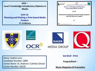
  • 1. OCR – Level 3 Cambridge Introductory Diploma in Media Unit 13: Planning and Pitching a Print based Media Product P1 Evidence Name: Sophie Lyne Candidate Number: 2084 Center Name: St. Andrew’s Catholic School Center Number: 64135 Set Brief - Print Project/Brief – Music Magazine & Promotion
  • 2.
  • 3. 1. Publisher of Q Slide 4 2. Media Product and Sub-genre(Q) Slide 5 3. Content of the Magazine (Q) Slide 6 and 7 4. Front Page Annotations (Q) Slide 8 5. Double Page Annotations (Q) Slide 9 6. Website Annotations(Q) Slide 10 7. Form and Style (Q) Slide 11 8. Target Audience (Q) Slide 12 9. Production Process (Q) Slide 13 and 14 10.About NME Slide 15 and 16 11.Content of the magazine (NME) Slide 17 12.Front Cover Analysis (NME) Slide 18 13.Double Page Spread Analysis (NME) Slide 19 14.Website Analysis (NME) Slide 20 and 21
  • 4. Bauer Media group are the publishers of Q magazine and they have more than 570 newspapers, over 300 digital products and 50 TV and radio stations. The business was started by the Bauer family 138 years ago and Bauer Media Group’s CEOs and its ‘sister’ company are David Goodchild and Paul Keenan. They have offices located all across Europe and in Australia. Additionally, they now have the slogan ‘We Think Popular’. The connotations of this is that Bauer Media create magazines which everyone will be interested in and therefore they will be ‘popular’. In 2011 business area such as sales decreased but then by 2012 they increased again and sales were 2175 million euros. Furthermore, Bauer Media have owned Q magazine since January 2008 after EMPA sold its consumer titles to Bauer Media Group.
  • 5. Q magazine has a monthly circulation of 48,353 copies and the sub-genre is usually rock and roll. Also it is non- fiction because it features interviews and can be factual with information on charts and tours. Additionally, Q magazine use social media to help promote their magazine and the company. Also Bauer media use social media as well which will mention Q magazine. More over, Q magazine is sold across the UK but you can access the magazine on their webpage so it could also be seen as worldwide and so they will have a larger readership. As well as that, Q magazine’s mission statement is all about giving their readers as much information about any features and everything important that’s happening in rock and roll at the time and this is the purpose of Q magazine. Also Q magazine’s strapline is ‘The UK’s biggest music magazine’ this detonates that there no other music magazine which is bigger than theirs so it can connote to theirs being the best. Q’s ideology is that readers are going to want to know what is happening now in the music industry, not about what happened in the past and so this is an important view for them. http://magazines.bauermediaadvertising.com/magazines/detail/Q http://www.qthemusic.com/
  • 6. The contents of the magazine include any stories or interviews that they’ve covered and they have reviews on, for example, any new albums and concerts. In the magazine they will talk about any other bands or artists as well as their main feature. At the back of the magazine they do ‘Q Mail’ and several pages of advertisements. Some advertisements include music lessons, anything you want to sell and they advertise any upcoming concerts. Even though they are advertising other brands and artists, it is important they give as much information to the reader as possible to keep them interested and wanting to buy the magazine again next month. Even on the contents page Q have the same style and layout as the front cover, for example the images in front of the title which can connote to showing the importance of the artists. As well as that, the layout is simple so it is easier for the customer to look at what is included in the magazine and can find it straight away. On the page after there is a editor’s letter and this is when the editor mentions a little about the issue and hopes that the reader enjoys the magazine. Also it mentions who was involved and their contacts. The colour scheme and layout is the same compared to the rest of magazine and this will keep Q’s brand identity constant and recognisable. Moreover, they have the page number, issue date and logo at the bottom of the page still and the connotations could be that its to keep advertising Q while you’re reading the magazine itself.
  • 7. Some reviews are about new albums such as Arctic Monkeys and The Manics and so this would inform the reader on whether they should buy the album. Also the cover story is the biggest on the contents page because it’s the main focus in the magazine and so they are going to want the reader to be drawn there to then find out what page(s) it is on.
  • 8. Main Image: as you can see, the band is actually positioned in front of the masthead. The denotations of this is that they must be important and show authority. Also because the image takes up most of the cover it means that consumers can see the band and know straight away who is the feature instead of having to look at a smaller image and then recognising the band and there is ‘star appeal’ (Richard Dyer) because Green Day are well know in rock and roll so they would have a big fan base who would be interested to know what the band is up to and so would buy this magazine. Strapline: By the magazine being the ‘biggest’ it means that it could be the most reliable and most interesting magazine because that could mean it’ll have better client than other magazines with the same genre. Cover Lines: The bands and artists are bigger and bolder than the quotes and statements because the consumer would rather know who is in the magazine and then what they have said. Main Headline: This follows convention because the headline is positioned at the bottom of the page. By having a quote from the band saying they’re ‘chaos’ it then links to the short phrase ‘let’s rock’. This connotes that the band can get straight back to business by starting off with this feature and so it should persuade the customer to purchase the magazine. Convergence, Barcode, Price and Month of Issue: The convergence is Q magazine’s web address and they may add this so people will go onto their website and become for interested in Q as a company and not just a magazine. Masthead: Only has one letter so that it stands out on newsstands. Also it has a red background. The denotation could mean anger because sometimes rock and roll can have anger or aggressive tones in that genre of music. The capital letter may mean that it has authority. Anchorage text: To link to the main headline, what the feature could be about. Also ‘They’re back. Let’s rock.’ and the fact that its white connotes that they are a blank canvas and are ready to start touring and making new music The connotations of the background being green could be because of the band being Green Day so it’s building their identity. As well as Green Day’s identity, red and green are complimentary colours so the masthead will be more noticeable so Q will stand out more which means more people will want to look at it and remember it.
  • 9. Issue month and year/ Page number/ logo: It is consistent throughout the magazine and is important so that Q can become even more recognisable. No distinctive separations of who is speaking: a band member is usually introduced at the beginning of a sentence: Set out more like a story rather than an interview. Quote from one of the band members: From this the reader can get an insight about what is included in the interview and what they will talk about. For example, they could use this quote because the cover story is about their comeback and it explains part of their story. Drop Capital: They use the drop capital to then go into a different section of the interview, such as talking about a different topic. Also they may use the colour red to keep it the same as the masthead and to stand out against the white background. Caption to support images: They would have captions to support images so the reader has more of an insight on why the magazine have included them and what relevance it may have to the cover story. Main image and smaller images: Q magazine may have chose images of the band performing and being together because the story is all about their comeback and so the images can convey this story.
  • 10. As well as in their magazine, their website keeps to the same house style and simple layout. They may have decided to do this because then if everything looks the same it could be more recognisable straight away. By advertising that you can subscribe and read the magazine digitally means that more people can buy it and so more consumers. Also it means that Q magazine are involved in technology as well as just a magazine. In addition to this, they have opportunities on the website where you can enter competitions and you can also contact the magazine if you wish to. For example, they have headings which take you to a competitions page and at the bottom it has links for if you want to apply for any jobs or work experience. Also, Q are in synergy with social media pages so the readers can get more information, e.g. possibly what will be in the next issue or if there are any competitions. This is important because then the more they advertise, the more exposure so marketing will increase and they will get more readers/ consumers.
  • 11. Throughout the magazine, Q magazine keep to a simple form and style. For example, they will have white font on a black background or vice versa. Also they will use red colour font for conventions such as drop capitals to keep with the theme so it matches the masthead and stands out against the basic colours of black and white. Furthermore, the front covers are usually set out in the same way and inside the magazine they always have the page number and web address so they are advertising more and keeps everything the same and this could be because it will be instantly recognisable and distinctive so people may start to buy Q magazine more. In every Q magazine, the font stays the same and its simple which is why it would appeal to the reader because then its carrying on with its distinctive features and also due to it being simple, the consumer will not find it difficult to read.
  • 12. Hartley’s theory Age: Stereotypically 15-30 would be the age range because this is more of a rebellious age and the music in the magazine reflects this because you wouldn’t have the older generation listening to rock. Gender: More males would read this than female because some men are more interested in rock than women. Class: People in ABC1 in the socio-economic needs because it would be working class who buy the magazine. This group of consumers is shown as 70%. The other 30% could be students because their target market age range between 15-24 so not many students will be categories A and B. Katz’ theory Inform and educate: The reader can find out what Green Day will be doing next on the return and learn facts about what is in the cover lines, for example unseen pictures of Nirvana. Personal Identification: It is about what Green Day will be doing now that they will be coming back to rock. Maslow’s Hierarchy of Needs Explorers: Readers of Q would be explorers because the magazine includes upcoming bands and stories about what is happening at one point in time to do with specific bands or artists and the reader would want to know this because then they can become more interest in new bands and possibly enjoy rock more. Also then the consumer can find out if there are tours happening, for example. http://magazines.bauermediaadvertising.com/ magazines/detail/Q
  • 13. The writers and editors of Q magazine are: Chris Catchpole, Matt Mason, Niall Doherty, Paul Strokes, Phil Alexander, Simon McEwen and Ted Kessler. The standard steps to producing a magazine are: 1.Set a date for publication. 2.Manage a schedule to prevent any mishaps: also it is to keep on track and can publish the magazine on time. 3.Editorial and budgetary decisions: at this stage editors can decide on how the money will be spent during the production and features in the magazine. 4.The content of the magazine to be planned: without any content there would be no magazine so during this step the company decide what will be featured and then journalists will start interviews and researching. 5.Sub- editing: is important because this is when the company need to make sure all the facts are right and then needing to sort out house style and colours. 6.Page Layout: this is important because it needs to look interesting and make the consumer want to buy it. 7.Proofreading: so there are no mistakes in the magazine. 8.Printing the magazine. 9.Distribution: When the magazine is sent out to stores and newsstands to be sold. http://hosbeg.com/the-magazine-production-process/
  • 14. I tried to contact Bauer Media so I could find out a bit more about their production process but even after trying more than three times I wasn’t able to get a response. However at http://www.bauermedia.co.uk/uploads/QMediaPack-Feb2013.pdf their media pack informs us that their editorial team are editor: Andrew Harrison, senior editor: Matt Mason, associate editor (digital): Paul Stokes and associate editor (production): Simon McEwan.
  • 15. The publisher of NME magazine is Time Inc (UK) and they have been around for 150 years. However, its name Time Inc UK was made this in 2014. Other magazines that they publish under entertainment are What’s on TV, InStyle and Uncut for example. The genre of NME is rock and this is visible because of the artists featured. Additionally, the purpose of the magazine is to ‘deliver the definitive verdict on everything that matters in music’. As for production, when you want to buy the magazine, you can either subscribe online or go to any supermarkets (for example ASDA) or corner shops or shops such as WHsmiths. With subscriptions, you can either have print or digital copies and you can use the website http://www.magazinesdirect.com/subscription/nme/33780876/nme.tht . http://www.timeincuk.com/brands/nme/ http://www.slideshare.net/hannahfox1/nme-11855499
  • 16. As for the frequency, it’s a monthly magazine at a price of £2.20 and they have a circulation at 56,284. The format of the magazine is a standard size of A4 and the style is quite a informal language and their main colour scheme is red and white with additional colours and they use a variety of shot angles, deadening on how it will reflect the artist and what the article is about. The readership is 411, 000 and as this is a magazine only in the UK, the audience is in the UK, mainly male, young adults and are within the ABC1 category because if they are adults they will have a reasonable spending power. Also they are more ‘explorers’ (Maslow) because they are quite trendy and want to keep up to date. Furthermore, they are more likely to buy the magazine for information and to educate (Katz) themselves because its all about keeping their viewers up- to- date on what is happening.
  • 17. The content that is included in NME magazine is any interviews, album reviews and information on live events. By doing this, it allows them to keep up to date on what has happened recently and they interview artists which are very well known. Anything that is more relevant, is shown in a bigger font and each article is put into sections. For example, reviews. Additionally, there is a band index at the side so that the reader can find possibly their favourite artist very easily and so it is helpful for them to get to the pages they are most interested in. Moreover, at the bottom of the contents page, they advertise their magazine for subscription and try and persuade them that they will save money by doing this. http://www.nme.com/magazine/issue/wolf-alice-in-wonderland
  • 18. Masthead: With the plain background, it allows the masthead to stand out and with the colour red, it connotes to the genre because red is associated with anger which is how some of the songs are portrayed as. By having Alex Turner in front of the masthead, it denotes that NME is already significant even if you cannot see the whole thing Cover Stories: they have them down either side of the magazine which fills up dead space and also doesn’t take the effect away from the picture and have similar artists to the main one. Headline/ Anchorage Text: This has the biggest text so you know that its about Arctic Monkeys and their story about a record. Barcode: It tells you the price, the issue date and website address. Strapline: By using the verbal code ‘express’ this connotes that they get all of the music news quickly so that they can tell all their readers. Main Image: this is very important because the readers are going to want to know who is the main feature. Also by Alex Turner holding a record, it relates to their article. Background: by having a simple background, it allows all the focus to be on the main image and also so that the colours will stand out and hopefully better than any competing magazines. Puff Promotion: in this magazine they are promoting a guide and many people may find this useful because it’s about upcoming concerts.
  • 19. Headline: Even the headline relates exactly to what the article is and the colour font really stands out against the dark background. Having the ‘bloody’ in white connotes that because its plain, that making the album could have been quite draining for all of the artists. Drop Capital: By using this, it’s a great way to start off the article and adds more effect to the article. Pull Quote: Having a quote can be a small section so the readers can have a indication of what it’s about. Main Image: Keeping the image to one side of the page can make the pages more eye catching and interesting. Also having the main singer in front of the others denotes how he has a lot of authority in the group. Page Number: This convention is very useful and have the logo. Another logo creates a subconscious advertising and so the customers will remember the brand. Stand First: This is used so that that reader has a quick over- view of what the article is about and so it can persuade them to read the whole interview.
  • 20. As for their website, there's advertisement on subscribing to their magazine and this will save the reader 34% of the original price per year. Also they include information on what is potentially in their magazine as well such as reviews. At the bottom there is links so you can contact them and another link so you can buy their content, presumably for their videos and pictures. The navigation bar at the top is useful because it offers the reader to find concert or festival tickets easily and because it is split into, reviews, photos and news, the reader knows where to go straight away for what they want to look at.
  • 21. Additionally, NME are in synergy with a variety of social media. All of these will be good to have as a company because the readers will be able to see what might be going on behind the scenes and have that extra connection with the artists being featured.
  • 22.
  • 23. 1. Summary of Ideas Slide 24 and 25 2. Initial Mind Map Slide 26 3. Font Styles Slide 27 and 28 4. Magazine Mind Map Slide 29 5. Mood Boards Slide 30 and 31 6. Mood Board Conclusion Slide 32 7. Hand Drawn Drafts Slide 33- 36 8. Hand Drawn Drafts Conclusion Slide 37 9. Graphic Layout Slide 38-41 10.Graphic Layout Conclusion Slide 42 11.Conclusion Slide 43
  • 24. The genre of my magazine will be rock and roll, likewise to magazines such as Q, Kerrang! and NME. Additionally, my magazine will have the standard dimensions of 8”X11” with a simple house style. The colours would be mainly monochrome with hints of other colours, for example red and the font style would be simple and clear so the reader doesn’t have difficulty reading the magazine. As for my target audience, there will be an age range of 15-30 as it is predominantly young adults who are into rock and roll and for gender it would be addressed to both male and female but stereotypically it would be for men. My target audience will have psychographics of having a big interest in music and could possibly have a big effect on your life and be quite up to date in the modern world. Apart from students who could possibly be unemployed, the socio-economic needs for my magazine would be A-C1 because other magazines such as Q have a 70% of ABC1 demographics. By consuming the magazine, the reader will learn anything that is happening in specific band/ artists lives and what they will be doing next on the professional front so if they will be touring or releasing a new album (Katz’ theory). The readers of my magazine are more likely to be ‘explorers’ (Maslow’s theory) because they will be wanting to know what is happening in rock and roll right now and what artists and bands are getting up to. http://magazines.bauermediaadvertising.com/magazines/detail/Q
  • 25. On my front cover, it will have some similarities as Q magazine’s (my magazine of inspiration) front covers. For example, I will have my masthead in the top left because that’s where most mastheads are and I think that it looks better in the top left where it’ll seen better/ clearer compared to if it was at the bottom. Also I will have one main image and no secondary images so the front cover stays simple and keep the attraction to my main feature in the magazine (e.g. exclusive interview). At the bottom of my magazine I would have the barcode because you don’t need to advertise the barcode so it doesn’t have to be as noticeable. For my double page spread I would have a collage of images because many people prefer visual aids and I would have a simple layout of text in columns and paragraphs so it doesn’t look too complex and included quotes that will stand out on the page, which will interest the consumer so they’ll read the interview.
  • 26. Magazine Ideas Masthead Colour Scheme Brand identity Types of Images Frequency Target Audience Muse Monochrome Demo EP Hints of Red Record Well Known Bands/ Artists Upcoming Bands/ Artists Mid Shots- More Close Up Monthly Circulation- Artists do not always albums being released More time to get information/ reviews Music can be people’s inspiration or muse Keeping up to date/ a record of what’s happening in music 15-30 Years of Age- Stereotypically, young adults prefer rocks music Dark colours can be connotations of rock and roll because of anger that can be linked to that genre of music Masthead next to each page number along side the web address- Make the reader more aware of the brand. Use bold colours to make conventions stand out Anthem Extended play- extending your knowledge about the music industry/ bands and artists. Then there will be more interest in buying the magazine ABC1- socioeconomics
  • 27. Bebas Neue Franchise Fight NightAcens I like these fonts for my masthead because they are simple and clear to read so it would be visible for the consumer to see and recognise which magazine it is straight away. Also I prefer how most of them are bold so it makes it stand out even more and I think it adds a little edge instead of the font being really thin. Gobold Headline Prosciutto Sansish
  • 28. Bebas Neue I have chosen Bebas Neue for my masthead font style because I think it is simple and the way it is shaped connotes to being more on a magazine than the other three because it isn’t stretched or a bit like bubble writing. Additionally, EP would be a good name for a magazine because it’s a shortened music related term and two letters is better than a long winded word due to the fact that not many people may remember it.
  • 29. Masthead Brand Identity Colour Scheme Frequency Types of Images Target Audience EP Magazine EP- Extended Play Because it means extended play, the reader can extend their knowledge on rock and roll and be up to date with what’s happening. Monochrome It will keep it simple and so the magazine will not look too complex with lots of different colours. Hints of Red With only certain conventions of the magazine re, it’ll be bold and draw attention. Monthly Circulation There would be more information because albums/ singles aren’t released all the time and bands/ artists are not touring all the time either. Mid shots- close up so artists/ bands are quicker to recognise. Upcoming/ well known artists and bands. Mainly ABC1 target audience, the rest could be C2 and E. It would appeal to these demographics due to the simplicity and maturity of the magazine as well as the interest in rock and roll. Masthead next to the page number- the reader can become more aware of the company. Simple, bold colours- it’s simple but effective.
  • 30.
  • 31.
  • 32. These images have been an inspiration because they use black, white and red colours and the genre of these magazines are rock and roll. Also the images of bands/ artists have been featured in magazines such as Q and NME so they could possibly be featured in my magazine. Moreover, if I wanted to include free giveaways in my magazine, it would include prizes such as guitars because it is music related and many people would be interested in having a chance in winning one. In my magazine I would ‘repeat’ how most of the main images are up close so the band/ artist are more recognisable.
  • 33.
  • 34.
  • 35.
  • 36.
  • 37. EP Front Cover Out of my two designs, I like the layout on the left with the headline and anchorage text at the top. Although with both I like how the cover lines are at either side, the barcode at the bottom and the masthead at the top left. Double Page I think that the design layout in the top left would be better because the images are more of a collage and in the middle so it will attract attention as soon as the reader turns the page. Furthermore, I like the idea that at the bottom on the left page will be the page number, logo and issue date while on the right instead of the issue date will be the web address because then by repeating the logo and having a web address it will become more recognisable and the reader may become more interested in the magazine. Record Front Cover As for these designs, I prefer the one on the right because the layout looks more like a magazine front cover. Double Page The one on the top looks better because I like the layout more and I think with having an image on one page with the headline and stand verse will seem more appealing.
  • 38. Masthead Strapline Headline/ Anchorage Text Cover Stories Cover Stories Barcode Quote Photo of Artist Photo of Artists Masthead Strapline Headline/ Anchorage Text Barcode Cover Stories Puff Promotion These are my graphic layouts of my front covers for EP which will be helpful when it comes to making my pages on Photoshop. Also it is more of a representation as well as my hand drawn drafts.
  • 39. Headline/ Stand Verse Photos CaptionQuote Text Text Text Drop Capital Page no/ logo/ Issue Date Page no/ logo/ Web Address Page no/ logo/ Issue Date Page no/ logo/ Web Address Drop Capital Headline/ Stand Verse Quote Caption Text Text Text Photos Photos This is what my double page spreads look like in a graphic layout. I prefer the layout at the top because it looks a lot more simple and organised.
  • 40. Masthead Puff Promotion Headline/ Anchorage Text Quote Barcode Cover Stories Photo of Artist Masthead Photo of Artist Cover Stories PuffProm otion Barcode Quote Headline/ Anchorage Text Here are my graphic layouts for my second magazine (Record). I prefer the one on the right because it looks more professional and organised.
  • 41. Headline/ Stand Verse Quote Photo Masthead Text Text Page Number/ Logo Web Address/ Page Number Text Text Text Headline/ Stand Verse Masthead Quote Photo Page Number/ Issue Date Logo Web Address/ Page Number These are my double page spreads for my second magazine ‘Record’. I think that the top layout looks better and not as cramped.
  • 42. These are the graphic layouts that I preferred because they are organised and set out well. Also these designs were better as my hand drawn drafts as well compared to the other ones. These will be the layout guidance I will use when working on Photoshop. However, I may change some conventions depending on the final outcome.
  • 43. Overall, my magazine will have the name EP and the colour scheme within this masthead will be red and white. Also the colour scheme in the magazine and on the front cover will mainly be black and white with hints of red, for example a red drop capital. On my front cover there will be just one main image and this will be of a band/ artist and the image will be a mid shot so they would be more recognisable at a distance and it’ll be close up. Additionally, I will have my cover lines on either side and my barcode at the bottom with the issue date and convergence, e.g. web address so the readers can go onto the website. Moreover, on my double page spread I will have a collage of images with a caption so the pages will be very visual and this means that the reader shouldn’t lose interest. Also there will be a differentiation between the questions and the answers, for example the questions will be in red while the rest of the text will be black. On one of the pages I will use a quote from the band/ artist so it could give a simple insight to what the interview is about. Lastly, at the bottom of the page I will have the page number, logo and web address so the reader will become more aware of my magazine and visit the website.
  • 44.
  • 45. 1. Proposal Slide 46 and 47 2. My Magazine- Final Slide 48 3. House Style Slide 49 4. Test Photography Slide 50 5. Magazine Flat Plan Slide 51 6. Hand Drawn Drafts Slide 52 7. Draft Article Slide 53 and 54 8. Step-by-step Summary Slide 55 and 56 9. Second Magazine Cover Slide 57 10.Second Magazine Cover DPS Slide 58 11.Conclusion Slide 59
  • 46.
  • 47.
  • 48. The magazine will be called EP because it is a musical terminology meaning extended play and therefore can be compared to customers wanting to expand or extend their knowledge on the music industry. Therefore this is why I chose EP and the fact that it is short and easy to remember. The font style is Bebas Neue with the font colour being white along side a red background. In the market place, it will be a new product launched and as time goes on it will works its way up to be one of the best music magazines. The competition will be of the likes such as Q, Kerrang! and NME because they are other rock sub-genre magazines. For my target audience there will be an age range of 15-30 years because younger people are more likely to listen to rock and stereotypically, it would be more of a male majority. As for socio-economic needs, like magazines such as Q, it will be ABC1 groups but it would also include C2 and E groups because of students buying the magazine. ABC1 groups will have a higher spending power compared to C2 and E groups because stereotypically, they will have a higher income.
  • 49. Colour Scheme The colour scheme will be set with black, white and red. This is because black and white are standard in other magazines and then with the red, it’ll give that edge which a music magazine would need. Font Style My magazine’s font will be in Tahomabecause it is clear to read and that is what is important when having block texts of interviews/cover stories and reviews. For my masthead, I am using the font called Bebas Neue because it has that sort of style which would be on a magazine and because it is a straightforward design, it will be more recognisable and can be noticed quicker. Furthermore, the masthead will be at the top left on the front cover to be seen easier. Also the logo will be at the bottom of each page to make the masthead more notable. Social Media EP would be in synergy with social media because then it will be able to become more well known and then it should lead to more readers and consumers, as well as publicity.
  • 50. These images will be suitable for my front cover and double page spread for my magazine because they reflect the right look and have the right angle and shot. They can be taken in a room where there is enough space and this is fine because the background will be edited out. If any room, a bedroom is acceptable because then it will almost be like she is getting ready to go out, for example the top right image.
  • 51. My magazine flat plan is useful because that way I can see how the magazine would look on a layout basis. Also I can see whereabouts my double page spread will go and see if everything is suitable for a rock and alternative music magazine.
  • 52. These drafts are going to be helpful when constructing my pages because then I have a rough idea of a layout for my front cover and double page spread and to see how everything will go together.
  • 53. My inspired interview is in Q magazine with the band U2 about releasing their new album. I would replicate this interview in various ways, for example the differentiated question and answers because then certain conventions will stand out and it will have more of an effect as soon as the reader sees the page. Additionally, the layout is clear and simple which then helps the reader focus on some conventions (images or text) and it doesn’t look complex and too over the top. I will be interviewing Christina Lewis who is of the likes such as Nicole Scherzinger and this will be the main headline on my front cover. Hello Christina, How are you? Hello Sophie, I’m great. How are you? I’m good thanks. So, next month you’ll be starting your world tour, let’s talk about that. Yes! I’m very excited and cannot wait to get started. What are you looking forward to the most? Seeing my fans from across the world is always something to look forward to when I go on tour and it just makes the experience that more special because they are so supportive. Although, there are a lot of back stage antics as well so it’ll be fun. And what are you like on tour? Anything you need to have with you? I wouldn’t say I’m that bad…. As long as I get some sleep (Christina laughed). Erm… well it’s always nice to have something from home so like a blanket if I’m on the plane so there is some comfort when travelling. In your opinion what are the top 5 necessities when touring? Ooh I would definitely say a blanket, make-up, hairbrush, snacks and some really comfortable clothing. One thing that I love after finishing a show is to get into some comfy clothing and have a bit of time to relax.
  • 54. What do you miss the most when on tour? One of the hardest things to do is to not be around family and friends for so long, that’s what I miss the most. Also like many other singers, will you be bringing any other celebrities with you as guest appearances? I wouldn’t want to give any spoilers but there or may not be someone joining me. When touring what is your favourite country where you like to visit? As much as I love my home country, I do love to visit places like New York. All my fans there are amazing; well all my fans are but there’s something about New Yorkers… I suppose it’s because they’re in the city that never sleeps. How hectic is it when touring? Do you have any spare time? It can be pretty hectic, especially when travelling from one country to the next so it can be hard to have some spare time and if I do it’s not always for long. If it’s been a while then I would try and find the chance to call home and my friends because when you’ve been touring for so long and get quite tired it helps when especially my friends motive me. I don’t think I’d be able to do it on my own! This will be your second tour, what will you change from your first? I definitely want to enjoy my time touring a lot more, simply because last year it was all work hard but every needs a break every now and then. We’re only human! Do you have any fears when going on tour? Last year I worried a lot more simply because it would be the first time I’d be away from home the longest but this year I’m not as worried. I guess the one thing I would hate doing is falling over on stage. Oh I’ve probably just jinxed myself now, I might as well say “Join me on tour to see me fall” (Christina laughed). Have you got any plans for when you finish? Go on holiday! (Christina jokes) Just to have some time to relax before I start working again. I think it would be a good time in my career to start making a new album so when touring finishes, make sure you start listening out for a new single!
  • 55. For a front cover Once you have your blank canvas set to the size that you need (A4), it is best to add ruler lines on your canvas so that everything will be in line with each other and this means it will look more professional. To add them click ‘Ctrl + R’ to add the ruler then press on the ruler and drag to wherever you want the ruler to be. If you want to hide the lines click ‘Ctrl + H’ and then do the same to make the lines appear again. Before adding any conventions, it may be easier to add a background colour first. An effect way to have a background it to have a gradient. On the side bar, look for a box with the colour going from dark to light (12th one down). Then change the colour by the using the colour boxes at the bottom of the tool bar and then have the colour as you wish. Then you are going to want to put the most important conventions in first. For example, masthead and barcode with the issue date, website address, small masthead logo and publisher’s logo. When adding your barcode, you can insert an image of one by going to ‘File’ and then ‘Place’. If you then click ‘Ctrl + T’, you can change the shape and size of the image, then move it to the desirable position. Above or to the side of the barcode you can insert text to add your additional information by clicking the ‘T’ on the side bar in Photoshop. Now that you’ve done that, you are going to want to place your masthead and strapline. What you want to do is add the shapes of the masthead and strapline by clicking on the solid square on the tool bar (18th down) and draw to the size you want. Then you should add the magazine name over the text and strapline. If you ever want to move this around all together and keep everything in the same place, highlight the layers on the far right, right click and click ‘Link Layers’. Depending on your logo, you can add text effects by right clicking on the text layer and go to ‘Blending Options’. The next convention that I would add next is the photo you want for your front cover. If you go to ‘File’ and then ‘Place’ again you can add that image. To remove the background of that image, have it selected (‘Ctrl + T’) and find the quick selection tool on the tool bar (4th down), then select the background you want to get rid of and make sure you don’t delete parts of the picture you need. To neaten the edges, click on the eraser (13th down) and select the airbrush tool and to do this look in the top left of the screen at the eraser and find it on the dropdown. Now you can soften the edges. Move the image around on the page and change the shape and size to how you want it. If you want to add an effect you can either go on the layer and to ‘Blending Options’ again or at the top go to filters and edit to how you want the picture to look. To make it look like a magazine, you need to add your headline, anchorage text, puff promotion, quote (optional) and cover stories. Use the text icon in the tool bar to add your text and then you can change to colour of your text using the colour swatches at the bottom of the tool bar and if you want to change the width and height of the text, highlight over it and click ‘Windows’ at the top of the screen and go to ‘Character’. Adapt it to how you’d like it to look and then carry on adding your text. For puff promotion, repeat the steps of adding a shape then text on top. For puff promotions, you do not want it to look too text heavy, so make sure you keep it concise.
  • 56. For a double page You will need to repeat the process like you would do for a front cover by creating the canvas to the size you would like and adding your ruler lines. You can move them if you do not like where they are placed. Also changed the background to how you’d like it. Like you would have done for the front cover, you should add your masthead but not the strapline. On your front cover, you can copy your masthead layer (select the layer and click ‘Duplicate Layer’) and drag it to your double page. If you want to add a border then use the shape tool and make the shape to the size you would like and place it. At the bottom, you need to add your page number, date issue and preferably your logo. To do this, use the text tool and add in the necessary information. On your double page, you need to add your headline and to make it stand out, it would be best to adapt the text. So going to windows and then character again is an example. Now that the basics are in place, the next thing to add would be your image(s). Repeat the same again like you would for your front cover by going to ‘File’ and then ‘Place’. You can edit your picture as you wish and move it to where you had planned it to go. Once everything is in place, you can now add your text for your article. The first bit of the article that could be added is a quote. The reason is because if you need to have text going around it, you know where and when to use the pen tool. By adding your quote, the stand verse is the next text to add. When adding your stand verse, you need to create a drop capital. So all you need to do is to create a text box and type the first letter of the first word you are going to use. Then you get the pen tool form the side bar (15th down) and click around some of the sides of your letter and then carry on making a text box where you want your stand verse to go. After that type all your text for that paragraph. The rest of your article can be added and if you need to, use the pen tool in case you need to type around a quote or an image, or both. Lastly, what you can do is add a caption to your photo(s) and then your double page is complete.
  • 57. I made a second cover of my other magazine choice named ‘Record’, as you can see EP is more eye-catching due to the more colours used and I think the masthead looks more professional as EP. The reason I did this was that you could see the difference between the two and it clearly shows what magazine would do better.
  • 58. Similarly to my front cover, you can see that the Record double page spread doesn’t look as eye catching because the colour black has been used so much. However, it does make the drop capital and quote stand out more. Also the picture in EP looks a lot more effective against the red header instead of the black.
  • 59. To conclude, my magazine, EP will have Christina Lewis as the main story and will be featured on the front cover and double page spread. Furthermore, I have made changes compared to my plans because it is now made to look more professional. Now that I have finished, I will be creating a presentation and pitching my ideas about EP magazine.
  • 60.
  • 61. 1. Environment of Presentation Slide 62 2. Sources of Presentation Slide 63 3. Material Used Slide 64 4. My Pitch Slide 65 and 66
  • 62. I have got pictures of the computer I used, an interactive board where everyone will see my presentation, a slide changer so I don’t have to stand by the compute and an apple mac where I set up my presentation for the class.
  • 63. * http://www.findalondonoffice.co.uk/toolbox/office-space-calculator/ * http://www.google.co.uk/url?sa=t&rct=j&q=&esrc=s&source=web&cd=3&sqi=2&ved=0CCsQFjAC&url=http %3A%2F%2Fwww.ppa.co.uk%2Fjobs-careers-and-training%2Fthe-periodicals-training-council-ptc%2F~ %2Fmedia%2FDocuments%2FTraining%2FMagscene %2FMagScene.ashx&ei=6O20VNulJ8y9aaG2gdgD&usg=AFQjCNEKzQVKxmP_Qb41eMd5hKp7- W3M6Q&bvm=bv.83339334,d.d2s * http://www.currys.co.uk/gbuk/computing/laptops/apple-laptops/apple-macbook-pro-13-with-retina-display * http://education.pugh.co.uk/index.php?nID=productDetail&manu=95&prodID=3891 * http://www.contentfac.com/how-much-does-social-media-marketing-cost/ * http://www.bauermedia.co.uk/uploads/Kerrang!-MediaPack-2011.pdf * http://print24.com/uk/product/magazines/ * http://smallbusiness.chron.com/much-television-advertising-really-cost-58718.html * http://www.stateofthemedia.org/2013/news-magazines-embracing-their-digital-future/news-magazines-by-t
  • 64. Here is an example of the materials I used. So I used PowerPoint before I had made my Prezi. As well as PowerPoint, I used the internet to get my information on how much office rent would be for example.
  • 65. Here are images of my witness statement which gave me feedback on my pitch and the information about it.
  • 66. Here are some screen shots that I have taken from the video of my pitch. So as you can see, my Prezi was organised and simple, I had my script so I didn’t have to read off the board and I did make eye contact.
  • 67.
  • 68. 1. Feedback Slide 69 2. Survey Monkey Slide 70- 72 3. Evidence of Feedback Slide 73 4. Feedback on my Magazine Slide 74 5. Production Plan Slide 75 and 76 6. Legal and Ethical Slide 77, 78 and 79 7. Calendar Events Slide 80 8. Conclusion Slide 81
  • 69. As well as asking for feedback via survey monkey, I obtained more feedback from my teacher. I had covered near enough everything on the checklist and then I had feedback on what I did well and any corrections that I needed to make. All the corrections have been made on my Prezi and if anything needed to be changed on the front cover or double page spread, for example spelling, the date in my magazine pages and moving headings around on my double page spread to make it look better.
  • 70. https://www.surveymonkey.com/analyze/mKFrj0wUl12epq0PGVKPtCnSn82v_2FpOsSJCRSqo1VAU_3D As you can see from the first question, I had good presentation skills and was very persuasive which is needed when you are promoting a new music magazine. Also for my second question, it is essential that you have given enough information so that the publisher would have a clear idea on the magazine. From the responses I got, I covered everything they needed to know.
  • 71. When you have a pitch, it’s best to know what the positives and negatives are so that you can improve and know what went well. A lot of positives were that I was understandable and that I had the right information. As for negatives, I did have one or two spelling mistakes and that I could look up more rather than looking at my script.
  • 72. To be able to have 75% to say yes they would buy m magazine means that most of them liked my ideas. Having 25% as a possibly is good because it may not have been a magazine with the genre of music that they like.
  • 73. Here is the before and after of the corrections I have made once I had my feedback. So the spelling of intentions, the date on my magazine and the word ‘exclusive’ has been moved to make my double page look better.
  • 74. The feedback I got on my magazine was very positive, many people though it had that formal and professional layout that a magazine should have. Also they like the images and the way they look on the pages themselves and how I included a lot of conventions for example, puff promotion and a drop capital.
  • 75. The magazines should be in stores by the 4th May.
  • 76. Equipment Cost Office Space £212,480 Apple MacBook Pro (X25) £29,975 Adobe CS6 Master Collection £9,179 Desks (X25) £937.25 Chairs (X25) £1249.75 Printer £79.99 Cameras (X3) £687 Pens £9.58 Paper £9.16 http ://www.staples.co.uk/stanford-desk-beech-effect/cbs/418927.html?promoCode=300300666&Effort_Code=WW&Find_Number=418927&cm_sp=W15_02_107_07UK-_-u_ad_01 http://www.staples.co.uk/street-fabric-operator-chair/cbs/385136.html?promoCode=300300666&Effort_Code=WW&Find_Number=385136 http://www.currys.co.uk/gbuk/cameras/digital-cameras/dslr-cameras/nikon-d3200-dslr-camera-body-only-16617165-pdt.html#cat-0 http://www.currys.co.uk/gbuk/computing-accessories/printers-ink/printers-scanners/all-in-one-printers/brother-dcpj4120dw-all-in-one-wireless-a3-inkjet-printer-10028091-pdt http://www.staples.co.uk/cristal-medium-ballpoint-pens-black/cbs/105841.html?promoCode=300300666&Effort_Code=WW&Find_Number=105841 http://www.staples.co.uk/a4-copy-paper-75gsm-5-reams/cbs/403657.html?promoCode=300300666&Effort_Code=WW&Find_Number=403657 Here are some examples of what equipment I would need and the staff involved in producing my magazine. Also because I did not think of the costs for some of the equipment , my budget may change which could lead to a change in the price for my magazine to cover the costs and so that we make a profit not a loss. However, it is essential that the price doesn’t become considerably high other wise my competitors could gain the customers that I would have had. Overall, I still think my financial aspects are still realistic but they could still be improved. Therefore, I could possibly have less staff in the first year while the brand is still building. Staff Salary Publisher £50, 000 Editors £19, 000 Journalists £22, 000 Writers £22, 000 Photographers £20, 000 Marketing £21, 000 Finance £18, 000 Design £21, 000 Human Resources £17, 000
  • 77. Copyright When you want to copyright work, you have to register and fill out forms, then pay a non-refundable filing and deposit fee. The forms which you fill out are continuation and renewal as well as fees varying ($100-130). With regards to the forms, you have to enter yours and the business’ detail and also that you are claiming copyright. The way to go about it is to either apply online or on paper. After this you would expected to be contacted to get more information or a certificate of registration which will say your work has been registered. Sometimes you can be contacted to say it hasn’t be registered. All of the work which is copyrighted needs to have the copyright logo clearly shown. ‘Copyright © 2015 [COPYRIGHT OWNER’S NAME]. All Rights Reserved.’ IPSO/ PPC For my magazine, the regulation I need to keep in check is that the editors code is not breached, make sure everything is factual and if any material can be commercially sensitive then it needs to be brought to the regulator’s attention so the content can be handled with respectively. Also any discrimination, harassment in researching and privacy of anyone’s personal life must be prohibited. With regards to personal life, you must have his or hers consent. These rules are an example of specific ones that need to be followed in producing my magazine. Lastly, the reason why everything needs to be accurate is that EP is not allowed to false advertise or publish an article which could create backlash because it will create the wrong opinion about that topic and the magazine itself. http://copyright.gov/forms/ http://copyright.gov/circs/circ01.pdf https://www.clickandcopyright.com/copyright-resources/copyright-symbol-usage.aspx https://www.ipso.co.uk/assets/1/REGULATIONS__PDF_.PDF http://www.pcc.org.uk/cop/practice.html http://info.legalzoom.com/fill-out-copyright-forms-23660.html
  • 78. Here is an example of some of the official guidelines in the Editors Code of Practise which I would have to follow. Clause 1-Acuracy - The press are not allowed to publish any inaccurate or misleading pictures and information. - If it is then they must correct it as quickly as possible and also publish an apology. - Publishes must state the difference between comment, conjecture and fact. - The publication must have a fair and accurate report for the action of defamation unless an agree settlement is published or agreed otherwise. Clause 12- Discrimination - The press must not publish anything that is prejudicial to an individual’s race, colour, religion, gender, sexual orientation or any mental and/or physical ability. - It must always be avoided unless it is relevant to the story. Clause 14-Confidential sources - All journalists have a moral accountability to protect any confidential sources of information. https://www.ipso.co.uk/IPSO/cop.html
  • 79. IP Content that usually has copyright can be referred to as Intellectual Property (IP) and this is protected by the law. IP can be divided into two categories; Industrial Property and Copyright. So with IP, any literary work and photographs will be protected. Additionally, IP allows owners and trademarks to be benefitted from their own work and investment. This is important to have for my magazine because all of the work that goes into my magazine will be original and needs to be protected. As well as having IP on all printed work, I would get a digital watermark which protects any copyrighted content from my magazine online and in any digital format. If you would like to register online you have to upload your work and files and make a payment along with entering your personal details. However, for printed forms, this is for work which may be quite slow to upload and what you do is complete a form online, print off this form, sign it and post it with your payment in the envelope. The photo of the flower is an example of a watermark. Data Protection Act As well as protecting my companies content, the Data Protection Act protects any personal information and how personal information is used within business. A few examples of the ‘Data Protection Principles’ are that it is used accurately, fairly, kept safe, beliefs, opinions, health and any criminal records. This is important to keep safe because someone's personal life could affect the company and each worker should have privacy within the industry. http://www.smashingmagazine.com/2011/06/14/understanding-copyright-and-licenses/ https://www.copyrightservice.co.uk/register/registration_centre http://www.wipo.int/edocs/pubdocs/en/intproperty/450/wipo_pub_450.pdf http://www.webopedia.com/TERM/D/digital_watermark.html https://www.gov.uk/data-protection/the-data-protection-act
  • 80. There are no dates or events that could conflict with the release date of my magazine because festivals usually take place in the summer, so July and August, not May. However, any events that could possibly be an issue such as festivals, then it can be used as content coverage for my magazine so I will still have enough information to publish. So in my cover stories I could say that there will be information about reading festival for example, such as royal blood preforming, or I could have an artist feature on the front cover to promote my magazine. http://www.readingfestival.com/line-up
  • 81. To conclude, I have evaluated my feedback and made any corrections to improve on and now I can look over my production plan to know when everything should be completed in order for the magazines to reach stores in time. Also after looking at legal and ethical issues for my magazine, I know that the ‘Editor's Code of Practise’ is extremely important and that it shouldn’t be breached as well as making sure all the content in my magazine is copyrighted so that all the information and photographs are protected. Additionally, the content that is to be featured on future magazines would have information on festivals so any upcoming events are not seen as conflicts.