1. Target Audience
VOGUE:
Age:
I think the age range of Vogue is 18-Onwards, I think it starts from 18 because
it’s one of the expensive magazines which most wouldn’t want to splash out on
every week unless they’ve got a job which most 18 year olds have.
Gender:
Women would be the top targeted gender for Vogue due to the many articles and
celebrities in and on the magazine which relate to women more. I’d say a small
minority of men would read Vogue also but find less adverts, articles and
pictures that relate.
Social Status:
People with in a higher class and social status would be more enticed to buy
vogue due to the price range, and also the adverts included in vogue are what the
higher class would be targeted at. The A-list celebrities also buy Vogue as a
respectable magazine to keep up to date and even buy their own covers which
they may appear on.
2. VIBE:
Age:
The age range for Vibe magazine is 18-30; this is because the types of adverts
inside are a lot more sophisticated. The artists features in vibe magazine are
mostly R&B, which contains allot of adult language and themes, whilst also
keeping to the younger audience, finding few over 30’s.
Gender:
The gender for Vibe is generally both male and female; this is because the music
and adverts aren’t bias to any gender and really applies to both in an equal way.
Social Status:
The social status for a Vibe magazine is very middle class. They are people that
earn a bit of money and have a bit to spend, due to the adverts inside, but also
the music featured is listened to by varied classes.
Aesthetics
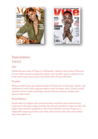
VOGUE:
The fonts used in VOGUE are very classy and elegant, with the title in classic
block capitals which changes colour in different issues to match the theme and
the cover image used, as VOGUE keeps the aesthetics in mind throughout.
In the issue I’ve chosen, the main colour is orange for the main text, with black
and white text to break it up and add extra detail, but with only one colour
running through the main points, keeping it looking appealing to the eye.
The text is place around the edges and the top and bottom of the page, to keep
the middle area free to focus on the image and celebrity used. Vogue is known for
its a-list celebrities used and if you appear on Vogues front cover it’s almost like
an acceptance of your high status.
3. The language used is more formal than others but still has a friendly and relaxed
way about it. This is because the people that read this magazine would expect a
certain degree of formality and less slang than usual, but still interesting and
comforting to read, the audience is anchored by all of this and the A-list
celebrities used.
VIBE:
The fonts used in the vibe magazine are a lot bolder and modern than Vogue.
This is because the magazine is based upon R&B music and artists; having a
bold and striking text is much manlier than vogue, and creates a different
audience and feeling.
The language used is more informal than most, to connect with the audience and
created a chilled atmosphere whilst reading.
They have a very good way of impacting the audience, and drawing them in to
the magazine with the popular artists, Bright, energetic colours and striking
headlines making them want to read on.
Like Vogue, Vibe magazine changes the
colour of their theme and title for each
different issue, to suit the artist and
shot taken for the front cover.