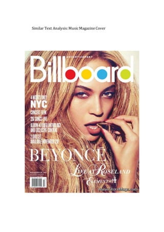
2. The font used in this ‘Billboard’ magazine
cover is sans serif. Sans serif fonts show
modernity, which is suitable for the magazine
cover, as it is aimed at a young target
audience. A sans serif font is neutral, so is
suitable for this cover, as it is aimed at both
genders. The only serif font used on the
Billboard cover is the name Beyoncé. This is in
a serif font as it connotes femininity, which is
appropriate for the cover as Beyoncé is the
cover image of the magazine. This attracts the
reader’s attention because she has a lot of
fans that want to know more about her. The
font colors used are all white because the
color white is classy and sophisticated, so a
professional impression for the magazine
cover is created. This makes the font more
attractive which compels the target audience
to read more. The masthead ‘Billboard’ is
white, red, yellow, blue and green. This is
because it’s Billboard’s logo, so the magazine
is easily recognized and the extra colors other
than white, lets the masthead stands out from
the rest of the page. This would attract many
‘Billboard’ fans.
3. The colors used on this Billboard magazine cover are very simple and plain, yet they still look
sophisticated and classy, giving the cover a professional look, which entices the older audience
in the target audience. The main two colors used are white and a bronze color theme. The
bronze theme is present because Beyoncé has an olive skin tone, her hair has a blonde/bronze
summer glow to it and she has a gold necklace in her mouth. The colors used are very neutral
and suitable for both genders, therefore will appeal to Billboard’s target audience of both
males and females in-between the ages of 16-26. The bronze color theme relates to a ‘lioness’
idea, giving the impression that Beyoncé is very fierce, dominant and powerful, which will
appeal to Billboard’s young target audience, as they will look up to her. The white font used
against a background of bronze colors creates a very sharp and eye-catching contrast, as it
makes the font stand out and look clearer, drawing attention into the cover. The font in the
white also looks high-level and stylish, as it’s a very classy and modern color, which makes the
whole cover more appealing to look at for the audience.
4. The magazine will attract a lot of people, as Beyoncé is a world-renowned performer
with millions of fans, with the same target audience as Billboard. Due to this, readers will
see Beyoncé’s face and will unconsciously be persuaded to purchase it. The camera shot
used is a close-up, so that Beyoncé’s face is the main attraction to the cover, so it’s clear
she’s the main focus and that this Billboard edition is based on her. It also creates a
dramatic, eye-catching look for the magazine. Mise-en-scene has been used, as a
necklace has been used as a prop. The necklace in Beyoncé’s mouth is an unusual and
quirky pose, which shows Beyoncé, is posing in an arousing manner, which connotes a
seductive and ‘sexy’ look that creates intimacy for the magazine, so that Beyoncé will
appeal to both genders. The pose is fierce as well as lustful, so Beyoncé appears as a
strong and powerful woman, which helps the magazine target the female gender.
Beyoncé staring into the camera helps create the fierce look to her pose, as it shows
high self-esteem. It also uses direct mode of address so the target audience feels more
intimate. The bronzy colors makes Beyoncé’s dominant woman power more pronounced,
a ‘lioness’ look, which connotes Beyoncé to seem very influential and successful.