
Recommended
More Related Content
What's hot
What's hot (19)
Similar to Visual Evaluation of a Gaming Magazine
Similar to Visual Evaluation of a Gaming Magazine (20)
More from NathanMillett
More from NathanMillett (20)
Recently uploaded
Recently uploaded (20)
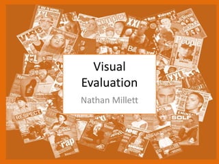
Visual Evaluation of a Gaming Magazine
- 3. Research Strengths- One of the strengths of this method is that I can see what other magazines look like and what I can use for my own work to make it look as professional as I can make it. It also allows me to see what has been use previously so I can avoid copy right as when I was doing the masthead this came in very important as I did not know what was being used and what was copyrighted for this project. Furthermore I got to see how others have positioned the images and text and even the size to make it appealing for the audience. Weaknesses- This is very time consuming due to this I did not have as much time as I would have like to have when I was making the assets due to this some of the assets where not detailed enough as I would want the to be also some of the ideas that I had had never been done before so I didn't have much inspiration for it and since google images only has some pictures I could get every single image that I needed to make the magazine.
- 4. Planning Strengths My planning with the mind map helped me a lot as I was able to clearly see all my ideas and construct them into a mind map. It also helps to plan your ideas as you can develop them and change your ideas. It also helps you be more prepared and allows you to imagine what your idea will look like. I can also avoid copyright. Weakness On of the weakness would be that it is very time consuming and that you do not get a visual image.
- 5. Time Management My time management for tis project went very well as I was always on task and kept up with the time as I have completed my work very successfully with lots of detail there isn’t much that I could improve on during this product that involves time management.
- 7. Similarities- The color schemes of the the magazines is very similar as they have utilized a color scheme of dark colors. The layout on the front page is very similar as the pose and position of the characters are in the same position. Differences- One of the differences of my product compared to this existing one would be that they have used lees pictures and more information on the game to give detail to the audience on the game product
- 8. Aesthetic Qualities I believe that my work looks creative and eye catching for the audience due to the colour scheme and the effect that I have used, if I was too improve on this I would try to put even more effects into it and add more information on the double page spread to give as much detail to the audience about the product.
- 9. Audience Appeal My product I have made sure that it has appealed to the audience as I have added prizes and eye catching images and colour schemes to get tem to buy the product. The colour scheme that I have utilised makes the audience interested in there product as it is suitable for the content and makes the reader engage with eh magazine as the colours that I have used in my magazine make it look interactive and intere3sting for the audience. To help the audience want to buy the product I have used a series of images and pictures of in game gameplay and best players around the world to make them want the product even more. As the target audiences age is for 14-30 year olds I made sure the images that I have used are suitable for this age group I sure of this by making sure that there was no graphic images used or bad language in the magazine as this could upset some viewers.
- 10. Peer Feedback
- 11. Feedback 1 • What did you like about the product? – I liked the fade from one of the images on the double page spread. – I also liked the colour schemes with the white on black and then the colours on the front cover worked as well. • What improvements could have been made to the product? – More information on the pro league players.
- 12. Feedback 2 • What did you like about the product? I really like the front cover and the design of it. I is very well layout. I also like the black background on the double page spread. • What improvements could have been made to the product? • I think the double page spread needs more writing I don’t think there is enough information.
- 13. Feedback 3 • What did you like about the product? – The double page spread is well organised and clear – The front page looks professional • What improvements could have been made to the product? – E text is small and hard to read
- 14. Peer Feedback Summary • What do you agree with from your peer feedback? – I agree that I should of added more detail in the pro league players • What do you disagree with from your peer feedback? – That black on white is good it can be a bit difficult to read sometimes
- 15. Peer Feedback Summary – Next time I do this I will add more information to the double page spread and fill in more of the spaces. This is so the audience gets more information on the game and will interest them as much as I can.
Editor's Notes
- What were the strengths of your research? How did your research help your product? What were the weaknesses of your research? What could you have done better/improve? What effect would this have had on your product?
- What were the strengths of your planning? How did your planning help your product? What were the weaknesses of your planning? What could you have done better/improve? What effect would this have had on your product?
- Did you manage your time well? Did you complete your project on time or would your products have improved with additional time? What would you have done if you had more time to produce your work?
- Compare your work to similar existing products and discuss the similarities and differences Put your final piece(s) in the centre of a page alongside an existing product Use text boxes and arrows
- Does your work look good? Was it creative? What aspects of your game’s visuals do you like? What would you improve? How would you improve it? Discuss the strengths and weaknesses Put your final piece(s) in the centre of a page and analyse them Use text boxes and arrows
- How have you appealed to your target audience? What specific bits of content would appeal to your target audience. Refer to your findings from your questionnaire. Put your final piece(s) in the centre of a page and analyse them Use text boxes and arrows
- What changes would you make to your product based upon your peer feedback and why?