
Recommended
More Related Content
What's hot
What's hot (20)
Viewers also liked
Similar to Contents page analysis
Similar to Contents page analysis (20)
More from KFox_AS
Recently uploaded
Recently uploaded (20)
Contents page analysis
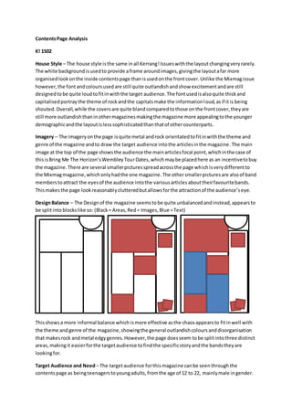
- 1. ContentsPage Analysis K! 1502 House Style – The house style isthe same inall Kerrang!Issueswiththe layoutchangingveryrarely. The white backgroundisusedto provide aframe aroundimages,givingthe layoutafar more organisedlookonthe inside contentspage thanisusedonthe frontcover.Unlike the Mixmagissue however,the font andcoloursusedare still quite outlandishandshow excitementandare still designedtobe quite loudtofitinwiththe target audience.The fontusedisalsoquite thickand capitalisedportraythe theme of rockandthe capitalsmake the informationloud,asif itis being shouted.Overall,while the coversare quite blandcomparedtothose onthe frontcover,theyare still more outlandishthaninothermagazinesmakingthe magazine more appealingtothe younger demographicandthe layoutislesssophisticatedthanthatof othercounterparts. Imagery – The imageryonthe page isquite metal androck orientatedtofitinwiththe theme and genre of the magazine andto draw the target audience intothe articlesinthe magazine.The main image at the top of the page showsthe audience the mainarticlesfocal point,whichinthe case of thisisBring Me The Horizon’sWembleyTourDates,whichmaybe placedhere as an incentivetobuy the magazine.There are several smallerpicturesspreadacrossthe page whichisverydifferentto the Mixmagmagazine,whichonlyhadthe one magazine.The othersmallerpicturesare alsoof band memberstoattract the eyesof the audience intothe variousarticlesabouttheirfavouritebands. Thismakesthe page lookreasonablyclutteredbutallowsforthe attractionof the audience’seye. DesignBalance – The Designof the magazine seemstobe quite unbalancedandinstead,appearsto be splitintoblockslike so: (Black= Areas,Red= Images,Blue =Text) Thisshowsa more informal balance which ismore effective asthe chaosappearsto fitinwell with the theme andgenre of the magazine,showingthe general outlandishcoloursanddisorganisation that makesrock andmetal edgygenres.However,the page doesseem tobe splitintothree distinct areas,makingit easierforthe targetaudience tofindthe specificstoryandthe bandstheyare lookingfor. Target Audience and Need – The targetaudience forthismagazine canbe seenthroughthe contentspage as beingteenagerstoyoungadults,fromthe age of 12 to 22, mainlymale ingender.
- 2. Thiscan be seeninseveral ways,throughthe colours,layoutandimagerywithinthe page.Firstly, the imageryismainlyof all male bands,particularlyinthe more metal genres,whichsuggeststhe audience isalsomale,asthese bands,withparticularfocusonBringMe The Horizon,are portrayed ina masculine way,makingthe imagespurpose toinspire othersinbandslike theirs.The colouris alsoa majorfocus,withplentyof reds,yellowsandblacksbeingused.Eachof these backsup the genre andthe type of people whowouldreadKerrang!Magazine,eachcolourconnotingthe various areas of rock; redconnotesdangerand,possibly,evil,somethingwhichhasbeenassociatedwith metal and‘metalheads’since the eraof bandslike IronMaidenandBlackSabbath,yellow connotes energy,somethingall metal androckbandsand fansare full of,made especiallyclearattheir concerts,and then,again,connotesdanger,andblackconnotes darknessandgothictendencies, seentobe popularwithbandslike BlackSabbathandMarilynManson. Finally,the layoutshowsthe target audience asthe overall waythatthe textand imagesare displayedisquitechaotic,beingseen to be synonymouswith the general bands,genreandfansof rock, especiallythose of ayoungerage. The GuttenbergDesignPrinciple – The GuttenbergDesignPrinciple isappliedinarathercleverand unknowingwayinthiscontentspage,withaquicklookoverthe page seemingtoshow noregard for any order.However,the principle hasbeenusedtodraw the attentionof the audience toall areasof the page,includingthe weak fallowarea.Straightaway,the eyesof the audience are drawntothe mainimage of the page inthe primaryoptical area, makingthemaware to the maintopicthe magazine isdiscussingwhich,inthiscase,isBringMe The Horizon’sWembleyTour.The page then containsseveral smallerpicturesplacedcarefullyinall the cornersof the magazine,fillingthe strong fallowarea,the weak fallowareaandthe terminal area.Thisdrawsthe audience’seyestoall areas of the page,withthe picturesbrightcoloursmakingthemstandoutfromthe black text.The textis alsoplacedcleverly,makingiteasierforthe audience toscanacross the page to findthe storythey are lookingfor. Mixmag (May 2013) House Style – Unlike the Kerrang!Magazine,the MIxmag ContentsPage isquite sophisticated,organisedand,in termsof colour,bland.Thiskeepsthe magazine page simple andsuitable forthe restof the magazine,being usedpurelyforone purpose:allowingthe audience tofind the article theyare lookingfor.The coloursfitinwiththe restof the magazine,beingwhitefontoverablack backgroundand capitalsbeingusedforarticle headings. This,coupledwiththe basicbold sansserif font,keepsthe house style suitableforthe targetaudience,drawingthem intothe magazine. Imagery – Ratherthan the sheermassof imagerythat Kerrang!chose to spreadacross theirpage,Mixmagwent for one huge image whichfitwiththe mostpopulararticle inthe magazine,thisbeingforahuge electronicmusic festival.Thisisdisplayedtodraw the attentionof the audience tothisone specificarticle,makingthemaware of
- 3. the importance or notorietyof the story.The onlyotherimage onthe page isthe coverof the free albumincludedinthe issue,thistimebeingGroove Armada.Thisisdisplayedjustforthe purpose of introducingthe small article aboutthe albumincludedandthe artistbehindit. DesignBalance – Thoughmore formal than Kerrang!,the overall page isstill veryinformal. Unlike Kerrang!,the contentspage of thismagazine ismuch more textbased,withthe picturesbeingreducedtoplace a higheremphasisonthe text.Thisshowsamore sophisticatedandmature audienceasthe bodiesof textare muchlarger.However,similarlytoKerrang!,the designisnotsymmetrical andisunevenly balanced,done todrawmore attentiontothe mainimage thanthe text.Thisis effective asitmakes the picture standout more,displayingaclearimage of the magazinesgenre andtargetaudience. Target Audience – The targetaudience forthismagazine is,again,veryobviousforseveralreasons. The target audience ispeoplewhoenjoyorare avidfansof the electronicgenresof musicsuchas house,technoandtrance,mainlythose of a more sophisticatednature,agedaround25-40.This is, firstly,made apparentthroughthe colours.The magazine usesonlyblackandwhite,withthe only colourbeingsituatedinthe twoimagesonthe page.This,while drawingmore attentiontothese images,showsamore mature audience who,unlikethose whoreadKerrang!,donotneedbright coloursand heavyimage use tokeeptheminterestedinthe articles.Secondlyisthe font,witha more sophisticatedandsimplisticfonttype beingusedtoshow control andorganisation,something mostpeople wouldassociate withthe electronicgenre.Finally,the layoutof the magazine isnot chaoticand is quite well structuredandorganised,showingmore intelligence andahigherlove of textthanimagery. The GuttenbergDesignPrinciple – The principal hasclearlybeenthoughtaboutwhenmakingthis page,withthe title of the magazine andthe mainimage beingsituatedinthe primaryoptical area, drawingthe eyesof the audience directlythere. The weak fallow area,however,seemstohave sufferedwiththe mainitemsinthe areabeingtext.Thisdoesn’tdraw the eyesof the audience to that area which,unfortunately,meanstheyare lesslikelytoreadthisbodyof text.Finally,the main texthas beenplacedinthe strong fallow areaandleadsdowntothe terminal area,makingsure the audience readthe text.