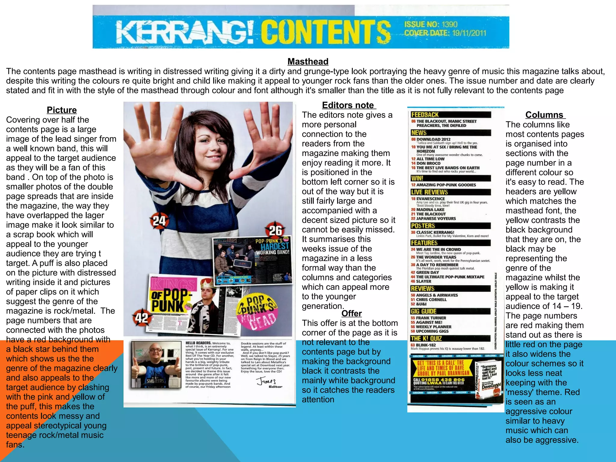
The contents page uses a distressed masthead font and bright colors to appeal to younger rock fans. Over half the page is taken up by a large photo of a band's lead singer, surrounded by smaller photos from inside articles. Columns are organized into sections with alternating red and black text, and a red star graphic behind page numbers relates to the magazine's heavy music genre. An editor's note gives a personal connection, and a black subscription offer contrasts the white background to stand out. Overall, the layout portrays a messy, scrapbook-style look fitting for its target teenage rock/metal audience.
Here I have analysed different Rock related contents pages and double page spread's so I could see how they were structured for the production of my own magazine.
Los lugares más exóticos del planeta TierraMarlon Bunting
Una presentación muy alusiva a los lugares mas hermosos tocados por la mano del hombre y otros que ni la mirada de muchos ha pasado por ahí; espero que este trabajo sea de todo su agrado y si les gustó porfavor denle like :D
2. Masthead
At the top of the contents page is the masthead, instead of using the classic word ‘contents’ they have used ‘nme this week’ then put the date underneath so it fits in.
The writing fits the house style as it the same as the cover and the colours are very widely used colours, the NME is red so it stands out and is recognisable as the logo.
The masthead sets the colour theme for the rest of the contents page as it is the first thing the reader will see due to it being the largest thing on the page and at the
top.
Side bar
NME put a band index in a
side bar, this is a list of the
bands included in this
weeks issue and the page
number they are on. The
bands are red and the page
number is black which is the
opposite to the contents
column parallel to this, by
doing this is keeps in with
the house style but varies
the colour so it looks
attractive to the reader and
not to boring and repetitive.
Picture
In the middle of the
NME contents page
is a large picture
with a small article
relating to it beneath
this. The main tones
of the picture are
black and red which
fit in with the house
style of this contents
page .
Of fer
Positioned in the
centre of the page
but at the bottom of
is a promotional
offer to subscribe to
the magazine. This
positioning makes
sure the reader
see’s it but it also
does not get in the
way of the contents
page, the yellow
writing and dark
background don’t fit
in with the house
style, this makes it
stands out more as
it is not relevant to
the contents page
Columns
The articles and their page
numbers have been organised
into a list and it has been
organised into sections.
It has the main article name
in bold then a brief
description of the article in
smaller text so people know if
they want to read it, it also
has arrows pointing to what
was on the cover so the
audience can easily locate the
articles they may be most
interested in.
The page numbers are in red
so they stand out and also
brighten up the page.
3. Masthead
The masthead of the contents page is bright red which relates to the Q logo, also on the contents page. The writing on the contents page is a basic computer type font
making it look neat and organised which appeals to it’s target audience, this contrasts with the bright red background which looks more interesting and eye-catching.
The bright red can reflect the type of music genre this magazine is based on as it is rock music whilst it is softened by the white in the Q so it doesn’t look too heavy
because the rock is also combined with mainstream chart music, symbolised by the red and white.
Columns
The contents page is
organised into sections
carrying on with the theme of
organisation and appealing to
a more mature audience than
magazines such as kerrang.
The text alternated from red
to black keeping a variation
throughout the contents page
so it does not look repetitive
and boring to the reader.
There is a picture at the top of
the column relating to the
named article below it which
is larger than the other
focusing the readers attention
on what the magazine
believes is the most important
part of this column, it also
stands out and draws in
attention by having the body
text as red whilst the others
have black body text, this
makes it brighter and more
eyecatching.
Large Image
Placed close to the centre is a
large image taking up most of
the page, this image shows a
band in what looks like China
or Japan suggesting that they
are on a world tour giving the
reader an idea of what the
article might be about. The
image has a lot of red, black
and white in it so it fits in with
the house style of the
contents page, the people in
the photo are dressed in a lot
of black suggesting they are a
rock band fitting in with the
genre of the magazine. In the
left hand corner of the
magazine is a large number in
white telling the reader what
page this bands article will be
on, it is very large so it is easy
to see.
4. Masthead
The contents page masthead is writing in distressed writing giving it a dirty and grunge-type look portraying the heavy genre of music this magazine talks about,
despite this writing the colours re quite bright and child like making it appeal to younger rock fans than the older ones. The issue number and date are clearly
stated and fit in with the style of the masthead through colour and font although it's smaller than the title as it is not fully relevant to the contents page
Picture
Covering over half the
contents page is a large
image of the lead singer from
a well known band, this will
appeal to the target audience
as they will be a fan of this
band . On top of the photo is
smaller photos of the double
page spreads that are inside
the magazine, the way they
have overlapped the lager
image make it look similar to
a scrap book which will
appeal to the younger
audience they are trying t
target. A puff is also placed
on the picture with distressed
writing inside it and pictures
of paper clips on it which
suggest the genre of the
magazine is rock/metal. The
page numbers that are
connected with the photos
have a red background with
a black star behind them
which shows us the the
genre of the magazine clearly
and also appeals to the
target audience by clashing
with the pink and yellow of
the puff, this makes the
contents look messy and
appeal stereotypical young
teenage rock/metal music
fans.
Editors note
The editors note gives a
more personal
connection to the
readers from the
magazine making them
enjoy reading it more. It
is positioned in the
bottom left corner so it is
out of the way but it is
still fairly large and
accompanied with a
decent sized picture so it
cannot be easily missed.
It summarises this
weeks issue of the
magazine in a less
formal way than the
columns and categories
which can appeal more
to the younger
generation.
Offer
This offer is at the bottom
corner of the page as it is
not relevant to the
contents page but by
making the background
black it contrasts the
mainly white background
so it catches the readers
attention
Columns
The columns like
most contents pages
is organised into
sections with the
page number in a
different colour so
it's easy to read. The
headers are yellow
which matches the
masthead font, the
yellow contrasts the
black background
that they are on, the
black may be
representing the
genre of the
magazine whilst the
yellow is making it
appeal to the target
audience of 14 – 19.
The page numbers
are red making them
stand out as there is
little red on the page
it also widens the
colour schemes so it
looks less neat
keeping with the
'messy' theme. Red
is seen as an
aggressive colour
similar to heavy
music which can
also be aggressive.