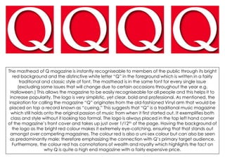
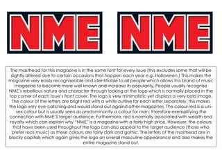
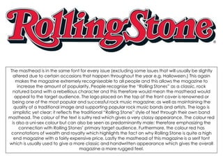
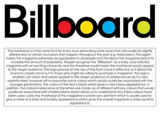
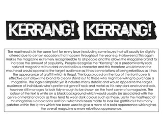
SlideShare a Scribd company logo
1 of 6
The masthead of Q magazine is instantly recogniseable to members of the public through its bright
red background and the distinctive white letter “Q” in the foreground which is written in a fairly
traditional and classic style of font. The masthead is in the same font for every single issue
(excluding some issues that will change due to certain occasions throughout the year e.g.
Halloween.) This allows the magazine to be easily recogniseable for all people and this helps it to
increase popularity. The logo is very simplistic, yet clear, bold and professional. As mentioned, the
inspiration for calling the magazine “Q” originates from the old-fashioned Vinyl arm that would be
placed on top a record known as “cueing.” This suggests that “Q” is a traditional music magazine
which still holds onto the original passion of music from when it first started out. It exemplifies both
class and style without it looking too formal. The logo is always placed in the top left hand corner
of the magazine’s front cover and takes up just over 1/12th of the page. Having the background of
the logo as the bright red colour makes it extremely eye-catching, ensuring that that stands out
amongst over competing magazines. The colour red is also a uni-sex colour but can also be seen
as predominantly male; therefore emphasizing the connection with Q’s primary target audience.
Furthermore, the colour red has connotations of wealth and royalty which highlights the fact on
why Q is quite a high end magazine with a fairly expensive price.
The masthead for this magazine is in the same font for every issue (this excludes some that will be
slightly altered due to certain occasions that happen each year e.g. Halloween.) This makes the
magazine very easily recogniseable and identifiable to all people which allows this brand of music
magazine to become more well known and increase its popularity. People usually recognise
NME’s rebellious nature and character through looking at the logo which is normally placed in the
top corner of each issue’s front cover. The logo is very minimalistic yet displays a very bold image.
The colour of the letters are bright red with a white outline for each letter separately, this makes
the logo very eye-catching and would stand out against other magazines. The colour red is a uni-
sex colour but is usually seen as predominantly a colour for men; therefore exemplifying the
connection with NME’S target audience. Furthermore, red is normally associated with wealth and
royalty which can explain why “NME” is a magazine with a fairly high price. However, the colours
that have been used throughout the logo can also appeal to the target audience (those who
prefer rock music) as these colours are fairly dark and gothic. The letters of the masthead are in
blocky capitals which again gives the logo an overall masculine appearance and also makes the
entire magazine stand out.
The masthead is in the same font for every issue (excluding some issues that will usually be slightly
altered due to certain occasions that happen throughout the year e.g. Halloween.) This again
makes the magazine extremely recogniseable to all people and this allows the magazine to
increase the amount of popularity. People recognise the “Rolling Stones” as a classic, rock
natured band with a rebellious character and this therefore would mean the masthead would
appeal to the target audience. The logo placed on the top of the front cover is renowned or
being one of the most popular and successful rock music magazine; as well as maintaining the
quality of a traditional image and supporting popular rock music bands and artists. The logo is
simplistic yet clear; it reflects the traditional “Rolling Stone” style of text through their own band
masthead. The colour of the text is sultry red which gives a very classy appearance. The colour red
is also a uni-sex colour but can also be seen as predominantly male; therefore emphasizing the
connection with Rolling Stones’ primary target audience. Furthermore, the colour red has
connotations of wealth and royalty which highlights the fact on why Rolling Stone is quite a high
end magazine with a fairly expensive price. Lastly the masthead of this magazine is a serif font
which is usually used to give a more classic and handwritten appearance which gives the overall
magazine a more rugged feel.
The masthead is in the same font for every issue (excluding some issues that will usually be slightly
altered due to certain occasions that happen throughout the year e.g. Halloween.) This again
makes the magazine extremely recogniseable to all people and this allows the magazine brand to
increase the amount of popularity. People recognise the “Billboard” as a lively, pop natured
magazine with an exciting character and this therefore would mean the masthead would appeal
to the target audience. The logo placed on the top of the front cover is effective as it allows the
brand to clearly stand out to those who might be willing to purchase a magazine. The logo is
simplistic yet clear; and would appeal to the target audience of adolescences as it is very
sophisticated, however still incorporates some colour which would usually be associated with the
younger generations. The colour of the text is black which gives a very classy appearance. In
addition, the colours inside some of the letters are made up of different primary colours that would
usually be associated with children/teens which allows us to understand why these colours have
been used. Lastly the masthead of this magazine is a bold sans serif font which is usually used to
give a more of a bold and bubbly appearance which gives the overall magazine a more youthful
appearance.
The masthead is in the same font for every issue (excluding some issues that will usually be slightly
altered due to certain occasions that happen throughout the year e.g. Halloween.) This again
makes the magazine extremely recogniseable to all people and this allows the magazine brand to
increase the amount of popularity. People recognise the “Kerrang” as a predominantly rock
natured magazine with a dark and rebellious character and this therefore would mean the
masthead would appeal to the target audience as it has connotations of being rebellious as it has
the appearance of graffiti which is illegal. The logo placed on the top of the front cover is
effective as it allows the brand to clearly stand out to those who might be willing to purchase a
magazine. The logo is simplistic yet it includes many details; and would appeal to the target
audience of individuals who’s preferred genre if rock and metal as it is very dark and rushed look,
however still manages to look tidy enough to be shown on the front cover of a magazine. The
colour of the text is white on a black background which would usually be associated with the
genre of metal and rock as they tend to wear dark colours such as these. Lastly the masthead of
this magazine is a bold sans serif font which has been made to look like graffiti as it has many
patches within the letters which has been used to give a more of a bold appearance which gives
the overall magazine a more rebellious appearance.

More Related Content

What's hot

5 magazine front covers
5 magazine front covers5 magazine front covers
5 magazine front covers
robyngarcia
 
Mojo magazine analysis
Mojo magazine analysisMojo magazine analysis
Mojo magazine analysis
LittlePainter
 
Contents analysis
Contents analysisContents analysis
Contents analysis
kimb0ot
 
Contents analysis
Contents analysisContents analysis
Contents analysis
kimb0ot
 
Music Magazine Textual Analysis
Music Magazine Textual AnalysisMusic Magazine Textual Analysis
Music Magazine Textual Analysis
Lennon Riley
 
All analysis
All analysisAll analysis
All analysis
ljeyash
 

What's hot (20)

Analysisi of magaixzne
Analysisi of magaixzneAnalysisi of magaixzne
Analysisi of magaixzne
 
Magazine research
Magazine researchMagazine research
Magazine research
 
Mojo’ magazine analysis
Mojo’ magazine analysisMojo’ magazine analysis
Mojo’ magazine analysis
 
5 magazine front covers
5 magazine front covers5 magazine front covers
5 magazine front covers
 
Double page spread analysis
Double page spread analysisDouble page spread analysis
Double page spread analysis
 
Mojo magazine analysis
Mojo magazine analysisMojo magazine analysis
Mojo magazine analysis
 
Contents analysis
Contents analysisContents analysis
Contents analysis
 
Contents analysis
Contents analysisContents analysis
Contents analysis
 
Analysing Music Magazines
Analysing Music MagazinesAnalysing Music Magazines
Analysing Music Magazines
 
Front cover analysis.
Front cover analysis.Front cover analysis.
Front cover analysis.
 
Music Magazine Collarge2
Music Magazine Collarge2Music Magazine Collarge2
Music Magazine Collarge2
 
Magazine analysis
Magazine analysis Magazine analysis
Magazine analysis
 
Contents page evaluations
Contents page evaluationsContents page evaluations
Contents page evaluations
 
Music Magazine Textual Analysis
Music Magazine Textual AnalysisMusic Magazine Textual Analysis
Music Magazine Textual Analysis
 
Magazine Analysis
Magazine AnalysisMagazine Analysis
Magazine Analysis
 
AS media studies magazine research and planning
AS media studies magazine research and planning AS media studies magazine research and planning
AS media studies magazine research and planning
 
Magazine Analysis
Magazine AnalysisMagazine Analysis
Magazine Analysis
 
All analysis
All analysisAll analysis
All analysis
 
Unit 14 - LO1
Unit 14 - LO1Unit 14 - LO1
Unit 14 - LO1
 
Music mag analysed
Music mag analysedMusic mag analysed
Music mag analysed
 

Viewers also liked (8)

Survey Results Analysis
Survey Results AnalysisSurvey Results Analysis
Survey Results Analysis
 
Contents Page Analysis
Contents Page AnalysisContents Page Analysis
Contents Page Analysis
 
The audience profile
The audience profileThe audience profile
The audience profile
 
Feedback for emily
Feedback for emilyFeedback for emily
Feedback for emily
 
Front cover analysis
Front cover analysisFront cover analysis
Front cover analysis
 
Feature Article Analysis
Feature Article AnalysisFeature Article Analysis
Feature Article Analysis
 
Contents cover analysis
Contents cover analysisContents cover analysis
Contents cover analysis
 
Audience profile
Audience profileAudience profile
Audience profile
 

Similar to Existing Mastheads Analysis (20)

Mast head analysation
Mast head analysationMast head analysation
Mast head analysation
 
Existing mastheads
Existing mastheadsExisting mastheads
Existing mastheads
 
Existing magazine mastheads
Existing magazine mastheadsExisting magazine mastheads
Existing magazine mastheads
 
Mastheads analysis
Mastheads analysisMastheads analysis
Mastheads analysis
 
Mast head analysis
Mast head analysisMast head analysis
Mast head analysis
 
Mojo
MojoMojo
Mojo
 
Masthead research
Masthead researchMasthead research
Masthead research
 
Magazine analysis
Magazine analysisMagazine analysis
Magazine analysis
 
Punk magazines
Punk magazinesPunk magazines
Punk magazines
 
Audience research
Audience researchAudience research
Audience research
 
Kerrang! magazine cover analysis
Kerrang! magazine cover analysisKerrang! magazine cover analysis
Kerrang! magazine cover analysis
 
Masthead analysis
Masthead analysis   Masthead analysis
Masthead analysis
 
Masthead anaylsis
Masthead anaylsisMasthead anaylsis
Masthead anaylsis
 
Mastheads analysis
Mastheads analysisMastheads analysis
Mastheads analysis
 
Magazine cover annotation
Magazine cover annotationMagazine cover annotation
Magazine cover annotation
 
Rock and folk presntation
Rock and folk presntationRock and folk presntation
Rock and folk presntation
 
Music magazine Market Research and Textual Analysis
Music magazine Market Research and Textual AnalysisMusic magazine Market Research and Textual Analysis
Music magazine Market Research and Textual Analysis
 
Magazine anaylisis
Magazine anaylisisMagazine anaylisis
Magazine anaylisis
 
Magazine anaylisis
Magazine anaylisisMagazine anaylisis
Magazine anaylisis
 
Music magazine analysis
Music magazine analysisMusic magazine analysis
Music magazine analysis
 

Recently uploaded

Recently uploaded (20)

Unit 3 Emotional Intelligence and Spiritual Intelligence.pdf
Unit 3 Emotional Intelligence and Spiritual Intelligence.pdfUnit 3 Emotional Intelligence and Spiritual Intelligence.pdf
Unit 3 Emotional Intelligence and Spiritual Intelligence.pdf
 
How to Add New Custom Addons Path in Odoo 17
How to Add New Custom Addons Path in Odoo 17How to Add New Custom Addons Path in Odoo 17
How to Add New Custom Addons Path in Odoo 17
 
Sensory_Experience_and_Emotional_Resonance_in_Gabriel_Okaras_The_Piano_and_Th...
Sensory_Experience_and_Emotional_Resonance_in_Gabriel_Okaras_The_Piano_and_Th...Sensory_Experience_and_Emotional_Resonance_in_Gabriel_Okaras_The_Piano_and_Th...
Sensory_Experience_and_Emotional_Resonance_in_Gabriel_Okaras_The_Piano_and_Th...
 
80 ĐỀ THI THỬ TUYỂN SINH TIẾNG ANH VÀO 10 SỞ GD – ĐT THÀNH PHỐ HỒ CHÍ MINH NĂ...
80 ĐỀ THI THỬ TUYỂN SINH TIẾNG ANH VÀO 10 SỞ GD – ĐT THÀNH PHỐ HỒ CHÍ MINH NĂ...80 ĐỀ THI THỬ TUYỂN SINH TIẾNG ANH VÀO 10 SỞ GD – ĐT THÀNH PHỐ HỒ CHÍ MINH NĂ...
80 ĐỀ THI THỬ TUYỂN SINH TIẾNG ANH VÀO 10 SỞ GD – ĐT THÀNH PHỐ HỒ CHÍ MINH NĂ...
 
Economic Importance Of Fungi In Food Additives
Economic Importance Of Fungi In Food AdditivesEconomic Importance Of Fungi In Food Additives
Economic Importance Of Fungi In Food Additives
 
VAMOS CUIDAR DO NOSSO PLANETA! .
VAMOS CUIDAR DO NOSSO PLANETA!                    .VAMOS CUIDAR DO NOSSO PLANETA!                    .
VAMOS CUIDAR DO NOSSO PLANETA! .
 
UGC NET Paper 1 Unit 7 DATA INTERPRETATION.pdf
UGC NET Paper 1 Unit 7 DATA INTERPRETATION.pdfUGC NET Paper 1 Unit 7 DATA INTERPRETATION.pdf
UGC NET Paper 1 Unit 7 DATA INTERPRETATION.pdf
 
On_Translating_a_Tamil_Poem_by_A_K_Ramanujan.pptx
On_Translating_a_Tamil_Poem_by_A_K_Ramanujan.pptxOn_Translating_a_Tamil_Poem_by_A_K_Ramanujan.pptx
On_Translating_a_Tamil_Poem_by_A_K_Ramanujan.pptx
 
HMCS Max Bernays Pre-Deployment Brief (May 2024).pptx
HMCS Max Bernays Pre-Deployment Brief (May 2024).pptxHMCS Max Bernays Pre-Deployment Brief (May 2024).pptx
HMCS Max Bernays Pre-Deployment Brief (May 2024).pptx
 
How to Manage Global Discount in Odoo 17 POS
How to Manage Global Discount in Odoo 17 POSHow to Manage Global Discount in Odoo 17 POS
How to Manage Global Discount in Odoo 17 POS
 
Graduate Outcomes Presentation Slides - English
Graduate Outcomes Presentation Slides - EnglishGraduate Outcomes Presentation Slides - English
Graduate Outcomes Presentation Slides - English
 
Interdisciplinary_Insights_Data_Collection_Methods.pptx
Interdisciplinary_Insights_Data_Collection_Methods.pptxInterdisciplinary_Insights_Data_Collection_Methods.pptx
Interdisciplinary_Insights_Data_Collection_Methods.pptx
 
Beyond_Borders_Understanding_Anime_and_Manga_Fandom_A_Comprehensive_Audience_...
Beyond_Borders_Understanding_Anime_and_Manga_Fandom_A_Comprehensive_Audience_...Beyond_Borders_Understanding_Anime_and_Manga_Fandom_A_Comprehensive_Audience_...
Beyond_Borders_Understanding_Anime_and_Manga_Fandom_A_Comprehensive_Audience_...
 
Jamworks pilot and AI at Jisc (20/03/2024)
Jamworks pilot and AI at Jisc (20/03/2024)Jamworks pilot and AI at Jisc (20/03/2024)
Jamworks pilot and AI at Jisc (20/03/2024)
 
COMMUNICATING NEGATIVE NEWS - APPROACHES .pptx
COMMUNICATING NEGATIVE NEWS - APPROACHES .pptxCOMMUNICATING NEGATIVE NEWS - APPROACHES .pptx
COMMUNICATING NEGATIVE NEWS - APPROACHES .pptx
 
REMIFENTANIL: An Ultra short acting opioid.pptx
REMIFENTANIL: An Ultra short acting opioid.pptxREMIFENTANIL: An Ultra short acting opioid.pptx
REMIFENTANIL: An Ultra short acting opioid.pptx
 
Wellbeing inclusion and digital dystopias.pptx
Wellbeing inclusion and digital dystopias.pptxWellbeing inclusion and digital dystopias.pptx
Wellbeing inclusion and digital dystopias.pptx
 
21st_Century_Skills_Framework_Final_Presentation_2.pptx
21st_Century_Skills_Framework_Final_Presentation_2.pptx21st_Century_Skills_Framework_Final_Presentation_2.pptx
21st_Century_Skills_Framework_Final_Presentation_2.pptx
 
Tatlong Kwento ni Lola basyang-1.pdf arts
Tatlong Kwento ni Lola basyang-1.pdf artsTatlong Kwento ni Lola basyang-1.pdf arts
Tatlong Kwento ni Lola basyang-1.pdf arts
 
Model Attribute _rec_name in the Odoo 17
Model Attribute _rec_name in the Odoo 17Model Attribute _rec_name in the Odoo 17
Model Attribute _rec_name in the Odoo 17
 

Existing Mastheads Analysis

  • 1.
  • 2. The masthead of Q magazine is instantly recogniseable to members of the public through its bright red background and the distinctive white letter “Q” in the foreground which is written in a fairly traditional and classic style of font. The masthead is in the same font for every single issue (excluding some issues that will change due to certain occasions throughout the year e.g. Halloween.) This allows the magazine to be easily recogniseable for all people and this helps it to increase popularity. The logo is very simplistic, yet clear, bold and professional. As mentioned, the inspiration for calling the magazine “Q” originates from the old-fashioned Vinyl arm that would be placed on top a record known as “cueing.” This suggests that “Q” is a traditional music magazine which still holds onto the original passion of music from when it first started out. It exemplifies both class and style without it looking too formal. The logo is always placed in the top left hand corner of the magazine’s front cover and takes up just over 1/12th of the page. Having the background of the logo as the bright red colour makes it extremely eye-catching, ensuring that that stands out amongst over competing magazines. The colour red is also a uni-sex colour but can also be seen as predominantly male; therefore emphasizing the connection with Q’s primary target audience. Furthermore, the colour red has connotations of wealth and royalty which highlights the fact on why Q is quite a high end magazine with a fairly expensive price.
  • 3. The masthead for this magazine is in the same font for every issue (this excludes some that will be slightly altered due to certain occasions that happen each year e.g. Halloween.) This makes the magazine very easily recogniseable and identifiable to all people which allows this brand of music magazine to become more well known and increase its popularity. People usually recognise NME’s rebellious nature and character through looking at the logo which is normally placed in the top corner of each issue’s front cover. The logo is very minimalistic yet displays a very bold image. The colour of the letters are bright red with a white outline for each letter separately, this makes the logo very eye-catching and would stand out against other magazines. The colour red is a uni- sex colour but is usually seen as predominantly a colour for men; therefore exemplifying the connection with NME’S target audience. Furthermore, red is normally associated with wealth and royalty which can explain why “NME” is a magazine with a fairly high price. However, the colours that have been used throughout the logo can also appeal to the target audience (those who prefer rock music) as these colours are fairly dark and gothic. The letters of the masthead are in blocky capitals which again gives the logo an overall masculine appearance and also makes the entire magazine stand out.
  • 4. The masthead is in the same font for every issue (excluding some issues that will usually be slightly altered due to certain occasions that happen throughout the year e.g. Halloween.) This again makes the magazine extremely recogniseable to all people and this allows the magazine to increase the amount of popularity. People recognise the “Rolling Stones” as a classic, rock natured band with a rebellious character and this therefore would mean the masthead would appeal to the target audience. The logo placed on the top of the front cover is renowned or being one of the most popular and successful rock music magazine; as well as maintaining the quality of a traditional image and supporting popular rock music bands and artists. The logo is simplistic yet clear; it reflects the traditional “Rolling Stone” style of text through their own band masthead. The colour of the text is sultry red which gives a very classy appearance. The colour red is also a uni-sex colour but can also be seen as predominantly male; therefore emphasizing the connection with Rolling Stones’ primary target audience. Furthermore, the colour red has connotations of wealth and royalty which highlights the fact on why Rolling Stone is quite a high end magazine with a fairly expensive price. Lastly the masthead of this magazine is a serif font which is usually used to give a more classic and handwritten appearance which gives the overall magazine a more rugged feel.
  • 5. The masthead is in the same font for every issue (excluding some issues that will usually be slightly altered due to certain occasions that happen throughout the year e.g. Halloween.) This again makes the magazine extremely recogniseable to all people and this allows the magazine brand to increase the amount of popularity. People recognise the “Billboard” as a lively, pop natured magazine with an exciting character and this therefore would mean the masthead would appeal to the target audience. The logo placed on the top of the front cover is effective as it allows the brand to clearly stand out to those who might be willing to purchase a magazine. The logo is simplistic yet clear; and would appeal to the target audience of adolescences as it is very sophisticated, however still incorporates some colour which would usually be associated with the younger generations. The colour of the text is black which gives a very classy appearance. In addition, the colours inside some of the letters are made up of different primary colours that would usually be associated with children/teens which allows us to understand why these colours have been used. Lastly the masthead of this magazine is a bold sans serif font which is usually used to give a more of a bold and bubbly appearance which gives the overall magazine a more youthful appearance.
  • 6. The masthead is in the same font for every issue (excluding some issues that will usually be slightly altered due to certain occasions that happen throughout the year e.g. Halloween.) This again makes the magazine extremely recogniseable to all people and this allows the magazine brand to increase the amount of popularity. People recognise the “Kerrang” as a predominantly rock natured magazine with a dark and rebellious character and this therefore would mean the masthead would appeal to the target audience as it has connotations of being rebellious as it has the appearance of graffiti which is illegal. The logo placed on the top of the front cover is effective as it allows the brand to clearly stand out to those who might be willing to purchase a magazine. The logo is simplistic yet it includes many details; and would appeal to the target audience of individuals who’s preferred genre if rock and metal as it is very dark and rushed look, however still manages to look tidy enough to be shown on the front cover of a magazine. The colour of the text is white on a black background which would usually be associated with the genre of metal and rock as they tend to wear dark colours such as these. Lastly the masthead of this magazine is a bold sans serif font which has been made to look like graffiti as it has many patches within the letters which has been used to give a more of a bold appearance which gives the overall magazine a more rebellious appearance.