The double page spread in Kerrang! magazine follows the chaotic house style through its use of colors and layout. Most of the primary optical area is blank except for band members' faces, while the title and introduction are in the weak fallow area to draw readers' eyes. The large central image shows the band, venue, and article title. Text is placed around the image in an unorganized way to match the magazine's style.
The double page spread in Mixmag magazine follows the consistent house style through its dark backgrounds, sans-serif font, and similar image and layout styles. The large introductory letter draws readers straight into the article rather than an image. Smaller, darker images are used compared to magazines
Elite screens are available from Dukane.
Dukane is an American company serving the education, corporate, government and house of worship markets for over 85 years.
I am an authorized consultant for Dukane
Bill McIntosh
SchoolVision Inc ( my consulting company)
Authorized Dukane/Convey Consultant
Dukane Website : www.Dukaneav.com
Phone :843-442-8888
Email :WKMcIntosh@Comcast.net
Twitter : @OtisTMcIntosh
SchoolVision Website on Facebook: https://www.facebook.com/WKMIII
Visit BVIS Hanoi official website: http://www.bvishanoi.com/
Like us on FACEBOOK: https://www.facebook.com/BVISHanoi.Official
Follow us on TWITTER: https://twitter.com/BVISHanoi
And on Google+: https://plus.google.com/+Bvishanoi-official
A slideshow to show how I addressed my target audience, comparing my product to similar Kerrang! pages.
"5. How did you attract/address your audience?"
This is a presentation by Dada Robert in a Your Skill Boost masterclass organised by the Excellence Foundation for South Sudan (EFSS) on Saturday, the 25th and Sunday, the 26th of May 2024.
He discussed the concept of quality improvement, emphasizing its applicability to various aspects of life, including personal, project, and program improvements. He defined quality as doing the right thing at the right time in the right way to achieve the best possible results and discussed the concept of the "gap" between what we know and what we do, and how this gap represents the areas we need to improve. He explained the scientific approach to quality improvement, which involves systematic performance analysis, testing and learning, and implementing change ideas. He also highlighted the importance of client focus and a team approach to quality improvement.
How to Create Map Views in the Odoo 17 ERPCeline George
The map views are useful for providing a geographical representation of data. They allow users to visualize and analyze the data in a more intuitive manner.
The Roman Empire A Historical Colossus.pdfkaushalkr1407
The Roman Empire, a vast and enduring power, stands as one of history's most remarkable civilizations, leaving an indelible imprint on the world. It emerged from the Roman Republic, transitioning into an imperial powerhouse under the leadership of Augustus Caesar in 27 BCE. This transformation marked the beginning of an era defined by unprecedented territorial expansion, architectural marvels, and profound cultural influence.
The empire's roots lie in the city of Rome, founded, according to legend, by Romulus in 753 BCE. Over centuries, Rome evolved from a small settlement to a formidable republic, characterized by a complex political system with elected officials and checks on power. However, internal strife, class conflicts, and military ambitions paved the way for the end of the Republic. Julius Caesar’s dictatorship and subsequent assassination in 44 BCE created a power vacuum, leading to a civil war. Octavian, later Augustus, emerged victorious, heralding the Roman Empire’s birth.
Under Augustus, the empire experienced the Pax Romana, a 200-year period of relative peace and stability. Augustus reformed the military, established efficient administrative systems, and initiated grand construction projects. The empire's borders expanded, encompassing territories from Britain to Egypt and from Spain to the Euphrates. Roman legions, renowned for their discipline and engineering prowess, secured and maintained these vast territories, building roads, fortifications, and cities that facilitated control and integration.
The Roman Empire’s society was hierarchical, with a rigid class system. At the top were the patricians, wealthy elites who held significant political power. Below them were the plebeians, free citizens with limited political influence, and the vast numbers of slaves who formed the backbone of the economy. The family unit was central, governed by the paterfamilias, the male head who held absolute authority.
Culturally, the Romans were eclectic, absorbing and adapting elements from the civilizations they encountered, particularly the Greeks. Roman art, literature, and philosophy reflected this synthesis, creating a rich cultural tapestry. Latin, the Roman language, became the lingua franca of the Western world, influencing numerous modern languages.
Roman architecture and engineering achievements were monumental. They perfected the arch, vault, and dome, constructing enduring structures like the Colosseum, Pantheon, and aqueducts. These engineering marvels not only showcased Roman ingenuity but also served practical purposes, from public entertainment to water supply.
Students, digital devices and success - Andreas Schleicher - 27 May 2024..pptxEduSkills OECD
Andreas Schleicher presents at the OECD webinar ‘Digital devices in schools: detrimental distraction or secret to success?’ on 27 May 2024. The presentation was based on findings from PISA 2022 results and the webinar helped launch the PISA in Focus ‘Managing screen time: How to protect and equip students against distraction’ https://www.oecd-ilibrary.org/education/managing-screen-time_7c225af4-en and the OECD Education Policy Perspective ‘Students, digital devices and success’ can be found here - https://oe.cd/il/5yV
Unit 8 - Information and Communication Technology (Paper I).pdfThiyagu K
This slides describes the basic concepts of ICT, basics of Email, Emerging Technology and Digital Initiatives in Education. This presentations aligns with the UGC Paper I syllabus.
How to Split Bills in the Odoo 17 POS ModuleCeline George
Bills have a main role in point of sale procedure. It will help to track sales, handling payments and giving receipts to customers. Bill splitting also has an important role in POS. For example, If some friends come together for dinner and if they want to divide the bill then it is possible by POS bill splitting. This slide will show how to split bills in odoo 17 POS.
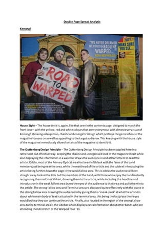
1. Double Page Spread Analysis
Kerrang!
House Style – The house style is,again,like thatseeninthe contentspage,designedtomatchthe
frontcover,withthe yellow,redandwhite coloursthatare synonymouswithalmosteveryissue of
Kerrang!,showing adangerous,chaoticandenergeticdesignwhichportraysthe genre of musicthe
magazine focusesonaswell asappealingtothe targetaudience.Thiskeepingwiththe house style
of the magazine immediatelyallowsforfansof the magazine toidentifyit.
The GuttenbergDesignPrinciple – The GuttenbergDesignPrinciple hasbeenappliedhere ina
rather oddbut effective way,keepingthe chaoticandunorganisedlookof the magazine intactwhile
alsodisplayingthe informationinaway that drawsthe audience inandattracts themto read the
article.Oddly,mostof the PrimaryOptical areahas beenleftblankwiththe facesof the band
membersjustbeingnearthe area,while the mastheadof the article andthe subtextintroducingthe
article beingfurtherdownthe page inthe weakfallow area.Thisisoddas the audience will not
straightaway lookat the title butthe membersof the band,withthose whoenjoythe bandinstantly
recognisingthemasEnterShikari,drawingthemtothe article,while includingthe headline and
introductioninthe weakfallow areadrawsthe eyesof the audience tothatarea andpullstheminto
the article.The strongfallowareaand Terminal areaare also usedquite effectivelywiththe quote in
the strong fallowareadrawingthe audience inbygivingthema‘sneak-peek’atwhatthe article is
aboutwhile mainbodyof textissituatedinthe terminal area,thisbeingthe lastplace theireyes
wouldlooksotheycan continue the article. Finally,alsolocatedinthe regionof the strongfallow
area to the terminal areaisthe sidebarwhichdisplaysextrainformationaboutotherbandswhoare
attendingthe UKstretch of the Warped Tour ’13.
2. Main Image/Images– Otherthan those locatedinthe sidebar,the entire of the page istakenup by
one huge mainimage,whichholdsboththe title of the image andiscoveredinthe cornersby the
text.Thismainimage isquite powerful andtellsthe readereverythingtheyneedtoknow aboutthe
article,withthe bandbeingthe mainfocus,showingthe audience whoisthe subjectof the article,
the venue forthe festival isinthe backgroundof the image whichgivesahintto the subjectbeing
WarpedTour and, finally,the title isvisibleonthe posterthe bandisholdingwhichshowsthe
audience the mainsubjectof the article andgivesthemanindicationof the articlescontent.The two
otherimagesinthe sidebarare usedina somewhatdifferentway,withthe profile headshotsbeing
use to showwho is the interviewee fromeachof the bandsnamed.
Headline – The headlineinthisarticle islocatedclosertothe bottomof the page inthiscase andhas
beeninsertedintothe picture ontopof a bannerthat Rou Reynolds,EnterShikari frontman,was
alreadyholding.Thisiscleverbecausenotonlydoesitdraw the audience towardsthe weakfallow
area,withaid fromthe kicker,butalso adds to the image so thatthe one image will show exactly
whatthe entire article isabout.The coloursallow ittostand outto the audience anddraw inthe
audiences’ eyesaswell asthe size andfontmakingitapparentthat thisis the headline.
Text - There isplentyof informal language throughoutwithabbreviationsbeingusedlike ‘Ally
Pally’s’,meaningAlexandraPalace.There are use of punsincertainareaswiththemfollowingupa
storyabout a hurricane bysayingit isthe ‘literal calmafterthe storm.Exaggerationisusedat several
stages,evenbythe bandwiththe mainhall of the concert venue beingdescribedas‘colossal’.The
overall language isverycolloquialandchattywiththe banddescribingthe eventsasif theywere
talkingtoa friend.Again,‘AllyPally’isalsoause of an informal name forthe venue.The sentences,
however,are quite longandcomplicatedforaninformal magazinewithafew shortandsnappy
sentencesmixedin.There isuse of heightenedlanguage suchas‘destruction’and‘near-hurricane’.
The adjectivesare alsoquite excitingwithwordslike‘triumphant’beingused.Finally,thereis
frequentuse of elision. The purpose of the article isbothtoinformandto entertainwiththe article
detailingthe locationanddate of WarpedTourwitha line-upof the bandsthatwill be there and
informationaboutthe headliningbandbutalsohasinterviewswithotherbandsandthe mainband
whichfocuson entertainingwiththe questionsbeingamix of seriousandhumorous. The article is
quite chattywiththe band beingseenclosertofriendswiththe audiencethananythingelse.
However,the article isquite seriouswiththe mildelementof humourinsertedatpointstokeepthe
audience interested.Also,oddlyenoughforaninformal magazine,the sentencesare mainlyquite
longwithonlya fewshortersentences. The mainimage isof the bandstood outside the concert
venue withablanksignwiththe words‘THE ROADTO WARPED’ insertedafterwards.Thisisthe title
of the article andintroducesthe bandandthe venue inthe same image aswell asdrawingthe
audience intothe article abouthowEnterShikari feelsaboutperformingatWarpedTour. The
headline isshort,snappyandtothe point,introducingthe mainfocusof the article,‘WarpedTour
‘13’. There are no punsor alliterationusedasthe headlineappearshere tojustaimto informand
nothingelse.
3. DesignBalance – The designbalance acrossthe page is quite informal andchaotic,witheverything
fromthe slantedangle of the headline toall otheraspectsof the storybeingstrewnacrossthe page,
withthe kickerbelow the headline inthe weak
fallow area,the pull quote upinthe top corner
of the page inthe strongfallow areaandthe
actual dropcapped informationbeingplacedin
the terminal area,withthe sidebarrunning
alongside it.Thismatchesthe general house
style of the magazine,usingthe chaosand
disorganisationtorepresentthe rockandmetal
genresasa whole,aswell asappealingtothe
destructive nature of theirtargetaudience,
youngteenmales. The mainimage isthe
backgroundof the spread,leavingno white space,usingcolourtodraw in the audience.The textto
image ratiomatchesthe contentspage,withthere beingfarmore imagesonthe page than there
are blocksof text.This,again,appealstothe target
demographic,withthe maintextblocksbeingsmall and
the imagesbeingthe mainpage focus,drawingtheminto
the article.Ascan be seeninthisdiagram, the page is
splitinto5 sections:the mainimage/the background;the
kicker;the pull quote;the textandthe sidebar.The main
image andother images(red) are stretchedacrossthe
entire page,makingsure thatthe firstthingthe audience
focusesonisthe images,lettingthemknow the purpose
of the article.Thoughthere are more blocksof text(blue)
across the double page,the imagesare usedmore
prominently,with the editortryingtomake those the
focusof the page and the hookto draw the audience into
the article.The textisthensplitacross the page,being
placedintogapsaround the image,coveringthe boring
areas of the image while tryingnottodisruptthe images
mainpurpose.The chaoticway inwhichthe textisplaced
isalso usedasa hook,attractingthe target demographic
as the magazine,like theirpreferredmusical genresof
rock and metal,isloud.Eventhe sidebar,the onlyareaof
organisedtext, isplacedona slantwitha cornercurled
over,reinforcingthe chaoticnature of the magazine.
Pull Quote
Kicker
4. Mixmag
House Style – The house style of the magazine isevidentthroughout,withall pageshavingdarkor
blackbackgroundsand mosthavinga similarlayout.The sans-serif fontisusedacrossall pages,with
the same style dropcaps beingdeployedacrossthe textandeven the image style beingsimilar.This
matchesthe coverof the magazine andthe contentspage,keepingthe magazine recognisablefor
those whoreadit on a regularbasis,andusingcoloursand ‘futuristic’fontstofitinwiththe genre of
musicthat the magazine focuseson.
The GuttenbergDesignPrinciple – The GuttenbergDesignPrinciple hasbeenexercisedwellinthis
piece,fillingthe page inordertoattract the eyesof the audience toeventhe weakfallowareaswith
textbeingplacedthere.The large letterinthe PrimaryOptical Areamakesitclearto the audience
where theyneedtobeginaswell asdrawingtheirattentionstraightintothe article ratherthanit
beinga photolike Kerrang!,showingthe layoutof the page hasbeenadaptedfora more mature
audience whoare interestedandattractedmore bythe textthantheyare bythe imagesandphotos
on the page.The strong fallowareatothe terminal areahasalsobeenusedmuchlike ithas in
Kerrang!,witha sidebarshowingextrainformationconcerningthe maintheme of the article.
Main Image/Images– The imagesonthe page are smallerandfewerthanmagazinesaimedata
youngeraudience suchasKerrang!,withthe professional shotsalsobeingalotdarkerand more
broodingforthe audience,fittingwiththe typical portrayal of modernelectronicartistssuchas the
artistmentionedinthe piece,Groove Armada.The imagesare all indoorphotoshoots,again
contrastingwithKerrang!,inwhichthe mainimage onthe page isfroman outdoorphotoshoot.The
5. imagesall appearto be stagedand professionallydone withonlythe smallerimagesinthe sidebar
beingonlocation.
Masthead – There is nomastheadon the page introducingthe bandwitha large introductionletter
beingusedinsteadtodrawthe audience straightintothe article.
Text – The language throughoutthe article isquite informal,withthe entire articlebeingahalf
humorous,half seriousinterview withthe electronicduo,Groove Armada.There are some usesof
puns,jokinglyusedtoattractthe audience andallow themtoconnectwiththe duoon a more
friendlylevel.Overexaggerationisanothereffectthatisseenoftenthroughthe article,withthem
over-emphasisingthe band’smusicandbuildingthe twoupinorderto attract new audiencesto
theirmusic.Slangisusedon a regularbasisallowingthe youngerdemographictoconnectwiththe
magazine andengage inthe article to the fullest.The language isverychattywiththe subjectbeing
an interview,andinformal namesare usedinorderto,again,connectthe audience tothe bandin a
friendlierway,makingthemseemcloser.There isobviousfocusuponthe appearance andstyle of
the page,withregularuse of elisionandheightenedlanguage which,again,helpsthe audience
engage further. Muchlike Kerrang!,there isamix of the purpose beingtoentertainandtoinform,
but thistime,there isahigherfocuson the level of informing,withthe humorouslanguage takinga
back shelf mostof the time.The informal andjokinglanguage remains,butinaway that itis
informingthe audienceof the bandina way whichallowsthemtoconnectbetter. The overall style
of the piece isquite chattyandinformal,withthe funnypunsandcommentsspreadthroughout
beingusedtodraw the attention of the audience tothe page and to attract otherpeople readingthe
magazine toread aboutthe duo if theyhave neverheardof them. The mainimagesare sparse,with
there beingahigherfocuson the textwithinthe magazine,withthe imagesbeingusedpurelyfor
the purpose of showingthe audience whatthe duolooklike withsimpleprofile shots. Thereisno
headline onthe page thatisnoticeable tothe audience,whichisstrange andmay leadthemtoskip
past the section.
DesignBalance – The designbalance of the piece ismore complex thanKerrang!,buthassmaller
imagesanda larger bulkof textto show itis more targeted
towardsan olderandmore mature targetaudience.The
imagestake upa small amountof space comparedto the text
and there isa largerbalance of textthanthere isof imagery.
However,the designbalance alsoseemstobe quite uneven
and more informal suggestingthatthe audience wouldbe of a
youngermature age such as fromtheirearly20s to 30s and
wouldpreferthe information andtextof the article overthe
accompanyingpicturesandphotos.