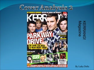
This cover follows magazine design conventions, using a reverse-S eye flow. It begins at the top left masthead and moves to the main coverline featuring the band Parkway Drive. Additional images and sections like the kickers provide information about the magazine's contents. The central cover image shows the band members looking directly at the camera. The varied color scheme and inclusion of multiple images help convey the magazine's eclectic rock/alternative atmosphere but may distract from other elements. Overall the cover successfully promotes Kerrang! magazine's style and content to its target audience.
My preso on foodies' new media.
Content:
short digital media theory / slide #9
20+ best practices:
delivery / slide #17
recipes discovery / slide #21
celeb’s new home / slide #28
community / slide #36
venue discovery / slide #41
Twitter, the fastest growing micro-blogging Web site, is connecting individuals and companies with an astonishing yearly growth rate of 1,382%. Whether it’s Facebook, MySpace,Twitter or LinkedIn, social networks have engulfed the Web andenabled millions of people who share common interests to interact.
How to Make a Field invisible in Odoo 17Celine George
It is possible to hide or invisible some fields in odoo. Commonly using “invisible” attribute in the field definition to invisible the fields. This slide will show how to make a field invisible in odoo 17.
Synthetic Fiber Construction in lab .pptxPavel ( NSTU)
Synthetic fiber production is a fascinating and complex field that blends chemistry, engineering, and environmental science. By understanding these aspects, students can gain a comprehensive view of synthetic fiber production, its impact on society and the environment, and the potential for future innovations. Synthetic fibers play a crucial role in modern society, impacting various aspects of daily life, industry, and the environment. ynthetic fibers are integral to modern life, offering a range of benefits from cost-effectiveness and versatility to innovative applications and performance characteristics. While they pose environmental challenges, ongoing research and development aim to create more sustainable and eco-friendly alternatives. Understanding the importance of synthetic fibers helps in appreciating their role in the economy, industry, and daily life, while also emphasizing the need for sustainable practices and innovation.
Instructions for Submissions thorugh G- Classroom.pptxJheel Barad
This presentation provides a briefing on how to upload submissions and documents in Google Classroom. It was prepared as part of an orientation for new Sainik School in-service teacher trainees. As a training officer, my goal is to ensure that you are comfortable and proficient with this essential tool for managing assignments and fostering student engagement.
The Indian economy is classified into different sectors to simplify the analysis and understanding of economic activities. For Class 10, it's essential to grasp the sectors of the Indian economy, understand their characteristics, and recognize their importance. This guide will provide detailed notes on the Sectors of the Indian Economy Class 10, using specific long-tail keywords to enhance comprehension.
For more information, visit-www.vavaclasses.com
Unit 8 - Information and Communication Technology (Paper I).pdfThiyagu K
This slides describes the basic concepts of ICT, basics of Email, Emerging Technology and Digital Initiatives in Education. This presentations aligns with the UGC Paper I syllabus.
The French Revolution, which began in 1789, was a period of radical social and political upheaval in France. It marked the decline of absolute monarchies, the rise of secular and democratic republics, and the eventual rise of Napoleon Bonaparte. This revolutionary period is crucial in understanding the transition from feudalism to modernity in Europe.
For more information, visit-www.vavaclasses.com
Ethnobotany and Ethnopharmacology:
Ethnobotany in herbal drug evaluation,
Impact of Ethnobotany in traditional medicine,
New development in herbals,
Bio-prospecting tools for drug discovery,
Role of Ethnopharmacology in drug evaluation,
Reverse Pharmacology.
Operation “Blue Star” is the only event in the history of Independent India where the state went into war with its own people. Even after about 40 years it is not clear if it was culmination of states anger over people of the region, a political game of power or start of dictatorial chapter in the democratic setup.
The people of Punjab felt alienated from main stream due to denial of their just demands during a long democratic struggle since independence. As it happen all over the word, it led to militant struggle with great loss of lives of military, police and civilian personnel. Killing of Indira Gandhi and massacre of innocent Sikhs in Delhi and other India cities was also associated with this movement.
How to Split Bills in the Odoo 17 POS ModuleCeline George
Bills have a main role in point of sale procedure. It will help to track sales, handling payments and giving receipts to customers. Bill splitting also has an important role in POS. For example, If some friends come together for dinner and if they want to divide the bill then it is possible by POS bill splitting. This slide will show how to split bills in odoo 17 POS.
2. Masthead (slightly obstructed) Main Coverline Strapline Kickers Splatter Barcode (Price line & Date line included) Coverlines Explanatory Text Coverline Central Cover Image Additional Cover Image
3. Eye Flow The eye flow of this cover follows the convention seen generally on magazine (music) front covers, employing the “reverse-S” shape for the eye flow of the cover, as represented by the curved blue line on the cover to the left. The eye flow begins at the top left, where the masthead, which is in capital letters, large, bold and in a colour that contrasts the background (white font against dark background), captures the reader’s attention. The obscuring of the masthead on the right side of the cover by one of the cover people, leads the reader to concentrate on his face. The eye flow that continues to the main coverline, as a result of its large font, boldness and the use of a red layer for its background, to emphasise the words “PARKWAY DRIVE”. It then continues through the explanatory text below the coverline, due to the contrast of the yellow brush and the black large, capital font. The bright colour of yellow captures the attention of the reader’s eyes. Afterwards, the eye flow continues through to the bottom right of the magazine, to the end of the kickers on the right.
4. Sections of the Cover The masthead of Kerrang! is large sized and goes across horizontally from the top left edge of the page to the top right, which is the norm for most magazines. On this cover, the masthead is white, but the colour usually changes in different MASTHEAD This issue’s masthead issues, although white is most prominently used.. The font of the masthead is an Impact yet the embellishments present suggest that it is a Grunge font. The features that make it an Impact font (the capital letters, boldness, etc…) indicate that the magazine is strong and the fact that it is the largest font on the cover suggests its importance is above anything else written on the page. The Grunge aspect of the masthead suggests the modernity of the magazine and its audience, as the Grunge “movement” only started recently. The masthead elicits a type of eclectic quality through the combination of elements present on the front cover that show that the magazine mainly focuses on rock and alternative music.
5. Sections of the Cover (cont…) MAIN COVERLINE The font of the coverline is the largest on the cover, except for the masthead, as Kerrang! want the coverline to be one of the first elements of the cover the reader see. The font mostly matches the masthead, which was what I also found in the other front cover of NME that I looked at. Additionally, it is white and is an Impact font, although the embellishments suggest a Grunge influence in the font. The red brush used as the background emphasises the words “ PARKWAY DRIVE”. The audience can ascertain that, as Kerrang! is a music magazine, that the words “PARKWAY DRIVE” are a band, and as the cover image is a group shot, that the central image consists of the members of ‘Parkway Drive’. Additionally, the main coverline is tilted slightly with the right higher than the left part. Collectively, the tilt, the grunge/impact font and the colours used suggest the modern and tough nature of “Parkway Drive” and of Kerrang! as a magazine.
6. Sections of the Cover (cont…) SPLATTER KICKER The role of a splatter is to alert the audience and capture their attention to the information written inside it. The splatter here is relatively small, with the shape of a circle and sharp edges going out of it. This unique shape is one of the reasons it is able to attract attention from the reader. The impact font and yellow colour used for the word “PLUS!” distinguishes it from the other words on the cover and from the font used in the kicker, which is helpful as the splatter is used to introduce the kicker and attracts the audience to reading from the splatter horizontally to the end of the kicker. The kicker here is located on the bottom of the page, which is one of the usual locations it is found at. The job of the kicker is to inform the reader about some of the content that will be found inside the magazine, but in short phrases that have some sort of meaning to the audience. The phrases here, such as “A DAY TO REMEMBER”, are names of bands that are mentioned in some form or another inside the magazine. The font is smaller than the coverlines as kickers are not supposed to take up a large space. They are supposed to persuade a reader to read the magazine with the mention of a few words (a band in this case) that they feel they have a personal connection with, without using too much space of the cover.
7. Colour Scheme Kerrang! is known for using unusual colour schemes and for employing a wide range of colours on its front cover, as this cover shows. The colours used are white, green, black, red and yellow. Front covers of other music magazines usually have a maximum of 3 colours, and therefore Kerrang! break the mould in this compartment. The colour of the coverlines are mostly white, although one is yellow, so there is clearly a pattern and structure to the colour scheme, although less restrained than other music magazines. The high variety of colour gives out the feeling of a hyper-real and eclectic atmosphere, which matches the feeling that rock, alternative and “grunge music” elicit to their fans.
8. Language The “access all areas” phrase is something that is usually seen on music magazines to suggest a certain exclusivity or at least full coverage of a particular event or band. This part of the strapline clearly entices the reader as it suggests that they will receive an complete, fully rounded glimpse into this event/artist. This explanatory text is an example of the direct address to the audience that the front cover employs. With the use of the personal pronoun “you” Kerrang! create the effect that the reader is part of the magazine, and draw the reader into the magazine. The use of exclamation marks is found throughout the cover, in order to symbolise something as exciting, and therefore make it seem more exciting to the audience. Being a band magazine, artists and bands are mentioned throughout. If a reader sees that a band they like is in the magazine’s content than they will be more likely to purchase the magazine.
9. Mise en scene The central image here is a group medium shot of 5 men, suggesting that they are the members of a band, given that this is a music magazine. The band fill up the frame suggesting that they The lighting is bright, with their faces lit up clearly. The band collectively seem to be wearing casual and smart clothing, suggesting that they take their music seriously yet are here to have fun. However, there is a juxtaposition between this and their facial features, as none of them are smiling. On the other hand, their faces do not emit a particular seriousness. These neutral faces may be attempting to create the connotation that they are ‘cool’. Additionally, the band members are looking directly into the lens, creating the impression that they want the audience’s attention, in contrast to if they were looking away from the camera, which would create the impression of detachment from the audience. Additionally, there are several other additional images on the cover, mainly with people playing electronic guitar and pulling faces. These contribute to create a rock n’ roll tone on the front cover.
10. Final Thoughts Kerrang!’s covers are notable for having strange colour schemes, multiple images on the front cover besides the central cover image and being cluttered with ‘content’. This front cover is no exception. However, I do feel that altogether it is quite impressive in the way it manages to convey an eclectic atmosphere that no doubt targets Kerrang!’s target audience of young adult males that are interested in the rock and alternative genres. The use of additional images is a good idea but I think it detracts from the cover image as well as other aspects of the cover. I like the central image as it selects to use a group shot to capture a band as the cover people, rather than a close up shot of a single artist. This will provide me with a thought to consider when I create my front cover.