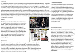
House style:
For KERRANG!the house style isusually quite darkandthiscontentspage inparticular followsthe pattern.The darkgrey
of the backgroundiscomplementedbywhite andyellowwhichhasa bigimpacton the audience; the colouryellow
reflectsenergyandblackrepresentspower,thisworkswell asitfitsinandreflectsthe genre of the magazine- rock. The
usesof black andwhite are classiccolourswhichwere usedinmanyrock videos. The fontalsoreflectsthisasthe sans
serif,crackedfontfollowsthe house style throughoutthe contentspage.Itisalsoboldwhichexpressesanimportance but
alsoloudness,aswe wouldsee awordwrittenincap locks as someone shouting, emphasisingthe genre of rock further.
The designof the contentspage is carefullythoughtoutdue tothe contrast of light to dark.The white helpsemphasize the
textand pictures;howeverthere isablackbox around the yellowtext,thisisbecauseitwouldbe hardtoread if itwas
placedontop of the white background.Thisisalsoapparentonthe otherhalf of the page where a white box isneededto
showthe black writing.The frequentuse of boxesmakesitlooksorganisedandprofessionalso the audience candepict
froma title andinformation.
Designbalance
The designbalance isclearlypresentwithinthe contentspage anditis repeatedthrougheach
KERRANG!magazine.Rule of thirdsisusedwithinthe image whichprovidesaperfectspace for
textand pictures,helpingtoframe itto create a focal pointfor the viewer.Designelementsare
repeatedthroughoutthispage suchasthe blackand yellowheadingsandwhitespaces.This
causesthe readerto feel thatareasare connectedandpart of an overall composition. The overall
page is balanceddue tothe symmetry;the contrastof blackand white isbalancedinformally
across the horizontal axisandispresentedmuchlike acollage.
Imagery:
The photographusedon the top half of the page blendsinto
the background,whichalsosetsone part of the colourtheme
of black. Blackis a classiccolourto use as it wasusedin rock
videosandalsowornby classicrock bandssuch as Guns n
Roses. The image of slash usedisrule of thirdswhichis
convenientforthe Guttenbergprinciple,helpingtoprovide a
place for the picturesandtext.The mainimage isquite dark
and mysteriousdue tothe costume hidinghisidentity.Italso
suggeststhathe is featuredinthe magazine alongwiththe
othersmall images presentingtoursandotherbands.The
darknessof these images reflectsthe atmosphere of the
whole magazine.
Target audience andneed:
The target audience of the magazine canbe predicted
fromthe type of imageryusedandcontent.Forthis
magazine itwouldbe aimedatpeople agedaround16-
36 due to the type of genre, butcouldalsobe aimedat
an olderaudience due tothe classicrock bandsand
musiciansfeaturedsuchasSlash,whichwere aroundin
the 70’s/80’s. There is an obvioususe of
advertisementsof productsandanemphasisonrock
bandsand musicians,proving ittobe a needforthe
viewer.Thisisimportantasitis the mainfocusof the
audience,assome readersmaybuythe magazine for
the musician/bandfeaturedandothersforthe
productsadvertised.
The Guttenbergprinciple:
Thisprinciple helpsthe magazine rankthe mostimportant
coverlinestothe least,whilstalsohelpingittolook
professional.The image andtextatthe top leftof the
page are positionedinthe primaryoptical area,suggesting
that theyare the maincoverlinesof the magazine. The
offerfora bundle of magazine ispositionedinthe
terminal areawhichisthe lastthinga viewerwouldread
due to the fact that people naturallyreadfromleftto
right.Thisindicatesthattheyare the leastimportantand
isn’tthe sellingpointforthe magazine.Whereas the
image of Slashis foundinthe strongfallowarea
suggestingitisthe mainsellingpoint. The weakfallow
area can be foundinthe bottomlefthandcornerof the
magazine,where inthiscase the journalistof the
magazine isfoundas it isn’tas importantsubjecttothe
viewerasSlash.
House style
Withthiscontentspage there isa prominentuse of black,pinkandwhite.The blackresemblessophisticationand
givesa magazine alookof professionalism.The pinkisenergeticandeye catchingfittinginwiththe genre of the
magazine,thisbeingdance music.Itreflectsthe energy associatedwithdance andtherefore setsthe colourtheme.
The white contrastswiththe black, highlightingthe textandrepresentingaformality. The sansserif fontof the
masthead‘mixmag’doesn’tcarry onthrough the magazine buta bolderandharsh textisused.Thischange infont
createsa diversityandhelpsthe readerdistinguishfromdifferenttexts.The backgroundof the page iscompletely
blackwiththe onlycolourcomingfrom the imagery.There isnobalance withinthe layoutbutthe positioningof the
textisneatlyplacedsoit isclearto the audience alsosuggestingformalitycomparedtoKERRANG!Magazine.The text
doesnotneeda boarderdue to the fact that you can see itclearlyontop of the backgrounditsself,andyouclearly
distinguishbetweenaheadingandinformationfromthe size andfont.E.g.CONTENTS.
Designbalance
The imagesusedcarry visual weightforthe audience.Bypresentingone image biggerthanthe othermakesit
clearthat these elementsare differentandreflecttheirimportance tothe magazine. The mainimage carries
the most visual weightdue tothe combinationof itssize,positionandcolour. The positioningof the main
image providesafocal pointforthe page helpingthe readertodistinguishfromdifferentelements.Overall,
there isa combinationof elementssittingacrossthe horizontal axisandthe vertical axis. However,the
elementssittingonthe vertical axisholdmore visual weight,therefore itismore dominant.
Imagery
The imageryusedonthispage isenergeticwhichcomplimentsthe
coloursof pink,blue andyellow. The warmcoloursadvance intothe
foregroundwhich acreatesclearfieldof view forthe reader,thus
reflectingthe importanceof the image forthe magazine due to
visual weight- itisthe sellingpointforthe magazine.Italso
emphasisesthe genre of the magazine of dance music,whichcanbe
gatheredfromthe confetti, dancingandinthe smallerimage,which
alsofeaturessubjectsrelatedtothe genre,suchas the head
phones.The mainimage considersthe factthatthe magazine is
promotingclubbingortoursgiventhe factthat there isan advertfor
an eventatthe bottomof the page.
The Guttenbergprinciple
The main image occupiestwoareasof the Guttenberg
principle- the primaryoptical areaandweakfallowarea.
Thisallowsmore attentiontobe broughttowardsthe text
bellowitdue tothe fact that the viewernaturally reads
fromright to left. However,the mastheadisoccupying
the primaryoptical area completelydue toitssignificance
of the magazine, alongwiththe title of the page
“CONTENTS”whichis positionedinthe strongfallowarea.
Alsoa smallerimage,holdinglessvisual weightthanthe
mainimage,sharesthe strongfallowareawiththe title.
Thissuggeststhatthere is a relationshipbetweenthis
image andthe contentwithinthe magazine,therefore
beingone of the coverlines.The textunderneaththe
mainimage followingthe horizontalaxis goesfromthe
weakfallowareainto terminal area.Thissuggeststhatit
doesn’thasas much significanceasthe otherelements
consideringitholdsthe leastvisualweight.
Target audience andneed
Consideringthe genre representedbythe imagery
and colourscheme the targetaudience couldbe
readersagedaround16-36. However,due toimagery
of people atclubsthismaysuggestthatthis particular
magazine isaimedatpeople of anolderage,such as
18+, due to the fact that there isan age restriction to
go clubbing.The advertisementsforupcomingevents
and the latestmusicianssuggestthatthisisthe main
focusfor the viewer.However,the needforevents
that have happenedseemto be more of a focal point
than upcomingevents,due tovisual weight.The main
image representsarecentevent whichseemstoa
sellingpointforthe magazine.

Contents Analysis

  • 1.
    House style: For KERRANG!thehouse style isusually quite darkandthiscontentspage inparticular followsthe pattern.The darkgrey of the backgroundiscomplementedbywhite andyellowwhichhasa bigimpacton the audience; the colouryellow reflectsenergyandblackrepresentspower,thisworkswell asitfitsinandreflectsthe genre of the magazine- rock. The usesof black andwhite are classiccolourswhichwere usedinmanyrock videos. The fontalsoreflectsthisasthe sans serif,crackedfontfollowsthe house style throughoutthe contentspage.Itisalsoboldwhichexpressesanimportance but alsoloudness,aswe wouldsee awordwrittenincap locks as someone shouting, emphasisingthe genre of rock further. The designof the contentspage is carefullythoughtoutdue tothe contrast of light to dark.The white helpsemphasize the textand pictures;howeverthere isablackbox around the yellowtext,thisisbecauseitwouldbe hardtoread if itwas placedontop of the white background.Thisisalsoapparentonthe otherhalf of the page where a white box isneededto showthe black writing.The frequentuse of boxesmakesitlooksorganisedandprofessionalso the audience candepict froma title andinformation. Designbalance The designbalance isclearlypresentwithinthe contentspage anditis repeatedthrougheach KERRANG!magazine.Rule of thirdsisusedwithinthe image whichprovidesaperfectspace for textand pictures,helpingtoframe itto create a focal pointfor the viewer.Designelementsare repeatedthroughoutthispage suchasthe blackand yellowheadingsandwhitespaces.This causesthe readerto feel thatareasare connectedandpart of an overall composition. The overall page is balanceddue tothe symmetry;the contrastof blackand white isbalancedinformally across the horizontal axisandispresentedmuchlike acollage. Imagery: The photographusedon the top half of the page blendsinto the background,whichalsosetsone part of the colourtheme of black. Blackis a classiccolourto use as it wasusedin rock videosandalsowornby classicrock bandssuch as Guns n Roses. The image of slash usedisrule of thirdswhichis convenientforthe Guttenbergprinciple,helpingtoprovide a place for the picturesandtext.The mainimage isquite dark and mysteriousdue tothe costume hidinghisidentity.Italso suggeststhathe is featuredinthe magazine alongwiththe othersmall images presentingtoursandotherbands.The darknessof these images reflectsthe atmosphere of the whole magazine. Target audience andneed: The target audience of the magazine canbe predicted fromthe type of imageryusedandcontent.Forthis magazine itwouldbe aimedatpeople agedaround16- 36 due to the type of genre, butcouldalsobe aimedat an olderaudience due tothe classicrock bandsand musiciansfeaturedsuchasSlash,whichwere aroundin the 70’s/80’s. There is an obvioususe of advertisementsof productsandanemphasisonrock bandsand musicians,proving ittobe a needforthe viewer.Thisisimportantasitis the mainfocusof the audience,assome readersmaybuythe magazine for the musician/bandfeaturedandothersforthe productsadvertised. The Guttenbergprinciple: Thisprinciple helpsthe magazine rankthe mostimportant coverlinestothe least,whilstalsohelpingittolook professional.The image andtextatthe top leftof the page are positionedinthe primaryoptical area,suggesting that theyare the maincoverlinesof the magazine. The offerfora bundle of magazine ispositionedinthe terminal areawhichisthe lastthinga viewerwouldread due to the fact that people naturallyreadfromleftto right.Thisindicatesthattheyare the leastimportantand isn’tthe sellingpointforthe magazine.Whereas the image of Slashis foundinthe strongfallowarea suggestingitisthe mainsellingpoint. The weakfallow area can be foundinthe bottomlefthandcornerof the magazine,where inthiscase the journalistof the magazine isfoundas it isn’tas importantsubjecttothe viewerasSlash.
  • 2.
    House style Withthiscontentspage thereisa prominentuse of black,pinkandwhite.The blackresemblessophisticationand givesa magazine alookof professionalism.The pinkisenergeticandeye catchingfittinginwiththe genre of the magazine,thisbeingdance music.Itreflectsthe energy associatedwithdance andtherefore setsthe colourtheme. The white contrastswiththe black, highlightingthe textandrepresentingaformality. The sansserif fontof the masthead‘mixmag’doesn’tcarry onthrough the magazine buta bolderandharsh textisused.Thischange infont createsa diversityandhelpsthe readerdistinguishfromdifferenttexts.The backgroundof the page iscompletely blackwiththe onlycolourcomingfrom the imagery.There isnobalance withinthe layoutbutthe positioningof the textisneatlyplacedsoit isclearto the audience alsosuggestingformalitycomparedtoKERRANG!Magazine.The text doesnotneeda boarderdue to the fact that you can see itclearlyontop of the backgrounditsself,andyouclearly distinguishbetweenaheadingandinformationfromthe size andfont.E.g.CONTENTS. Designbalance The imagesusedcarry visual weightforthe audience.Bypresentingone image biggerthanthe othermakesit clearthat these elementsare differentandreflecttheirimportance tothe magazine. The mainimage carries the most visual weightdue tothe combinationof itssize,positionandcolour. The positioningof the main image providesafocal pointforthe page helpingthe readertodistinguishfromdifferentelements.Overall, there isa combinationof elementssittingacrossthe horizontal axisandthe vertical axis. However,the elementssittingonthe vertical axisholdmore visual weight,therefore itismore dominant. Imagery The imageryusedonthispage isenergeticwhichcomplimentsthe coloursof pink,blue andyellow. The warmcoloursadvance intothe foregroundwhich acreatesclearfieldof view forthe reader,thus reflectingthe importanceof the image forthe magazine due to visual weight- itisthe sellingpointforthe magazine.Italso emphasisesthe genre of the magazine of dance music,whichcanbe gatheredfromthe confetti, dancingandinthe smallerimage,which alsofeaturessubjectsrelatedtothe genre,suchas the head phones.The mainimage considersthe factthatthe magazine is promotingclubbingortoursgiventhe factthat there isan advertfor an eventatthe bottomof the page. The Guttenbergprinciple The main image occupiestwoareasof the Guttenberg principle- the primaryoptical areaandweakfallowarea. Thisallowsmore attentiontobe broughttowardsthe text bellowitdue tothe fact that the viewernaturally reads fromright to left. However,the mastheadisoccupying the primaryoptical area completelydue toitssignificance of the magazine, alongwiththe title of the page “CONTENTS”whichis positionedinthe strongfallowarea. Alsoa smallerimage,holdinglessvisual weightthanthe mainimage,sharesthe strongfallowareawiththe title. Thissuggeststhatthere is a relationshipbetweenthis image andthe contentwithinthe magazine,therefore beingone of the coverlines.The textunderneaththe mainimage followingthe horizontalaxis goesfromthe weakfallowareainto terminal area.Thissuggeststhatit doesn’thasas much significanceasthe otherelements consideringitholdsthe leastvisualweight. Target audience andneed Consideringthe genre representedbythe imagery and colourscheme the targetaudience couldbe readersagedaround16-36. However,due toimagery of people atclubsthismaysuggestthatthis particular magazine isaimedatpeople of anolderage,such as 18+, due to the fact that there isan age restriction to go clubbing.The advertisementsforupcomingevents and the latestmusicianssuggestthatthisisthe main focusfor the viewer.However,the needforevents that have happenedseemto be more of a focal point than upcomingevents,due tovisual weight.The main image representsarecentevent whichseemstoa sellingpointforthe magazine.