1. TARGET AUDIENCE AND GENRE
The target audience of this magazine is mainly men
aged 18 to 30. This is apparent by the layout being
quite precise and neat suggesting a more mature
audience. The magazine’s genre is the Rap/Hip-Hop
area with elements of RnB and Dance music. This
can be seen by the names of the artists and the
general house style.
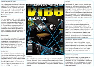
MAIN IMAGE
The main image takes up the entire of the page and
is of House music artist, Deadmau5, who is dressed
all in black, blending in with the background. The
image is large making it easy for it to catch the eye
of the target audience and fans of this artist. The
dress is quite formal with Deadmau5’s mask, his
symbol and signature item of clothing, being the
centre of attention to further draw the attention of
fans. The formal attire shows the mag’s maturity
MODEL CREDIT
The model credit is covering part of the main image
and is placed under the lead article, connecting the
three together while it is also mostly in bright
yellow, making it stand out and catch the eye of the
audience rather than blending with the black
background. The ‘>INSERT RAPPER HERE<’ is in a
grey colour which stands out less
LEAD ARTICLE
The lead article is large and covers the main image,
indicating that the two are linked together. It is in a
large font and is white, allowing for it to stand off
the black background of the page and catch the eye
of the audience. It has also been placed more
towards the Primary Optical area to allow it to be
the first thing to catch people’s eyes as they scan
over the front page of the magazine
MASTHEAD
The mastheads font style fits in with the magazines usual
house style but the colours are varied with the large font
and the bright yellow colouring standing off the page and
attracting the audiences’ eyes to the magazine title so that
regular purchasers of the magazine can easily see the
magazine’s title. The title also begins in the primary optical
area allowing for it to be the first thing the audience sees
when they look at the front cover. The font and fade effect
also allow the audience to see the genre of music covered
THE GUTENBURG DESIGN PRINCIPLE
The layout is similar to that of Q Magazine, with there being
a lot placed round the edges but the majority of the
magazine cover being quite empty. The title and main
article are placed closest to the primary optical area with
the other articles being placed in the strong fallow area and
the terminal area of the magazine to attract the eyes of the
reader to the articles in the magazine. However, unlike
other magazines that try and attract your eyes to the weak
fallow area, Vibe has placed just a single darkened article
and the barcode to make sure all articles are read
COLOURS/TYPE FACES/HOUSE STYLE
The colours of the magazine seem to change with every
issue but area always very eye-catching and aesthetically
pleasing to the audience to allow for them to be attracted
to purchase the magazine. The type faces are the same
across all magazines with the font being fitting for the
covered genres but quite formal to attract an older and
more mature audience
COVERLINES
There are a plethora of coverlines down the magazines right side, leading from
the strong fallow to the terminal area and decorated in bright colours to attract
the eye of the audience, providing them with further stories to persuade them to
make a purchase of the magazine as well as giving them an idea of the magazines
contents
BANNERS/FLASHES/BADGES
Again, like Q Magazine, there are only two banners and
flashes. The first is located along the top of the page,
attracting the eye of the audience directly to that location
to persuade them with a story snippet while the other is,
oddly, in the weak fallow of the page, attempting to draw
the eye of the audience