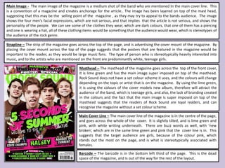
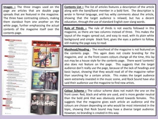
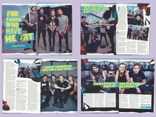
The document provides an analysis of the layout and design elements of the magazine "Rock Sound". It summarizes that the magazine does not have a consistent color scheme across issues but aims to attract different audiences based on the featured artist. While the pink and lime green colors on the cover are aimed at teenage girls, inside articles use more neutral colors. The layout focuses on images of bands wearing stylish but dark clothes to appeal to readers. Overall, the analysis finds the magazine targets a primarily young, female audience that is heavily invested in music.
Read| The latest issue of The Challenger is here! We are thrilled to announce that our school paper has qualified for the NATIONAL SCHOOLS PRESS CONFERENCE (NSPC) 2024. Thank you for your unwavering support and trust. Dive into the stories that made us stand out!
Students, digital devices and success - Andreas Schleicher - 27 May 2024..pptxEduSkills OECD
Andreas Schleicher presents at the OECD webinar ‘Digital devices in schools: detrimental distraction or secret to success?’ on 27 May 2024. The presentation was based on findings from PISA 2022 results and the webinar helped launch the PISA in Focus ‘Managing screen time: How to protect and equip students against distraction’ https://www.oecd-ilibrary.org/education/managing-screen-time_7c225af4-en and the OECD Education Policy Perspective ‘Students, digital devices and success’ can be found here - https://oe.cd/il/5yV
How to Make a Field invisible in Odoo 17Celine George
It is possible to hide or invisible some fields in odoo. Commonly using “invisible” attribute in the field definition to invisible the fields. This slide will show how to make a field invisible in odoo 17.
Welcome to TechSoup New Member Orientation and Q&A (May 2024).pdfTechSoup
In this webinar you will learn how your organization can access TechSoup's wide variety of product discount and donation programs. From hardware to software, we'll give you a tour of the tools available to help your nonprofit with productivity, collaboration, financial management, donor tracking, security, and more.
How to Split Bills in the Odoo 17 POS ModuleCeline George
Bills have a main role in point of sale procedure. It will help to track sales, handling payments and giving receipts to customers. Bill splitting also has an important role in POS. For example, If some friends come together for dinner and if they want to divide the bill then it is possible by POS bill splitting. This slide will show how to split bills in odoo 17 POS.
The Roman Empire A Historical Colossus.pdfkaushalkr1407
The Roman Empire, a vast and enduring power, stands as one of history's most remarkable civilizations, leaving an indelible imprint on the world. It emerged from the Roman Republic, transitioning into an imperial powerhouse under the leadership of Augustus Caesar in 27 BCE. This transformation marked the beginning of an era defined by unprecedented territorial expansion, architectural marvels, and profound cultural influence.
The empire's roots lie in the city of Rome, founded, according to legend, by Romulus in 753 BCE. Over centuries, Rome evolved from a small settlement to a formidable republic, characterized by a complex political system with elected officials and checks on power. However, internal strife, class conflicts, and military ambitions paved the way for the end of the Republic. Julius Caesar’s dictatorship and subsequent assassination in 44 BCE created a power vacuum, leading to a civil war. Octavian, later Augustus, emerged victorious, heralding the Roman Empire’s birth.
Under Augustus, the empire experienced the Pax Romana, a 200-year period of relative peace and stability. Augustus reformed the military, established efficient administrative systems, and initiated grand construction projects. The empire's borders expanded, encompassing territories from Britain to Egypt and from Spain to the Euphrates. Roman legions, renowned for their discipline and engineering prowess, secured and maintained these vast territories, building roads, fortifications, and cities that facilitated control and integration.
The Roman Empire’s society was hierarchical, with a rigid class system. At the top were the patricians, wealthy elites who held significant political power. Below them were the plebeians, free citizens with limited political influence, and the vast numbers of slaves who formed the backbone of the economy. The family unit was central, governed by the paterfamilias, the male head who held absolute authority.
Culturally, the Romans were eclectic, absorbing and adapting elements from the civilizations they encountered, particularly the Greeks. Roman art, literature, and philosophy reflected this synthesis, creating a rich cultural tapestry. Latin, the Roman language, became the lingua franca of the Western world, influencing numerous modern languages.
Roman architecture and engineering achievements were monumental. They perfected the arch, vault, and dome, constructing enduring structures like the Colosseum, Pantheon, and aqueducts. These engineering marvels not only showcased Roman ingenuity but also served practical purposes, from public entertainment to water supply.
This is a presentation by Dada Robert in a Your Skill Boost masterclass organised by the Excellence Foundation for South Sudan (EFSS) on Saturday, the 25th and Sunday, the 26th of May 2024.
He discussed the concept of quality improvement, emphasizing its applicability to various aspects of life, including personal, project, and program improvements. He defined quality as doing the right thing at the right time in the right way to achieve the best possible results and discussed the concept of the "gap" between what we know and what we do, and how this gap represents the areas we need to improve. He explained the scientific approach to quality improvement, which involves systematic performance analysis, testing and learning, and implementing change ideas. He also highlighted the importance of client focus and a team approach to quality improvement.
We all have good and bad thoughts from time to time and situation to situation. We are bombarded daily with spiraling thoughts(both negative and positive) creating all-consuming feel , making us difficult to manage with associated suffering. Good thoughts are like our Mob Signal (Positive thought) amidst noise(negative thought) in the atmosphere. Negative thoughts like noise outweigh positive thoughts. These thoughts often create unwanted confusion, trouble, stress and frustration in our mind as well as chaos in our physical world. Negative thoughts are also known as “distorted thinking”.
How to Create Map Views in the Odoo 17 ERPCeline George
The map views are useful for providing a geographical representation of data. They allow users to visualize and analyze the data in a more intuitive manner.
2024.06.01 Introducing a competency framework for languag learning materials ...Sandy Millin
http://sandymillin.wordpress.com/iateflwebinar2024
Published classroom materials form the basis of syllabuses, drive teacher professional development, and have a potentially huge influence on learners, teachers and education systems. All teachers also create their own materials, whether a few sentences on a blackboard, a highly-structured fully-realised online course, or anything in between. Despite this, the knowledge and skills needed to create effective language learning materials are rarely part of teacher training, and are mostly learnt by trial and error.
Knowledge and skills frameworks, generally called competency frameworks, for ELT teachers, trainers and managers have existed for a few years now. However, until I created one for my MA dissertation, there wasn’t one drawing together what we need to know and do to be able to effectively produce language learning materials.
This webinar will introduce you to my framework, highlighting the key competencies I identified from my research. It will also show how anybody involved in language teaching (any language, not just English!), teacher training, managing schools or developing language learning materials can benefit from using the framework.
The Art Pastor's Guide to Sabbath | Steve ThomasonSteve Thomason
What is the purpose of the Sabbath Law in the Torah. It is interesting to compare how the context of the law shifts from Exodus to Deuteronomy. Who gets to rest, and why?
The Art Pastor's Guide to Sabbath | Steve Thomason
5sos work
1. Masthead – The masthead of the magazine goes across the top of the front cover,
It is lime green and has the main image super imposed on top of the masthead.
Rock Sound does not have a set colour scheme it uses, and the colours will change
depending on the topic or artist that is on the magazine. By using the lime green,
it is using the colours of the cover models new album, therefore will attract the
audience of the band, which is teenage girls, and also, the lack of branding created
in the colours and the fact that the main image is super imposed on top of the
masthead suggests that the readers of Rock Sound are loyal readers, and can
recognise the magazine without a set colour scheme.
Strapline – The strip of the magazine goes across the top of the page, and is advertising the cover mount of the magazine. By
placing the cover mount across the top of the page suggests that the posters that are featured in the magazine would be
important to the reader, as they would be large music fans. The type of person who is stereotypically heavily interested into
music, and to the artists who are mentioned on the front are predominantly white, teenage girls.
Main Image - The main image of the magazine is a medium shot of the band who are mentioned In the main cover line. This
is a convention of a magazine and creates anchorage for the article.. The image has been layered on top of the mast head,
suggesting that this may be the selling point of the magazine , as they may try to appeal to the bands audience. The image
shows the four men's facial expressions, which are not serious, and that implies that the article is not serious, and shows the
personality of the people. We can see some of the clothes they wear, which are dark colours, that one of them has a piercing
and one is wearing a hat, all of these clothing items would be something that the audience would wear, which is stereotypes of
the audience of the rock genre.
Main Cover Line – The main cover line of the magazine is in the centre of the page,
and goes across the whole of the cover. It is slightly tilted, and is lime green and
pink, with white writing underneath. There are buzz words as well, with ‘new
broken’, which are in the same lime green and pink that the cover line is in. This
suggests that the target audience are girls, because of the colour pink, which
stands out the most on the page, and is what is stereotypically associated with
females.
Barcode – The barcode is in the bottom left third of the page. This is the dead
space of the magazine, and is out of the way for the rest of the layout.
2. Colour Scheme – The colour scheme does not match the one on the
front cover. Red, black and white are used, and is more gender neutral
than the bold pink that was obviously aimed towards females. This
suggests that the magazine gives each article an audience and the
colours are chosen depending on who would be most interested in the
topic, showing that Rock Sound may have a diverse target audience.
However, no branding is created in this way.
Masthead/Heading - The masthead of the magazine is not featured on
the contents page. This again does not create branding for the
magazine, and as the front covers colours change all the time, this lay
out may be a house style for the contents page. There word ‘contents’
also does not feature on the page. This suggests that the target
audience don’t really use the page, because of the lack of headings and
basic layout, showing that they would read all of the magazine rather
than searching for a certain article. This makes the target audience
seem extremely invested in the music scene, and Rock Sound have also
said their audience use the magazine to find new artists.
Rule of Thirds – The rule of thirds is not exactly followed in this
magazine, as there are two columns instead of three. This makes the
layout of the mages spread out, and easy to read, with its plain white
background and simple black font, gives the eyes a pattern to follow,
still making the page easy to read.
Contents List – The list of articles features a description of the article
along with the band/band member in a bold font. The description is
wrote in formal language, and has witty comments about the article,
showing that the target audience is relaxed, but has a decent
education, through the use of standard English over slang words.
Images – The three images used on the
page are articles that are double page
spreads that are featured in the magazine.
The three have contrasting colours, making
them standout from one another on the
white page, further emphasising the actual
contents of the magazine itself over the
contents page.
3.
4. Images – The images on the page are all either
medium shots or long shots of the band. In the images
we see tour busses, and them breaking vinyl records
with a baseball bats. They are seen to be wearing the
stereotypical clothes that the target audience would
wear, skinny jeans, boots or converse, and completely
dark colours. This makes the band seem relatable to
the target audience and draw them into the article
more. The breaking vinyl's is just a pun for the article,
as it partly mentions how them are ‘breaking records’.
By showing the tour bus in the background, it tells the
audience about how they are on tour, which is an
interest for the target audience, who spend lots of
money on tour/festival tickets, showing how they
must be from middle class families.
Colour Scheme – The colour scheme of the article is
blue and yellow. This does not match the
magazines front cover, therefore does not create
branding. The colours are even more gender
neutral than the front cover, with blue being a
stereotypically male colour and yellow a girls,
bringing the attention of all of the readers. It also
matches the colour scheme of the images, which
have a blue hue to them, creating an anchorage in
them.
Drop Capital – Drop capitals are used throughout the
article. They are in the same font as the masthead,
however in a blue colour instead of yellow. The drop
capital separates the article up, and brings attention
to certain parts of the article. It also makes the article
seem more formal, like a book.
Masthead – The masthead of the article is in a blue
and yellow, sans serif, bold font. This makes the
font have sharp edges and lines, and making it look
quite modern, showing the younger target
audience. It features a logo in place of a letter in
the word ‘heart’, which is a symbol they talk about
in the article, again creating anchorage for the
article.
Block Quotes – Several block quotes are used
throughout the article. These bring attention to
certain parts of the article, and people who scan read
the article will be able to get relevant information
about the article. It also gives an insight to certain
people who are in the article, or highlights any main
messages the people want to highlight.
Language – The language in the article is standard
English, with a few swear words in the quotes. This
shows that the audience have a decent education,
however are still laid back. It shows they are
younger as well, as older generations stereotypically
look down on swear and slang words.