
Recommended
More Related Content
What's hot
What's hot (20)
Viewers also liked
Viewers also liked (16)
Similar to Analysis of conventions in Digipak album art designs
Similar to Analysis of conventions in Digipak album art designs (20)
More from JacobDMBird
Recently uploaded
Recently uploaded (20)
Analysis of conventions in Digipak album art designs
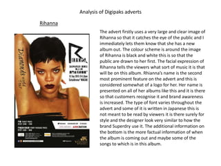
- 1. Analysis of Digipaks adverts Rihanna The advert firstly uses a very large and clear image of Rihanna so that it catches the eye of the public and I immediately lets them know that she has a new album out. The colour scheme is around the image of Rihanna is black and white this is so that the public are drawn to her first. The facial expression of Rihanna tells the viewers what sort of music it is that will be on this album. Rhianna’s name is the second most prominent feature on the advert and this is considered somewhat of a logo for her. Her name is presented on all of her albums like this and it is there so that customers recognise it and brand awareness is increased. The type of font varies throughout the advert and some of it is written in Japanese this is not meant to be read by viewers it is there surely for style and the designer look very similar to how the brand Superdry use it. The additional information on the bottom is the more factual information of when the album is coming out and maybe some of the songs to which is in this album.
- 2. Tinie Tempar In this Digipak advert is again very plain and minimalistic the colour schemes use all very plain and mainly black-and-white is used throughout the entire advert. The main feature is again the artist them selves which proves that it is a common convection in digipak adverts. The artist is placed on the advert so that members of the public instantly realise that it is Tinie Temper who has released a new album. The the reason that the artist is looking up, suggests that his lyrics of his raps will be very deep and emotionally charged. The typology and most of all the name Tinie Temper is more of a logo for the artist raising brand awareness and allowing viewers to automatically notice who the artist is. This font used for his name will be on any albums or products that he is associated with. The rest of the writing en the advert are all promotional statements that give information about the album and tracks. By using words such as superstar it grabs the viewers attention and that makes them want to listen to his tracks as he must be very talented to achieve this title.
- 3. Adele The third digipak advert I looked at was the Adele 21 advert where again the very simplistic design was the first thing that I noticed. The prominent feature again however is the artist herself this is to tell the public that Adel has released a new album and it is available for purchase. The facial expression mixed in with the plain black and gray colour scheme tells the viewers what type of music is going to be on the album and in this case we can guess it will be sad, slow and emotional. The small added colour of green is used to just make the little less important things stand out. By using it in part of the title and then as a little statement it makes the viewer read both parts because the eye is drawn to it. The typography that is used in the advert is kept as one consistent font which gives the whole overall look of the advert as very clean cut and professional. In the left hand corner of the the advert actually shows an image of the digipak itself so this is so that customers will recognise the product and purchase one.
- 4. Katy Parry The next digipak advert I looked at was the Katy Perry- Teenage Dream. The most prominent feature again is the artist herself this is to tell the public that Katy Perry has released a new album and it is available for purchase. The facial expression and erotic revealing picture of the artist is there to grab the attention of the veiwer. The colour scheme tells the viewers what type of music is going to be on the album and in this case we can guess it will be very fast up beat and catchy. The bright bold colours make the advert even more exiting and goes against the convections of normal digi pack adverts. The typography that is used in the advert is kept as one consistent font which gives the whole overall look of the advert as fun and silly but with a hint of sexual drive there as well. In the left hand corner of the the advert shows the additional less important information that the viewers will want to know if they are a listener of Katy Parry.
- 5. Codes and Convections of Digipak Adverts After completing this task and analysing the different digipak adverts I have discovered many codes and convections which I will have to consider when making my own digipak advert. The first noticeable convection is the image, on all the examples I discovered there was a picture of the artist taking up two thirds of he advert. One repeating code is that they use a medium close up shot that includes the shoulders of the artist but most importantly they focuses on the facial expression of the artist. The facial expression is then made to be some what of a representation of the type of music that will be in the album. The next most trending convection is the simplistic design and minimalistic layout which the adverts have. Learning comment After completing this task I have realised that there are many codes and conventions in digipak adverts which I will try to incorporate into my digipak advert. The the most certain aspects that I will include in my advert will be a large picture of the artist that takes up at least half of the page. Another aspect I will have to consider when making my advert Will be to designed a style of all the main aspects to represent the type of music that is in the album.