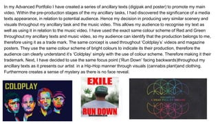
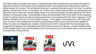
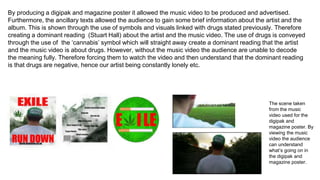
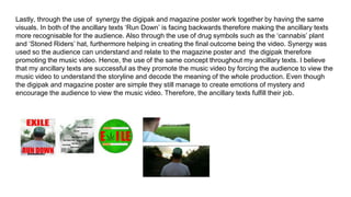
1. Evaluation 2
How effective is the combination of your main
product and the ancillary texts?
Dawid Jurkowski
2. In my Advanced Portfolio I have created a series of ancillary texts (digipak and poster) to promote my main
video. Within the pre-production stages of the my ancillary tasks, I had discovered the significance of a media
texts appearance, in relation to potential audience. Hence my decision in producing very similar scenery and
visuals throughout my ancillary task and the music video. This allows my audience to recognise my text as
well as using it in relation to the music video. I have used the exact same colour scheme of Red and Green
throughout my ancillary texts and music video, so my audience can identify that the production belongs to me,
therefore using it as a trade mark. The same concept is used throughout âColdplayâsâ videos and magazine
posters. They use the same colour scheme of bright colours to indicate its their production, therefore the
audience can clearly understand itâs âColdplayâ simply with the use of colour scheme. Therefore making it their
trademark. Next, I have decided to use the same focus point (âRun Downâ facing backwards)throughout my
ancillary texts as it presents our artist in a Hip-Hop manner through visuals (cannabis plant)and clothing.
Furthermore creates a sense of mystery as there is no face reveal.
3. The concept of standing backwards towards to the audience is to show that âRun Downâ doesnât look back
which links to the music video; his drug addiction and rebellious lifestyle. Furthermore, this will force the
audience to view the music video to understand âRun Downâ and overcome the sense of mystery produced
by the hidden face. Very similar concept is used within Eminemâs digipak and magazine poster âCurtain
Callâ. Eminemâs face is never shown therefore the audience can only assume it's him through the mid-shot
of a manly figure. This forces the audience to view the music video to understand and decode the digipak
and the magazine poster. On whole I have produced the ancillary texts to force the audience to view the
music video which will allow them to decode the digipak and magazine poster, therefore making my
ancillary texts and music video promote each other.
4. Break Down of the Magazine poster and digipak - The name of the album is called 'Exile' linking to the
concept of an âoutlawâ. 'Run Down' is constantly doing negative (outlaw) actions such as Drugs and
rebellious behaviour, therefore the name 'Exile'. The font is purposely simple and red as simplicity is generic
within the Hip-Hop genre. The idea of using simple font is inspired by Eminem's poster 'Recovery' which
contains simple font however, still manages to create successful visuals. Our artist is the main focus point of
the poster presented in the middle of the poster as well as digipak for audience attention, which is enhanced
by his position within the poster. The artist 'Run Down' is facing backwards to convey the idea of rebellious
lifestyle which relates to never looking back. Therefore we don't see the artists face but only his drug life
visible within the marijuana plant,'Stoned Riders' hat and smoke at the back of the digipak. The use of
marijuana plant and stoned riders hat is for the audience to decode the personality of our artist and to show
his negative drug life. Wiz Khalifa in his album âRolling Papersâ uses similar concept by creating a male figure
from smoke indicating that Wiz Khalifa and his album will be about drugs (Hip-Hop convention). This idea
was adapted into my digipak and magazine poster by adding âCannabisâ symbol on the ancillary texts and
Smoke on the back of the digipak.
5. The colours within the posters are used to complement each other therefore the use of white and green to
make the red stand. On the bottom of the magazine poster I have placed social media links as well as an
official website for my artist. This will help the audience in receiving information about 'Run Down' as well as
getting in contact with him for tour purposes etc. Further more, social media will allow my target audience to
follow 'Run Down' which will not only create a larger 'Fan base' but will also increase publicity for the Album,
therefore increasing the sales. I have decided to place the record label 'UVR' at the bottom of the magazine
poster for publicity reasons as well as bringing awareness to the audience that 'Run Down' belongs to 'UVR'
therefore indicating his from a hit record label. However, on the digipak I have placed the âUVRâ logo at the
back, to make it more professional and clean by decreasing symbols used on the front of the digipak.On
whole, the poster and digipak was created in simple manner which is typical within the Hip-Hop genre as
magazines and digipaks from that genre don't tend to be fancy hence my decision. I believe that the poster
and the digipak does its job and fits perfectly to the Hip-Hop genre due to the simple colour contrast as well
as simple clean writing and font.
6. By producing a digipak and magazine poster it allowed the music video to be produced and advertised.
Furthermore, the ancillary texts allowed the audience to gain some brief information about the artist and the
album. This is shown through the use of symbols and visuals linked with drugs stated previously. Therefore
creating a dominant reading (Stuart Hall) about the artist and the music video. The use of drugs is conveyed
through the use of the âcannabisâ symbol which will straight away create a dominant reading that the artist
and the music video is about drugs. However, without the music video the audience are unable to decode
the meaning fully. Therefore forcing them to watch the video and then understand that the dominant reading
is that drugs are negative, hence our artist being constantly lonely etc.
The scene taken
from the music
video used for the
digipak and
magazine poster. By
viewing the music
video the audience
can understand
whatâs going on in
the digipak and
magazine poster.
7. Lastly, through the use of synergy the digipak and magazine poster work together by having the same
visuals. In both of the ancillary texts âRun Downâ is facing backwards therefore making the ancillary texts
more recognisable for the audience. Also through the use of drug symbols such as the âcannabisâ plant
and âStoned Ridersâ hat, furthermore helping in creating the final outcome being the video. Synergy was
used so the audience can understand and relate to the magazine poster and the digipak therefore
promoting the music video. Hence, the use of the same concept throughout my ancillary texts. I believe
that my ancillary texts are successful as they promote the music video by forcing the audience to view the
music video to understand the storyline and decode the meaning of the whole production. Even though
the digipak and magazine poster are simple they still manage to create emotions of mystery and
encourage the audience to view the music video. Therefore, the ancillary texts fulfill their job.