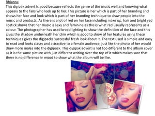
1. Rhianna
This digipak advert is good because reflects the genre of the music well and knowing what
appeals to the fans who look up to her. This picture is her which is part of her branding and
shows her face and look which is part of her branding technique to draw people into the
music and products. As there is a lot of red on her face including make up, hair and bright red
lipstick shows that her music is sexy and feminine as this is what red usually represents as a
colour. The photographer has used broad lighting to show the definition of the face and this
gives the shadow underneath her chin which is good to show of her features using these
techniques gives the digipacks successful fresh look about it. The text used is simple and easy
to read and looks classy and attractive to a female audience, just like the photo of her would
draw more males into the digipack. This digipak advert is not too different to the album cover
as it is the same picture with just different writing over the top of it which makes sure that
there is no difference in mood to show what the album will be like.
2. Lana Del Rey
The Lana Del Rey digipak is simple but
still very effective and they have used
the same technique as the Rhianna
digipak advert as they have also used the
same picture which is on the album
cover to keep the mood the same and
make sure the two link. The picture is
good because it show the genre of the
music within her facial expression which
contradicts the rest of the photo which is
bright and gives a happy mood. . The
harsh name of the album 'Born To Die'
also supports the contradicting attitude
to this poster and links to the genre of
the music. The writing on the poster
looks quite fancy and this gives the
mood of calm and feminine music in the
album. Also the large photo within the
pack showing her as an artist what she is
about which the fans like to have an
insight.
3. The Script was the only digipak advert that I found that was in quite a negative colour and this
instantly gives the genre and mood of the music which is quite emotional and masculine. The
basic showing that they was no gimmicks just the stripped back music.The writing on the
poster is simple but is bold which is successful. This poster also uses the same picture as on
the album and this is a common theme for digipak posters. The very plain and simple look is
attractive as it makes you want to look at it without it being too complex, this is good as it
supports their whole brand of simplicity and interesting music.Also the CD is quite basic but
affective all linking to together to make the digipack.
4. What I have
learnt?
I have noticed doing this task they try and link the
download and album to the digipack but offer more of
people they know people already know and like such as
other photo in the Lan Del Ray digipack always linking
the colours, music artists also use these adverts to
show off their branding and image. Linked well making
it flow. The digipacks offering more so people who like
the artist pay and gain more