Contemporary philippine arts from the regions_PPT_Module_12 [Autosaved] (1).pptx
Q2
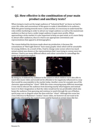
1. Q2. How effective is the combination of your main product and ancillary texts?<br />When trying to reach out the target audience of “Industrial Rock” we knew we had to cover the codes and conventions of this genre to make it identifiable to its audience. With this genre leaning towards more a niche market, it is necessary to understand the rules within marketing in order to attract our target audience as well as the mainstream audience so that we have a wider target audience to gain more profits. When approaching a niche market it is also important to keep an open mind, as it’s more likely to attract other audiences, thus it’s vital to use appropriate conventions and representations that appeal to all demographics. <br />The reason behind the decisions made about my production, is because the connotations of “Red-Light District” have many graphic shots which will be unsuitable for young children. As a result of this, I had to change some scenes where too much sexual content was shown or the representations that I was trying to convey were too obvious. I had to use many different effects and colour correction to camouflage the scene so it wasn’t too explicit. <br /> <br />By doing so, it widened my audience to the extent in which children were also able to watch this music video and would not be offended or be negatively influenced in a way that would be unacceptable in the market today. Another scene for example was of the character approaching her “client”. With this scene conveying many different meanings, it was vital to obscure the audience from knowing exactly what happens and instead leave it to their imagination so that the video would not be too predictable which also keeps the audience from guessing and continue to watch through the use of flashes, quick jump cuts to disguise what she does with her “client”. Although this scene has cross reference to Madonna’s “erotica” music video, we however do not want to be negatively criticised by the explicit scenes and be banned at certain times like her. <br /> <br />Furthermore, this shows that we have considered the codes and conventions and the views and opinions avoiding limiting our production. This artist is marketable through its appealing appurtenance and unique style and music, just like Lady Gaga, who has become a very successful artist. The artist is able to use her iconic image and personality to reach out to her target audience, produce songs in which her audiences can relate to. <br />My Decision is using this picture and making this as the album cover developed whilst filming this scene. What stood out about this picture is that it’s a close up of the “singer” in which she is represented as a powerful yet easy going person who has her own style and doesn’t follow mainstream fashion. The title “Red-light District” is in bold to appeal to the audience and let them recognise straight away that’s the name of the album. <br /> For example, in one of Britney’s CD cover she keeps the cover very plain and simple with a close up of herself in the background which emphasises and connotes the meaning of how she is as an artist and as a person. With Britney looking directly at the camera evokes the impression that she’s looking at “us” the audience which also appeals directly to the target audience which makes it catchy. It is as if she is telling the audience to look right into her and understand what she is like inside. This expresses her emotional side.<br /> <br />The fact that it’s in red and bold emphasise the meaning of “RED light district” which has many meanings to it such as love, passion, danger and seductiveness. Furthermore I aimed to evoke this meaning to the audience to show them that there’s more to it than what you see first impression, thus it also hides the dilemma the “prostitute” goes through. This also suggests that it is therefore aimed at demographics of C1&2 and ages of teenagers and above to adulthood both men and women who can relate to the lyrics such those who have a dilemma in what they are doing in life. Men would also enjoy this music video as some of them may be the quot;
clientquot;
themselves, and thus this will be an eye opener to how a quot;
prostitutequot;
feels.<br />The name of the artist “Porcelain and the Tramps” is written in black in a simple yet childish font to evoke the meaning that although the name seems as though it is a bit crude or rebellious side to the artist and her music, it however also signifies the meaning that she is a fun and doesn’t follow the “norm” of today’s society and that she has her own style. Furthermore, this appeals to a more niche market that challenges the stereotypes and norm of how society should be. This is effective as the picture I have used is a close up which draws the audience to the front cover as they would have recognised the artist straight away. Although, the artist is a very expressive character, I didn’t want to make the cover too expressive with too many details that would appear too busy for the audience to notice. Thus, I decided to keep it simple with just the title of the album as well as the artist’s name. <br /> <br />For the inside page of the album cover I decided to use many different pictures of the artist to portray the versatility of the artist. As shown in the first two pictures, the headphones she is wearing emphasise her passion and enjoyment with music and that her opinions are reflected through her songs and in the lyrics. The other pictures emphasise her fun and rebellious side to her personality and isn’t afraid to express her style or emotions. By using a montage of images of the artist it allows the audience to gain an insight and understanding of what the artist is like and her influences to music. This is important from a marketing point of view as it involves the audience and sells the artist’s real identity which allows the audience to identify with her and gain inspiration. By having a red borderline, it instils the meaning of passion, love and danger of the artist which also relates back to the theme of “Red light District” that this album is promoting. I believe this is very effective in giving the audience an insight to what the artist herself is like when she is not singing, which gives the audience the feeling where they can relate to her and understanding where her aspirations derived from. As shown in the picture above, this third cover of the digi pack and is placed behind the actual CD. I decided to keep this part plain as it will be placed right behind the CD where it is not always seen and the first aspect of the album when the audience picks it up. The use of this picture shows her fun and girly side of the singer with the use of purple font colour which goes with her dress well.<br /> <br />For the back cover of the album, I decided to keep the theme of black, white and red as these are the colours that convey many different meanings, which keeps the audience guessing. The image I used is also a picture that was taken whilst filming that inspired me to use as the back cover, as it emphasises the passion and emotions of the artist when she is singing, this is also a way in which the audience can relate back to the music video of the song “Red light District” Which captures that specific moment in time when the artist is singing. <br />I decided to use red and white for the other songs in her album to make them stand out, which goes well against the black background. The use of the barcode in the corner also makes it more realistic that it is an actual album cover as seen and shown on other album covers of artists such as Madonna and Britney. I used Lady Gaga as a sample and guideline to create my back cover. As shown in hers, there is an image of Lady Gaga singing which emphasises her passion for singing and the emotions which is related to the song titles. To show that I have fully understood the codes and conventions of what an album cover has, I have included institutional information about the album and the artist for more information. To help with the institutional information needed, I researched through many different album back covers and understood the purpose of having this feature. <br />The final part of my ancillary task was to make a magazine poster promoting this album. This poster comes from a magazine from NME (New music express) which is a popular music magazine which has mainly focussed on rock/punk music’s. I believe that the genre industrial rock furthermore fits the criteria of this magazine and I think that it would be well marketed and have great appeal for those who read NME or similar music magazines. <br /> On the right is an example of an advert in a NME magazine. I based my decision to make my advert similar to this through the use of big, bright and appealing quotations to appeal to the target audience. This effect reaches out to the target audience by capturing their interest and informs them when the album is out what positive feedback it has received. I kept the emphasis of quot;
Red light Districtquot;
by keeping the red fonts to show its powerful meaning. To show that it is from NME i placed a page number and NME's logo on the bottom right hand side to show that i have considered the codes and conventions of this magazine and have taken into account what appeals to its target audience. <br />I decided to challenge my editing skills further by using a picture and splitting it into different sections as though it is a puzzle. The use of this editing technique creates the meaning of playfulness which also attracts the audience to the point where is looks effective and skilful. <br />This is another example of a page in an NME magazine. The use of bright red and blue reaches out to the audience and stands out which gets the audience interested. This has also influenced my decision in using bright colours to appeal to my target audience. The pictures and writing are neatly spaced out so that the page does not look too busy. The border line and the page itself are different colours so that it is clear that it is an advert/article. In order for my products to sell in a real media industry, I had to cover the codes and conventions and understand from marketing perspective of how and what attracts my target audience. Thus, I believe I have achieved this through the use of iconic images and appealing colours that grab the audience’s attention straight away. The idea of keeping the theme simple yet expresses the artist’s personality, has been inspired by Lady Gaga, in particular as she has become well known through her iconic and challenging image she presents to society. <br />